
Thanks
Thanks to everyone who participated in my first bounty. Out of the entries that followed the instructions, these are the entries I subjectively liked the most:
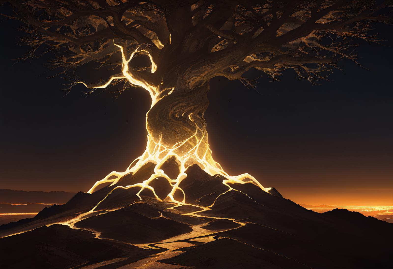
1st Place - MarcianoTheVoyager's floating lantern entry. A very nice overall composition with a good use of colors and lighting. The plague doctor entry is also very strong.
2nd Place - ScratchyStar's desert landscape entry. The lighting cascading off the falling sand is very nice.
3rd Place -Whan129180's shrine entry. Good mix of candle lighting and the lighting from above.
100 buzz to everyone else. Thanks again for the submissions!
Findings
The overall goal was to see if anyone had any lighting tricks that I wasn't already using, since lighting is one of the most important pieces of a composition. Please see the bounty entries as most of them have generation details.
I'm not sure if my personal goal was fully met, but hopefully this compilation can help others:
The default image that the AI uses is a gray background, so if you do image to image with just a black background, it will lend itself to darker results
Styles that are easier to deal with lighting changes
Realistic
Landscapes
Painting styles
"Neon" will lend itself to casting it's coloring to the lighting
"Chiaroscuro" is an art style that mixes light and dark (and what I used for the example image). This prompt is recognized by Flux and Illustrious, but not Pony.
General prompts that can impact lighting in various ways: Day, Dawn, Dusk, Night, Twilight, dynamic <optional color> lighting, bright, dim lighting, dark, shadows, luminous, glow, glowing <optional item>, high contrast, vibrant colors
1/l9/25 Update: Adding backlit to this list.
Typically you should use weights and/or repeating prompts to push the AI towards a direction as some of the above have small gains that need to be emphasized for it to have larger impacts on the overall piece
Items I need to test more Testing of items:
Prompt Scheduling (thanks @MarcianoTheVoyager) - Interesting concept of scheduling an initial prompt prior to building out the rest of the piece.
Unclear if/how much this will help lighting specifically. 1/l9/25 Update: So I believe the term for this is pre-prompting, but unfortunately it is not natively supported in ComfyUI and I couldn't get the one custom node I found to work. This apparently works fine in A1111 from what I read."Volumetric shadows" & "volumetric light" (thanks @panzeryokai) - From testing, I'm not sure this actually helps with lighting, but it seems to add detailing so seems useful. Using just "volumetric" doesn't give me good results. 1/l9/25 Update: So I like the outputs that volumetric shadows provides from usage out in the wild, so I try using it when I feel something is lacking on detailing to see what the output will be, but it's fairly erratic. Volumetric light actually works more like how I pictured shadows to work, in that it sometimes will create dynamic mix of light and shadow on a piece. It's extremely neurotic though as sometimes it does close to nothing or something random. Both work far better in Illustrious than Pony.
1/l9/25 Update: "(black background:0.5)" - Thanks @NanashiAnon for commenting with this recommendation. This actually works pretty well in Illustrious as it adds some shadowing to the existing composition. When I tried going up to 0.6 weight, the composition changed, and at 0.7 weight I lost the background, so 0.5 weight looks to be ideal. This kind of works in Pony, but the composition shifted even with lowering of weight. The effect of added shadow isn't very large either.