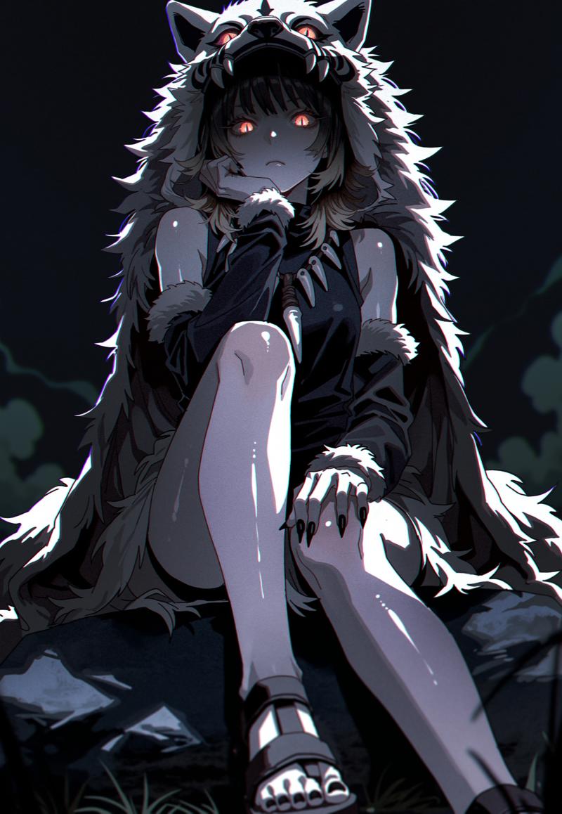
INTRODUCTION:
I've been asked many times about my workflow, there's really nothing special about it and almost everyone generating exactly the same way. But it would be easier for me to post once and refer people here than to answer in private messages every time.
So. DISCLAIMER!
I know you can do better. I know I'm doing wrong. I know the raw version is better. You're right. You don't have to write about it in the comments. Love you.
Now DISCLAIMER to those who realize that everyone has different tastes and that I do what I like first. Sometimes I like my work and publish it, sometimes I don't like the result and delete it. I will show what I think is a little above average. It's not a masterpiece, it's a simple work that took me barely fifteen minutes to complete. So I can't say much. I just wanted to show the process.
I don't speak English very well, so I used a translator. I apologize for that. I hope your eyes won't bleed in the process. Including from the view of the final image.
I work in ReForge. No, I have no idea how to work in other WebUIs. Especially ComfyUI. But it's probably the same, it just looks a little different.
All the generation was done using WAIv9. It's an excellent model that I'm currently experimenting with.
The first thing I always start with is an IDEA. I come up with an image in my head, but not a specific one, but a general VIBE. This is important, you can spend a lot of time chasing after how something should look like. Or otherwise if you don't know what you want, you can sit over a prompt for a long time. Balance will saves your time. Just have fun.
PROMPTING:
So, when you have an idea, then you need to start with a prompt. I always start with 1girl, solo / 1boy, male focus.
Then I add details that will convey the vibe I came up with. In this case I want to make tribal theme, 1girl, wolf pelt and from that I start to pick up the prompt and the composition as a whole. Since the example is simple, the prompt will be simple but detailed.

I use these LoRAs for stabilization, they are already part of my workflow. But you can use your own or just delete them. WAIv9 is good enough to work without any LoRAs. NoobAI-XL is a different love and hate story x)
<lora:NOOB_vp1_detailer_by_volnovik_v1:0.5> <lora:noobai_ep11_stabilizer_v0.114_fp16:0.5>
<lora:ponyv6_noobV1_2_adamW:0.3>

scenery, blurry background, depth of field, dark, night, dappled moonlight, sidelighting, black sky, horizon, vanishing point, green clouds, green smoke, green fog,

from below, perspective, looking down, looking at viewer, staring, sitting, hand on own knee, knee up, feet on stone, head rest, hand on own chin, thinking,

1girl, solo, blonde hair, black hair, medium hair, wolf cut, multicolored hair, gradient hair, (wolf pelt helmet:1.1), detached sleeves, fur-trimmed sleeves, red eyes, thick eyelashes, long eyelashes, slit pupils, glowing eyes, tribal theme, tribal amulet, tooth necklace, sandals, pale skin, black nails, sharp fingernails,
masterpiece, best quality, amazing quality,
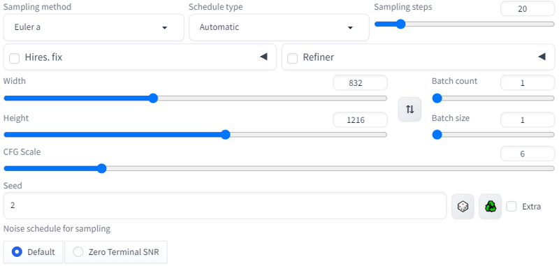
When I pick up a prompt and style, I always generate on lowres without upscaling, simply because I don't want to spend a lot of time on it. Here are the settings I always start with. Nothing special.
We got something like this, good vibe already:
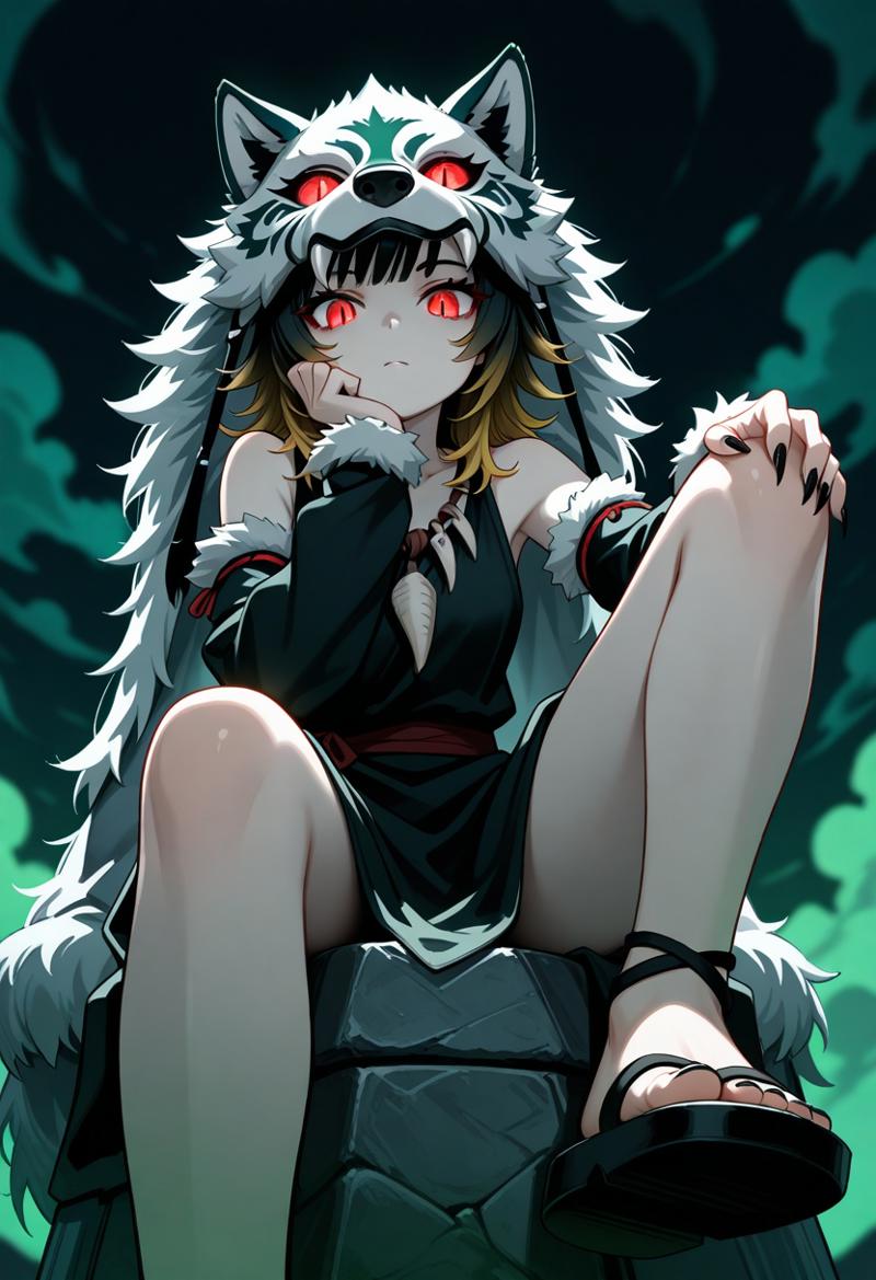
Some might have noticed that I divide my prompt into different groups. This makes it easier for me to edit my prompt if the image is going to be complex and I need to change things constantly.
In my current workflow I have this order:
LORAS -> BACKGROUND -> ANGLE/POSE -> CHARACTER -> QUALITY TAGS -> STYLE -> ARTIST TAGS
It's not a rule, I break it often. But it's easier to work with organized information.
Also, if I'm writing a prompt from scratch (which is 95% of the time), I start with the character's head and move down, so it's easier to write details without forgetting something. But that's not the rule either and when I'm lazy, I just write wherever I want. The main thing is to make it work and comfortable.

<lora:NOOB_vp1_detailer_by_volnovik_v1:0.5> <lora:noobai_ep11_stabilizer_v0.114_fp16:0.5> <lora:ponyv6_noobV1_2_adamW:0.3>scenery,

(blurry background:1.1), (blurry foreground:1.2), (depth of field:1.1), dark, night, (dappled moonlight:1.1), (sidelighting:1.1), (black sky:1.1), horizon, (vanishing point:1.1), green clouds, green smoke, green fog,

from below, perspective, looking down, looking at viewer, staring, sitting, hand on own knee, knee up, feet on stone, head rest, hand on own chin, thinking,

1girl, solo, blonde hair, black hair, medium hair, wolf cut, multicolored hair, gradient hair, (wolf pelt helmet:1.1),  detached sleeves, fur-trimmed sleeves,  red eyes, thick eyelashes, long eyelashes, slit pupils, glowing eyes,  tribal theme, tribal amulet, tooth necklace, sandals, pale skin, black nails, sharp fingernails,

masterpiece, best quality, amazing quality

(sketch:1.1), (realistic:0.75),  (shiny skin:1.1),(mzet:1.1), (m omoo:1.1),  (solipsist:0.9), (mogutofuoes, shiren \(ourboy83\):1.1),
Now for the style. I know how artists tags work, so I just pick them up out of my head. If you have difficulties with it, just find examples, there are a lot of them nowadays. Or go to danbooru/gelbooru and pick the style you like.
I took "mzet + m omoo" (Slightly pointy chin + narrowed eyes). as my main style, so I put them first. According to my observations the first artists tags will be the main one in 90% of cases. The rest will be more of a supplement.
"solipsist" gives soft and slightly thick lines + soft shading, and "mogutofuoes, shiren \(ourboy83\)" give additional outline colors and slightly pale shading to the character.
I also added weights where needed based on my experience, added a "blurry foreground" and ‘sketch, realistic, shiny skin’ to get desired style. These refinements work fine with artist tags, just experiment.
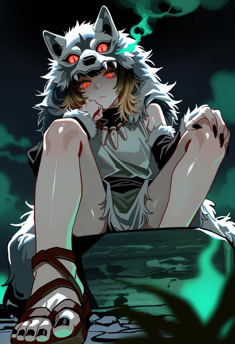
We will get something like this:
GENERATION:
When the prompt and style are picked, then we move on to the main process - generation.
This time I didn't bother and took the FIRST generated result, because it suited me. If you want more aesthetics, then add tags for lighting, angle and additional details for the background and character. Since this is a simple example, I didn't think about it too much.
And so, in the current workflow on WAIv9 I use these settings. But in NoobAI-XL I use 832x1216 and just upscale initially to x1.5. And then sometimes another x1.25 in IMG2IMG. It's not so important, everyone has their own preferences here. But at the moment I like to experiment with higher resolutions, the result is very clean, love it. Here are the settings for the current generation + upscaling:
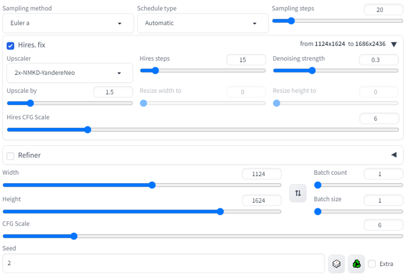
I got this:
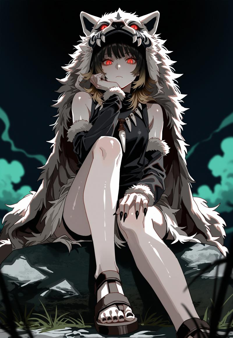
INPAINTING:
For detail quality, I often use inpainting. Usually not very much and just for better details of eyes/face, some main objects. I select a small area, generate, insert a new variant and repeat the process with another area until I am satisfied with the result.
If the image is broken/want to change the composition, I use photoshop and roughly correct everything by running the generation again through IMG2IMG/Inpainting. But usually everything turns out smooth enough as it is, we don't take into account extra/missing fingers (he-he classic) - I add/cut them from time to time. Chick-chick.
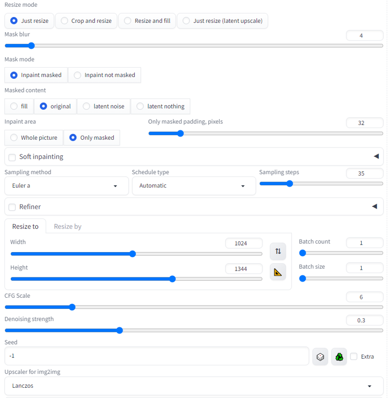
Here are the settings and an example of what it looks like. I start with the face and end with the eyes. Like I said, I often edit the hands and clothing elements, but since the generation turned out clean, I don't need to do almost anything. The whole thing completed in a few minutes even on my rtx3060.
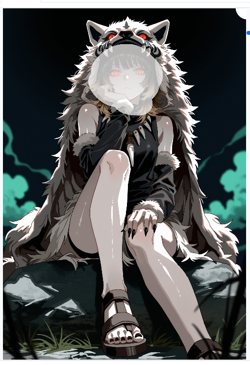
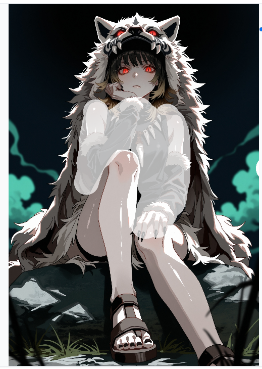
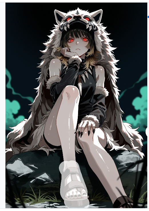
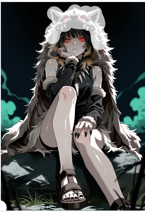
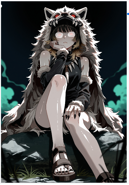
Here's the result I'll be working with in Photoshop. But you can sit on this step endlessly, running the image through photoshop+inpainting multiple times.

PHOTOSHOP TO GET SOME "VIBE":
Photoshop... I'm not going to describe and show exactly how I did it all, I'm not a teacher and my skill is at a beginner level. So I won't teach you bad habits, just watch some YouTube videos. There is a lot of information and tutorials.
In brief:
I use masks.
I separated the background from the character. Both are smart objects.
Added color correction to the background.
Added color correction to the character.
Used Camera Raw Filter for processing. Almost all of the processing goes through it. That and color correction / filters / adding noise.
Used masks and pattern fill to create ‘texture’, I like to have a little texture when zooming in.
Transferred everything to a new layer.
Added glow to the eyes.
Camera Raw Filter: Optics -> Distortion + Geometry -> Rotate + Scale
Blurred foreground a bit
Blending Layer Options to get chromatic aberration effect.
Darkened the image in the specific area a bit to make the brightness of the eyes more visible.
All of this took about ten minutes, but you can do it faster.
Final result:
