
In this article, we're going to explore pre-building an image, and the process of framing said image before you ever use your AI. This is such a simple process, but it's a great way to test your creative side, especially if you're going into an image with a concept.
While this is far from an academic paper, I'll acquaint you with a few terms I think will help you expand your knowledge and take it to the next level.
Mise-en-scene
I want to introduce you all to mise-en-scène, an extremely important French term in stagecraft, photography and film. Roughly translated, it means, "what is put into the scene." In practice here, it's not much different, as the idea is to arrange every aspect of your picture in a purposeful way. Historically speaking, films like The Cabinet of Dr. Caligari (1920) embraced the concept fully, and became one of the most iconic German expressionist films. While I won't go fully in-depth on the meaning (click the links above to see the related Wikipedia articles), what we are trying to accomplish is to generate with intention, choosing how the image is portrayed.
I think to make effective proper images, we should always take into account every aspect of our image, from the frame and where the actor stands, to the background, foreground, and all elements therein. This is the essence of what we are trying to accomplish, and it will make you a better artist, as well as have a stronger understanding of what makes quality art. Further, if you like breaking the rules, you have to know WHAT the rules are first, and do so with purpose.
Rough Outlining
AI, as you well know, is vastly creative, and can work with very little, and I'm going to give you a powerful example of what I mean. To start, I made a rudimentary and extremely rough image (if you can call it that) in GIMP (image software similar to Photoshop, but free) which took perhaps 30 seconds.
Here is the rough outline:

To start, I simply adjusted the hue of the background to be slightly blue, then followed with contrasting colors to differentiate the different aspects of the frame. I also purposely tilted the horizon with high contrast to give the image a bit of a canted angle style. Pretty damn ugly, ain't it? It REALLY doesn't matter though, because this is all we need.
Next, I grabbed RAMTHRUST'S-NSFW-PINK-ALCHEMY-MIX, and used IMG2IMG, with a high de-noise strength of 0.85, then input the following prompt:
"masterpiece, aesthetic, realistic, sunset, woman standing on beach, clothing"
This was the first output:

Not too bad huh? I'd say it generally followed the prompt and initial rough image. Let's compare the two images directly, using a 50% opacity layer to actually check:

As you can see, it picked up many the major details from the rough original image, including the general posture/stance, ocean, sand, sky, height, and even the tilted horizon.
______________________________________________________________________________________
Prebuilding & Taking it to the Next Step
Now, let's do something more complex as it relates specifically to this article. Let's outline what I want to accomplish:
- A cowboy shot of a woman framing their fingers towards the viewer while smiling
- A striking abstract and contrasting background
- Add some style, sass, and a retro "synthwave" aesthetic
To do this, I'm going to use the concepts of mise-en-scène. I'm going to be using random internet images, make major adjustments, and make almost exactly what I want.
Lets start with a simple image. A simple Google search is all we need.

I chose a watermarked image that more or less conveyed what I wanted to start with, then saved it and imported it into GIMP.

For my purposes, I'm going to make some changes. First, I want to remove the background. In this example, I can probably add an alpha layer, set boundary layer to the image size I want, and remove the background with the magic selection tool (with a bit of tweaking). I'll hand remove everything else with a simple eraser.

Now we need to clean up things a bit more. I'd like to use a solid color for the shirt, remove some of the logos, etc. To do this, I'm just going to select a color for the shirt - a dark blue is fine. Also, I'm going to use the smudge tool to loosely remove some of the logos, so they don't create issues later on. I further adjusted the edges to remove some of the yellow, and also slimmed them down with the eraser, since we'll be changing them to a female.
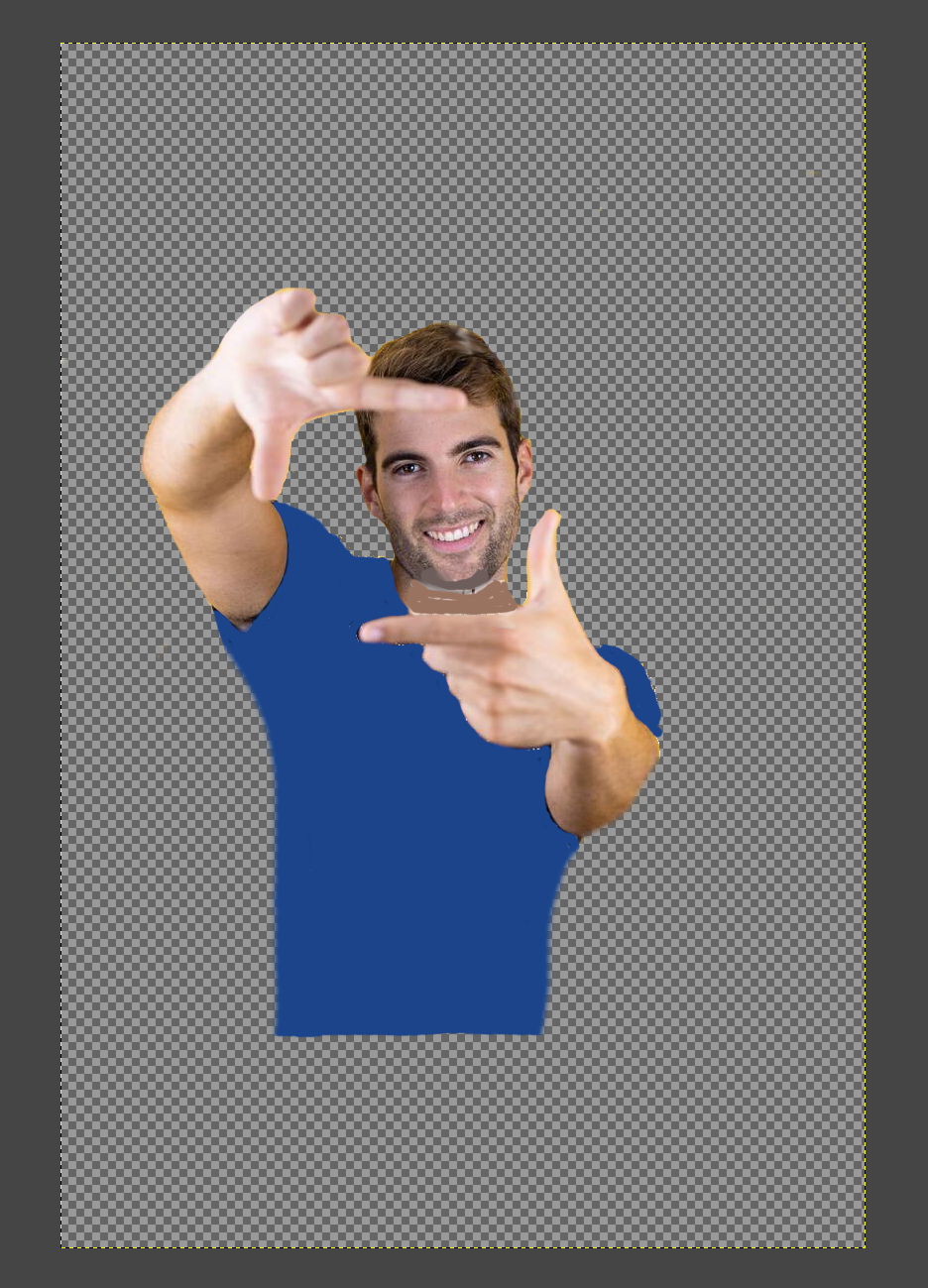
Quite rough, but that's all we need. Now I want to frame them. I'm going to roughly use the Rule of Thirds, a concept regarding framing and aesthetics in where and how to frame something or someone in a picture. In this picture below I overlapped the rough outline for your convenience, applying it to our picture with an additional layer. Note, I'm only showing you this for reference, as it's not something I do normally after many years in the media industry - I think it's important to develop the fundamentals. Learn to walk before running.
Rough outline for Rule of Thirds:

Now, using scaling, the Rule of Thirds, and rotation, I adjusted the image to put the framing of the actor into the general area. Note, when using rule of thirds for what is referred to as a Cowboy Shot (also known as an American Shot, and something you should definitely check out), you generally want the eyeline around the top 1/3 of the image, without too much space from the actor(s) head to the top of the frame. In this case, I split the difference.

Now let's add some striking abstract elements. Using layers, I'm going to add some basic elements to the background, starting with some black space, and layering forward, as well as adjusting the "body" of the actor.

I'm also going to use some elements of perspective to give the space some depth, and build upon the "synthwave" aspect, as well as add some "strikes" to the image, letting the contrast play with the final output.
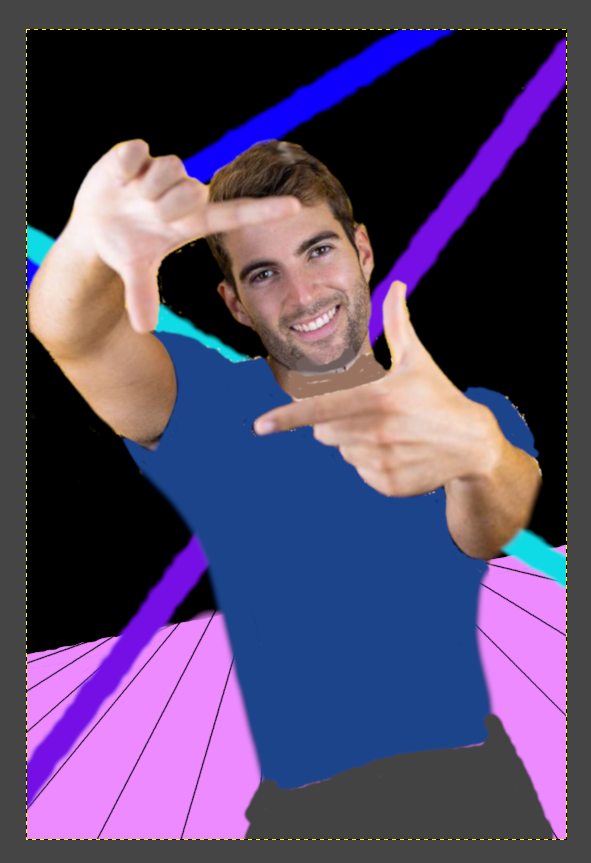
Starting to look like something, but I also want to add some elements of "film dust," to give it a more cinematic and epic look. Simply put, just add some tiny white dots! These tend to look best around the actor themselves, and mimics high powered stage lighting. Lastly, I outlined the fingers a bit to pop them better from the other skin tones.

Alright, this looks totally ridiculous, doesn't it? But, that's okay, because we've very quickly framed the image, and setup all the important elements here to move forward.
______________________________________________________________________________________
Time to Use AI
Now, let's see what the AI can give us. Using the same checkpoint as before (RAMTHRUST'S-NSFW-PINK-ALCHEMY-MIX) I used the following parameters:
- IMG2IMG
- De-noise scale of 0.675
- Sampler of Euler Ancestral
- Guidance scale of 5
Positive Prompt:
masterpiece, aesthetic, realistic, synthwave, 1girl, cowboy shot, striking neon tube lights, trendy attire, hand gesture, perspective, vivid, reflective gradient floor, cinematic, filmic dust, sassy mischievous tilted grin, styled short black hair
Negative Prompt:
worst quality, bad quality, cartoon, anime, leather, long hair
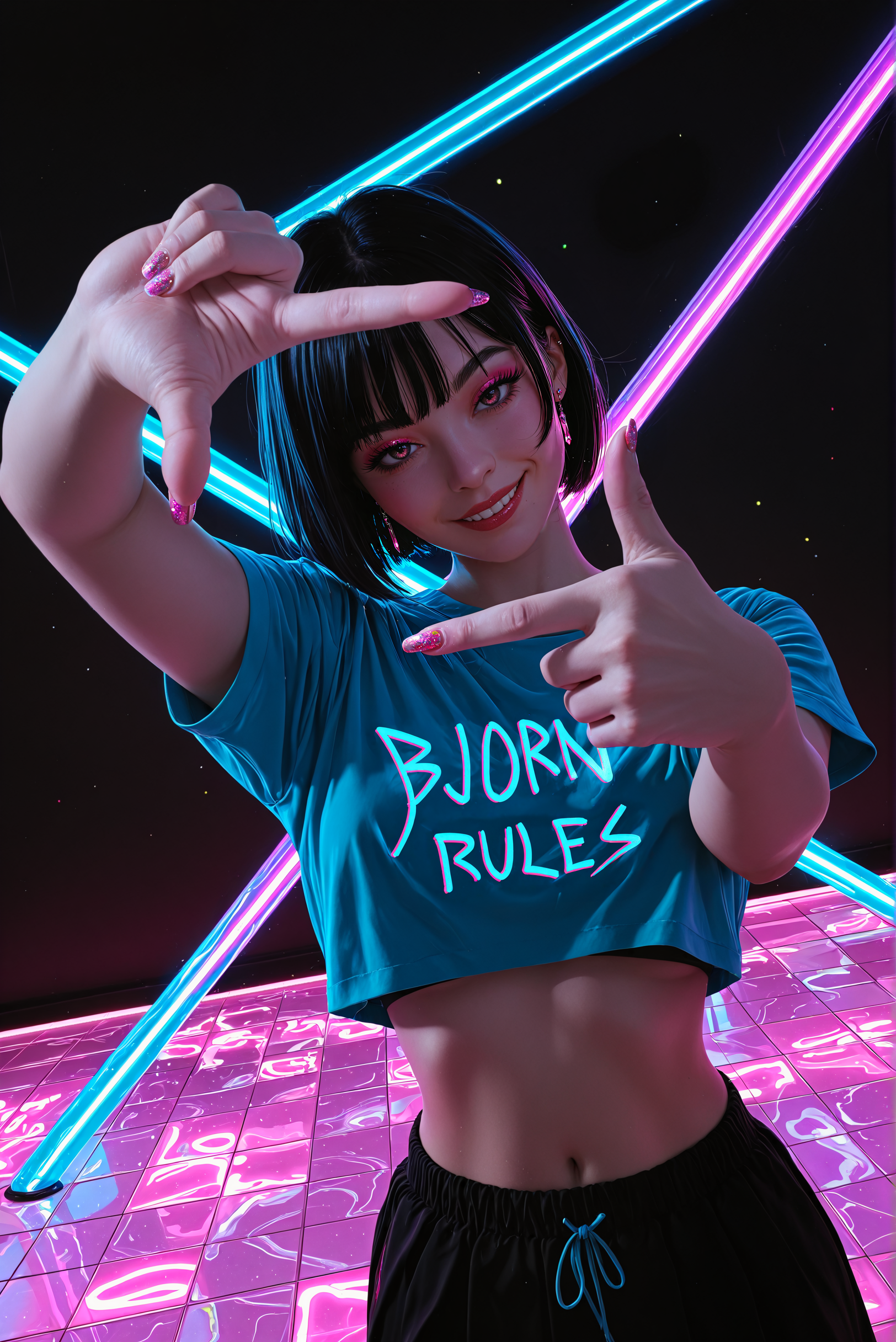
I ran 5 iterations, and chose the one that looked the best, which is this:

Let's adjust the opacity of the original image, and overlay them and compare:

Quite close! Almost exact, honestly, or close to it. Made a few quick edits to adjust the shirt, and a few other minor things:

Now, I want to clean it up a bit more, so I ran the image back through the AI, but at a 0.6 de-noise strength. Result:

From this point forward, which I won't bore you with, I did my usual thing (check some of my other articles to see how I inpaint, upscale, etc.). I spent a bit of time cleaning everything up, used a different refiner, upscaled, and generated several iterations to create what I felt most matched my typical work.
You can see the original high resolution image HERE.
So, let's compare the final image, to the last one before I plopped it inside AI:
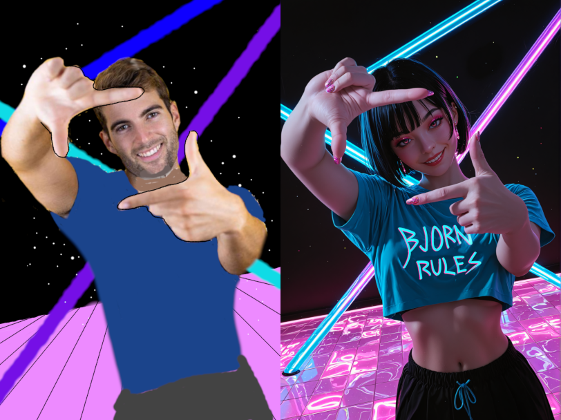
And finally, the same images overlapped upon each other with opacity:

I think overall, I hit all the objectives I was going for, and as you can see, we basically framed the image exactly how we intended, starting from a very low quality image, and building it up to be oh so much more.
Anyways, that's it for the article. I hope you all learned something, and have a new tool from which to work with.
Also, as an aside, can you guys let me know if you got notified regarding the article? The site is acting up. Thanks in advance!
Warmest regards,
-Bjorn