As a preface, I'm a beginner in using Stable Diffusion models for image generation, so take everything that follows with a grain of salt.
Basically, I've noticed how many people advise using "common prompts" when trying to generate any type of image. As a result, I'm sure lots of beginners (like me) copy-paste these prompts without realizing exactly what result they have. Having a bit of background in machine learning, I've been skeptical about the usefulness of many of those tokens ever since I laid eyes on them. This motivated me to do a bit of simple testing to see whether they're should be included in my prompts or not. I thought the results are pretty interesting, so I decided to share them with everyone.
Quality Tokens Comparison Experiment
Methodology
The setup is pretty straightforward:
A1111 for local image generation
The model used is DreamShaper v8, based on SD1.5.
Steps: 35, Sampler: DPM++ 2M Karras (to eliminate the randomness aspect of the SDE variant), CFG scale: 7, NO HiresFix, NO refiner, Size: 512x512.
Clip skip is set to 2. I did notice 1 yields slightly different images, but I wanted to see the potential effects of these tokens when using the settings I actually use all the time.
Seed: 1805345318
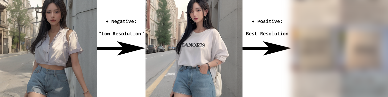
Starting from a blank prompt, I let the model hallucinate until I stumbled upon a random seed which seemed to yield a cohesive looking image. That one is this:
Original image, with 0 prompts: woman posing for a photo on a street, with a wall to the right and a background (vegetation, road and buildings) to the left. You can tell the image is highly unrefined, there's lots of flaws, that is why I consider this a great starting point, as there's many aspects that can be improved with additional tokens.
The Tokens
The tokens I'm analyzing are some that I, in turn, copy-pasted from a popular guide here on CivitAI. They are, supposedly, going to improve the quality of the original image:
Positive: sharp, detailed, HD, HDR, best quality, best resolution, masterpiece, maximalist
Negative: blurry, low quality, low resolution, noisy, distorted, pixelated, minimalist
Looking at these words in relation to the previous image logically make a lot of sense. You cannot think of anything else when you see sharp, for example, right? Its' purpose is to improve the clarity and detail of the image, right?? Well, you'd be surprised.
Evidently, there's many more tokens out there, but it's impossible to test all of them. The point of this small experiment is to exercise your critical thinking and skepticism when it comes to prompting, giving you an insight into how generative AI "thinks".
Results
Be warned, some of the following images contain NSFW content. I did not influence this in any way, they are prompted using only the tokens you will see next to them (which are obviously not indicative of NSFW content, but the model's bias comes into play here, I guess).
Each photo grid which analyses 1 token is organized in the following way: one usage with it in its' rightful prompt (negative or positive) and one usage in the opposite prompt, then the token is used in the intended prompt with each of the tokens from the opposite sentiment (you'll understand better once you see the grids). This means that when you look at the negative analyses, there will be images that you'll have seen in the positive analyses already. I still went through with this approach simply to best show the effects of each token in particular.
VERY IMPORTANT: It may be difficult for you to fully grasp some of the particularities of each image, at first. Trust me, though, it all clicks once you'll have gone through all the data. To this end, if you're willing, I recommend going through the positives one more time after looking at the negatives, this way you'll understand why some of the images in the grid have no connection to the girl on the street in the uninfluenced seed.
I'm going to link the Google Photos album containing all the grids here, for anyone who just wants the TLDR, but for whomever is interested in my take on it, let's start with the positive tokens.
Sharp
Let's answer a question from before: what can you think about when you see 'sharp'? Well, AI takes it a little more literally than us, as in it tries to include sharp objects and angles wherever possible. Sharp negative results in nice and smooth surfaces, no sharp objects in sight. Each of the subsequent negatives adds a particular bias (which we'll discuss later), but notice how there are sharp angles (clothes design) or extremities (fingers, ears) in all images with sharp as positive. Despite this, do we see a drastic decline in sharpness and clarity with sharp as negative? Not really. If sharp meant for AI what it means for us, it would've done anything in its power to make it as unclear as possible...
Detailed
This one is pretty straightforward. It adds details on clothes, hair and adds accessories whenever detailed is in the positive prompt (with one observation: adding noisy as a negative kind of conflicts with detailed, because what it does is remove detail in the background and on the subject; noisy basically sees detail as noise). In the detailed negative image, there quite clearly isn't a huge loss in detail, it's just not the kind of detail the model associates with this prompt.
HD
HD positive has a clear bias for as much NSFW as possible. Proof of that is the HD negative, which puts clothes on the woman until very little skin is shown. Otherwise, I do want to say I notice a clear improvement in quality. I suspect that a lot of NSFW training data was labeled as 'HD', maybe that is why we see nudes.
HDR
HDR is simple: it adds nature. Perhaps it does this because it is associated a lot with those HDR showcase videos everywhere, in which a lot of nature landscapes are filmed. I'm not sure if it does anything for the colors, it might be that when you combine this with another positive which the model has to focus on, HDR instead improves contrast. HDR negative deviates far from nature and keeps the image monochromatic, which might be proof towards HDR's usability.
Best quality
I think this is one of those types of prompts the model does not understand and it either takes literally or flat out ignores. Wherever you see a woman, the result was actually influenced by the negative and I think 'Best quality' was ignored. In some images, it tries doing some weird illustrations in which 'Best quality' is introduced quite literally: 'BEST' can be seen written. Also, I don't see 'Best quality' negative as having low quality, so there's that.
Best resolution
Worse than 'Best quality'. Notice 'Best resolution' negative, it doesn't look low res to me... Anyway, the rest of the images speak for themselves. It may have something to do with screens, as resolution is associated with them.
Masterpiece
This is an interesting one, let's start with masterpiece negative. Its' composition is highly similar to that of the original picture, meaning that 'masterpiece' was not identified in that context. In almost all masterpiece positive prompts, though, we can see a painting being added to the composition, be it in the background or becoming the subject itself. Basically, masterpiece = art.
Maximalist
In the case of 'maximalist', we can see that, with nothing else to focus on, the model is creating images in the color scheme and art style of what the training data labeled as 'maximalist'. It's unclear to me whether or not it understands that 'maximalist' conceptually means "more is more", as in add stuff until every empty space contains something, or if it's just reproducing it's training images.
===============================================================
That's pretty interesting, right? I'm sure, though, that you're confused about some of the negative prompts, wondering why the changes are so drastic when using different negatives. Bear with me, you will see the whole picture after these analyses of negative prompts...
Blurry
From this point on, we can more clearly understand the bias of each token. Whenever there's a main positive prompt, blurry does a good job at keeping things sharp (proof being blurry positive, where the result is very blurry), whilst a blank positive prompt doesn't give blurry anything to focus on, so it just creates an interesting looking coin.
Low quality
It might just be a coincidence that the inclusion of low quality makes things look much better, but they do. I think this one's pretty good.
Low resolution
Very similar to 'low quality'. At the very least, it doesn't seem to hurt quality, so that's nice.
Noisy
As I've already mentioned earlier, noisy is a detail remover. It's pretty clear it sees details (either background or textures) as noise, and it tries to remove them. The pattern is clear, if there is a main subject detected, the background becomes blank. Noisy positive is funny though, I think it associates the word with literal noise (speakers).
Distorted
Distorted is also pretty cool. Every pattern that we've been seeing so far is present here as well:
no positive prompt = adherence to the original image
distorted as positive = something fucked up (so it's good we're avoiding this by including distorted as a negative)
best quality is ignored
best resolution probably wants to include screens, so it adds devices
detailed adds nice looking patterns
HD makes the women naked :D
HDR blesses us with a calm forest atmosphere
masterpiece in this case doesn't add art and I think it's because even the model agrees that the subject is already enough of a masterpiece
maximalist focuses on the familiar colorful room with many things in it
sharp tries to add sharp angles
Pixelated
Pixelated is another useful one I'd say. Again, its' effect is similar to other negatives around here: avoids pixelated iterations.
Minimalist
For the life of me, I cannot clearly formulate an explanation for this one. It seems to have add a medieval/royal vibe in some (the one with no positive, detailed, HD, masterpiece, HDR replaces the house with a steam locomotive lol) and avoid lack of presence of objects in others (sharp, maximalist, best quality, best resolution).
All tokens prompt
Finally, this is the result of including all aforementioned tokens in their intended places in the prompt. You can probably tell for yourself, at this point, what each token adds to this or if it is even taken into consideration (as in, ignored completely).
Conclusion
That's it, all. I hope you don't feel influenced by this article to altogether stop using tokens you were using already, but to think twice about what they actually add to your generated images. Maybe they yield impressive results, but don't belong where you think they belong (such as masterpiece). Maybe you think they improve quality, but are actually bloating your prompts (such as best resolution). Maybe you keep getting nude women and have no idea why, as you did not include any NSFW tokens in your prompt and the problem might lie with something you didn't expect (such as HD).
END.