Designing an Album Cover with AI & Photopea
Introduction
This is a simple article, it's not delving into the HOW as more the why. It'll touch on as to why someone with a design degree uses AI outside of their everyday trainings on Civitai. Trying to mitigate file sizes with this is .. a nightmare and I understand why the under 5mb - but Spotify requires 3k by 3k sizing and recently required a 300dpi minimum requirement despite it not being print ... (Not doing a dots per inch lecture, if you want that you can pay me 30k USD per year to teach you design lol).
NOW INCLUDES A SMALL TUTORIAL ON THE HOW TO MAKE!
(Original publishing Date april 24 NZ time at about 10pm?)

So this is the FINAL cover for the upcoming single that you can listen to here:
It's also for pre save here: https://distrokid.com/hyperfollow/duskfall1/spiders-stardust-demo
(What'd you think this was going to be just an article straight only about single covers? PFFT, it's an excuse to sell you something xD but yes keep reading it's still an article!)
The Hows & Whys
Why is it I use AI in my covers for singles and albums for spotify?
It's not as "Philosophical" in some ways as you think: You can only use the same stock images twice, the same concept three times - And with as low of a budget as I have - it's not like I can just whip out 500 bucks to get a professionally illustrated single cover every single time. (And when you're talking the fact it's commercial use to a point - like i'm not selling it on tshirts, (yet) or what not but it's going on major streaming platforms - a lot of artists are gonna want big bucks for this sort of things)...
And while yes I can draw, and I can do my own designs my illustration skills are - largely lacking enough for concepts like this. Yes, i've mostly designed a lot of my own single covers (until earthnicity fired me jk) - but on the advent of stable diffusion? Things were MUCH easier to conceptualize something interesting that matched the vibe of the song.
Let's dive into the images I used that were from an embed that Earthnicity made:
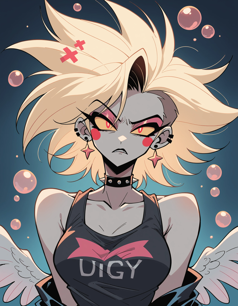
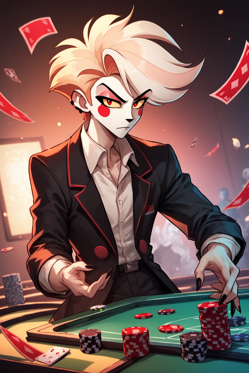
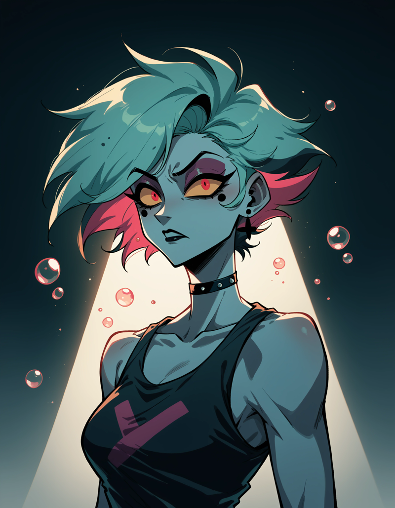
Two of these use a standard prompt I stole from our dear CEO, Justin Maier and it's regularly featured now with the Splatterpunk style models. It seems to be a midjourney style prompt, and if you REALLY want it, comment below and i'll fish out exactly what my settings were.
One of them i'm not sure AT THE MOMENT because I was on morning tea at church, and I had my SD instance from the night before still running - and I managed to SOMEWHAT get it to work on my phone if only i would stop trying to flick chrome off.
The theme of the song is ANGEL DUST from Hazbin Hotel. The complicated male vocals (complicated in the theme, not in the actual vocals, I purchase loops and samples, it's sort of the pre-AI incoherent dusk way of doing music) - are rife with different themes that Angel Dust goes through during Season One.
It was inspired by the fact that YES as a DID system I have an Angel Dust fictive, and i'm also working towards getting him into a tumblr roleplay - so he wanted a "VOICE CLAIM" or even a song for himself... and We wanted something of our own - and NOTHING fit, and we ran into a pack on Splice called "FILTHY VOCALS" - and started hilariously playing with trap and phonk inspired beats...
And that's how the song was born.
So now you know the THEME roughly of the song and the reason behind the pics? Well it couldn't be LITERALLY Angel Dust, because spotify WILL likely reject non liscenced copyrighted material. (Some people get away with this, but I pay enough money on distrokid, I don't need to get black marked for anything). So we had a bunch of AI images that were from several of our pony XL models - and embeds - both earthncity and I sat down earlier today and came up with concepts for this.
The concept being: The title is SPIDERS STAR DUST. The images need to be reminisce of Angel Dust either feminine or Masculine - and have an air of Hazbin Hotel.
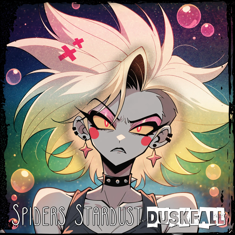
Well this was the first one we came up with, rainbow gradient, shadows, grunge overlay - and sadly a fairly pisspoor choice in title font. It's not that the font isn't cool - it's just that it doesn't quite MATCH the aesthetic we're going for. Btw: If you didn't know? Photopea is free, and to remove ads it's 5 bucks a month. ( https://www.photopea.com/ )
So we know this was WAY too "RAINBOW LEANING" in sort of a "It has no meaning" - it's cool looking but it sort of doesn't have enough meaning.
Also noting: "DUSKFALL" is a pre existing logo we have for merch & related things for music & art products. Blankblittzkrieg I think is the name of the font. ALL other fonts used that weren't pre-rendered PNGs were already in photopea, if you ask me to render all my fonts from my local computer you'll crash my computer and i'll cry. I only use photopea because If i tried to do this in Affinity i'd cry and punch a wall.
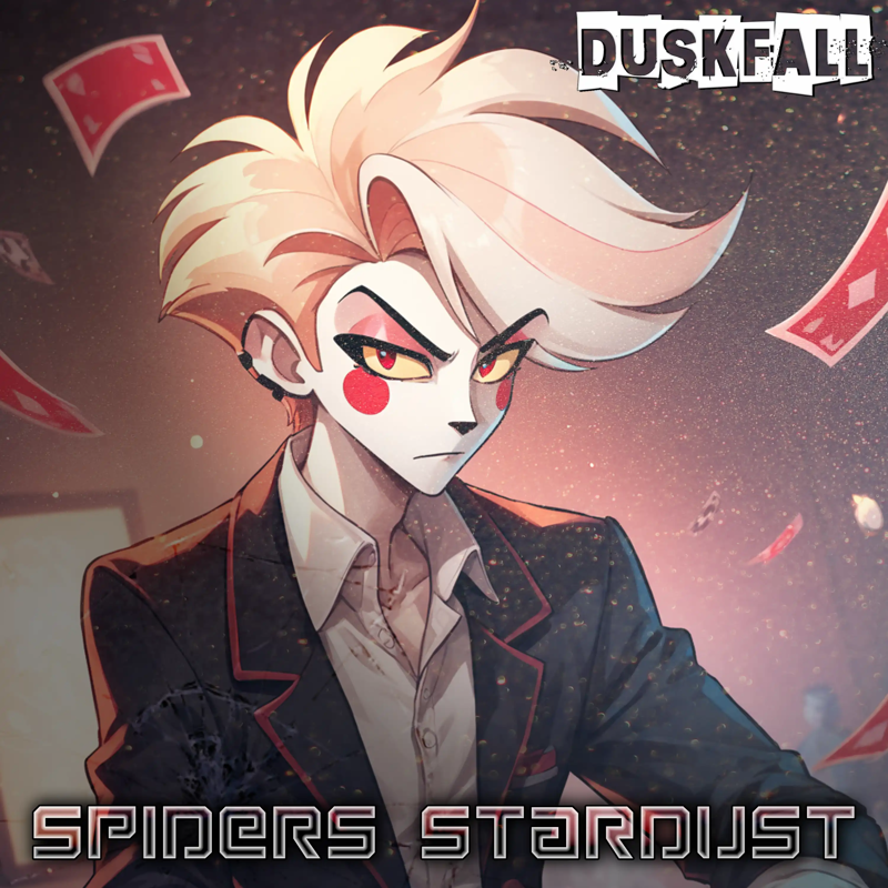
3 NZD later with the most epic glitter star dust texture later (which I can't share because it's one not AI, and two is actually something i had to buy on deviantart lol) - We have the POKER playing Angel Dust in the style of Charlie Morningstar.
Come to think of it I think I tried to say something about playing poker with this because I was curious where I could push the embeds while I was on my phone.
(As for how to use A111 via vast on a phone - wait, I have a video on my phone that shows me using it, I haven't sent it to my mac yet, and i'd like to make a mini tutorial on it. Sadly it'll only SHOW A111 themed like I use it, and i wont' show the rental, but it'll give you a rough guide when i Get to it.)
This didn't get used because it -- you can't really FEEL ANGEL DUST in it. It's a masculine Charlie, and it's cute - ti's amazing. But the flying gamble isn't Angel Dust, it's a husk theme..
The text effect was just a gradient that was pre-existing that was the half transparent one, color overlay and an inner glow. Again the font was already one you could access from Photopea.
THERE IS a png I scored for tumblr graphics that is a GLASS texture that I added to this on top of the stardust. My graphics degree didn't teach me that, using photoshop since age 15 did. (I've been ruining video cards and motherboards since 1998! XD)
So yea.. this one was great in theory.
Just not great enough.
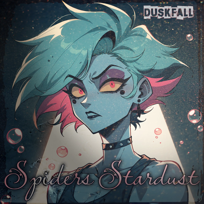
First edition of the final cut - this ALMOST hit the floor and went - but Earthnicity had a previous design Idea that they wanted us to slap in... Before we go through to show you the last stage before final - let me explain why this style almost worked.
It sure. doesn't EXACTLY look like anyone entirely in Hazbin, it's a crossover AI image from a Pony XL model + embed. (You'll have to look up earthnicity, I honestly can't recall at this stage which one of their two it is for PonyXL)... It shares in image the complicated feelings of the song, the "Your relationship with the toothbrush is it personal?" comes out more with this image (sorry it's one of my favorite things in the song lmao)
The stardust shines a bit more...
The "WTF" mixed with the "Oh dude you went there" and "Yea of course i'm hot.. but you're not" and "Uhhhhh" - it has an Air Of Angel Dust and has an air of just genuinely being complicated.
Yet it was just MISSING SOMETHING small. IT wasn't complicated ENOUGH. Which is weird because this is design right?
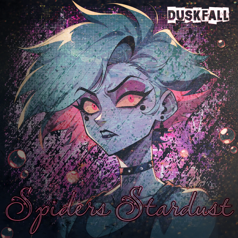
This was the final before the final-final. Incorporating an even more grunge-aesthetic. Complicated the mood even more, and complicated the fact that I had to try and see if it would let me get rid of what felt like a pain in the ass background (it wasn't).
It's messy, like finger paint but you can still see the bubbles.
Yet at the same time the font's a bit hard to read, and something's still missing.
It could go as is.
But something just -- When earthnicity smacked their version up and told us to fix the text so it matched, everything clicked into place:
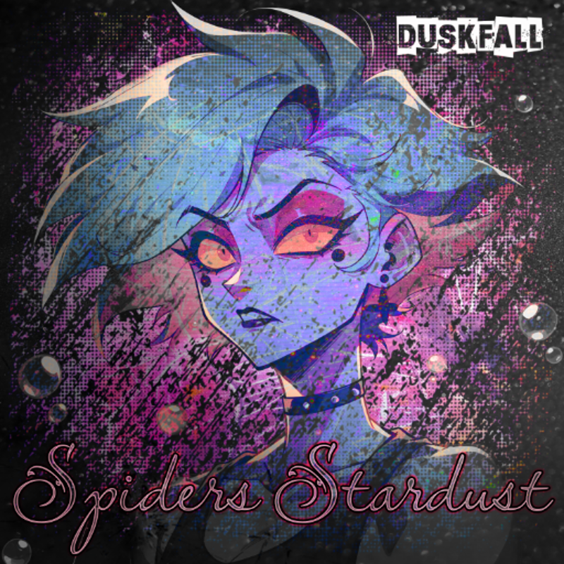
This complicated it in such a sweet SWEET but crazy way, a saturation overlay, and a slight text fix. The emotions are complicated. And so yet is the messy cover.
Not everyone's cup of tea of course, and it almost breaks 90% of what I learned in my design degree: except that sometimes a messy design is required.
TUTORIAL: "THE HOW"
Alright disclaimer first of all the PSD included does not include any AI generations, or any textures that are used in the tutorial. I wouldn't be a very good graphic designer if i'm leaving in textures I picked up from random PNG sites. Also, the key here is for you to try doing this with your own generations.
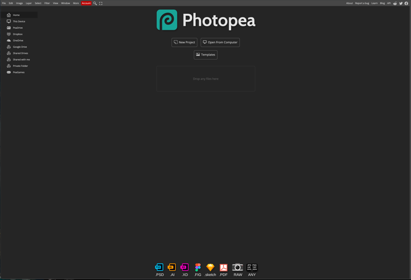
Start: You're going to Photopea on a journey eery horror noises - Er uh, yea just go to Photopea!
(New Disclaimer: My browser was lagging so a few things may look different name wise or layer wise depending on the screenshot)
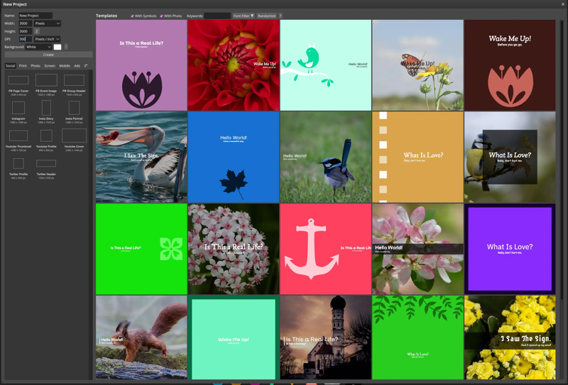
When you hit "NEW" at the top, you're going to be faced with a screen similar to this, now i've already pre-filled in the values required for most streaming platforms. 300 Dots Per inch is a standard print size, so it's really weird that spotify etc want THAT and not 3k x 3k at 72dpi. Unless something's changed since I graduated?
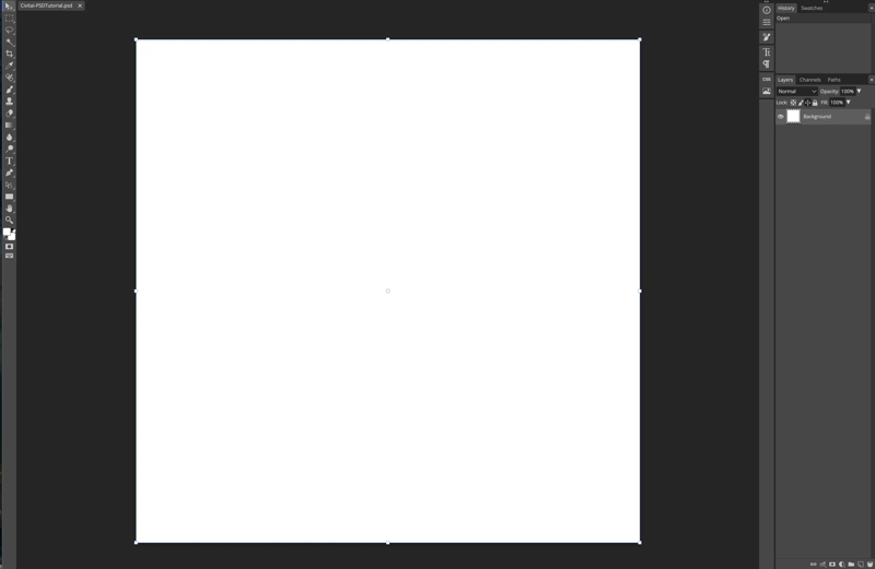
Blank ... like my brain a saturday morning - I MEAN WAIT yes! White stage canvas!
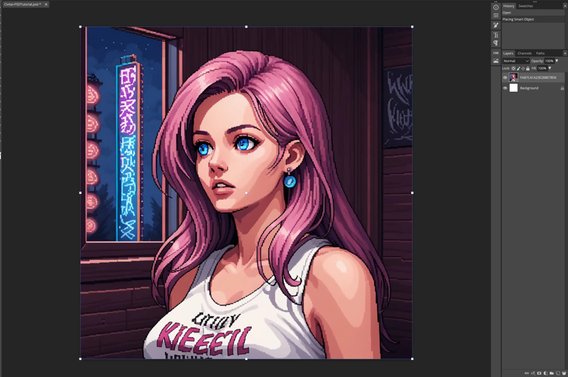
Drop in your SQUARE size image, (it doesn't have to be but if you're not familiar with photopea, stick to square so you don't have to fudge with cropping). You can if you're on desktop just finagle this by dragging and dropping into the window.
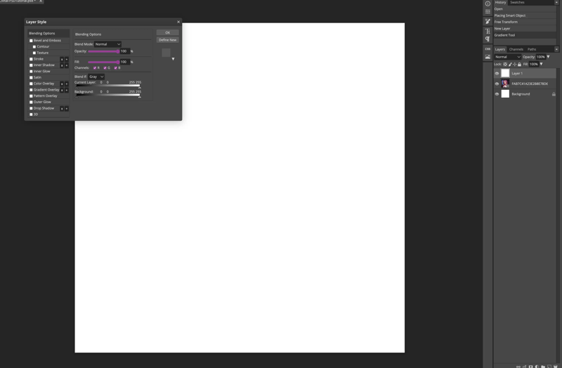
Create a NEW layer, use the FILL tool (paint bucket) and drop in whatever color - you're just going to fix different settings - it won't matter.
After that go into your effects panel, drop your FILL PERCENTAGE TO 0%.
Layer effects will still apply, but now you don't have to apply + worry about the paint color.
(You can't do this on an empty layer, i've tried.)
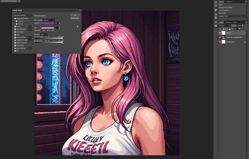
See how it now looks transparent? Your next job is to go down to where it says "GRADIENT OVERLAY" (note: I've left the layers in but not the images like said above, so if you're just using the template this is already effects wise applied on the template in question).
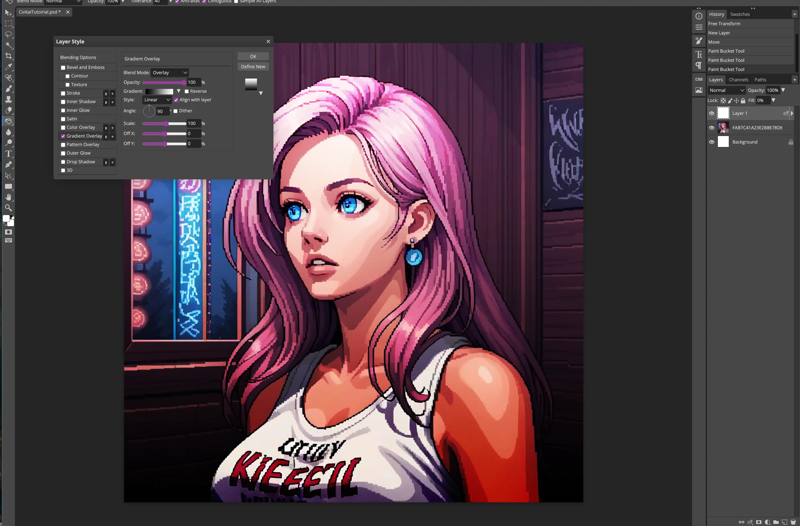
It's your choice what you use in this case, I have just done a simple one because my brain hasn't computed how gradients work (*Yet this is just like OG photoshop my brain needs therapy). In this case you're just applying the gradient with an overlay, and it gives you a bit of a lighting edge to your composition.
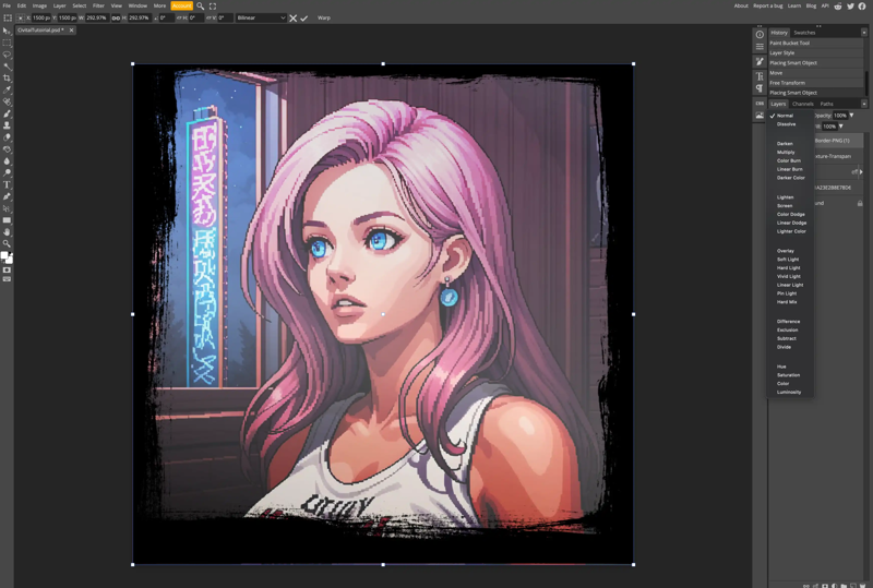
BE THE DESIGNER AT HEART! - Hit up google, or whatever search engine you use, snag a few transparency PNGs for borders, grab a few glass textures - whatever hits your fancy. If this is too much for your newbie brain, just leave it at the previous stage - it's not a worry you're just as a valid as an advanced user!
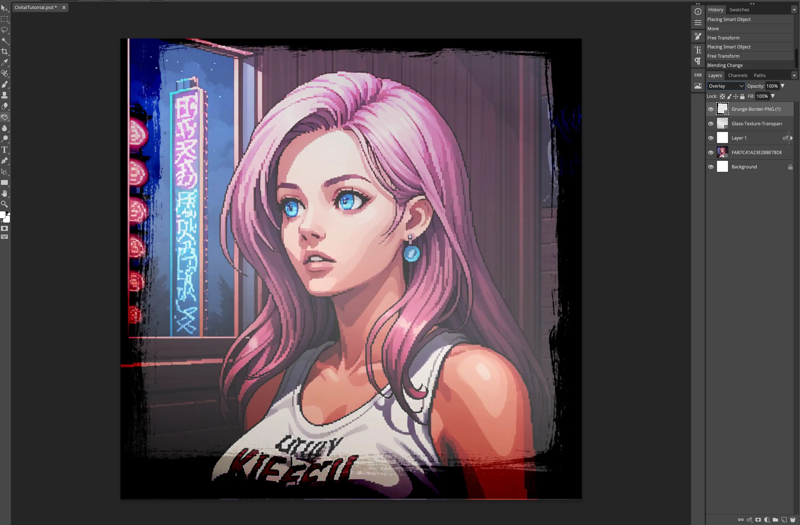
You'll note that the PNG border I used I hit it to overlay for kicks and giggles.
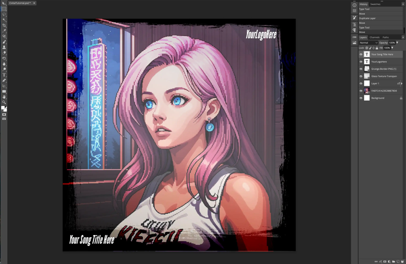
Add your text in whatever fashion and font you want ( I've pre-set some examples in the template) - and bada bing bada boom you got a single cover!
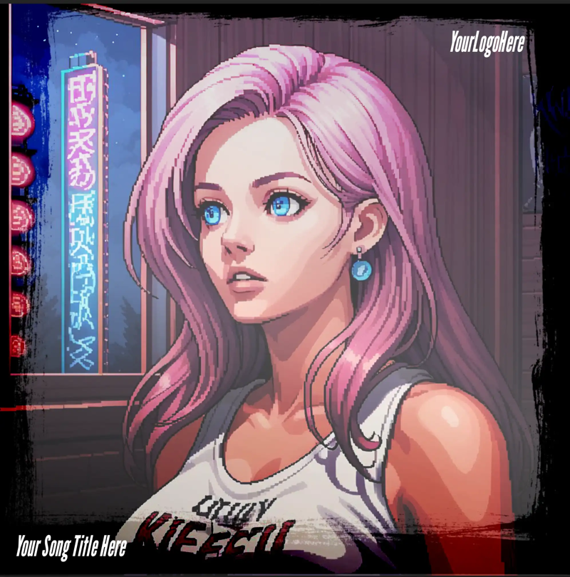
Kinda snazzy ain't it? Now just a reminder: only the basic layers are included with the template, I can't by rights commercially pass around PNGtree images for fun - they're my sneaky tumblr stash. If you're stuck on a step, and need help feel free to comment, DM or catch me in the E&D discord here: https://discord.gg/5t2kYxt7An
Tools used
This is going to get more development in how this works tools wise soon i'm just fleshing this out more so it's literally more of an article!
Come to think of it this is likely either Stygian Mix for Pony XL (unreleased, i'll probably drop it next month, i'm a chicken shit i'm sorry) - and it's likely the masc one is Osenayan or Hellaine.
I'll get prompts later on from the original images when I can find them again.
The versions I showed here were birme resized from the major upscales to use for the cover design.
https://huggingface.co/spaces/ehristoforu/image-upscaler
https://civitai.com/models/387572/hashbin-style
POSSIBLY: https://civitai.com/models/362212/hellaine-illustration-xl
Contact Us:
Our Discord: https://discord.gg/HhBSvM9gBY
Earth & Dusk Media https://discord.gg/5t2kYxt7An
Backups: https://huggingface.co/EarthnDusk
Send a Pizza: https://ko-fi.com/duskfallcrew/
WE ARE PROUDLY SUPPORTED BY: https://yodayo.com/ / https://moescape.ai/
JOIN OUR DA GROUP: https://www.deviantart.com/diffusionai
JOIN OUR SUBREDDIT: https://www.reddit.com/r/earthndusk/


