Introduction
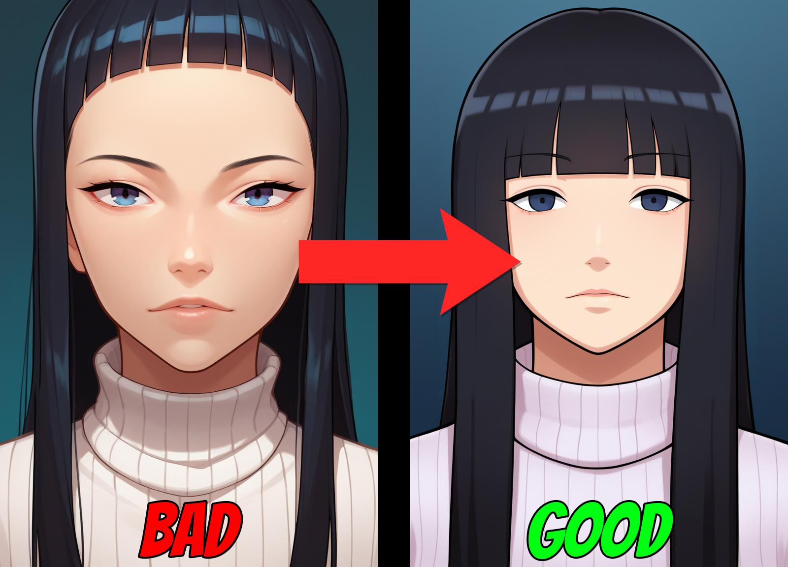
Alright, so I've been delving into style testing with PonyDiffusionV6/PonyXL for a while now, and I've discovered its impressive capability to replicate styles, whether by completely recreating them or generating a version closely resembling the original. However, one crucial factor affecting this process is the checkpoint used. In my exploration, I've found that the AutismMix Confetti SDXL Checkpoint is exceptionally versatile, serving as my preferred choice due to its unique abilities that other checkpoints lack.
Now, one might question the need for an entire article on this topic, considering that style dependency on checkpoints seems quite obvious. Don't most individuals already grasp this concept?
Indeed, one would hope so, but it's likely that some are unaware, which isn't the primary focus of this article. Many users commonly employ tags like score_9, score_8_up, score_7_up, source_anime, and BREAK at the onset of their prompts. These tags significantly contribute to producing higher-quality generations, a fact that's widely acknowledged. However, do these tags maintain their efficacy when applied to style-based generations? This is something I recently started thinking about as I'm not the smartest when it comes to this stuff. I really don't know what these tags really mean, I just know they work. So I started testing and for the most part, I have found my answer to this.
Testing
I'm going to show 3 examples of 5 styles I have made. The examples will be in order slowly removing the tags. At the end of the set, I will give a summary of what I'm seeing. Feel free to look up each style to see original vs my generations. (WARNING: Some are NSFW)
Prompts:
score_9, score_8_up, score_7_up, source_anime, BREAK "STYLE LORA", "PROMPT"

score_9, score_8_up, score_7_up, BREAK "STYLE LORA", "PROMPT"

"STYLE LORA", "PROMPT"

Negative Prompt: monochrome, watermark

Negative prompt, seed (may change for each style), CFG, checkpoint, steps, and resolution will stay the same for all examples.
Examples Posted Here to see for yourself⬅️Click Text
Style 1 (Knight of Love)
For this style I just wanted to generate a basic prompt
Example 1: score_9, score_8_up, score_7_up, source_anime BREAK <lora:knightoflove-guy-PONYv1:1>, 1girl, solo, glasses, turtleneck sweater, orange hair, braided ponytail, portrait, looking at viewer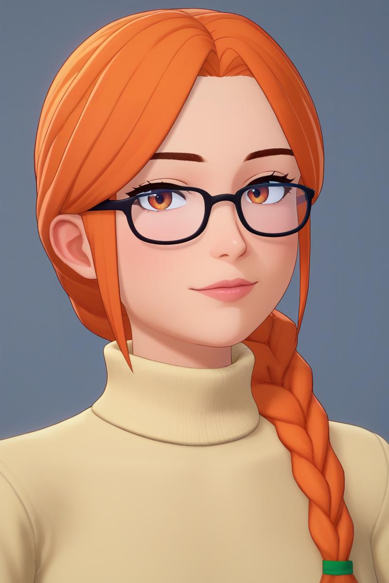
Example 2: score_9, score_8_up, score_7_up, BREAK <lora:knightoflove-guy-PONYv1:1>, 1girl, solo, glasses, turtleneck sweater, orange hair, braided ponytail, portrait, looking at viewer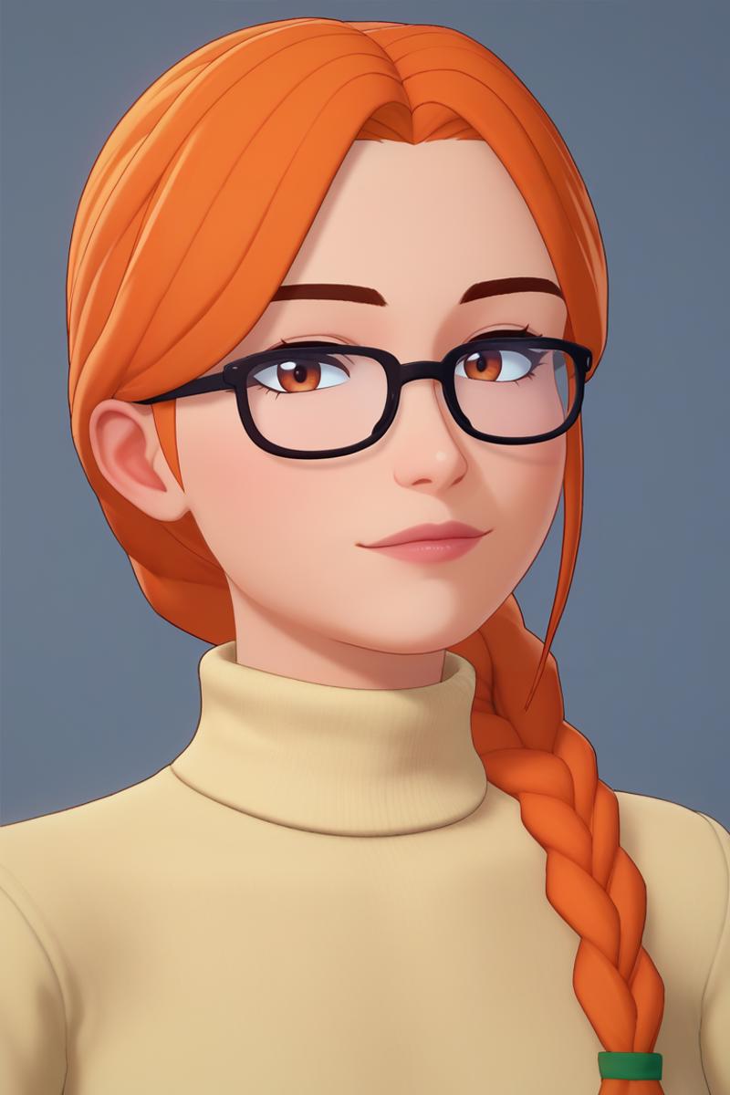
Example 3: <lora:knightoflove-guy-PONYv1:1>, 1girl, solo, glasses, turtleneck sweater, orange hair, braided ponytail, portrait, looking at viewer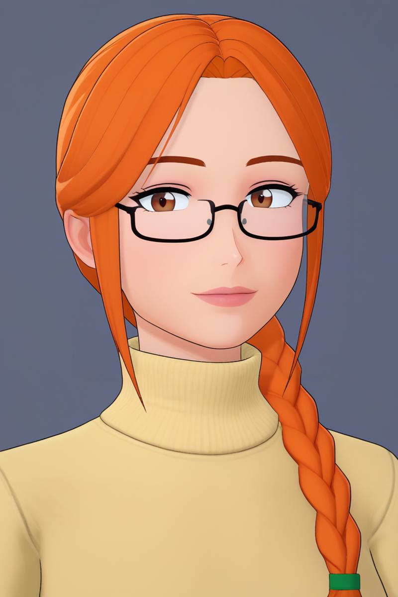
Summary: Currently Example 3 looks the best, maybe not in detail but the best to represent the style as it's almost identical. EX3>EX2>EX1.
Style 2 (MrPotatoParty)
For this style I just wanted to generate a basic prompt again but with a different hairstyle to show if it's just the hairstyle.
score_9, score_8_up, score_7_up, source_anime BREAK <lora:mrpotatoparty-guy-PONYv101:1>, 1girl, solo, turtleneck sweater, black hair, hime cut, portrait, looking at viewer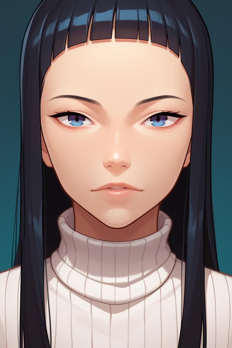
score_9, score_8_up, score_7_up, BREAK <lora:mrpotatoparty-guy-PONYv101:1>, 1girl, solo, turtleneck sweater, black hair, hime cut, portrait, looking at viewer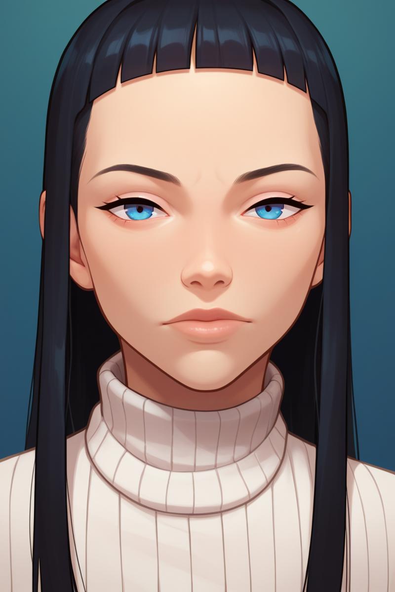
<lora:mrpotatoparty-guy-PONYv101:1>, 1girl, solo, turtleneck sweater, black hair, hime cut, portrait, looking at viewer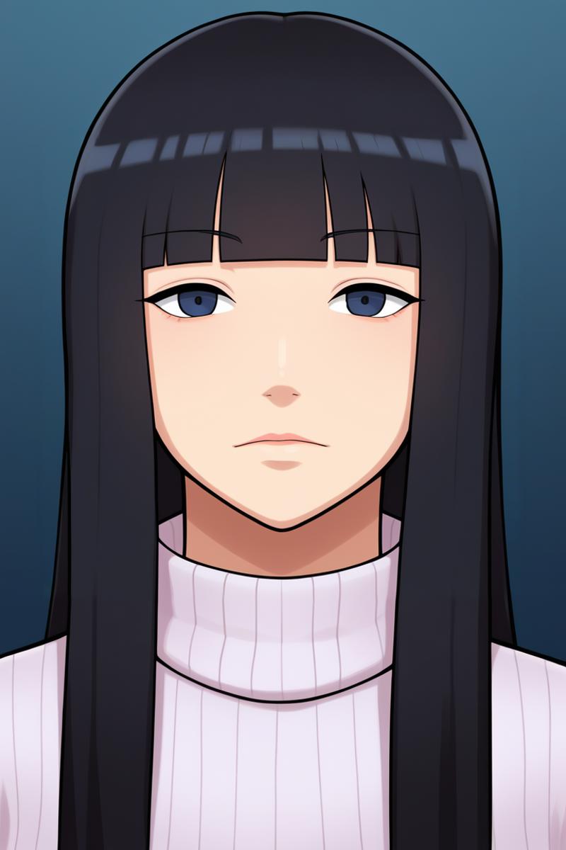
Summary: Example 1 and 2 look almost the same while Example 3 looks like the style. They may look more detailed but they lack the style. Again EX3>EX2>EX1
Style 3 (ToBinge)
For this style I wanted to use a character tag, to see if it affected the generation.
score_9, score_8_up, score_7_up, source_anime BREAK <lora:tobinge-guy-PONYv1:1>, 1girl, solo, turtleneck sweater, portrait, looking at viewer, cammy white, long sleeves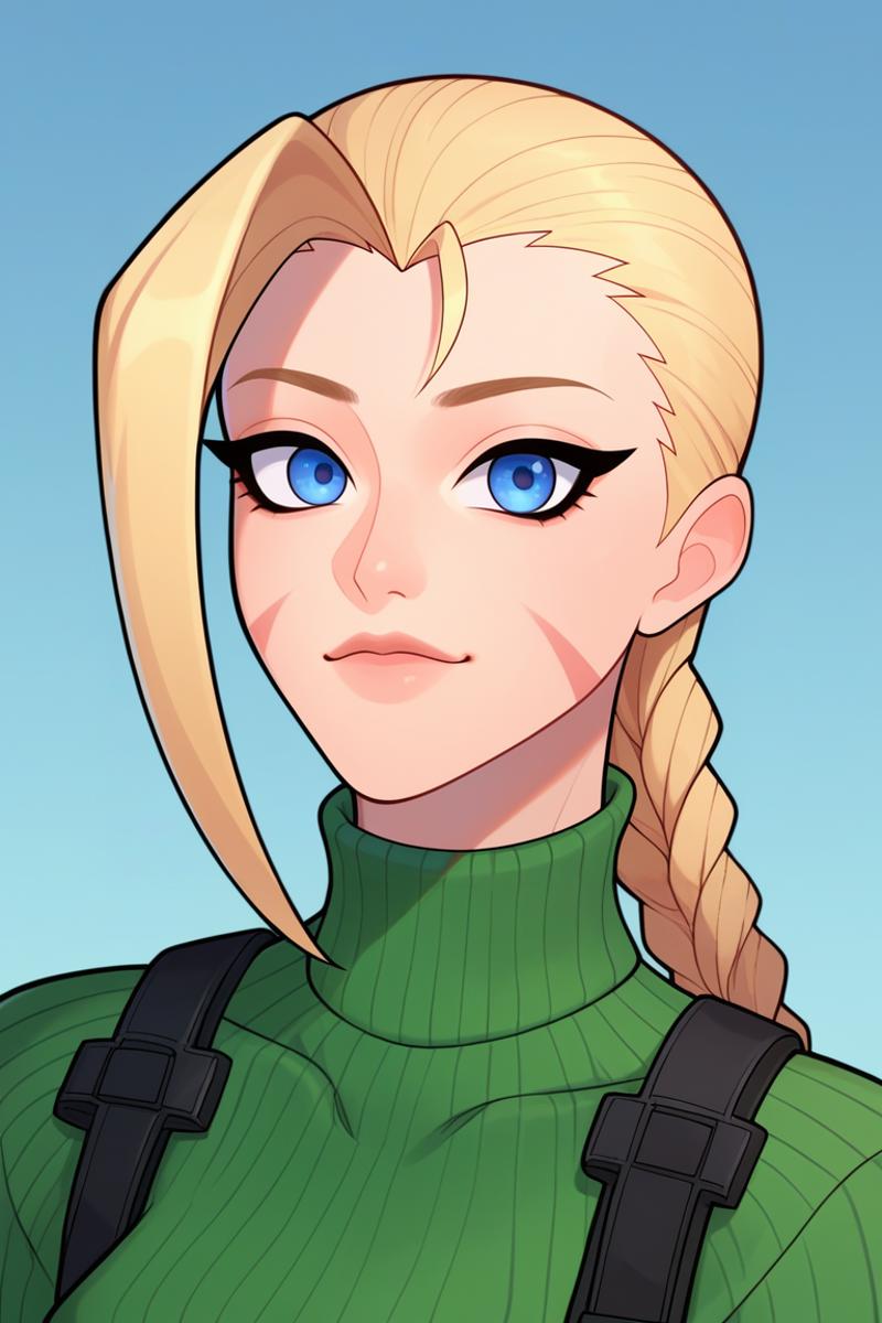
score_9, score_8_up, score_7_up, BREAK <lora:tobinge-guy-PONYv1:1>, 1girl, solo, turtleneck sweater, portrait, looking at viewer, cammy white, long sleeves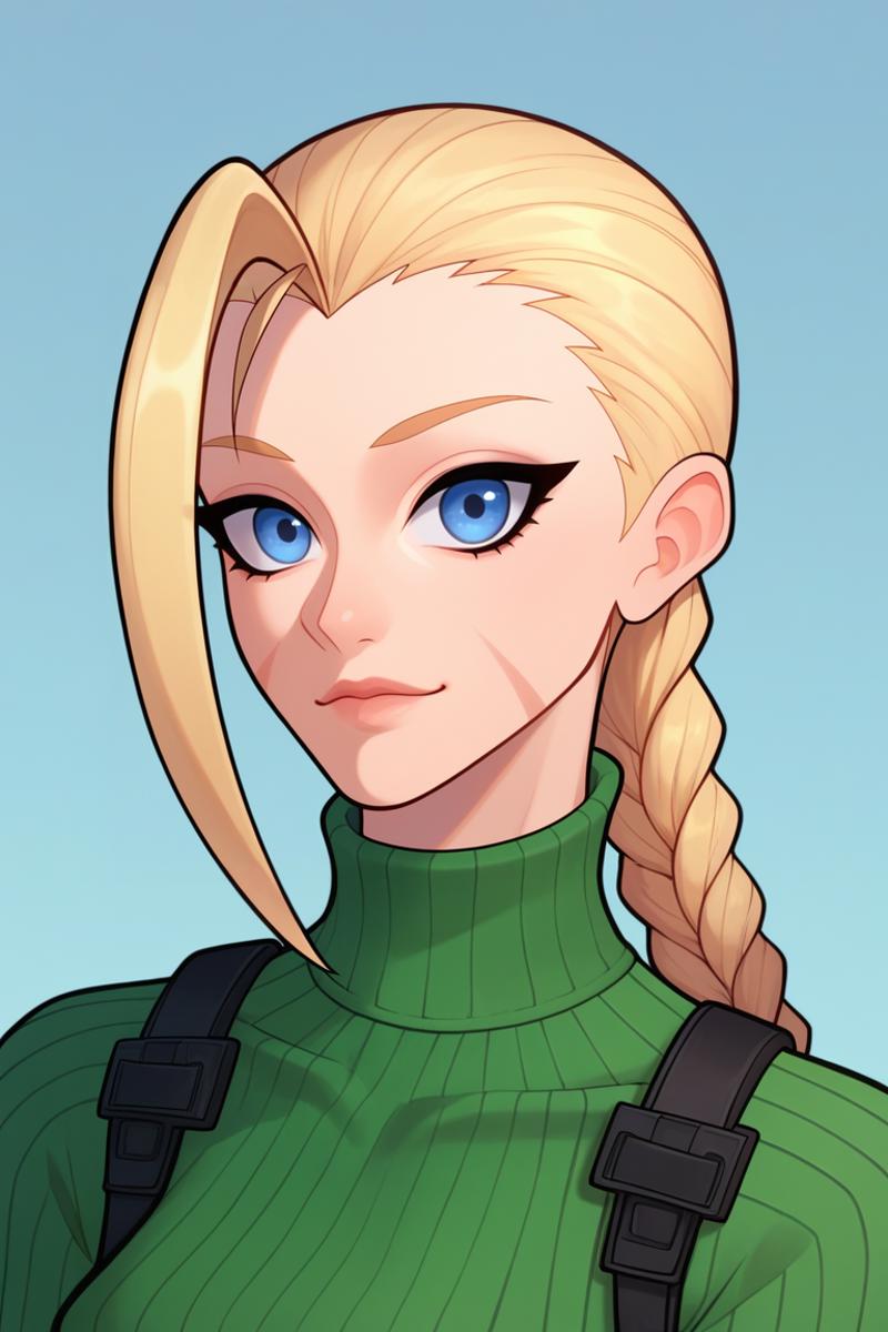
<lora:tobinge-guy-PONYv1:1>, 1girl, solo, turtleneck sweater, portrait, looking at viewer, cammy white, long sleeves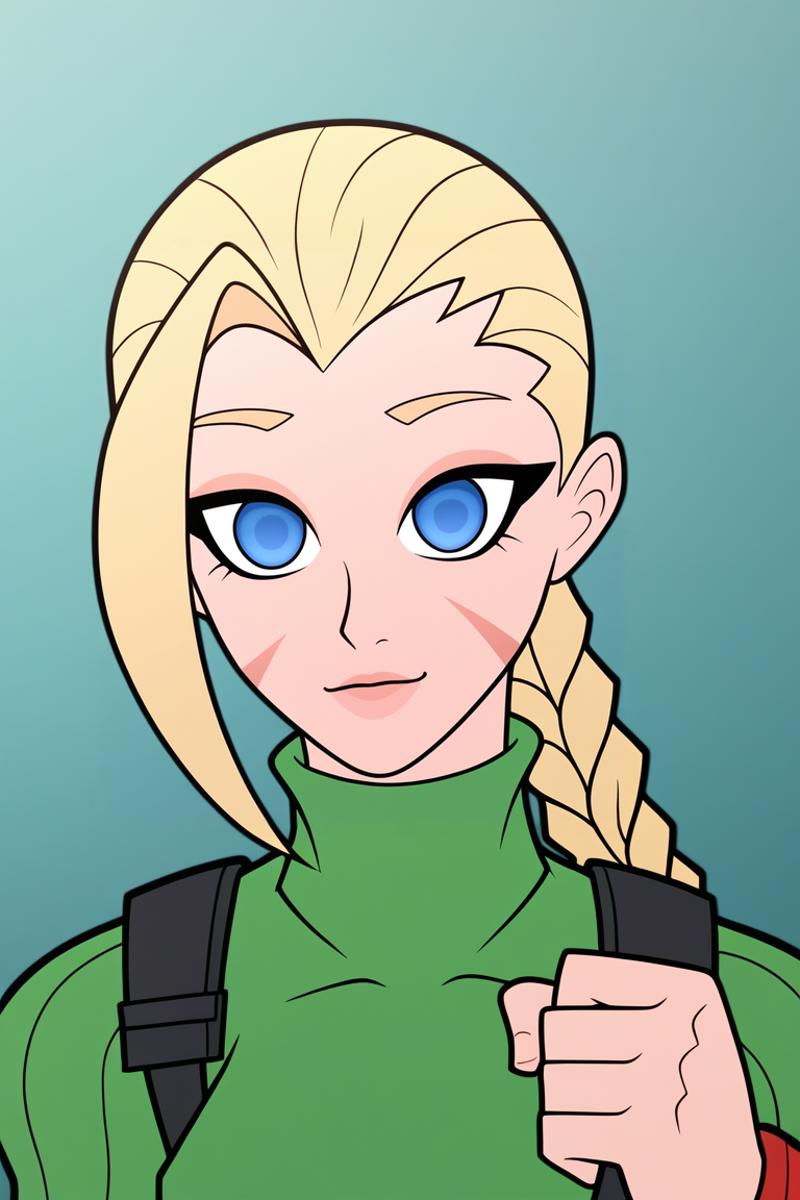
Summary: Example 1 and 2 are more detailed, and you can see that the style is working because of the eyes. However Example 3 is definite the winner as it look like the style. I would actually argue Example 1 looks a little better and closer to the style than example 2. EX3>EX1>EX2
Style 4 (Liang Xing)
For this style I changed to a different character to see if it was just that character tag.
score_9, score_8_up, score_7_up, source_anime BREAK <lora:liangxing-guy-PONYv1:1> depth of field, light particles, 1girl, solo, turtleneck sweater, portrait, looking at viewer, hatsune miku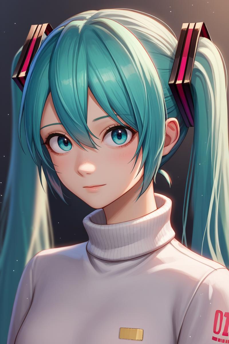
score_9, score_8_up, score_7_up, BREAK <lora:liangxing-guy-PONYv1:1> depth of field, light particles, 1girl, solo, turtleneck sweater, portrait, looking at viewer, hatsune miku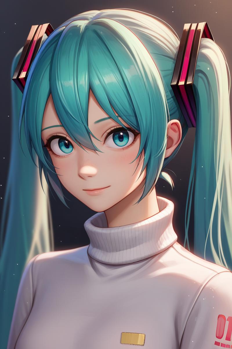
<lora:liangxing-guy-PONYv1:1> depth of field, light particles, 1girl, solo, turtleneck sweater, portrait, looking at viewer, hatsune miku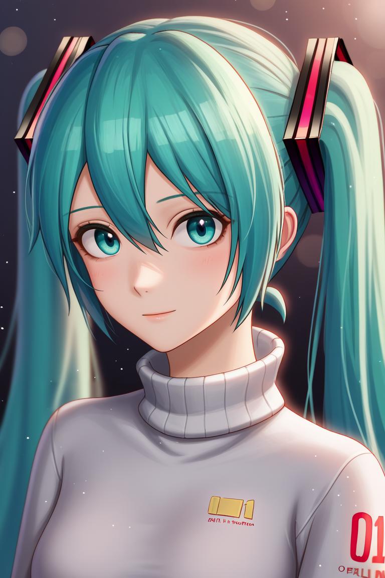
Summary: All 3 of these examples look like they could work for the style, however each one has pros and negatives. Example 1 I would say looks worse than Example 2 and Example 3 looks worse than both because of the lighting and coloring. However Example 1 and 2 do not include the light particles appearing in the background. This is something that is part of the style, example 1 and 2 do not have. I would also argue Example 1 is a tiny, tiny bit worse than Example 2 as there the yellow chip isn't straight and there is a tiny bit less definition in the face that would represent the style. EX2>EX1>E3.
Style 5 (Fugtrup)
For this style I chose a character that mostly has 2D art (I think) and also used a 3D style. I normally recommend using 2d and drawing in the negative to help with the 3D/ Blender look. How well will it work without the negatives?
score_9, score_8_up, score_7_up, source_anime BREAK <lora:fugtrup-guy-PONYv101:1>, 1girl, solo, turtleneck sweater, portrait, looking at viewer, tatsumaki,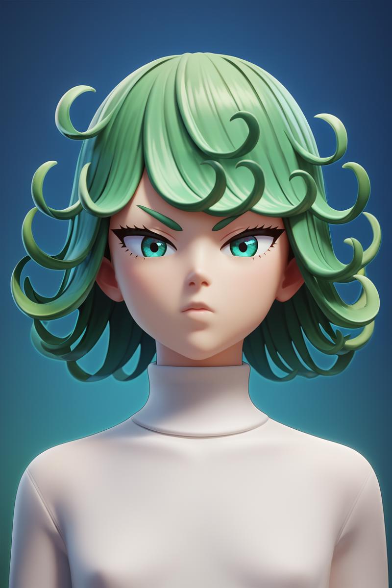
score_9, score_8_up, score_7_up, BREAK <lora:fugtrup-guy-PONYv101:1>, 1girl, solo, turtleneck sweater, portrait, looking at viewer, tatsumaki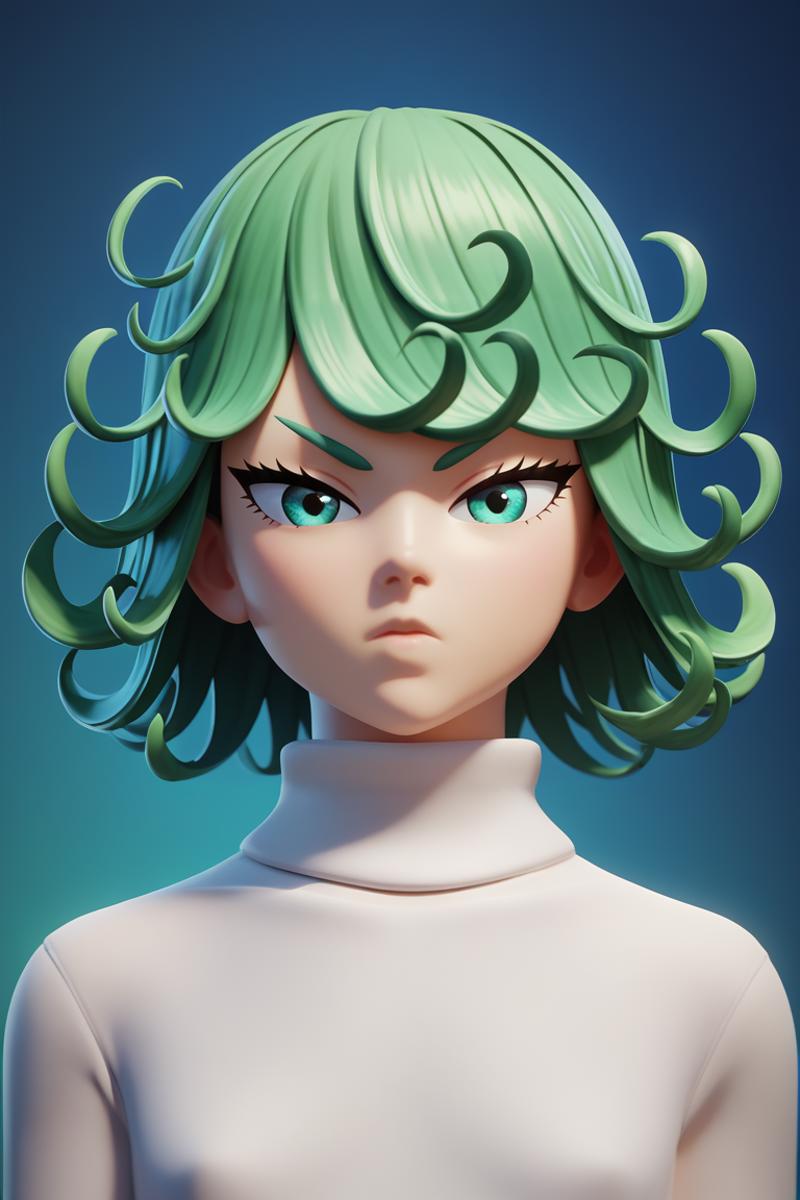
<lora:fugtrup-guy-PONYv101:1>, 1girl, solo, turtleneck sweater, portrait, looking at viewer, tatsumaki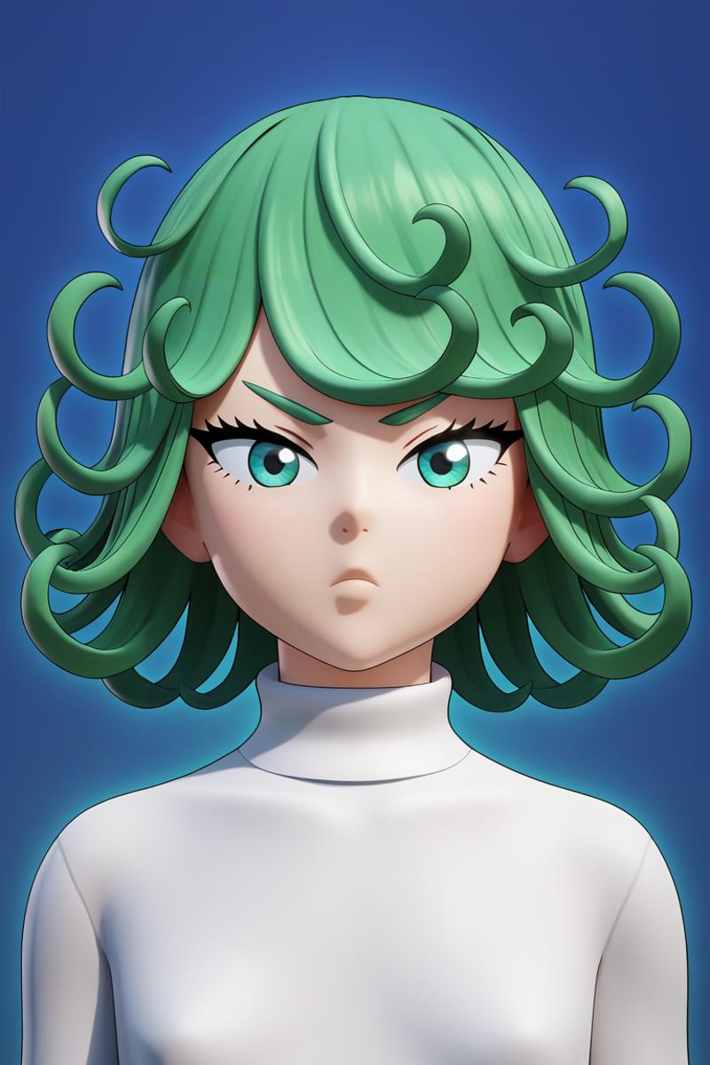
Summary: So for this one I will say that there are some cell shaded images and honestly it seems like this is more of an opinion thing of how you would want an anime character to be handled. To play devils advocate I will say that Example 3 looks the worse just because of the cell shading effect, but honestly if I got that when generating I would be happy. Again I would argue that Example 2 looks the best compared to Example 1, even though they look identical. The only reason is because of the fading with the background and the shirt. Example 2 looks more defined and has the illusion of 3D. EX2>EX1>EX3
The Verdict
So what is the answer to this? Honestly, there isn't really an easy answer. If the style you are trying to generate with needs a lot of detail, you should use tags. However if you aren't getting the results you want or you know the style has less detail, don't include these tags and see what happens. It seems not including these tags can help but also can diminish the detail of your generation.

