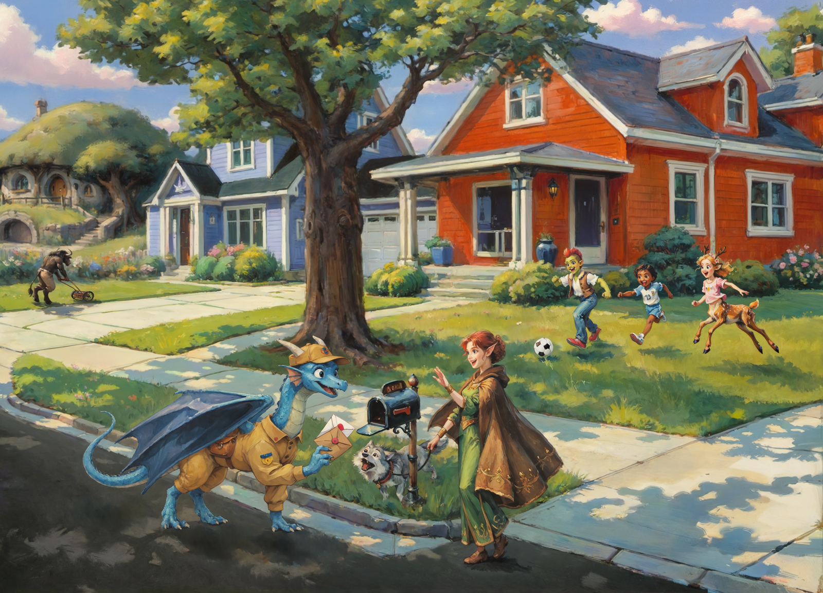
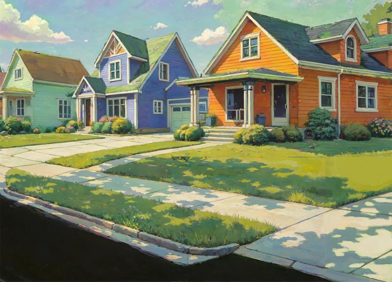
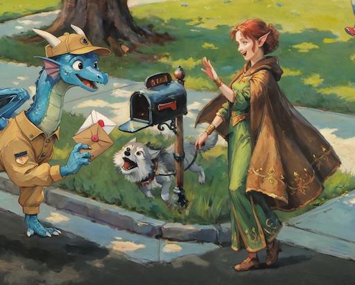
(Warning! Long read ahead!)
(Workflow for this image)
This started out as a more technical writeup. I planned to write about Invoke, and all the tools and techniques I used to make this image. But the entire project ended up being much more involved than I anticipated, so instead I cut most of the technical details and just focused on the high-level steps.
Setup
1. Software
I mostly used Invoke, with a few additions from Forge and Photoshop.
2. The Models
I used the following models over the course of this project:
SDXL
Pony
Illustrious
FLUX
LoRAs
Control Nets
Setting the Scene
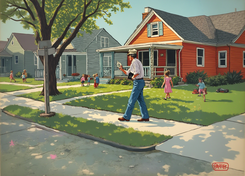
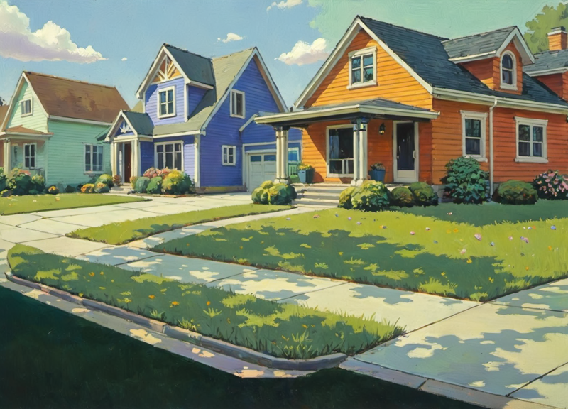
I wanted to draw a classic/nostalgic slice-of-life painting of a small town suburban neighborhood - but with a twist. What if this was from a high fantasy world with elves, dragons, goblins, and so on?
This was going to be a fairly complicated image, so I would need to do some pre-planning. I needed to make sure the composition would work before I started trying to draw the actual image.
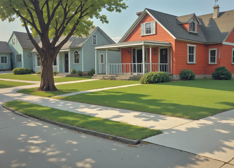
My initial thought was to have the camera looking down the street, with houses and characters on either side. Something like this.
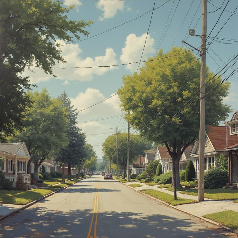
Model: flux1-dev-Q8_0.gguf Prompt: a middle-class suburban neighborhood from 1950s america
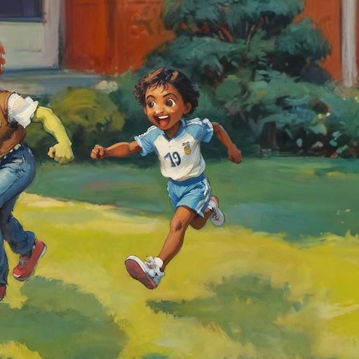
Immediately we can see a problem. Any characters added to the image would be tiny and indistinct. I needed to experiment with some other compositions and see if I could find something more suitable. Once again I used the FLUX[dev] Q8 model, and this time I gave it the following prompt:
Andy Warhol painting of a middle-class neighborhood from 1950s America. The foremost character is a mailman delivering the mail. In the background a small group of kids are playing in one of the yards. In another yard a man is mowing the grass.I actually made a mistake here - I wrote Andy Warhol when I meant Norman Rockwell. But it ended up working out. Among the 10 or so images was this one:
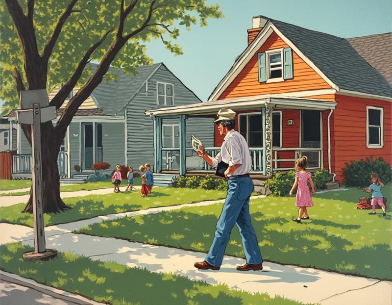
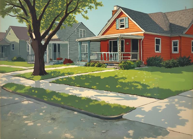
It wasn't the composition I'd originally planned, but the more I thought about it the more I felt like it was going to work. I decided to start with this as a base. I could use some more space to work with though. Time for some Outpainting:
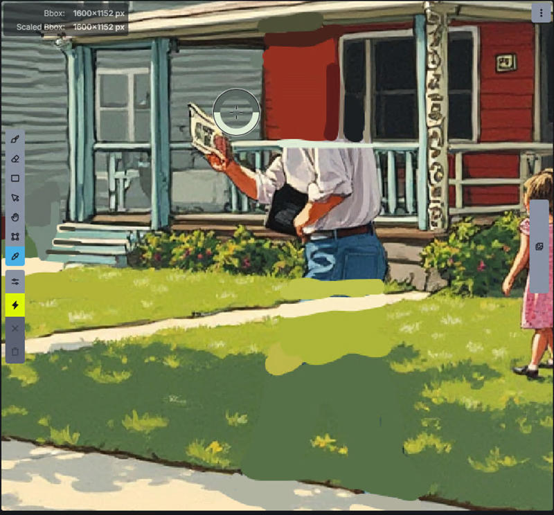
I liked the layout, but I wanted to add my own characters. To get rid of the characters and objects, I used the paintbrush to paint over them using the surrounding colors.
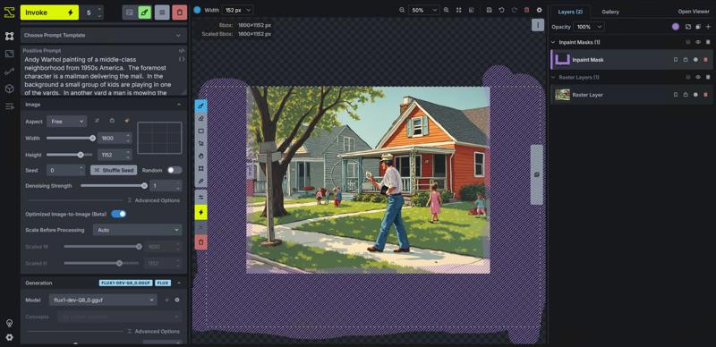
You can see some distortions where I made my edits, but on the whole I didn't think it was too bad. To clean up the image, I did an image-to-image with 0.5 denoise and the following updated prompt:
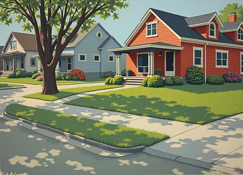
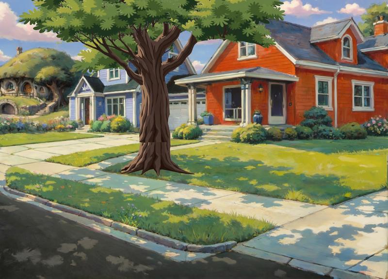
photo of a middle-class neighborhood from 1950s America. The atmosphere should be one of simple wholesomeness. The houses are nice, but not rich.I used a photo because at some point I'm going to be switching to an SDXL/Pony model, and using an SDXL ControlNet. So I wanted nice, clean lines. Here's the final image I decided on:
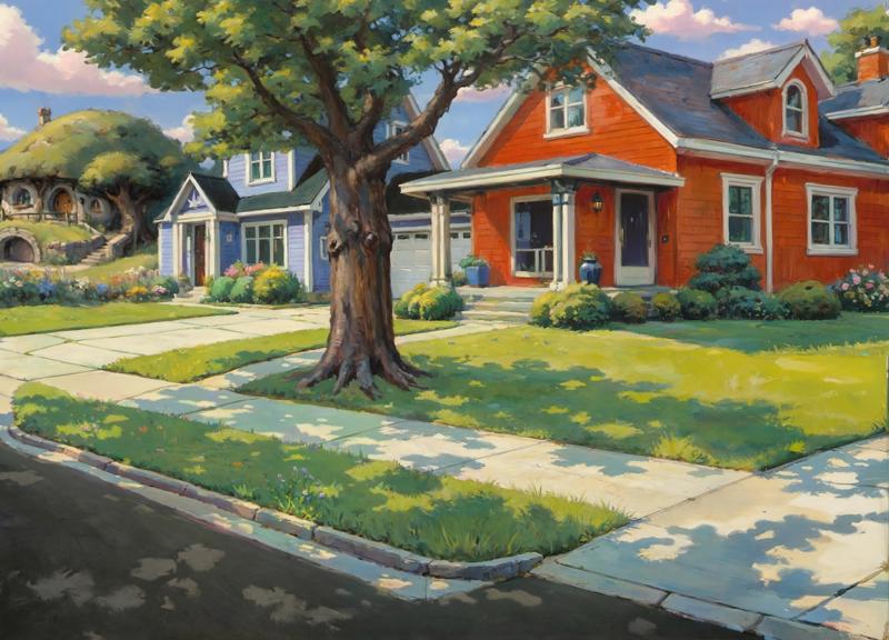
Changing the Style
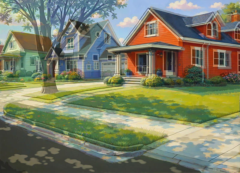
Before adding the characters, I wanted to get the style right. And it's here that I encountered a problem that ended up costing me literal hours of work. The short version is that after modifying the style and then upscaling with Forge's basic upscaler (Invoke's tile upscaler wasn't playing nice with the impressionist style), I couldn't get any of my characters to both blend in with the scene the way I wanted and use the style I wanted them to have. I think the main problem is that the regular upscale "lost" some of the brushwork from the original style, and since the characters didn't need upscaling to the same degree, they ended up looking different.
I needed to reevaluate. I created a few test images, and then tried experimenting with various SDXL and Pony checkpoints and LoRAs. Once I knew I could mostly get the same style in both, it was time for attempt 2.
First, I removed the tree using the same process as the characters. I liked it, but it was going to get in the way for what was coming next.
Then it was time to update the style. I used the following prompt:
(concept art by syd mead, realistic oil painting, impressionist, StdGBRedmAE, by studio ghibli, watercolor).and(suburbs, houses, homes, lawn, front doors, no humans, grass, outdoors, road, street, driveway)
The following LoRAs
StudioGhibli.Redmond - 0.3
Eldritch Impressionism - 0.6
Vivid Midjourney Mimic - 0.5
And 4 ControlNets (depth/color map/scribble/soft edge) - all at various weights, but all at early endings - I wanted to make sure the initial structure was aligned with the original, but I wanted to make sure the AI had enough freedom to introduce a bit of messiness from the impressionism.
Far from perfect, but there was basically no point in trying to fix it at this stage. I knew from experience that upscaling was going to introduce a lot of problems, and I had already resigned myself to effectively going over every inch of the canvas post upscale and using Inpainting to clean it up. The problem was, setting the creativity too low or structure too high had a tendency to ruin the brushstrokes. But giving the AI too much freedom meant problems like this:
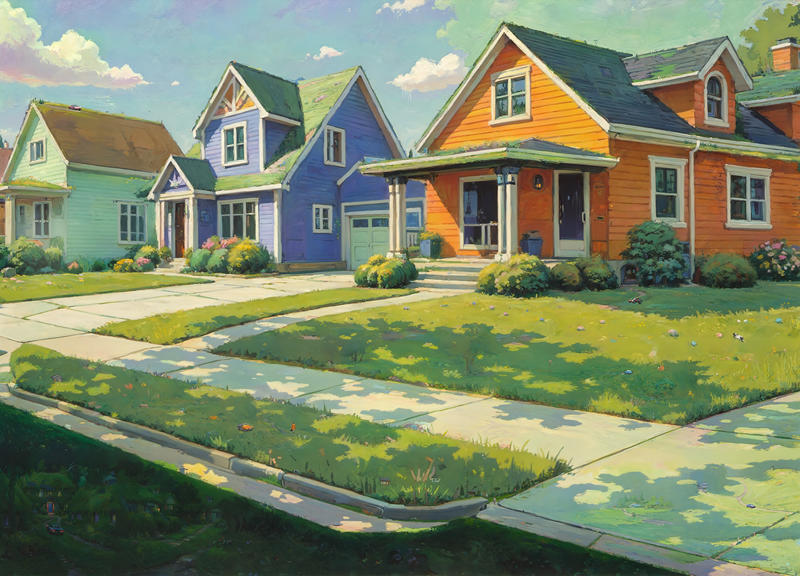
This was a 4x upscale, increasing the resolution to 6400x4608. Notice the roofs have lots of green on them? Also, there are hallucinations everywhere:
The problem is that Upscale uses tiling, but only a single prompt. Behind the scenes it's using a Tile ControlNet to mitigate this, but if I didn't give it enough freedom, much of the impressionism effect was lost. So the road tiles had references to houses, the roof tiles had references to grass, and so on.
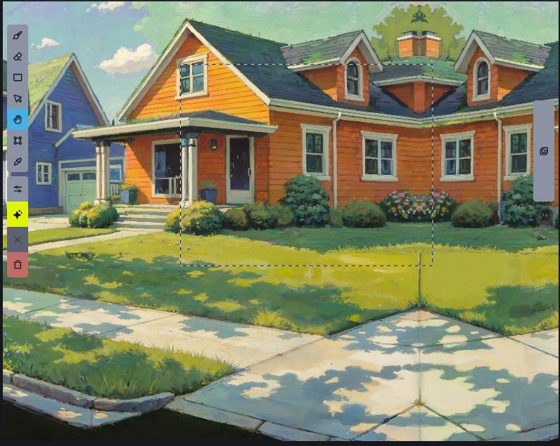
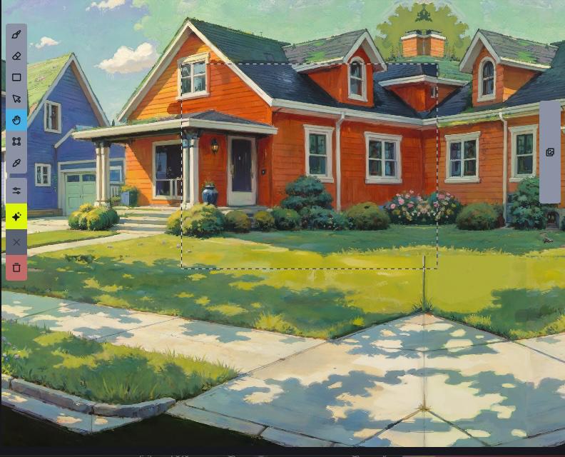
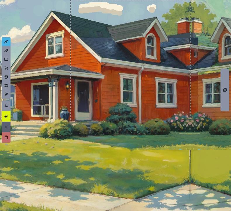
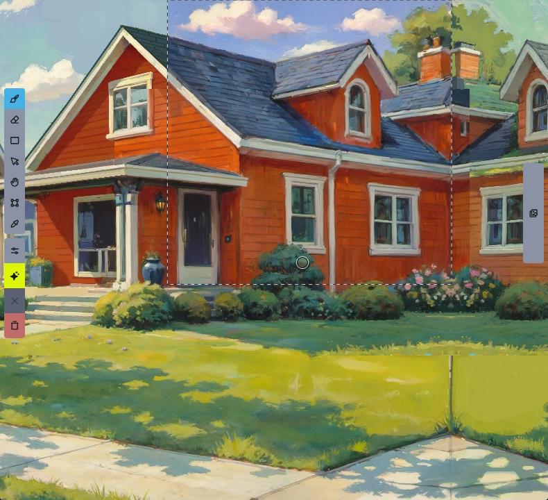
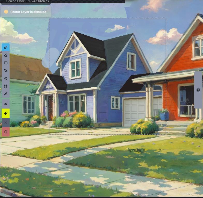
My solution was to set the bounding box to 2048 resolution (1024 pre-scaling), and manually inpaint each section. That way, I could ensure each section used a custom prompt specific to that section, and regional guidance for even greater control.
I started with the road.
When it came time to work on the red house, I had a lot of trouble getting the right side to match the color on the left. I suspected this was because it ended on an edge with no additional context to go on, so I mirrored the image while I worked on those parts.
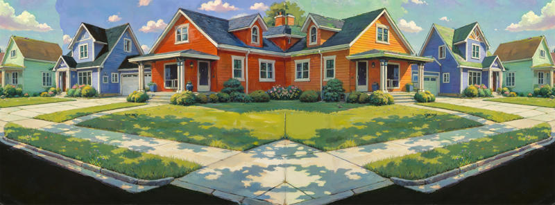
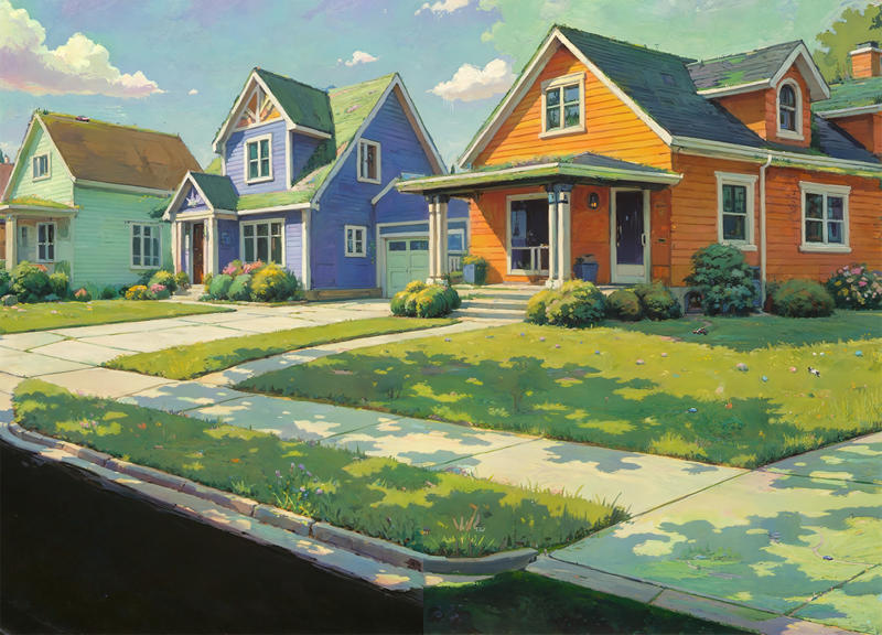
At this point I finally figured out what was bugging me about the road - it had lost the "dappled sunlight" effect. So after cropping out the no-longer-needed "mirror" part of the image, I went back to the original pre-style-change version, overlayed it on top of the current image in Photoshop, and used a layer mask to hide everything but the road. Then I adjusted the opacity and blend mode to bring the lighted areas back.
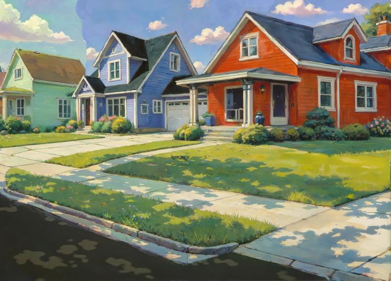
This was followed by another round of Inpainting, and then back into Photoshop for some color correction.

Completing the Scene
While I was making these edits, an idea had been growing in my mind - this was supposed to be a fantasy neighborhood, but all the houses were fairly mundane. What if I made the last house a bit more unique - something like a hobbit home?
I moved the bounding box off to the side and switched back to Flux. Then I used the following prompt to generate some hobbit homes
A hobbit home beneath a grassy hill in a suburban neighborhood. It has a rounded roof that blends into the yard above it. It's two stories tall. The view is angled so the we mostly see the side.The results were decent, but not quite what I was looking for. So I decided to give a different Flux model a try: Kestral, which had been finetuned on a lot of fantasy art.
The results were significantly better, but also surprising. Among them was this one:
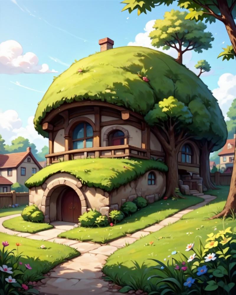
This wasn't what I had been going for, but the more I looked at it, the more I liked it. I felt like I could work with this one. I brought it into Photoshop, along with the green house it would be replacing, and then used the Skew, Perspective, and Distort tools to adjust the viewing angle, and also cleaned it up a bit.
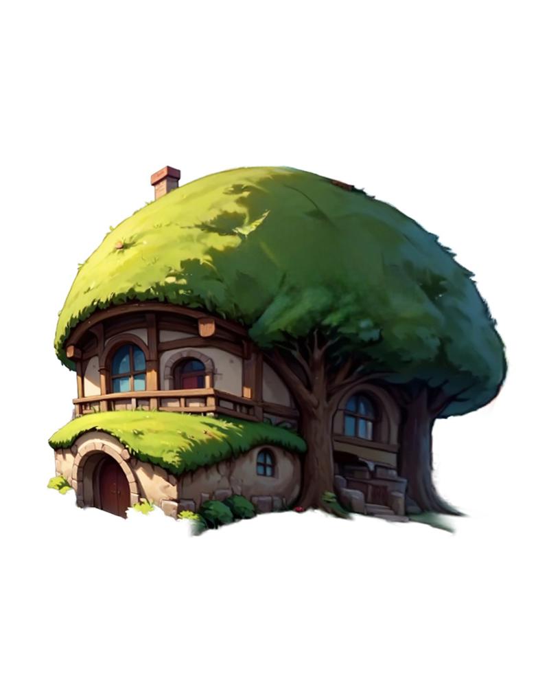
Back in Invoke, I painted over the green house with sky and added the hobbit home. Then I switched to Flux and ran the following prompt to inpaint over it:
A hobbit home built into a tree and a grassy hill. It is two stories tall and has a rounded roof. On the second story is a porch. Below that is a garage. The view is from the side. The home sits in the middle of a beautiful flowery meadow.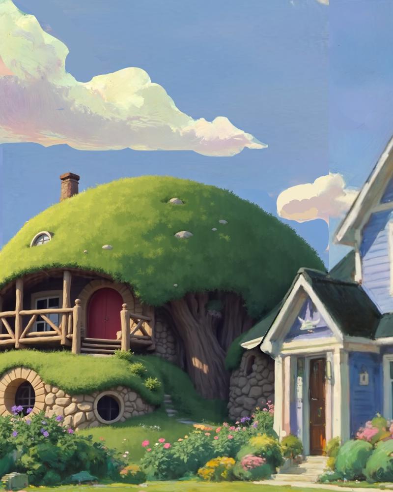
After a few more rounds of Inpainting, I had a design I was pretty happy with, so then I switched back to Painter's Checkpoint and the style LoRAs I had been using, and replaced it with something that fit the scene a bit better. Then it was a bit more Inpainting to finetune the details like the walkway, the windows, and the garage.
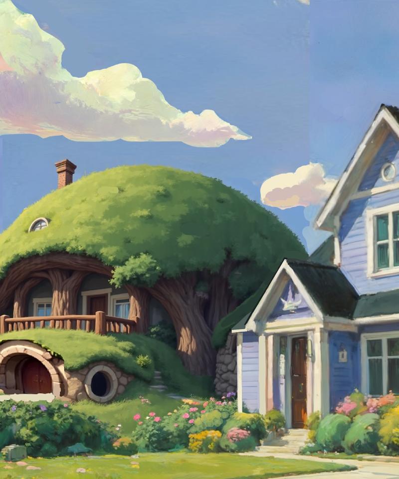
Now that the houses were all done, it was time to bring back the tree. I started by taking the tree from the original failed style transfer, and adding it as a new layer in Invoke. Then I adjusted the scale, deleted some of the smaller branches, and for the leaves just used a bunch of paint dots. Once I was mostly satisfied with the overall composition, I merged the tree layers and moved them off to the side, then added a white background. Then I generated a new tree using Flux.
.
The size and leaf coverage wasn't exactly what I was looking for, so I duplicated the tree a few times, stretching it and re-using different parts of it. Then I used another round of inpainting to convert the style, and then a few more rounds for fine tuning. Finally, I brought it back into Photoshop for to add a light atmospheric effect for the "back" part of the picture.

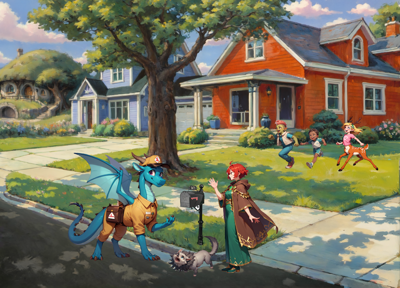
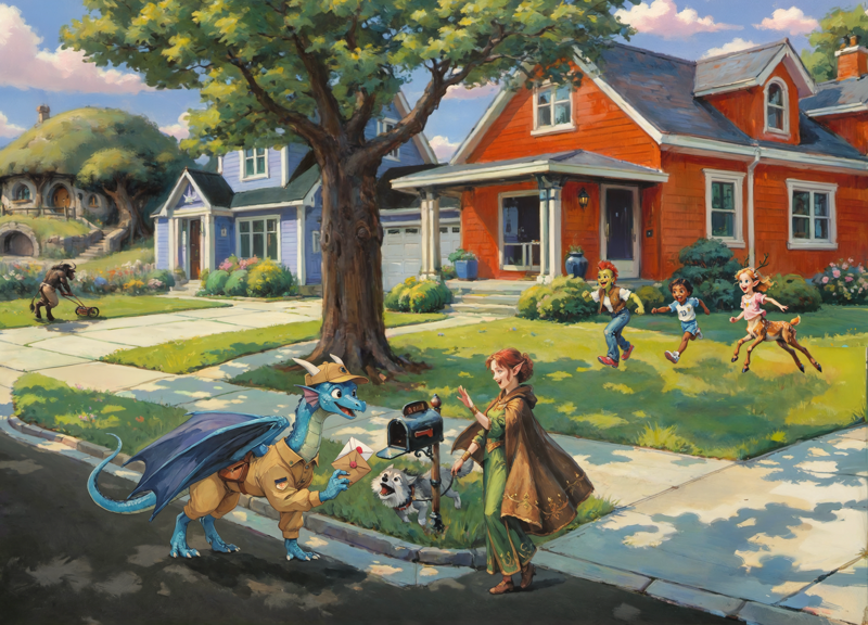
Adding the Characters
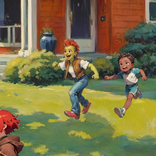
An empty neighborhood is pretty boring (not to mention lacking in "fantasy" elements, so it was time to add the characters. I had already decided on the main characters, now I just needed to make sure they still fit. So I added each of them as a new layer, arranged them, adjusted their size, and so on, until I had an arrangement I was happy with.
Each of these had been created with Nova Furry v3.0. For style transfer I did 2 passes:
First I used Alchemist Mix OnlyToons, with the following LoRAs (with some variations):
Anime Screencap Style - 0.2
StudioGhibli.Redmond - 0.4
Studio Ghibli Style - 0.4
And the following prompt:
positive:
(score_9, score_8_up, score_7_up, score_6_up, score_5_up, retro anime screencap by studio ghibli, cartoon by disney animation, 1990s \(style\), retro artstyle, StdGBRedmAF, hdr---).and(<prompt>)

negative:
nsfw, score_4, score_5
After converting the character to a toon style, I replaced the placeholder version in the main image and inpainted using PixelPaint Pony, with the following LoRAs (again with some variations):
StudioGhibli.Redmond - 0.2
Norman Rockwell Style - 0.3
Impressionism Oil Style - 0.5
Eldritch Impressionism - 0.7
And the following base prompt:
(score_9, score_8_up, score_7_up, score_6_up, score_5_up, norman rockwell style, realistic oil painting, impressionist, StdGBRedmAF, by studio ghibli, watercolor, faux traditional media, by disney).and(<prompt>)I used 2 ControlNets during this whole process: Xinsir Union ProMax and Xinsir Tile. During the first pass, I ran the input image through an Open Pose preprocessor. For the second, I actually did 2 separate control layers and merged them - Depth and Scribble.
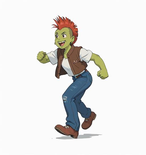
Orc Boy
Initial Prompt:
young orc child running, playing, laughing, mohawk, fur vest, white background, full length portrait, side view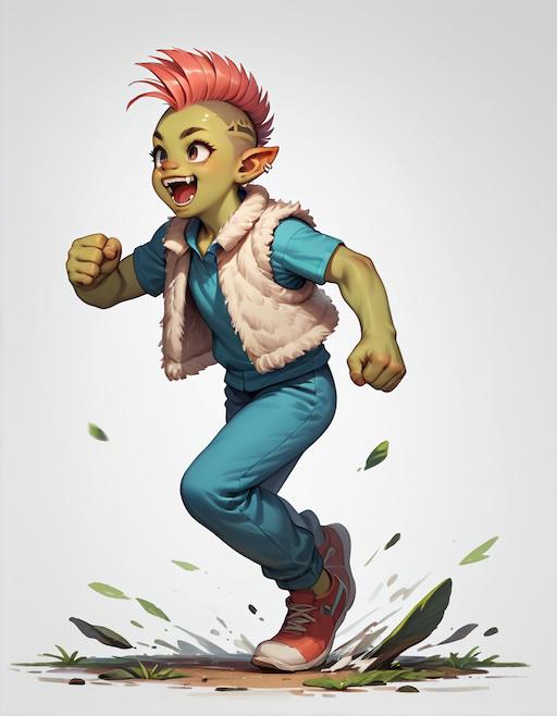
Human Boy
Initial Prompt:
young child running, playing, laughing, 1boy, dark skin, white background, full length portrait, front view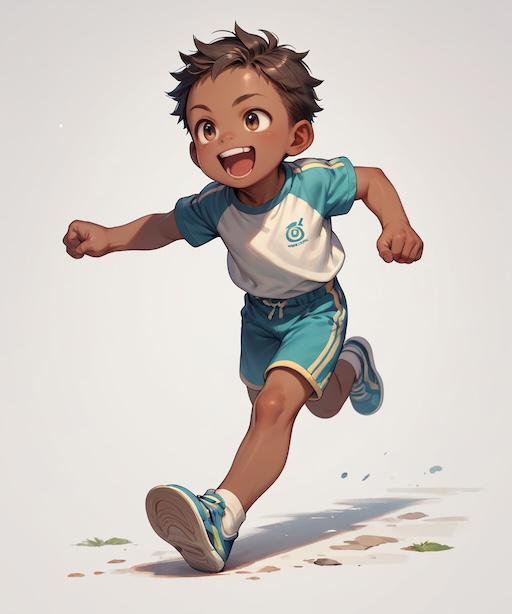
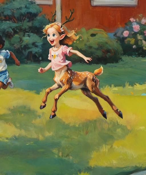
Deertaur Girl
Initial Prompt:
Positive:
young deertaur, taur, blond hair, running, laughing, leaping, deer body, pink shirt, dryad, simple background, three-quarter view, front view, from front, side view, full length portrait

Negative:
breasts, leaves, ponytail, low angle view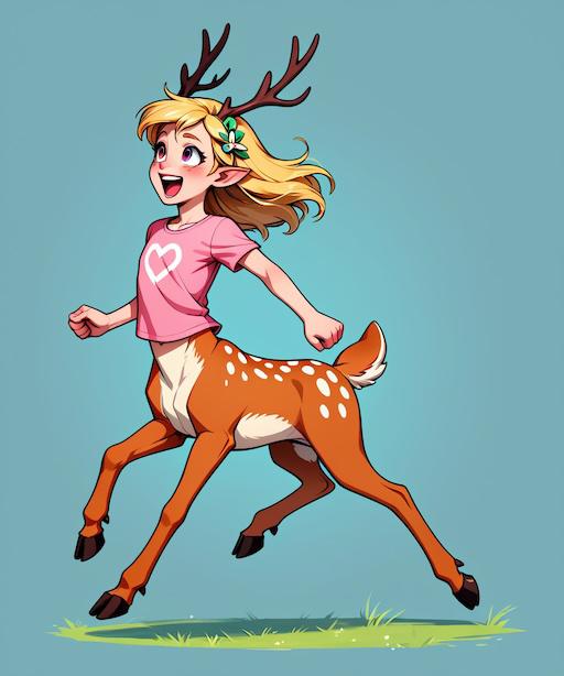
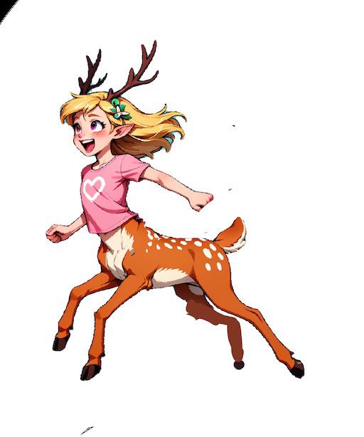
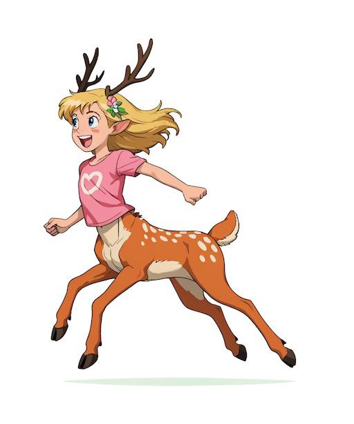
This turned out pretty well, but the posture was a bit awkward. So before doing the style transfer I imported an image of an actual running deer and tried to line her legs up with it. I also tilted her upper body forward a bit.
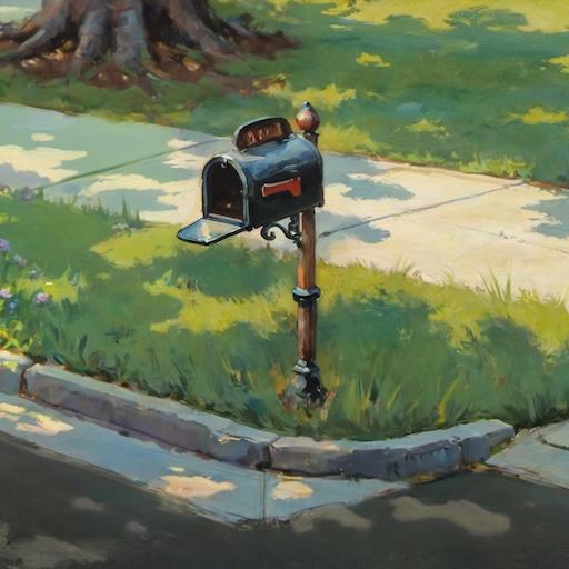
The Mailbox
Ok not technically a character, but I'm adding it at the same time so it goes here. Originally I was just going to grab a random mailbox image and Inpaint it directly, but that didn't sit quite right with me, so I painted over it first.
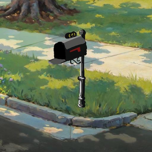
No cartoonifying this time, I just went straight to the painted style. I was surprised at how difficult this was - apparently Pony's definition of a mailbox is very different, and like the deertaur girl, I had to inpaint in multiple stages to get the end result that I wanted.
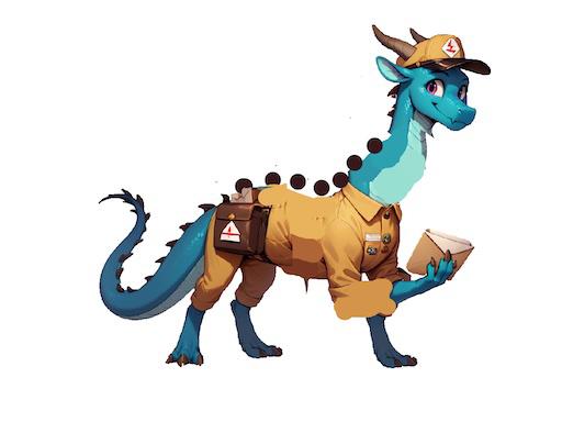
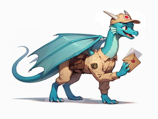
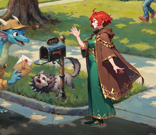
Dragon Postman
Of all the characters, the dragon was the one I was most looking forward to. This entire project actually began when a semi-random thought popped into my mind: "What would a dragon postman look like?" That idea ultimately ballooned into this entire Americana-style neighborhood, so I was very much looking forward to this part.
Initial Prompt:
feral dragon wearing postal uniform, western dragon, mythological creature, wings, saddlebags, smiling, greeting, simple background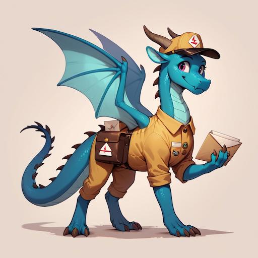
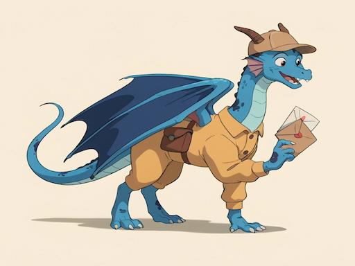
I loved this image! But the more I looked at it in the context of the scene, the more I realized it was a bit "off." I was going to need to make some manual adjustments before fixing the style.
The first thing I did was remove the wings - I'd be adding them back later but for now they were getting in the way. Then I split the dragon into pieces and tried to stretch him out a bit and give him a longer neck. I also made his right foreleg hold the letter instead of his left.
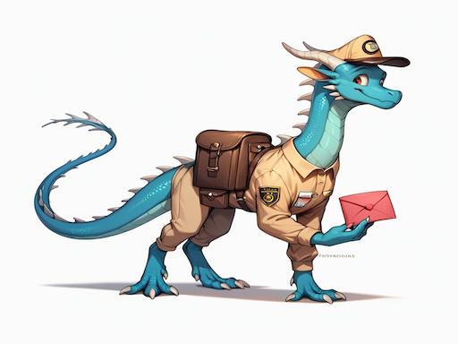
One of the problems with the first image was the extended wings. Within the context of the scene, it would make more sense for the wings to be down and relaxed. The problem is that this is achieved by the "folded wings" tag, which is pretty weak and easily overwritten. So I launched Forge and configured an XYZ plot to use multiple Illustrious checkpoints with the following prompt:
dragon, western dragon, mythological creature, feral, blue scales, ((folded wings)), side view, white background, full bodyKonpaEvo Mix produced an image with decent wings, so I brought it into Invoke, cut out the viewer-facing wing, resized and rotated it, then painted over it with the right colors. I also did some touch-up on the eyes to make the dragon look away from the viewer.
I started with img2img at 60% denoise until I got an image with wings that I liked. Then I kept Inpainting the rest over and over, gradually chipping away at the Inpainting mask as more areas finally fell into place. Eventually I had to do some manual editing on the right foreleg and head to give the Inpainting a little assist.

Then the first style change:
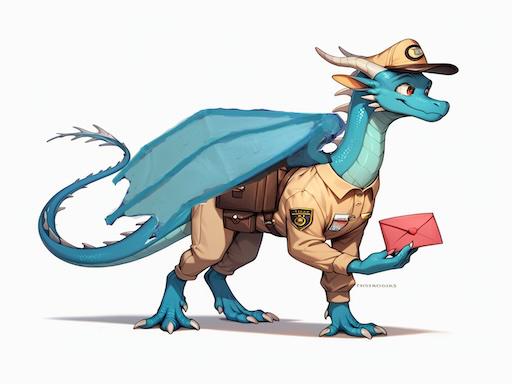
When I put him into the scene, I had to make some further adjustments. The wings kept trying to lift away from his body, so I put them into a new layer and lowered them. I added some shading to try to get the lighting correct. And I added a placeholder for the next character so I could use the "looking at another" tag to get the head right.
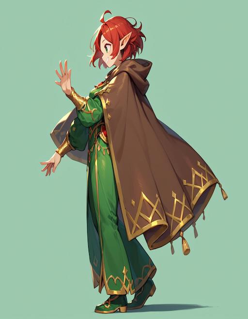
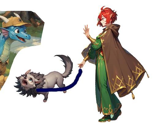
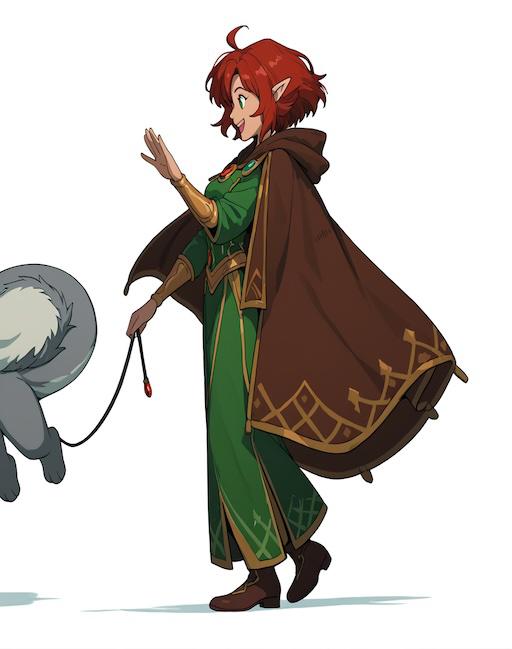
Elf Woman Walking Wolf
Initial Prompt:
Positive:
elven wizard, side view, woman, short red hair, green robes gold trim, brown cloak, full body shot, three-quarter view, smiling, waving, simple background, from side
Negative:
looking at viewer, detailed background, monochrome, sword, barefoot, hat
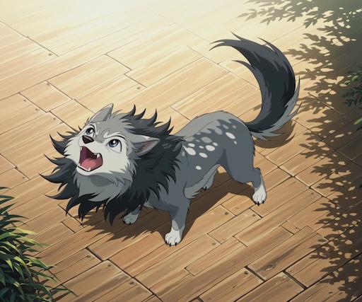
Positive:
feral direwolf puppy, gray fur, fangs, mane, looking up, barking, high angle view, simple background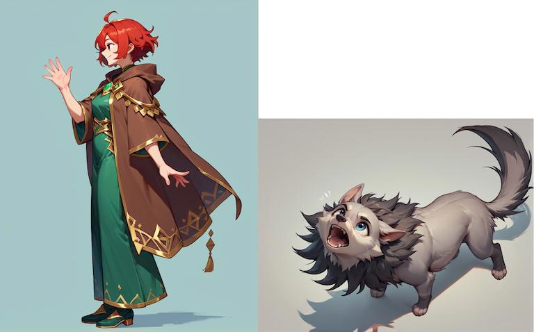
The wolf was pretty good, but the elf needed some work.
The problem is the model really wanted her to wave with her distal hand. I ended up painting her left arm up and right arm down, rendering a bunch of images at low denoise and copy-pasting the least-awful arms, then rendering the entire image again, which finally produced a good enough result for OpenPose to figure out her stance. At that point I was able to use ControlNet and a denoise of 70% to render a new batch of 50, which gave me the following:
To try to help further refine the pose, I rerendered her again, along with the wolf and the dragon, to try to give the model some more context (and, again, to help the "looking at another" tag).
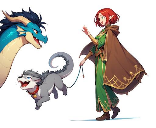
A few more refinements, and then the first style transfer.
The direwolf puppy, as I already mentioned, was mostly pretty good. It just needed a few tweaks and then I could do the first style transfer on it too.
Once I had both of them, I brought them into the scene to do the second style transfer together.
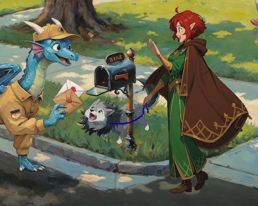
After running a bunch of batches, I realized the waving hand was going to be the most problematic (it kept trying to put the thumb on the outside), so I cranked up the ControlNets (Union with Depth + Scribble filter, and Tile), and then rendered a few batches until I got an acceptable hand. Then I removed the Inpaint mask from that part, turned the ControlNets down, and started running more batches, erasing the mask as different parts turned out the way I wanted.
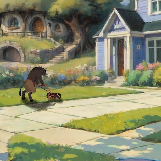
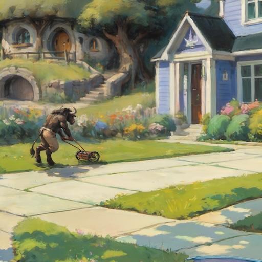
Minotaur
While I was arranging the main characters' placeholder images, I felt like the image was a bit imbalanced - everyone was concentrated on the right side. I really felt like one of the farther houses could use a character too. So I decided that the middle house would be home to a minotaur, who'd be out mowing his lawn.
Almost immediately I ran into a problem - Pony seems to have virtually no knowledge of lawnmowers. So I switched to KonpaEvo Mix, this time the CyberFix version.
Initial Prompt (excluding quality tags):
Positive:
minotaur mowing the lawn, rear view, three-quarters view, tauren, pushing lawnmower++, anthro, native american pants, hooves, leaning forward, cutting grass, 3d render, semirealism, standing walking, male, handlebars, mane, thick fur, side view

Negative:
looking at viewer, feathers, hunched over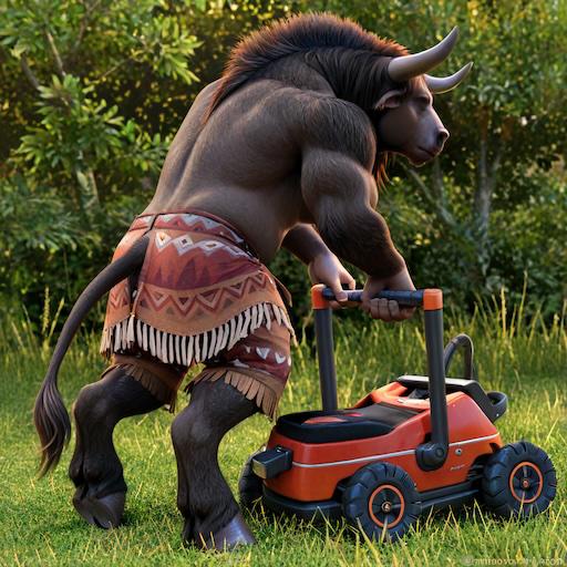
The lawnmower needed work, but I was mostly satisfied with the character. I touched up the image a bit, then did the first style transfer:

I wanted the mower to be an old, un-powered mower (apparently called a reel mower). Unfortunately, while non-pony SDXL models understood lawn mowers ok, none of them seemed able to draw the type of mower I was looking for. So I gave Flux a try. It didn't do much better, but eventually I got something close enough by repeatedly taking the best image of each batch, painting out the parts I didn't want, and then running image-to-image.
Anime screencap photo of a man pushing an antique, vintage reel mower in the 1950s. Side view, from behind, he's walking away from the camera and to the side.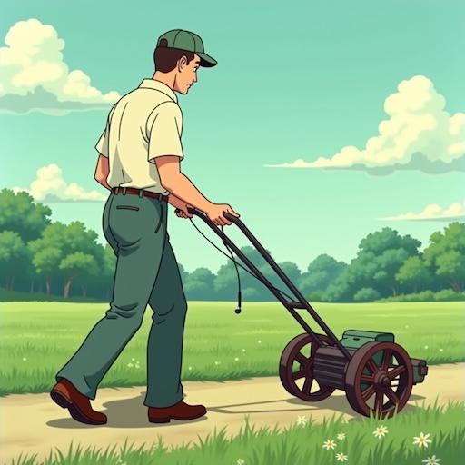
Once the minotaur and mower were both in the image, I could start working on the style transfer. One issue that caused problems is the minotaur looked too good and too detailed. The problem was it was a background character in an impressionist painting, so he needed to look much rougher. I solved this by expanding the bounding box so he was only a small part of the image during inpainting. As with the other difficult characters, I had to do multiple passes at different ControlNet settings to blend him in piece by piece.
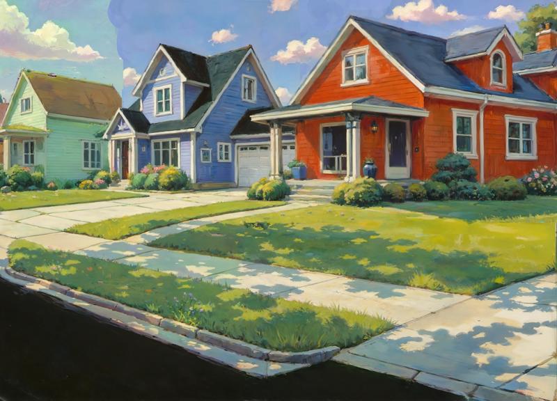
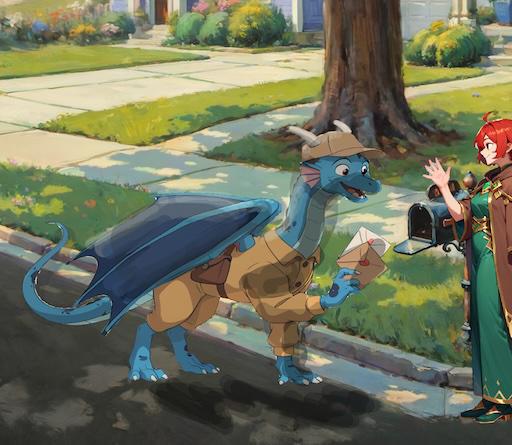
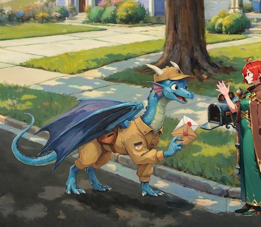
And that's it for the characters! There were a few other minor additions, and lots of touch-ups, but instead of covering them in detail I'll just show the before and after:

Thanks for reading!