

Who was Hans Thoma?
Hans Thoma was a German painter. From Wikipedia:
In spite of his studies under various masters, his art has little in common with modern ideas, and is formed partly by his early impressions of the simple idyllic life of his native district, partly by his sympathy with the early German masters, particularly with Albrecht Altdorfer and Lucas Cranach the Elder. In his love of the details of nature, in his precise drawing of outline, and in his predilection for local coloring, he has distinct affinities with the Pre-Raphaelites.
So, what is this LoRA about?
Contrary to my previous LoRAs where I tried to make compositional elements and brush/pencil strokes as part of the "style", in this case I went into "general feel". What I like most about Thoma's works is hist color work, contrast and somewhat otherworldly feel. I think I achieved it in this LoRA, at least I am mostly satisfied with results. Expect gorgeous foliage, German pastorals, punching colors and contrast, plump women, breathtaking sceneries, Nordic swords, biblical themes (try generating old man with long beard and long hair) and realism mixed with romanticism. How much is there from Thoma and how much from your checkpoint is debatable, but in my perspective this is best LoRA I trained to date.
Illustrious update note
Illustrious version is closer to source, more painterly, and less vibrant (last one because v-prediction do have better colors)
Mostly satisfied?
Yes. There are some things that I don't quite like, for example, it leans too much into likeness of artist's family, particularly his sister Agathe, sometimes gives pretty dull backgrounds (unless you ask for "scenery", but on that later), and some colors are too bright, punching right in the eye. And Thoma's signature sometimes appears multiple times, although it's not in anyway as bad as with W. W. Denslow LoRA. Anyways, I'm already tweaking dataset, so expect new version sometime in the future.
Illustrious update note
I honestly like Illustrious version a bit more and will try to make similar for v-predition - vibrant, but more painterly.
Compatibility
This is V-prediction LoRA, trained on Noob AI XL v-pred 1.0. It requires compatible tool and proper settings, although checkpoint used does not need to be v-pred. For example, it properly works with Noob Epsilon. It also somewhat works with Illustrious based checkpoints, but not as good, very dependent on checkpoint, prompt and stars alignment. Here's what I tested it with.
Noob AI v-pred 1.0 and eps-pred 1.1 - most true to original dataset, so since it's photos and scans of paintings and drawings, colors somewhat dull, a bit blurry, with cracks in paint, etc.
Noobai-Cyberfix-V2/Perpendicular-Cyberfix-V2 (VPred) - This is my go-to,
noob_v_pencil-XL - this is second best for me, giving a bit more anime, but going with great colors
WAI-SHUFFLE-NOOB - It's anime and nothing can convince it otherwise, but results are awesome
NEW ERA (New Esthetic Retro Anime) - As name suggests, goes into retro anime with very interesting results.
I also tested with bunch of Illustious mixes and fine-tunes and general conclusion is that results are better with more general purpose checkpoints, rather than anime ones. Your mileage may vary.
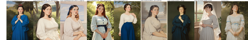
Here's sample grid. Generated with SwarmUI, seed 2041011578, prompt by thoma, newest, masterpiece, best quality, absurdres, highres, general, negative worst quality, old, early, low quality, lowres, signature, username, logo, bad hands, mutated hands, mammal, anthro, furry, ambiguous form, feral, semi-anthro, blurry, expressionless, upscaled to 1.5x with 4x NMKD Superscale SP 178000.
Usage tips
Have fun. If you don't have fun, stop and do something else.
Experiment with placing style/medium tags into positives and negatives (don't forget to escape parentheses if your tool automatically adds weight to them). List below.
Add
sceneryto make dull image prettier. Or just placesimple backgroundin negative. Or both.Adding
realisticorphotorealisticin positive either have no effect, or do same thing, butphotorealisticis worse. Adding them to negatives may do something or do nothing depending on checkpointAdd "blue" into negatives if you don't like blue color. It may not help.
Don't forget that Illustrious and Noob AI both benefit from natural language prompt in addition to tags.
Add
simple backgroundto negatives.Add
signature, artist name, artist logoto negatives.Describe clothes and hair, if you want less of that early 20th century rural Germany vibe.
Distant faces require fix. Close-up portraits are awesome.
Try lower weight. 0.1 already influences image in noticeable way, but better start from around 0.25-0.3. Try higher weight. Above 1.1 may or may not go into weird territory, but also may produce interesting results - I went up to 2.5, but there is absolutely no point going further than 2.0.
Refine and upscale
Post an image. I am really interested in your results. Doesn't matter how good or bad, how decent or horny, how pretty or dull.
List of tags to experiment with
Try combining those tags in positives and/or negatives to tweak the result. Don't forget that if your tool adds weight with parentheses, you need to escape them with backslash (\).
painting (medium)
monochrome
greyscale
simple background
ink (medium)
graphite (medium)
watercolor (medium)
portrait
hatching (texture)
acrylic paint (medium)
traditional media
Changelog
Noob v-predition v1.2
Initial release. All previous versions were unsuccessful.
Technical data for nerds
Used 103 images and trained with OneTrainer for 50 epochs (total of 1150 steps with batch 4) with Prodigy optimizer. Captioning was automatic with WD-eva02-large-tagger-v3, then cleaned up and a bit expended. All images were gathered from publicly available sources.
Illustrious XL v1.9.4
First and last Illustrious version. Used same dataset as for noob version, but with better onetrainer settings.