Download
1 variant available


License:
AnimaThe Anima Model is licensed by CircleStone Labs LLC. Copyright CircleStone Labs LLC. IN NO EVENT SHALL CIRCLESTONE LABS LLC BE LIABLE FOR ANY CLAIM, DAMAGES OR OTHER LIABILITY, WHETHER IN AN ACTION OF CONTRACT, TORT OR OTHERWISE, ARISING FROM, OUT OF OR IN CONNECTION WITH USE OF THIS MODEL.
Built on NVIDIA Cosmos

This post now contains 3 different Anima LoRAs, each converted from styles we originally used in SD / NovelAI.
They are grouped together because they come from the same circle and workflow — but each version has a different vibe.
All versions are trained specifically for Anima (DiT).
----------------------------------------------------------------------
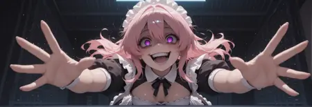
✦ 4X2 – Hanpi
Inspired by Hanpi. Onineko based style with fangdongye, karo, and kedama milk.
This version pushes softness and cute energy. It is dreamy, moe and eye-heavy.
Colors are lighter overall, with a softer, slightly washed-white rendering in both shading and highlights. The lighting feels airy and glowing.
Eyes are larger and more luminous, gradients are smoother, and often with layered gradients and strong shine.
Linework can include subtle colored outlines instead of pure black, which adds to the dreamy look.
----------------------------------------------------------------------
✦ 4X1 – Ayori / Yu-based
This version feels more painterly, with slightly softer and sometimes blurred brush edges instead of hard linework.
Lighting is much stronger here — it naturally produces bold light and shadow contrast.
Compositions also tend to feel more dynamic and cinematic.
It works especially well for artistic anime illustrations rather than flat character sheets.
White stockings / white fabric textures render particularly nicely in this version — the material shading and light interaction feel more dimensional.
----------------------------------------------------------------------
✦ 4X0 – AAAC Kupa
This version leans toward solid, confident linework and a slightly dark gothic lighting mood.
The lines feel firm and structured rather than soft or painterly.
Eyes are typically long and sharp, giving characters a more intense presence.
Colors sit on the darker side of the spectrum — not overly bright or washed out.
They’re moderately saturated but with lower overall luminance, so the palette feels rich and moody instead of glowing.