Intro
Who is this guide for?
People who already have AUTOMATIC1111's stable-diffusion-webui (AKA A1111, AKA webui) installed and a suitable setup to use it. I'm sadly not the person to ask regarding installation and setup of the webui, but you can find some help in their read me.
Hobbyists who are curious about anime-styled or other stylistic character design using Stable Diffusion, but are struggling to get nice-looking images. I'm not very good at photorealistic, or heavily NSFW stuff so we won't be looking at that.
Beginners-Intermediates who are curious about different Stable Diffusion txt2img workflows and their benefits. Knowing is half the battle! If you've already sorted out your workflow and have it super-optimized, that's cool too maybe you'll learn something from another perspective :)
People who are just generally curious about generative art and how it's made. I'm not a computer scientist, just a random joker on the internet so take all the things I say with a huge crystallized grain of salt. I will try to provide links to things when they arise.
While not provocative or R-18 at all, I wouldn't call this guide 100% SFW, just so you know :)
The goal here is to get more people to enjoy image generation and the creative process behind it with a step-by-step guide :)
We will go from default settings to a semi-decent piece of character art, and hopefully learn some stuff along the way!
Setup!
First of all, it's a good idea to get to grips with the basics of the webui.
Luckily there's a great guide already here on Civitai by RestlessDiffusion, which guides you through all the basic settings and what they mean, go read it!
Logistics
This is where you place additional Checkpoints, VAEs, Upscalers, Embeddings (Textual inversions) and LoRAs into your webui directory:
Checkpoints go here: stable-diffusion-webui/models/Stable-diffusion
VAEs go here: stable-diffusion-webui/models/VAE
Embeddings go here: stable-diffusion-webui/embeddings
LoRAs go here: stable-diffusion-webui/models/Lora
Upscalers go here: stable-diffusion-webui/models/ESRGAN
This is how you access them in the webui:
Checkpoints:

VAEs: (Settings on the top, then Stable Diffusion on the left then SD VAE)
Editor's note: As of webui version 1.6 you will find the VAE has its own tab on the left.

Sidenote: further down here is CLIP Skip:
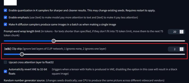
When you change anything, make sure to hit the Apply settings
For both TIs and LoRAs (Extra networks, it looks like a square red painting piece with a sun)
Editor's note: As of webui version 1.6 you will find these tabs visible by default (no need to press the extra network button).

You will find Textual Inversions, Lora and even Checkpoints here as rectangular boxes like this one:

If you want to follow along I will be using these extras to make our image:
VAE:
orangemix.vae (Not required, just have a nice VAE you like)
Textual Inversions:
Easy Negative (by gsdf)
bad-artist & bad-artist-anime (by nick-x-hacker)
bad-hands-5 (by yesyeahvh)
FastNegativeV2 (by Lykon) (Not required for final image)
LoRAs:
Add More Details (by Lykon) (Not required for final image)
LowRa (by XpucT)
Checkpoint:
I'll be using Dark Sushi Mix (brighter un-pruned) (by Aitasai), referred to as DSM, for all the image generations in this guide as I like the style and it's generally noob friendly :)
I heavily encourage you to fire up the webui and Generate as we go! I'll try and make the steps fairly intuitive. Don't worry if you aren't getting exactly the same images as I've put here, we likely have slightly different settings or hardware.
However, let's try and start similarly with:
Starting settings (usually in place by default):
Steps: 20
Sampling method: Euler a
CFG scale: 7
Size: 512x512
And these custom settings:
Seed: 4222258046
Checkpoint: darkSushiMixMix_brighter
Clip skip: 2 <- Deal with it
SD VAE: None
Editor's note: We are going to be talking a lot about Prompting, and its terminology is confusing. A Prompt is all of the stuff you put in that big scary box. Prompting is a verb meaning the "art" of changing the whole Prompt to get what you want. Each piece of text in the Prompt is sometimes also referred to as a prompt (with a little "p"), which is kinda inaccurate so I'll try and call them "prompt elements" or just elements just to make things less confusing (I hope :P).
Finally: If you want to learn how Stable Diffusion and other such text-to-image (txt2img) pipelines work in principle and don't mind computer lingo, there's a good post about the basics here.
Enough! Let's begin!
1. Prompt Me Bro
The infamous blank canvas... where do we start? Well, how about we just hit Generate and see what we get with no Prompt?
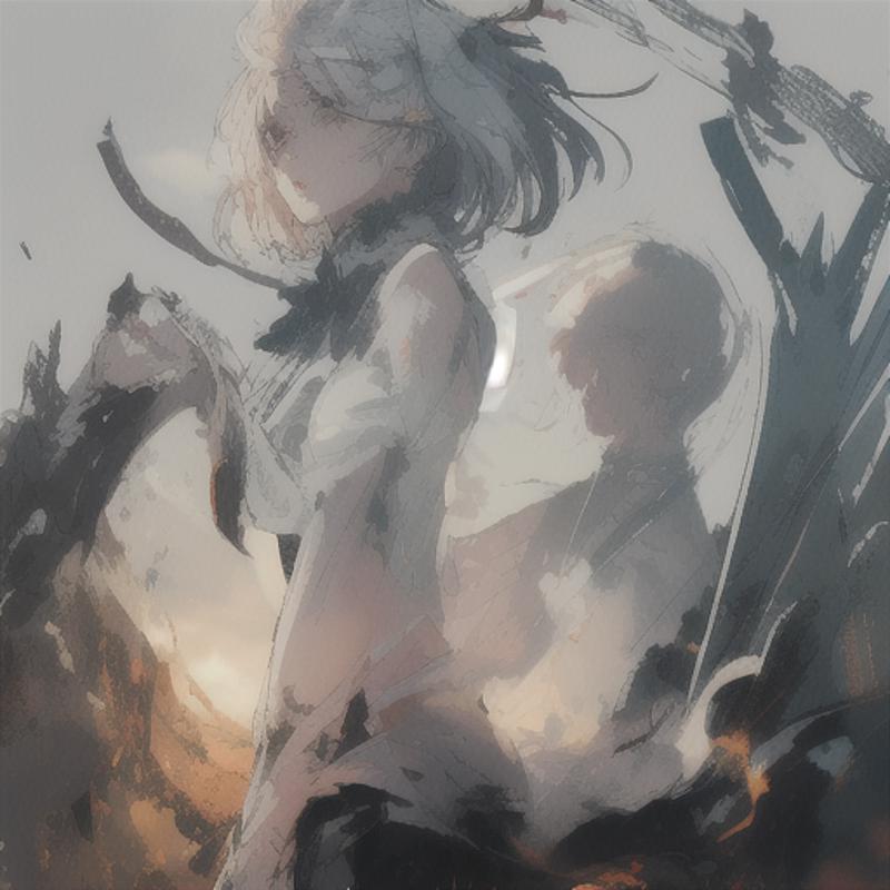
As you can see, it's just a bunch of diffused random noise, mainly determined by the Checkpoint and the random Seed given, hence why you get different images with different Seeds. Now, let's give the computer some help! If we type into the prompt:
watercolor sunlight ocean wave
the model interprets that as this:

So far so good, we type in elements we want to see and we get stuff. However, you can see that the model reads this as one big prompt element and tries to merge all of it into one thing! This is kinda funky, but maybe not what you're going for. So we separate distinct elements with commas:
watercolor, sunlight, ocean wave

Not too bad for a bunch of 1s and 0s!
Now, for the real stuff. I'm sure you're thinking:
"Oh great, watercolors of the ocean, big deal, I came here to make super detailed amazing 4k UHD lewds of my favorite anime character, not look at budget AI van Gogh over here"
Don't worry, we have an advantage already: each Checkpoint of Stable Diffusion has a theme or a desired output. Using the DSM Checkpoint it has some heavy bias towards representing anime-styled characters. So I just need to add in the "1girl, portrait" elements at the start of our Prompt, et voila:
1girl, portrait, watercolor, sunlight, ocean wave
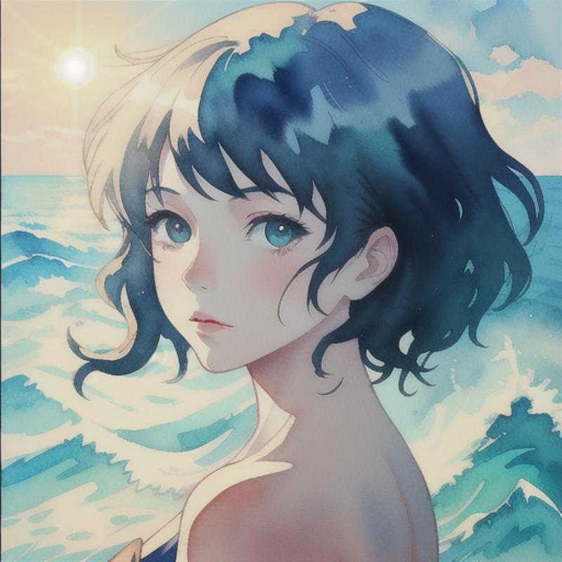
And for balance:
1boy, portrait, watercolor, sunlight, ocean wave

You may have noticed that 1girl/1boy is not a word, but the model recognizes some booru tags, as elements which will help us greatly when crafting characters.
Editor's note: A good extension for the webui is tagcomplete. This is essentially an autocorrect with a library of booru tags and will help you out greatly when adding elements in booru-tag trained Checkpoints! Give it a try if you want, but it isn't required for this guide.
We're going to make a nice scene now, so let's talk about the order of our distinct elements.
The order matters!
Very basically, the earlier the element the more the computer prioritizes it. So I like to go in the order: quality and style, then subject and finally backgrounds and themes. With that said, I spit out:
masterpiece, best quality, illustration, volumetric lighting, symmetry, 1girl, portrait, looking back, blue eyes, silver hair, short hair, camisole, sunlight, ocean, beautiful cloudy sky
Too much? Don't worry, let's pick it apart, and start with quality and style:
masterpiece, best quality, illustration, volumetric lighting, symmetry,
You want to get a high quality image so you gotta lay it out for the computer with: masterpiece, best quality. Other such elements can work, like high quality or highres, so feel free to play around with them, but don't go overboard and type the whole dictionary! I'm using symmetry to prevent strange cropping events and volumetric lighting gives some nice light effects. The prompt element illustration could be any artistic style you're looking for, I've used visual novel & cell shading & graphic novel before and they all give different results, it depends on the style you're looking for!

Yes. The guy is wearing a camisole and looks distinctly unhappy about it :P it's for science ok?
Anyway, next up, your subject:
1girl, portrait, looking back, blue eyes, silver hair, short hair, camisole
After you describe what the subject is (1girl or 1boy) and the framing (portrait, looking back), you can kinda go wild on the details of the character. Make sure to include the hairstyle and color (silver hair, short hair), what they're wearing (camisole), eyes (blue eyes) and where they're looking (looking back). There is no rule for the order here, you will likely have to play around heavily with conflicting prompts and other such things. For example, you might want to prioritize the looking back over the 1girl, so just swap around the elements as you can see:

It kinda messes up the setting so we'll keep the 1girl first in our order as it is high priority.
You can also have a lot of fun playing around with character traits, like emphasizing certain clothing types or certain expressions. Or just changing certain aspects of the character, like for example hair length:

Finally, we have the background and theme:
sunlight, ocean, beautiful cloudy sky
This is generally stuck at the back as we want to prioritize the character and quality, and can also include certain style elements that we want to prioritize less. As for the background, you can go from a simple grey background to something more elaborate, but don't do too much as eventually, you'll start to detract from your character, as you can see with some of the examples here:

This is also a good place to start playing around with color palettes and weird lighting effects, so I'll add in limited palette for a little bit and play around:
sunlight, ocean, limited palette, beautiful cloudy sky (replacing the limited palette):

So to recap, our final Prompt is:
masterpiece, best quality, illustration, volumetric lighting, symmetry, 1girl, portrait, looking back, blue eyes, silver hair, short hair, camisole, sunlight, ocean, beautiful cloudy sky
Looks complex still? Luckily, you now know better. It's just a string of words in a particular order, one that you can play around with to get your desired outcome :)
Our final outputs:
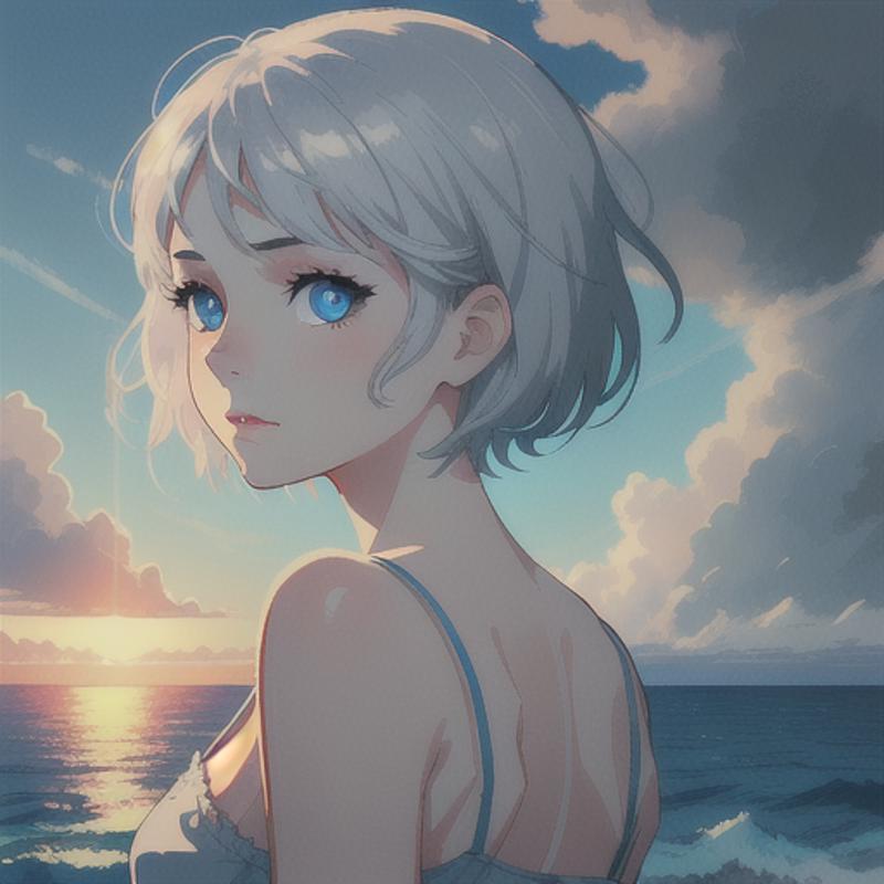

Great! We have a nice 512x512 pixel image right now! A good foundation for things to come!
Section 1. Generation Info
Prompt:
masterpiece, best quality, illustration, volumetric lighting, symmetry, 1girl, portrait, looking back, blue eyes, silver hair, short hair, camisole, sunlight, ocean, beautiful cloudy sky
Exercises:
You can play around with the elements and see how their order affects things, try putting the character elements at the rear and placing the background and themes first for example.
Go crazy and type in all sorts of random stuff now to see how it affects the image. We can always return to our baseline Prompt here.
Try different Seeds to see how they affect the generation (-1 in the Seed field is random) or change the Batch count to 4 or 9 to generate adding +1 to the Seed for however many images in the batch you set!
When ready we can move on to Upsclaling the image to something better :)
2. Upscale Me Bro
We now can upscale our image to make it a higher resolution. Luckily the webui has some fancy models just designed to upscale pixels to a higher resolution. You can find them all in the "Extras" tab at the top of the webui.
But wait! Before we go there, upscaling by itself doesn't necessarily add any more detail, it just upscales the pixels. Therefore, the illustration will look pretty much the same, it'll just be in higher resolution:
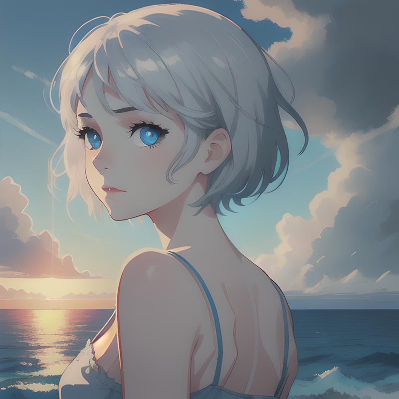
Upscaled to 1024x1024 pixels using R-ESRGAN 4x+ The detail just isn't there...
Hires Fix
Never fear though, we have a great tool at our disposal: The most holy "Hires. fix" in our txt2img tab. This essentially diffuses the whole image, upscales it and then performs another round of diffusion with varying strengths, allowing you to keep the composition roughly the same but also adding more detail in! It is a bit confusing, but it'll become more apparent with some examples.

First, we are presented with an Upscaler, this is the same fancy model found in the "Extras" tab. For now, we'll fool around with the R-ESRGAN 4x+ model, it's a good one for keeping lines sharp. If you want a different aesthetic with slightly more detail (and also more jank), you can try out the Latent upscalers.
Editor's Note: There are a bunch of other upscalers available, a lot are better than the ones that the webui starts with. Here are a just few with the ESRGAN architecture:
4x_foolhardy_Remacri by Foolhardy
4x-AnimeSharp by Kim2091
4x-UltraSharp by Kim2091
Hires. fix settings
Upscaler: We will go with a default one so more people can follow along: R-ESRGAN 4x+
Hires steps are the steps of the second diffusion, you can comfortably keep it around 20 without too much loss of detail. We will keep it at 20.
How much you Upscale by, is the scale factor, we will keep it at 2, you can also do 1.5. Try anything above 2 at your own peril, your graphics card might complain, or at least you'll waste a lot of time! You can also try a custom resolution, including a different aspect ratio to your original image, this will most probably give nightmare fuel, so again, use it at your own peril.
Denoising strength is a bit like the strength of the second diffusion step, and it takes values from 0-1. Too low, and your image doesn't change at all, resulting in the non-changed picture above, and too high your image changes too much. I'll let you see how it affects the image here:

You can see that higher than 0.5 the image changes substantially, but lower we lose some precious detail, as it just upscales without a second diffusion step. For this piece, we'll keep it around the 0.5 value. Depending on how much detail you want, you might want to go lower!
So with 0.5 Denoising, 2x Upscale and 20 Hires Steps we hit the Generate button, and you'll note it takes considerably longer! This isn't something you want to use all the time, it's just for producing a final piece!

Anyway, we have a pretty nice picture, but far from perfect!
VAE
Now, I've highlighted some strange regions in the picture. Mainly WTF is that strange purple blob? Also, the waves are kinda behind her back? Finally, the picture looks faded, with no nice vibrant colors, that's no good! This is where we need to talk about VAEs. I promise I'll make it brief XD
Essentially a VAE is something that transforms the pixelated computer nonsense into visual pixels that you and I can see and appreciate.
"even those 4k UHD AI lewds of my favorite waifu?"
Yes, even those... So having a good VAE is important, and currently, I have the default one from the Checkpoint, which in this case isn't great.
Editor's note: Some Checkpoints do come with a "Baked VAE", essentially putting a good VAE into their Checkpoint. They give good results based on the experience of the author, so in this case, using the "None" value is legit.
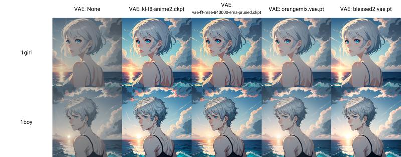
I show how to change it in Logistics at the start, but I'll re-iterate as it isn't that intuitive. Just go to the scary tab called "Settings" and press Stable Diffusion on the left (or VAE if you're using the 1.6 version or newer), and change the SD VAE to a suitable one from the drop-down menu.

I'll be using the orangemix vae, as I like it, but you can roll with whatever you want, it's up to you and your artistic vision. Here's a few of them for a reference:
Here's the Hires. fix image with the orangemix VAE. and our prompt from before:
masterpiece, best quality, illustration, volumetric lighting, symmetry, 1girl, portrait, looking back, blue eyes, silver hair, short hair, camisole, sunlight, ocean, beautiful cloudy sky
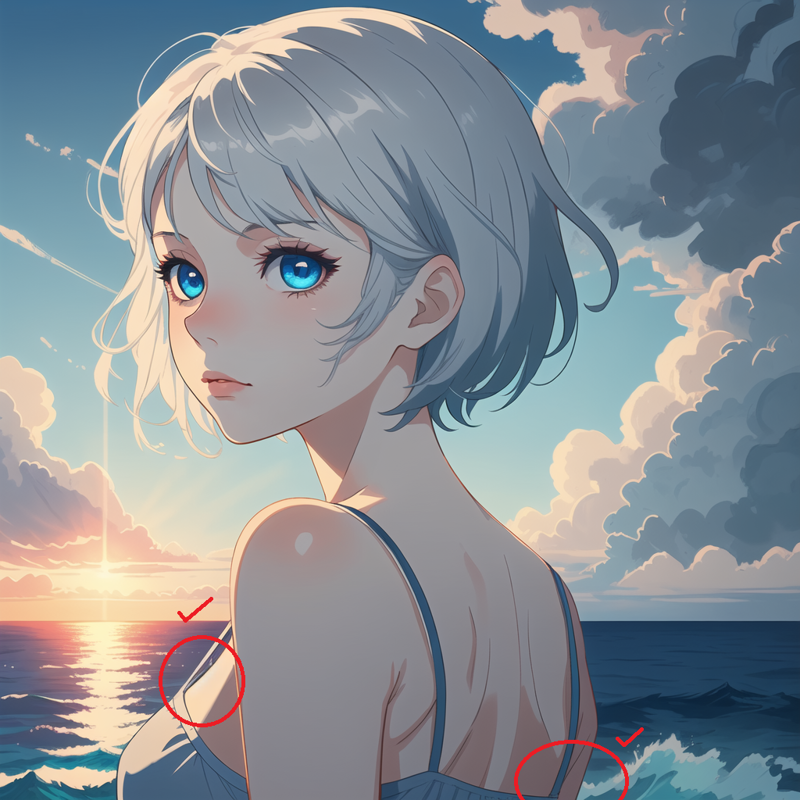
Great! It dealt with the strange purple blob, and the wave thing, and more importantly we have color!
Section 2. Generation Info
Prompt:
masterpiece, best quality, illustration, volumetric lighting, symmetry, 1girl, portrait, looking back, blue eyes, silver hair, short hair, camisole, sunlight, ocean, beautiful cloudy sky
VAE: Changed to: orangemix vae
Hires. Fix parameters (Our Default Parameters for the remainder of the guide):
Upscaler: R-ESRGAN 4x+
0.5 Denoising
2x Upscale
20 Hires Steps
Exercises:
Try some other Upscalers! See how it affects the style. If you want, get some of the non-default Upscalers and see how they affect your image!
Change VAE and see how the colors and light balance changes
Go crazy and try different Denoising strengths for wild artsy sh*t!
When ready we can move on to refining our Prompt and Negative Prompt :)
3. Prompt Me Properly Bro
So we'll leave the 1boy behind (sorry bro) and for now, just focus on 1girl. Also, make sure you unselect Hires. fix. We're in tweaking mode and we need to make lots of images to get something we want, and as you noticed, Hires. fix is slow!
Size
A slight aside here, but I want to make a portrait image, and having all your images as 512x512px squares isn't that interesting, and it can limit your scope, especially with character design. However whenever you change the size of the generation, your whole picture changes!
The computer needs a fixed canvas to do all its diffusing in, and will struggle if the sizes are too far outside its scope!
It's best to find a framing you want, and then start tweaking around after that. A few examples with our existing Prompt and changing the Width X Height
403 x 716 (9:16 portrait)
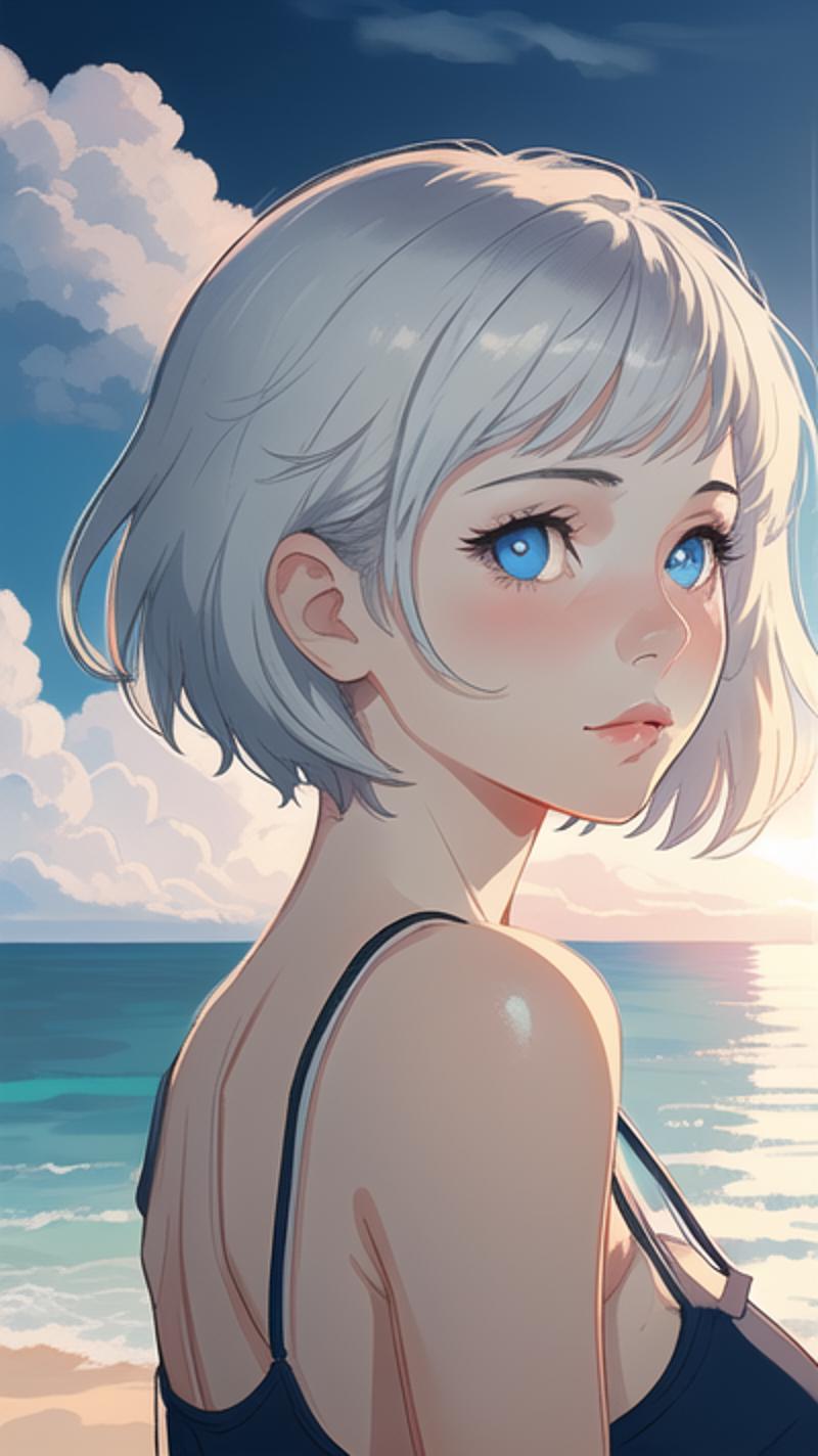
768 x 512 (3:2 landscape)
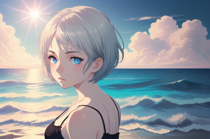
512 x 1024 (1:2 Portrait)

Wait what happened? You can see it's trying really hard to diffuse our whole Prompt into the 1024px Height.
Generally speaking, it's good to not stray too far from the default 512px values (For non SDXL stuff that is). If we want higher resolutions with the same aspect ratio Hires. fix will happily do that and maintain a good composition!
Editor's note: There are more tools in the img2img tab, for example outpainting, for manipulating sizes of your image but I won't be covering those today!
I, however, will settle for a 3:2 portrait style, as we're making a nice upper body shot! So in other words: 512x768 portrait style, just change the Height value to 768 and the Width to 512.
I personally stick to either 512x768 or 768x512.
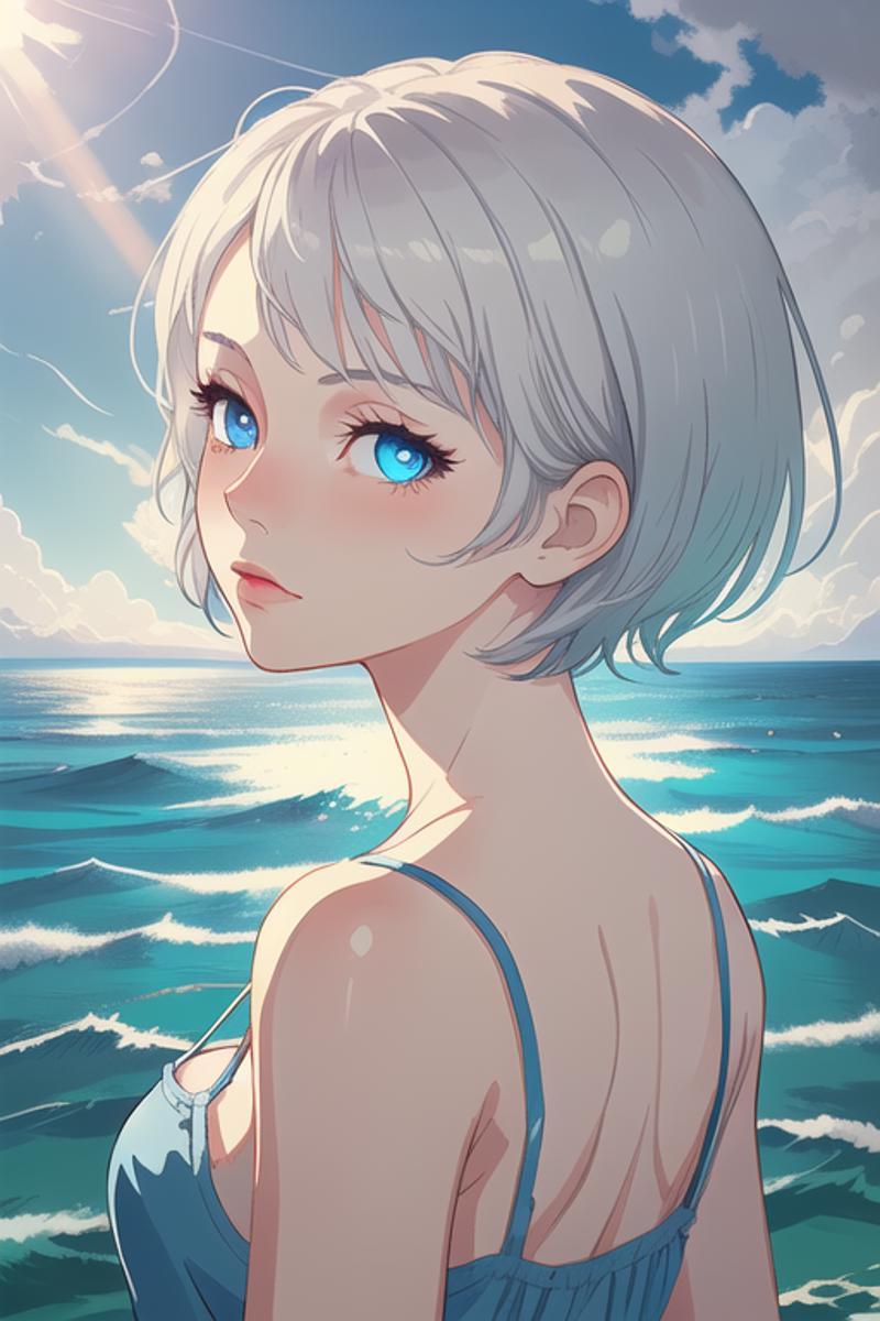
Cool, but by no means perfect.
Negative Prompt
"who cares about the size!? I'm playing around with elements and their order, and it's random AF and with all sorts of bad details, how'm I gunna make my character with all this jank?"
Well, we've told the computer the basics of what we want, now we need to tell it what we don't want. This is where the Negative prompt comes in.
"oh great, wtf do i type into the Negative prompt? worst quality, bad, super bad, extra bad, super extra bad, lowest of low res, very very very ugly, gross, lowres, zombie, eldritch horror, nightmare fuel,,,,,,"
Sadly, that list will go on forever, and if that's your cup of tea, don't let me stop you from tinkering in the Negative prompt, or copying HUGE text files in there. If it works for you then go ahead!
I prefer the lazy and clean option, in other words, Textual Inversions or Embeddings.
Textual Inversions (TIs)
These "super elements" do a lot of heavy lifting! Very very basically, they bypass the messy nature of decoding text into computer speak and just chat straight to the computer. They have lots of uses, from artistic styling, to themes and such. But probably the most useful is telling the computer what NOT to make.
TIs or Embeddings on Civitai and Hugging Face for Negative prompts are:
FastNegativeV2 by Lykon
Easy Negative by gsdf
bad-artist & bad-artist-anime by nick-x-hacker
Here's a fun experiment to see what exactly these negative TIs do. Let's just put one of them at the front of our positive Prompt and see what happens >:)

"HELP!! MY EYES!!!"
Basically, all the horrible things we don't want are put into this one Embedding. It also gives a certain control over the aesthetic, giving more of a consistent tone across our images, which is nice once you settle on one you like :)
Ok, let's cleanse our artistic palette, by putting one of them into the Negative prompt as intended:
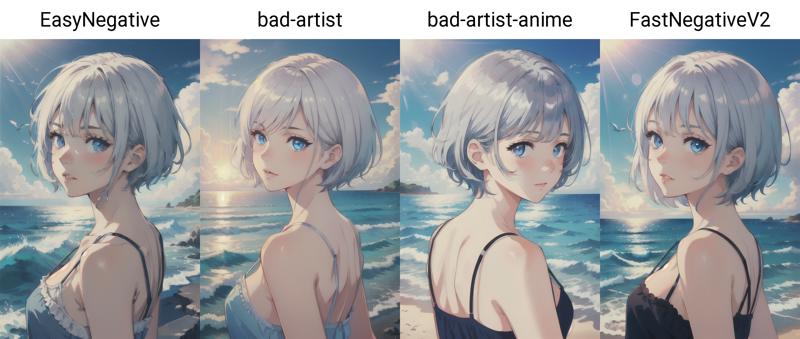
Much better ^^
An improvement! The great thing is you can actually mix and match these TIs as much as you want. I'll also add a few more based on my own artistic preferences to end up with this Negative prompt:
EasyNegative, bad-artist, (sketch:1.2), (bad-hands-5:0.8), (realistic, lips, nose, tooth:1.1)
First up, I just like how the EasyNegative and bad-artist complement each other, it's a personal choice. You can use bad-artist-anime or the FastNegativeV2 if you so desire. Here's a crazy mix of a few with EasyNegative, bad-artist, FastNegativeV2 in that order and eliminating some:

Go with your instinct :) Next we have...
"sketch? wtf, and also, why you got brackets around it?"
I just like the sketch negative with DSM, as the Checkpoint tends towards thick lines, and I've found sketch can mitigate some of that. More importantly, we can talk about those brackets or Weights finally!
Weights
Just to reiterate, the order and content of the prompt elements are paramount and this is your primary weapon! However... we can also tweak the priority of certain elements further (both up and down) by using weights. It's a tool that should be used sparingly. The syntax is this:
sketch an unweighted element
(sketch) a weighted element with poor control over weighting
(sketch:1.2) a properly weighted element with full control
(sketch:1.0) an unweighted element
(sketch, cropped, hands, all things bad:1.2) 4 separate elements in a specific order all weighted by 1.2
(sketch:0.8) a weight detracting from the element's importance
Tip: Highlighting an unweighted prompt element, then holding Ctrl and pressing the up and down key will automatically alter its weighting, including adding the brackets and everything.
I'll let you see the effect of the weighting in action as I weight the EasyNegative TI. Yes even TI Embeddings can be weighted!

"nice! so I just gotta crank up very super beautiful stunning woman to 1.9 and I'll get what I'm looking for right?"
Not quite D: as you can see above, the high weighting will mess up your image, and the computer will get too confused at the limitations imposed on it and start popping out gibberish!
A generalized rule I've found is:
1.2 is the max
1.3 is the nuclear option
Anything from 0.8 to 1.2 is fine for tweaking
It is best used if you already have a very finely balanced and optimized prompt order. Start with 1.1, and then if that isn't working move up to 1.15 then 1.2 (or the same in the reverse, 0.9 etc.).
Luckily we're just playing around here, and in my case sketch doesn't affect the image that much, so cranking it to 1.2 isn't too bad. Ooops, broke my own rule already lol XD.
In all seriousness, have a play around with weights, sometimes they will lead to a much better image. Also, different Checkpoints will have different reactions to weights. Just be aware that they won't solve all your problems!
Ok back on track we now have
EasyNegative, bad-artist, (sketch:1.2)
We will add:
EasyNegative, bad-artist, (sketch:1.2), (bad-hands-5:0.8)
So bad-hands-5. I will touch briefly on hands here, but this is another TI (which can be found here), specifically to deal with hands (yes they are a big problem). It has a weight of 0.8 due to the fact it actually changes the style quite a bit. Appending bad-hands-5 to our existing Negative prompt and playing with weights you can see how it changes stuff):

Best keep it in the background, for now, ready to pounce on any hands it sees...
More on hands later...
Editor's note: This bad hand TI by Nerfgun3 tries to solve the hand issue without stylistic changes, so check it out! There are others around Civitai but we won't be using any others in this guide.
Finally, we have:
(realistic, lips, nose, tooth:1.1)
Again, just a personal choice, I find this makes the character a little more anime-esque. For reference, yes, these are all weighted by 1.1.
Ok, so let's assess the situation with an upscaled image! We will use the same Hires. fix settings as before (Upscaler: R-ESRGAN 4x+, 0.5 denoising, 2x upscale and 20 steps).
Now however we have a Size of Height 768px Width 512px and we will have as our Prompt (in case you've forgotten):
masterpiece, best quality, illustration, volumetric lighting, symmetry, 1girl, portrait, looking back, blue eyes, silver hair, short hair, camisole, sunlight, ocean, beautiful cloudy sky
and Negative prompt:
EasyNegative, bad-artist, (sketch:1.2), (bad-hands-5:0.8), (realistic, lips, nose, tooth:1.1)
Output:

Not too bad ;) See how there are a lot more things going on in the picture! But we can do better!
Section 3. Generation Info
Prompt:
masterpiece, best quality, illustration, volumetric lighting, symmetry, 1girl, portrait, looking back, blue eyes, silver hair, short hair, camisole, sunlight, ocean, beautiful cloudy sky
Negative prompt:
EasyNegative, bad-artist, (sketch:1.2), (bad-hands-5:0.8), (realistic, lips, nose, tooth:1.1)
TIs Used:
EasyNegative
bad-artist
bad-hands-5
Scale changed:
Height has changed from 512px to 768px
Intermission
Now! If you'd like, you can take a break and enjoy your art, or play around with the different exercises so far. A few ideas:
Tweak more the Prompt or Negative prompt. You can change orders, and weights or simply add more elements in to see what happens!
Play around with negative TIs to get a nice aesthetic, or add a positive TI for a cool style you're looking for.
Hires. fix a nice piece using your own preferred upscaling technique!
Go crazy and try a different Checkpoint and see how it compares using exactly the same generation values!
I also encourage you to break the rules (they're more guidelines anyway) I've made in this guide, just to see what happens. You never know, you might find out something cool in the process ;)
For those not satisfied with our picture here, or are returning to learn more. We now move on to slightly more advanced stuff. We enter the realm of infinite Prompt tweaking, BREAKS & LoRAs in an attempt to get a really stunning image :)
4. Tweak Me Bro (Not Like That)
Welcome back! So, you probably guessed by now that our final image has been a bit of a cheat. I've just focused on the face and upper body and given the computer a generally easy time. Let's make it harder, as we tweak various bits of the image to our liking :)
We'll leave the Negative prompt unchanged for the remainder of this guide. For reference, it is:
EasyNegative, bad-artist, (sketch:1.2), (bad-hands-5:0.8), (realistic, lips, nose, tooth:1.1)
We're going to bring up our Prompt and tweak some things around, no upscaling, we're in tweak mode. From now on I'll underline the additions and strikeout the deletions of our Prompt:
Framing and Composition
Now we understand a bit of the basics we should decide on a composition of our image! I want a composition where we have our character facing forward and shot so we can see the head until just below the waist.
So first let's have our character face around by changing looking back to looking at viewer.
masterpiece, best quality, illustration, volumetric lighting, symmetry, 1girl, portrait, looking back, looking at viewer, blue eyes, silver hair, short hair, camisole, sunlight, ocean, beautiful cloudy sky

Sweet, facing the correct direction, but it's still a portrait style image. Don't worry about the fine details yet! Once we have a general composition we can start focusing on details.
To illustrate some compositions I'll use this Prompt, (don't bother typing it in) while keeping our Negative prompt the same:
masterpiece, best quality, illustration, volumetric lighting, symmetry, 1girl, straight-on, portrait, looking at viewer, blue eyes, silver hair, short hair, t-shirt, simple background, dark background
Changing out portrait on the x-axis and straight-on on the y-axis:

Now these images aren't great but I hope you can get a feel for how you can change composition based on what you're looking for!
Editor's note: There are a lot of borrowed composition terms from actual photography, and also the booru-tags have their own composition terms that all are useful for finding something you like, so give them a go!
Anyway, for our Prompt, what will we do?
I've already warned the computer I'm not interested in the character to be looking back (implying we're looking at the character from behind). I also don't want a portrait style composition any more. So I'll write in upper body and prioritize a bit of the lower body too by defining a piece of lower clothing (in this case jeans, belt). Clothing or certain body elements can also define framing. In other words don't type in boots, if you don't want to see the character's feet, the computer needs guidance!
We could have also used cowboy shot, which gives a similar effect (shot from the head to the upper legs), and will likely give jeans as well because y'know yee-haw I guess? (If it's too cowboy-y, just add cowboy to the Negative prompt XD)
So we end up with this:
masterpiece, best quality, illustration, volumetric lighting, symmetry, 1girl, portrait, upper body, looking at viewer, blue eyes, silver hair, short hair, camisole, jeans, belt, sunlight, ocean, beautiful cloudy sky

Cool, we're getting there!
Now, Stable Diffusion models can really easily deal with the hair, eyes, nose, mouth, and other ;) bits of the body too if trained properly, what they can't deal with is....
Hands
Infamous among StableDiffusion models are hands. They're annoying because human hands appear in a wide variety of positions (and therefore also do in the data of Checkpoints) and can very easily enter the uncanny valley realm of nightmares. Case in point, let's have our character show their hands by adding in:
masterpiece, best quality, illustration, volumetric lighting, symmetry, 1girl, upper body, looking at viewer, blue eyes, silver hair, short hair, camisole, jeans, belt, hands, sunlight, ocean, beautiful cloudy sky
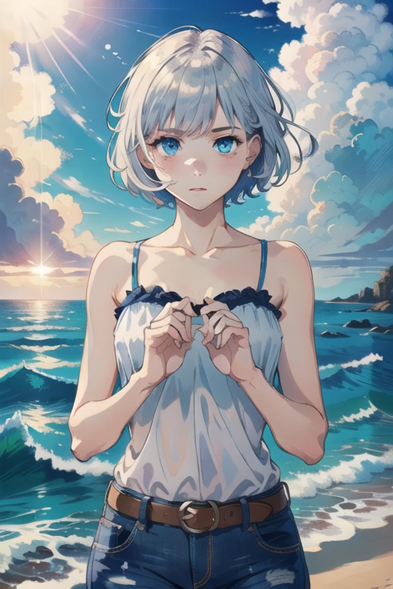
"BY THE GODS NO!!"
Fortunately, we have a couple of tools at our disposal to mitigate hands. The first one I've sneakily covered already!
1.Remove hands from the equation!
Easy right? Just have the hands out of frame. Not so easy for all types of images you want to generate, but certainly an option.
"hang on mate, I keep prompting and these bloody hands keep popping up all over the place, it's killing my vibe! I even put hands in the Negative prompt"
That is certainly one way to help. However, you need to give the computer an incentive to show no hands! For example, we can explicitly state where the arms/hands are in an image. So let's replace hands in our unholy example above with some other more useful terms:
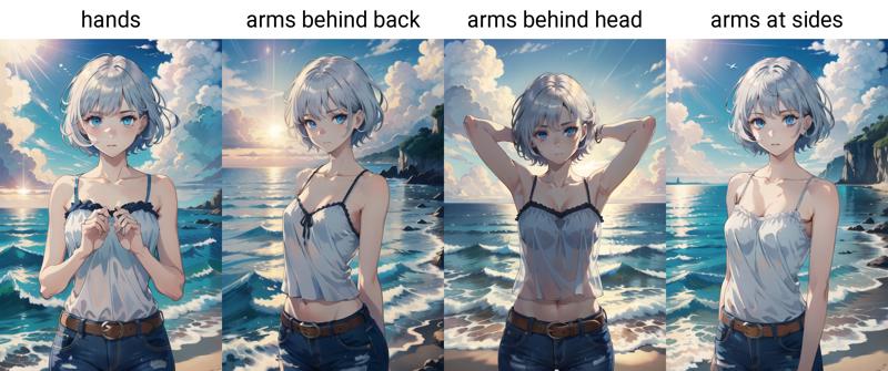
Nice, and you may have noticed that the explicit statement of poses adds to the composition itself So that's a two-for-one :)
The second way prompting can help is by stating what the hands are doing. Now for whatever reason, I have no idea why, certain hand poses are more reliable than others, like for example waving. So let's add waving after hands and see what happens:
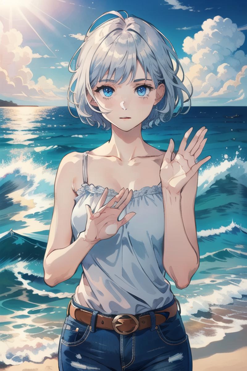
Not perfect, last I looked I didn't have that many digits on my hand, but much better than without wave! Other ones I've found to be reliable are:
hands on hips
hands in pockets (only if the character HAS pockets)
crossed arms (can give bad results on the arms)
Playing around and swapping out waving gives these examples, not too bad ;)

Again, adding style/composition and dealing with hands in a two-for-one move!
2.Use TIs to help!
We've already touched on this before in section 3. Using the bad-hands-5 TI (or another one) in the negative prompt can help, although I'm convinced (through my own experience, take it with a grain of salt) that higher weights of "bad hand" TIs don't help... Let's take our waving example and play with it, to see if we can make better hands.
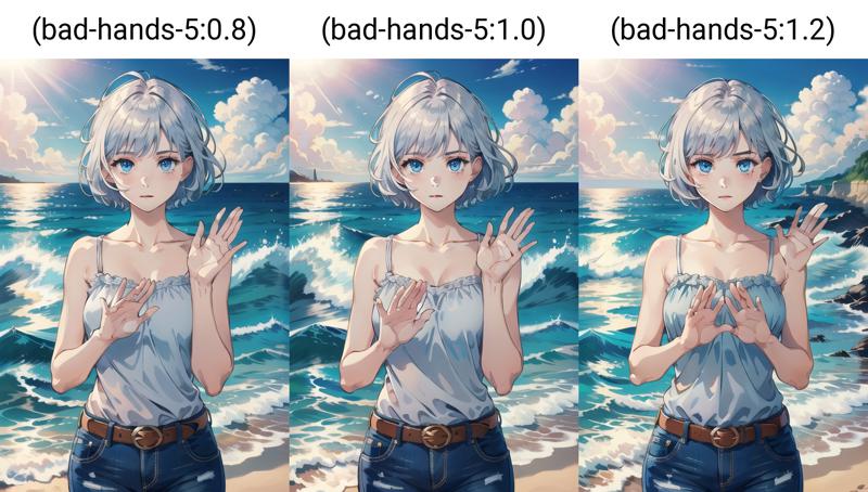
We see here that, like with all weights, higher is not always better. You can spend hours tweaking the weight of this TI even going higher than 1.3 and finally manage to get wonderful hands, if so, congrats! If not, don't worry we aren't all so lucky, we can always mitigate using the former method, or we can try lots of different Seeds to get something we are happy with.
Anyway moving on, I'm quite happy with the hands in pockets! so I'll add it to our growing prompt and we can remove the hands by themselves, as I predict the computer will get confused :P
Let's add a light smile and also crank up the generation Steps to 30 as I feel 20 Steps is starting to lose some detail.
Our Prompt:
masterpiece, best quality, illustration, volumetric lighting, symmetry, 1girl, upper body, looking at viewer, light smile, blue eyes, silver hair, short hair, camisole, jeans, belt, hands, hands in pockets, sunlight, ocean, beautiful cloudy sky

Nice, I think this deserves a Hires. fix using our default settings:

Looking great so far ^^
"yeah yeah great, I see you've got a nice boooring character, but I see Prompts with like thousands of words in them on super amazing images online, why you only got like 20? care to comment?"
Yeah I hear you, you can get really amazing stuff out of Checkpoints with absolutely tons of prompt elements, but it's actually not required!
In my experience, with great Checkpoints, you can get pretty decent stuff with low to medium amounts of elements in the Prompt and Negative prompt fields.
Remember that all the prompt elements need to work together in harmony, conflicting elements can lead to more trouble in the long run! The computer and the Checkpoint are your allies in this endeavor, you gotta work with them to get what you want!
Section 4 Generation Info
Prompt:
masterpiece, best quality, illustration, volumetric lighting, symmetry, 1girl, upper body, looking at viewer, light smile, blue eyes, silver hair, short hair, camisole, jeans, belt, hands in pockets, sunlight, ocean, beautiful cloudy sky
Negative prompt:
EasyNegative, bad-artist, (sketch:1.2), (bad-hands-5:0.8), (realistic, lips, nose, tooth:1.1)
Steps: increased to 30
Exercises:
Have a play around with other compositions, framing and "camera angles", you can even try to make it landscape by making the width 768px and the height 512px! See what happens beyond the bounds of 3:2 aspect ratios!
Change the pose to help with hands by tweaking the prompt, remember, both order and content will change it. See what works for you!
Go crazy and reign in control of the hands with different bad hand TIs!
Now, when ready let's have a look at a longer more complex Prompt and how to wield it
5. BREAK And CLIP Me Bro
You probably haven't thought much about that number to the top right of the Prompt screen.

Again, sorry for the computer talk, but how the text in your Prompt field turns into 1s and 0s the computer understands is complex, and it's done through something called CLIP, which stands for Crusty Lemons In Pineapples. Not really, but we all know we aren't remembering what it stands for, unless you read that article I linked to at the start. ^^
Anyway, very very very simply, a text item in the Prompt will add a certain number of Embeddings (the TIs are like Embeddings in raw format) to the computer which is how it interprets what's written and subsequently diffuses cool stuff.
In the webui, you handle all your Embeddings in chunks of 75, hence (54/75), if I add more text to make it go over that, it will automatically add another chunk of 75 and then somehow through the magic of computers try to mold the two together to get 1 output.
What does this mean for us mortals?
The more items in the prompt, the more you run the risk of having two of these chunks colliding. I'll try to show an example, don't worry you don't have to edit the Prompt for this bit.
I'll add to our existing prompt in a goofy example:
masterpiece, best quality, illustration, volumetric lighting, highres, 4k UHT wallpaper, photo shoot, backlighting, symmetry, 1girl, upper body, looking at viewer, light smile, blue eyes, silver hair, short hair, camisole, jeans, belt, hands in pockets, sunlight, ocean, beautiful cloudy sky, waves, palm tree
This brings it up to (74/75), an almost full house. Now we get this:

Cool, looks backlit and with some palm trees, now let's add a comma between illustration and volumetric lighting, so it reads like this
illustration, , volumetric lighting,
This adds a blank embedding so won't change the image much, but we're at (75/75):

Ok let's do it again:
illustration, , , volumetric lighting
and go from (75/75) to (77/150)! How does the image change?

Quite a bit actually! It's now trying to merge two separate chunks of Embeddings! In the right place, this merge of chunks can actually be a good thing or seamless depending on when it happens. However, we want to use it to our advantage!
"bro............ I'm not typing in commas to get this s**t to 75 on purpose................"
I'm glad you brought that up, this is where the BREAK comes in handy :)
We will need to change our original Prompt, so let's get our baseline Prompt from the last section ready, without all the extra fluff (just copy-paste this one):
masterpiece, best quality, illustration, volumetric lighting, symmetry, 1girl, upper body, looking at viewer, light smile, blue eyes, silver hair, short hair, camisole, jeans, belt, hands in pockets, sunlight, ocean, beautiful cloudy sky
Ok so, where to begin... We want distinct elements, so elements that don't really have much direct interaction, to be separated. Much like how we ordered elements by "theme"
So let's start with the quality statements, they're going to be in the first chunk:
masterpiece, best quality, illustration, volumetric lighting, symmetry,
And our character and framing can safely be in the 1st chunk too:
1girl, upper body, looking at viewer, light smile, blue eyes, silver hair, short hair, camisole, jeans, belt, hands in pockets,
Now, the last bits of text just define the background and extra fluff, so why not just shove them into a different chunk? so we write it all like this:
masterpiece, best quality, illustration, volumetric lighting, symmetry, 1girl, upper body, looking at viewer, light smile, blue eyes, silver hair, short hair, camisole, jeans, belt, hands in pockets BREAK
sunlight, ocean, beautiful cloudy sky
Note, there is no comma after hands in pockets and I've added an extra line to keep things neat after the BREAK (you can keep it to a one-line gap not a two-lines gap if you're copy-pasting). Your counter should now read (82/150), as we have two chunks (75+75) separated by the BREAK. And the image should look something like this:

Not much different than before right? Correct, and that's actually a good sign that we've BREAK'd well. We don't want to disturb the whole image! Now we have two chunks to play around with, let's add some more prompt elements in the latter chunk to get the background more detailed!
First I want a nice sunset, the sun is behind the character so we add backlighting, to make it more appropriately lit. We want there to be "warm" colors (orange-y hues) hence, warm color palette, and then finally some extra background details with beach & waves, palm tree, seagull.
This gives us:
masterpiece, best quality, illustration, volumetric lighting, symmetry, 1girl, upper body, looking at viewer, light smile, blue eyes, silver hair, short hair, camisole, jeans, belt, hands in pockets BREAK
sunset, sunlight, backlighting, warm color palette, ocean, beach, beautiful cloudy sky, waves, palm tree, seagull
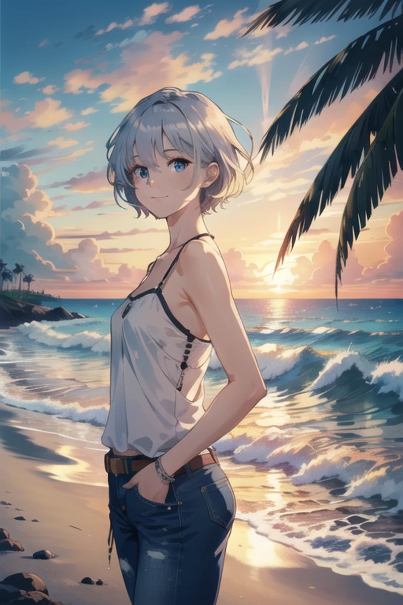
Cool, but, we've kinda messed up the character & framing. Let's try and give the character more elements so the computer will prioritize them more, while also keeping our existing composition!
With the BREAK we've got more room to express ourselves now we've separated out the background stuff! You'll excuse me as I apply my own personal choices to the character.
masterpiece, best quality, illustration, volumetric lighting, symmetry, 1girl, shiny skin, upper body, looking at viewer, light smile, blue eyes, glasses, silver hair, short hair, camisole, jeans, belt, thick thighs, hands in pockets BREAK
sunset, sunlight, backlighting, warm color palette, ocean, beach, beautiful cloudy sky, waves, palm tree, seagull
In all seriousness, adding the thighs is actually a double win, as now I've properly cemented the "cowboy shot" composition and added more style to the character.
"you put thick thighs bro, not just thighs"
Aaaaaanyway, here's what we get out:
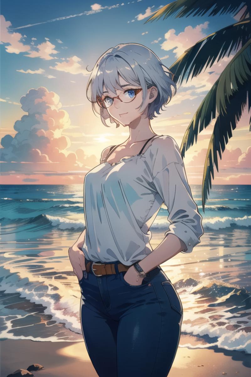
"sweet, we're getting somewhere bro, but... y'know the face is kinda melting right?"
With more text and elements the computer is getting a little bit stressed with all the choices we're forcing it to make!
So in this regard we can ease off the CFG scale, which stands for Cranky Fox Gourmet scale (not really, it's described here).
"bruuuuh, I'm not reading math"
Essentially: the CFG is how much we force the Prompt to the computer, a lower number means the computer has more freedom, and the higher, the more it is forced to accommodate all our Prompt.
Even more essentially: more elements in our Prompt, means we need to let the computer have more freedom, so it'll be less stressed and make the face less "melty". I'll let you see how it affects the image here:

Looks like CFG 5 is actually pretty good for now! Too low, and we'll start getting less and less of our Prompt take importance. We'll end up with a faded piece and the details will all start to mold into one another!
Aside from CFG, you can also see that there's dissonance with elements in our Prompt like shiny skin and the camisole, It cannot decide whether to put sleeves on or not. We could fix it in a couple of ways:
Explicitly state bare shoulders or sleeveless, just to give the computer guidance.
Change clothing to a more defined type, for example, replace camisole with a t-shirt, or a turtleneck
I'm going to opt to change the camisole out for a distinct no-sleeve top: tank top, just to put the sleeve problem to rest.
masterpiece, best quality, illustration, volumetric lighting, symmetry, 1girl, shiny skin, upper body, looking at viewer, light smile, blue eyes, glasses, silver hair, short hair, camisole, tank top, jeans, belt, thick thighs, hands in pockets BREAK
sunset, sunlight, backlighting, warm color palette, ocean, beach, beautiful cloudy sky, waves, palm tree, seagull
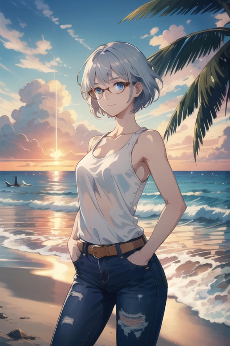
Looks like that fixed it pretty well! And the upscaled version using our default Hires. fix:
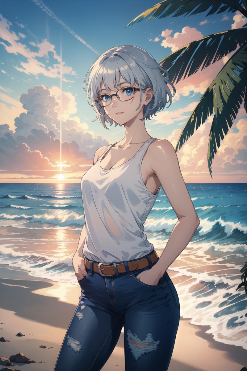
This is the Hires. fix version without the BREAK present:

Different, but neither one is better! It depends on what you're going for. With BREAK we have more control of larger more unwieldy Prompts and where they.. er.. break their chunks? Without BREAK we can prompt below or around 75 confidently, just be aware that if your image drastically changes past that 75 mark, you're probably merging those embedding chunks in an unhelpful place! The more ya know! ^^
As you're beginning to notice, it's an endless pit as to how much you can tweak away at this Prompt. But this is part of the FUN :) I hope someone is having fun :P
Section 5 Generation Info
Prompt:
masterpiece, best quality, illustration, volumetric lighting, symmetry, 1girl, shiny skin, upper body, looking at viewer, light smile, blue eyes, glasses, silver hair, short hair, tank top, jeans, belt, thick thighs, hands in pockets BREAK
sunset, sunlight, backlighting, warm color palette, ocean, beach, beautiful cloudy sky, waves, palm tree, seagull
Negative prompt:
EasyNegative, bad-artist, (sketch:1.2), (bad-hands-5:0.8), (realistic, lips, nose, tooth:1.1)
Exercises:
Now you know how to BREAK, have extra fun by BREAKing your Prompt up! See if you can separate elements out that go together and try it out.
Go crazy and add as many BREAKs in as you want, and watch your computer cry as it tries to merge all those chunks of 75 together XD
You have two BREAK chunks, (X/150) what happens if the first one goes above 75 Embeddings? How does it affect the image?
Try making as detailed a piece as you want, but keeping it below 75 Embeddings! Be thrifty with your text!
Now for the final push with LoRAs! We're almost done, I swear....
6. LoRA Me Bro
LoRAs are another type of model, often referred to as "mini-checkpoints". It stands for Lazy organized Radical Antelopes (no not really, it explains what they are here :P).
They go into the Lora folder in Models of your webui directory (See Logistics).
You will see a ton of LoRAs on Civit designed to generate distinct characters from popular cartoons, anime or even real-life people (ethics be damned) (Not any longer as of May 22 2025).
"FINALLY BRO! Can I find my favorite anime waifu on here?"
Most probably yes... just search for LoRAs or their name on the main page. However that's outside the scope of this guide! You do you XD
Aside from characters, however, they are actually very useful for guiding certain aspects of the generation process.
A few examples:
Tired of too little or too much detail in a piece? BAM there's a LoRA for that (by Lykon)
Tired of your images always looking like bright midday pieces? BAM there's a LoRA for that (by XpucT)
Tired of a lack of tentacles? BAM there's a surprising amount of LoRA for that! (but here's a SFW one XD by konyconi)
Now because LoRAs are a bit like "mini-checkpoints", you have to make sure they're going to gel with whatever actual Checkpoint you're using. I'm afraid you just gotta go for trial and error.
We're going to use some general stylistic LoRAs which work well with a lot of Checkpoints to get a tiny bit more out of our image and deliver the final blow! In fact we'll look at the first two of the examples I listed. Not the tentacles :P
First, we'll have a look at the add_detail. Let's take our prompt, complete with the BREAK:
masterpiece, best quality, illustration, volumetric lighting, symmetry, 1girl, shiny skin, upper body, looking at viewer, light smile, blue eyes, glasses, silver hair, short hair, tank top, jeans, belt, thick thighs, hands in pockets BREAK
sunset, sunlight, backlighting, warm color palette, ocean, beach, beautiful cloudy sky, waves, palm tree, seagull
If the add_detail LoRA is correctly placed in the Lora folder then you should see the option to select it from the LoRA tab of ExtraNetworks (like with TIs).
It will append to the Prompt when you click on it so you rarely need to type it in directly:
<lora:add_detail:1>
The LoRAs are weighted with that number on the end.
"more numbers :(("
It's ok, most pages for LoRAs have tips for their use! This one is special as it can go from an ideal range of -2 to +2, most LoRAs don't want or need to go below weight 0. The negative numbers subtract detail and positive numbers add it. Let's give it a go!
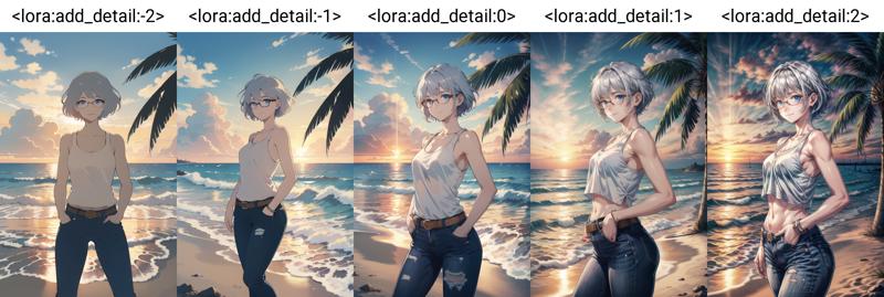
Cool, although the extremes are a little strange by my standards. But hey, maybe that's what you've been looking for in your art!
Now I'm actually happy with no detail added or subtracted, so we won't add this LoRA but I feel the picture needs a little je ne sais quoi. So I'll add a few more elements:
I'm going to change the expression to something else: ";)"
We're also going to add some jewellery for an added flair and tell the computer to enhance certain regions. Hey, I'm only human :P
masterpiece, best quality, illustration, volumetric lighting, symmetry, 1girl, shiny skin, upper body, looking at viewer, light smile, seductive smile, raised eyebrow, bracelet, necklace, single earring, blue eyes, glasses, silver hair, short hair, large breasts, cleavage, tank top, jeans, belt, thick thighs, hands in pockets BREAK
sunset, sunlight, backlighting, warm color palette, ocean, beach, beautiful cloudy sky, waves, palm tree, seagull
This is good, but now I've added in more jank, especially for the clothes and the accessories. So let's alleviate some pressure on the computer and take things that aren't important for the body or pose of the character and put them in another chunk. That means yet another BREAK, but what do we put in it? What's not important to the body or pose?
This is where we get a bit abstract I'm afraid. Does clothing affect the body? The computer seems to think so. Hair and eyes also are pretty linked, so what's left?
Well, accessories and facial expressions. I will highlight elements that have changed positions:
masterpiece, best quality, illustration, volumetric lighting, symmetry, 1girl, shiny skin, upper body, blue eyes, glasses, silver hair, short hair, large breasts, cleavage, tank top, jeans, hands in pockets, belt, thick thighs BREAK
looking at viewer, seductive smile, raised eyebrow, bracelet, necklace, single earring BREAK
sunset, sunlight, backlighting, warm color palette, ocean, beach, beautiful cloudy sky, waves, palm tree, seagull

Much better :) that fixed the problem with the top, the face and the jewellery, although that pesky hand is back despite me ordering it up in the priority to be in the pocket!
I don't feel like battling it at the moment, we can always tweak more later.
I'm perfectly happy with the framing of the character and the design now!
All that's needed is a touch-up to the background. I would like this to be a bit of a dimmer scene, with the sunset feeling like a sunset.
So! we'll move on to the next LoRA <lora:LowRA:1> (ha ha)
This is amazing, as Checkpoints often struggle with low lighting, there's even a DSM Checkpoint specifically designed with low lighting in mind! But we're gonna cheat and use the LoRA instead. So we will add it at the end:
masterpiece, best quality, illustration, volumetric lighting, symmetry, 1girl, shiny skin, upper body, blue eyes, glasses, silver hair, short hair, large breasts, cleavage, tank top, jeans, hands in pockets, belt, thick thighs BREAK
looking at viewer, seductive smile, raised eyebrow, bracelet, necklace, single earring BREAK
sunset, sunlight, backlighting, warm color palette, ocean, beach, beautiful cloudy sky, waves, palm tree, seagull, <lora:LowRA:1>
Now this LoRA suggests weights between 0 to 1, but there's likely a sweet spot somewhere around 0.4, let's play around and see what we get!

As suspected, at higher weights it starts to make everything darker, even the clothes! I like the 0.2 value, as we'll further tease out darkness with some more prompt elements. So we'll go with 0.2!
Editor's note: LowRA can also go into negative numbers to give lighter dreamier pieces!
Almost there :) We will add dark theme for a bit more darkness, distant lights for a few dots of color on the horizon, reflections for the sunlight on the water to look a little bit better and finally starry sky (but weighted down) so we don't get a full night sky!
My only regret is this silly seagull didn't show up, I should remove it, but my pride prevents me :(
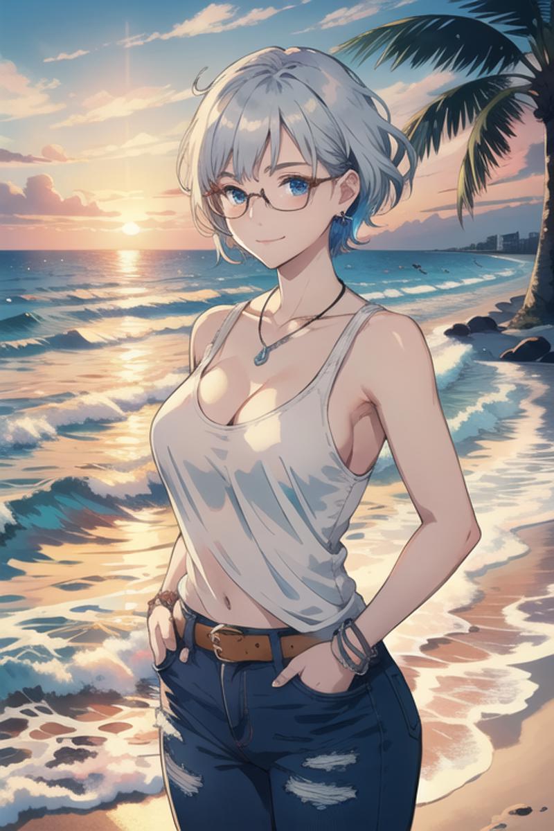
Our FINAL Prompt:
masterpiece, best quality, illustration, volumetric lighting, symmetry, 1girl, shiny skin, upper body, blue eyes, glasses, silver hair, short hair, large breasts, cleavage, tank top, jeans, (hands in pockets:1.0), belt, thick thighs BREAK
looking at viewer, seductive smile, raised eyebrow, bracelet, necklace, single earring BREAK
sunset, sunlight, backlighting, warm color palette, ocean, beach, beautiful cloudy sky, waves, palm tree, seagull, dark theme, distant lights, reflections, (starry sky:0.9), <lora:LowRA:0.2>
Let's go straight to the Hires. fix :)

Nice!
That hand did come back to bite us in the ass, but it's nothing more tweaking can't fix or if all else fails: manual fixing using another software or inpainting (but that's for another day).
I will end it here, but that doesn't mean this piece is "finished". You can always go further if you want. As I said, Prompt tweaking is a bottomless pit! A big struggle is knowing when to stop! For that, you will just have to defer to your instinct and your artistic taste, which are skills I sadly cannot teach!
I will stop here, as my instinct tells me I'm boring people now, it's a good point to end this guide on, and also more importantly, I need a nap!
Section 6 (Final) Generation Info
Final Image In glorious high detail
Prompt:
masterpiece, best quality, illustration, volumetric lighting, symmetry, 1girl, shiny skin, upper body, blue eyes, glasses, silver hair, short hair, large breasts, cleavage, tank top, jeans, (hands in pockets:1.0), belt, thick thighs BREAK
looking at viewer, seductive smile, raised eyebrow, bracelet, necklace, single earring BREAK
sunset, sunlight, backlighting, warm color palette, ocean, beach, beautiful cloudy sky, waves, palm tree, seagull, dark theme, distant lights, reflections, (starry sky:0.9), <lora:LowRA:0.2>
Negative prompt:
EasyNegative, bad-artist, (sketch:1.2), (bad-hands-5:0.8), (realistic, lips, nose, tooth:1.1)
Steps: 20
Sampler: Euler a
CFG scale: 7
Size: 512x768
Seed: 4222258046
Checkpoint: darkSushiMixMix_brighter
Clip skip: 2
SD VAE: orangemix.vae
Hires. Fix parameters:
Upscaler: R-ESRGAN 4x+
0.5 Denoising
2x Upscale
20 Hires Steps
TIs Used:
EasyNegative
bad-artist
bad-hands-5
LoRAs Used:
LowRA
Exercises
You now have access to LoRAs, the world is your oyster! Go make that character you've always wanted to make fan art of. Or just explore different artistic styles. Be aware that some other LoRAs need "keywords" to activate so be sure to add them to your Prompt.
Go crazy and crank up a LoRA to weight 10, or turn one to -1, and see what happens!
Take our final image and try and make it to your artistic taste!
End
Thank you for reading this far, you're truly awesome! I hope you've learned something about the process of txt2img generation, or at the very least had a bit of fun along the way.
If you have any questions, hit up the comments, I'll try my best to answer! I'm sure I've made plenty of mistakes here and there, let me know (please be gentle), and I'll edit them!
I wish you many successful generations, and may your hands always be flawless.
Peace,
XV
