This is the third part in a series:
Simple Composition Tricks to Instantly Improve AI Images with Prompts
More Simple Composition Tricks to Instantly Improve AI Images Using Prompts
Intermediate Composition Tricks to Instantly Improve AI Images Using Prompts
Intermediate Emotional & Narrative Composition Techniques for AI Images Using Prompts
Simple Composition Tricks to Instantly Improve AI Images with Prompts: Camera Angles Edition
Simple Composition Tricks to Instantly Improve AI Images with Prompts: Perspective Edition
Simple Composition Tricks to Instantly Improve AI Images with Prompts: Color & Mood Edition
Simple Composition Tricks to Instantly Improve AI Images with Prompts – Light & Shadow Edition
Simple Composition Tricks to Instantly Improve AI Images with Prompts: Texture & Detail Edition
Now that you’ve mastered basic framing tricks, it’s time to explore some next-level composition techniques. These tricks come from photography and art, and you can work them into your text prompts to get more dynamic AI-generated images. The best part is, you don’t need any special tools or add-ons – just clever wording in your prompts. We’ll cover ten advanced composition methods and show how to use them with Hi-Dream (Full, Dev, Fast, Mixes), Flux (Dev, Schnell, Mixes), and Stability AI models (SD 1.5, 2.1, SDXL, SD3). Each section below explains a technique in plain language, gives example prompts you can try, and offers tips for getting great results. Let’s dive in!
Implied Motion & Direction (Lead Room / Subject Facing Space)
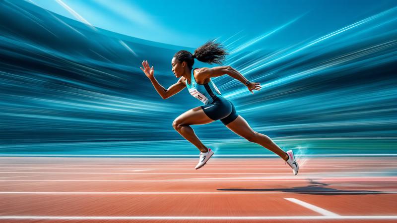
What it is: Implied motion is about giving the feeling that something in your image is moving or has a direction. A classic trick is using lead room (also called nose room or looking space). Lead room means leaving empty space in front of a moving subject or in the direction the subject is looking 1 . This empty space acts like a runway for the subject – it tells our eyes that the subject has room to move into, which makes still images feel more dynamic. Without it, a moving subject can look “cut off” or static.
Prompt example: “A sprinter bursting off the starting blocks, motion blur trailing behind her, plenty of open track ahead”. In this prompt, phrases like “motion blur trailing behind her” and “open track ahead” suggest both movement and direction. The models (Hi-Dream, Flux, Stable Diffusion) understand terms like motion blur, trail, or dynamic pose, which encourages them to render the runner with streaked background or limbs to imply speed. Including the “open track ahead” hints at lead room – the AI will likely compose the image with extra space in front of the runner so you sense where she’s headed. This works across Hi-Dream and Stability models because they’ve been trained on photography concepts of motion; even the Flux models, which are extremely fast, pick up on words like “blur” or “speed lines” to convey movement.
Tips: To really sell motion in prompts, use action verbs and adjectives: running, flying, racing, streaking. Combine them with cinematic terms like “motion-blur”, “long exposure”, or “panning shot”. Hi-Dream and SDXL tend to handle subtle motion cues well (e.g. flowing hair or dust trails). If a model’s output still looks too static, try emphasizing the effect (e.g. “dramatic motion blur” or “wind-swept background”). Also, ensure you describe something ahead of the subject or the direction they face – for example, “a cyclist speeding to the right, wide open road in front” – so the AI leaves that lead room for realism 1 .
Visual Flow & Eye Movement (Eye Paths Through Scene)
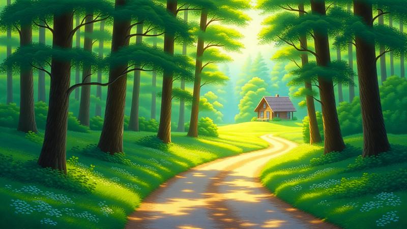
What it is: Visual flow is how the viewer’s eye naturally travels through an image . A good composition will guide the eye along certain paths – maybe a winding road, a fence, or a beam of light – toward the main subject or through a sequence of points. Think of it like giving the viewer’s gaze a roadmap. Techniques to create visual flow include leading lines (like a path or river that leads into the scene), S-curves or other curves, and layering elements from front to back. The goal is to avoid a static image where the eye stops dead; instead, you want the eye to wander meaningfully.
Prompt example: “A quiet forest path curving through sunlit trees, leading the eye toward a quaint cabin in the distance”. Here we explicitly mention a “path curving…leading the eye toward” the subject. Stable Diffusion and Hi-Dream will pick up on the “path” and likely draw a trail or road that winds into the scene – a natural leading line. The phrase “leading the eye” is more for us, but including a distinct object in the distance (the cabin) tells the AI that the path should connect foreground to that background element. Flux models, despite their speedy generation, also respond to clear structural elements like a road or river. By describing the path as curving through sunlit trees, we not only get a nice line but also a play of light that attracts the viewer’s eye through the frame. Visual flow can also be achieved by repeating shapes or a progression of elements; for instance, “a trail of footsteps in the snow, zigzagging towards the horizon” would create an eye path. All these models are trained on plenty of landscapes and scenes where such composition is common, so they tend to honor those cues.
Tips: When prompting for visual flow, think of elements that naturally guide the eye: roads, rivers, bridges, leading lines of architecture, or a string of objects. You can literally use the phrase “leading lines” in Stable Diffusion-style models (they sometimes understand it), but it’s often better to describe the actual line: e.g. “railway tracks converging into the distance” or “a row of lanterns diminishing in size, drawing attention inward”. Hi-Dream and SDXL are quite good at maintaining perspective, so mentioning a vanishing point (like “towards the horizon”) can reinforce depth. Also, consider layers: “receding layers of mountain ridges” or “overlapping city rooftops” naturally create a flow into the picture. The key is to make sure your prompt has elements at the foreground, middle, and background that connect or align – that gives the AI a blueprint for an eye path 2 .
Juxtaposition (Contrasting Subjects or Concepts)
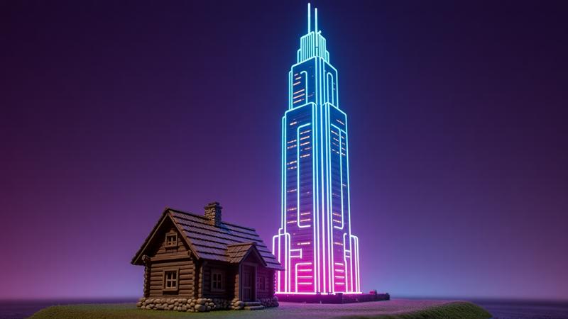
What it is: Juxtaposition means placing two very different things together to highlight their contrast . In composition, it’s a powerful way to make an image more interesting or tell a story. These contrasts can be in size (tiny vs huge), age (old vs new), texture (smooth vs rough), concept (technology vs nature), and so on. By showing opposites side by side, each element stands out more. This technique doesn’t require any fancy camera work – just the idea to put those elements in the same frame.
Prompt example: “A futuristic neon skyscraper towering behind a tiny old cottage made of wood and stone”. This prompt explicitly sets up two contrasting subjects: a modern futuristic skyscraper and a tiny old cottage. The AI will understand that one thing is extremely tall, new, and bright, while the other is small, old-fashioned, and earthy. By mentioning them together (“towering behind”) we guide the model to compose the scene with the cottage in front and the skyscraper in the background – a classic juxtaposition of scale and era. Stable Diffusion and Hi-Dream should both capture the contrast clearly because they recognize terms like futuristic, neon skyscraper vs old cottage. Flux models also will follow these descriptive cues and are less likely to mash them together because we’ve been clear about each element’s identity and positioning. The result is an image where each element emphasizes the other: the cottage looks older and smaller against the massive modern building, and the skyscraper looks even more high-tech next to the humble cottage.
Another example: “A delicate pink flower growing through a crack in a rusty steel machine”. Here we juxtapose delicate vs. industrial. The prompt describes contrasting textures and ideas (organic life vs metal, soft vs hard). Models like SD 1.5 or 2.1 handle this well – they’ll often show the flower very prominently against the machinery, playing up the contrast. Hi-Dream and Flux, with their strong prompt adherence, will also try hard to include both elements distinctly. By using strong adjectives (delicate, rusty) and clear nouns (flower, machine), we ensure the AI knows we want both in the image.
Tips: To use juxtaposition in prompts, clearly state both elements and consider adding an adjective to emphasize their difference (e.g. “tiny,” “massive,” “ancient,” “ultra-modern,” “fragile,” “monolithic”). If the model sometimes misses one of the two, try structuring your prompt as “X and Y” or “X next to Y” so it knows both must appear. For instance, “an eagle beside a mouse” or “a luxury sports car parked by a horse-drawn carriage”. All the targeted models can handle multiple subjects, but SDXL and HiDream in particular are good at keeping even small details (like the mouse) when clearly specified. If using Stable Diffusion 1.5 or older, you might occasionally get weird merges (like a single creature that’s half eagle, half mouse) – in those cases, be more verbose: “a giant eagle standing next to a tiny mouse, two distinct animals”. In general, juxtaposition is about concept clarity: make sure your prompt paints a clear picture of both elements and their contrast 3 .
Color Balance & Harmony (Simple Color Theory & Mood Control)
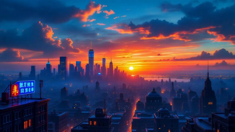
What it is: Color composition isn’t just about picking random colors – it’s about balancing colors to set a mood or make the image pop. Two key ideas from color theory are complementary colors and analogous colors. Complementary colors are opposites on the color wheel (for example, blue and orange, red and green, purple and yellow). When used together, they create strong contrast and vibrancy – each color makes the other stand out more 4 . Analogous colors are neighbors on the color wheel (like blue with green, or red with orange). Using analogous colors gives a more harmonious, unified feel, with a more subtle contrast 5 . You can also control color mood by sticking to a certain palette: warm colors (reds, oranges, yellows) for an energetic or cozy feel, cool colors (blues, greens) for calm or somber scenes, etc.
Prompt example: “A sunset cityscape in blue and orange tones, neon signs glowing blue while the sky burns orange”. Here we deliberately specify blue and orange – a classic complementary pair. Stable Diffusion and other models recognize color names well, so this prompt will likely yield a city scene with that dramatic orange-blue contrast (common in cinematic visuals). The prompt even doubles down by assigning where the colors go (neon signs = blue, sky = orange) to ensure the mix. The complementary contrast makes the image vibrant: the blues will feel more electric against the warm orange sky, and vice versa 6 . Hi-Dream and Flux both handle colors nicely too; Hi-Dream is known for rich, clean color rendering, so it will lean into those blues and oranges without muddying them. Flux’s rapid generation doesn’t compromise color understanding – it should still balance the two as instructed.
Another example: “A tranquil garden bathed in analogous hues of green and teal”. By mentioning analogous hues of green and teal, we’re telling the AI to use colors that are close together. This results in a harmonious, soothing color scheme. The model will likely produce lots of lush greenery with blue-green water or sky – overall unified and calm 5 . This is great for setting a specific mood (in this case, peaceful). You don’t always need to use the word “analogous” (the AI might not explicitly know it); instead you can list the colors or say “tones of green and teal” or “shades of blue and purple” for a cohesive palette. The newer SDXL model and Hi-Dream are particularly good at sticking to a defined palette when you specify it, whereas older SD might introduce extra colors unless you focus the prompt (you could add “monochromatic” or “limited color palette” if needed).
Tips: When controlling color via prompts, naming specific colors is the simplest approach (“a red and gold scene”, “lit by soft purple and pink lights”). For complementary contrast, try pairs like blue & orange, red & green, purple & yellow – these naturally pop when rendered 6 . For harmony, use words like “tonal,” “monochromatic,” “pastel palette,” or stick to adjacent colors (e.g. “shades of blue and green”). You can even reference color moods: “cyberpunk scene with neon magenta and cyan” (highenergy complementary vibe) or “autumn landscape in warm oranges and browns” (analogous warm tones for a cozy feel). All the models mentioned will follow color instructions well; however, be aware that Stable Diffusion 1.5 might sometimes add unwanted colors if, say, the subject is something known (it might add a blue sky by default). If that happens, explicitly say “blue sky” or “white sky” or whatever you want, to guide it. Lastly, consider adding lighting color words, like “bathed in golden light” or “under a cool blue glow”, which help set an overall color mood.
Foreground Interest & Framing Elements (Depth via Foreground Anchors)
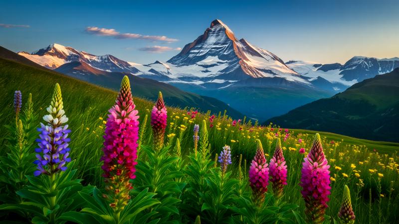
What it is: One way to make images feel more three-dimensional and engaging is to include something in the foreground – an element closer to the “camera” – while your main subject might be farther back. This is called adding foreground interest or a framing element. A well-placed foreground element (like overhanging tree branches, a person or object up close, etc.) draws the viewer’s gaze into the scene and adds a sense of depth 7 . It’s as if you’re giving the viewer something to look past or through before reaching the main subject. This layering of foreground, middle, background creates a richer composition. Sometimes, foreground elements also act as a frame around the subject (for example, shooting through a doorway or between two trees).
Prompt example: “A majestic mountain in the distance, with wildflowers in sharp focus in the foreground”. In this prompt, the mountain is our main subject, but we’ve explicitly added wildflowers in the foreground. Stable Diffusion and others will likely produce an image where colorful flowers are big and prominent at the bottom or sides, with the mountain smaller in the background. The effect is that the flowers provide depth – you can almost sense the distance between them and the mountain. This also makes the image more interesting than just “a mountain” by itself. The phrase “in sharp focus in the foreground” nudges the AI to make those flowers detailed, which is a hint at using depth of field (some models might even blur the background a bit to emphasize the depth, imitating a camera focus effect). Hi-Dream models tend to handle this nicely due to their high parameter count – they often produce clear, detailed foregrounds and still keep the background subject recognizable. Flux is very fast but still will understand “foreground” as meaning some element is closer; it might not perfectly do camera focus blur, but it will place elements accordingly.
Another way to use foreground framing: “an old oak tree’s branches arching at the top of the image, framing a cottage below”. This describes a natural frame – the dark branches and leaves occupy the top foreground, acting like a curtain, and the cottage is seen under them. The AI will position the tree limbs in front, cottage further away. This makes the viewer feel like they’re peeking into the scene. All the target models can incorporate such cues; if one doesn’t do it the first time, try reinforcing: e.g., “branches arching in the foreground” or even “overhanging”. Generally, these models know common compositions (many landscape photos have something in the foreground by design), so they respond well to such prompts.
Tips: To add foreground interest, explicitly mention an object or element and pair it with words like foreground, in front, framing, up close. For instance, “in the foreground, red autumn leaves blur softly” or “a pair of binoculars lying at the bottom of the image as if close to the viewer”. Even simply adding adjectives like “foreground” or “background” to elements in the prompt helps the AI sort out what goes where. SDXL and Hi-Dream are quite adept at multi-plane images and will often even simulate depth of field if you imply it (e.g. “foreground blur”). If using older Stable Diffusion and you don’t get depth, you can simulate it with words like “tilt-shift”, “bokeh”, or “macro photo” for strong foreground focus. However, since we aren’t using special tools, the safest is to just describe the scene’s layers clearly. Remember, your foreground element shouldn’t steal the show completely (unless it is the subject). It’s there to enhance depth. So if a model keeps centering the foreground item, you might add “…while the [main subject] stands further back” to balance it. With a bit of trial, you’ll find all these models give richer images when you give them that extra foreground detail 7 .
Scale & Proportion (Size Differences for Drama or Contrast)

What it is: Scale and proportion in composition deal with how big or small elements are relative to each other. By showing scale differences, you can add drama and storytelling to an image 8 . For example, a tiny human figure in a vast landscape immediately gives a sense of how grand and large the environment is. Or placing a giant object next to a normal-sized one creates a surreal contrast. Essentially, you use known size references to make the viewer go “wow, that’s huge!” or “wow, that’s tiny!”. It helps convey distance and three-dimensional space too – an object appearing small in the frame might be very far or just small in life, and including something of known size helps clarify which.
Prompt example: “A lone traveler standing at the foot of an enormous canyon, dwarfed by towering red rock cliffs”. This prompt is crafted to emphasize scale. We have a lone traveler (something presumably humansized) and enormous cliffs. Words like “dwarfed by” and “towering” explicitly tell the AI that the person should look tiny compared to the canyon walls. Stable Diffusion, Hi-Dream, and Flux will all typically oblige – you’ll get a composition with huge canyon walls occupying most of the image and a very small figure of a traveler for scale. This trick of adding a human figure to show scale is common in photography and the models have likely seen it, so they replicate it. The result is a dramatic sense of proportion: the environment feels truly gigantic 9 10 . By using adjectives like lone (to ensure only one small person, not a crowd) and enormous/towering for the cliffs, we make the contrast clear.
Another take: “A child reaches up to touch a giant robot’s hand”. Here, conceptually, we know a child is small and a giant robot is, well, giant. By placing them together (“reaches up to touch”), we ensure the model composes them interacting, which implies the size difference (the child probably only reaches the robot’s hand height). This could create a very touching image as well as clearly communicate scale. All the models should capture the gist: the robot will appear very large next to the kid. If one model makes them closer in size than intended, adding an explicit phrase like “the robot looms over the tiny child” would reinforce it.
Tips: Use comparative phrases in your prompts to nail scale. Words like dwarfed by, towering over, tiny beside, massive, gigantic, minuscule are your friends. Also mention at least one element whose size is universally recognizable (humans, animals, common objects like cars or trees). For instance, instead of saying “a giant mushroom in a field” (giant could be relative), say “a giant mushroom as tall as a house, with a small cottage beneath it” – now the model has a reference. If you want extreme sizes, be explicit: “an ant standing next to a sleeping elephant” or “a spaceship larger than an entire city”. The models handle hyperbole well when clearly instructed. Remember that Hi-Dream and SDXL have a lot of training data and tend to get perspective and scale cues right, but if you’re using Stable Diffusion 2.1 or similar, sometimes adding distance cues can help: e.g. “in the distance a tiny figure” or “foreground close-up of a leaf, huge mountains far behind”. This clarifies what should be big or small by context. Scale and proportion, when done right, will add visual impact – as one photography guide notes, it enhances three-dimensional space and tells a story 8 . So don’t be afraid to exaggerate sizes in your prompt to get that drama.
Framing with Light & Shadow (Lighting as a Compositional Tool)
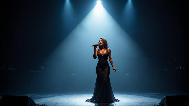
What it is: Not all frames are physical objects – you can also use light and shadow to direct attention in a composition. This means arranging the lighting so that the subject is illuminated or surrounded by darkness/light in a way that “frames” it. For example, a spotlight on your subject against a dark background naturally draws the eye to the lit area. Or shooting a subject in a bright doorway while the foreground is dark creates a frame of shadow around them. Essentially, bright areas and dark areas can themselves form compositional shapes. Photographers often use this technique (think of a person standing in a ray of sunlight in an otherwise dim room – the light acts like a frame). It adds mood (high contrast lighting can be dramatic and moody) and clear focus on the subject 11 .
Prompt example: “A lone singer on stage, illuminated by a single bright spotlight, everything around her receding into darkness”. This prompt explicitly describes a lighting scenario. The single bright spotlight on the singer will make the AI produce an image where the singer is under a beam of light, and we said everything around her receding into darkness, which tells the model the background and surroundings should be dark or not visible. This effectively frames the singer with darkness – your eye goes straight to the bright subject. Stable Diffusion (all versions) does quite well with this kind of theater lighting scenario because it’s very common in imagery. Hi-Dream, which has strong contrast and lighting in its data, will also excel at creating that stark light cone. Flux, being a fast model, might not render super fine light details, but it will still get the concept of a lit figure against dark (especially since we phrased it clearly). We’re using light as a compositional tool: the spotlight is the frame highlighting the subject 11 .
Another example: “Sunlight streams through a window, forming a rectangle of light around the cat curled up on the floor, rest of the room in shadow.” This describes a very visual scene where the light itself (coming through a window) creates a shape – a rectangle – that frames the cat. The cat is in that light patch, making it the focus, while the rest is darker. The prompt provides the geometry (rectangle of light) and contrast (rest in shadow). Models should respond by creating exactly that lighting contrast. If the rectangle isn’t perfect, that’s okay – the idea of light framing will come through as the cat being lit and the surroundings dark. The mention of a window also hints at where light comes from, helping the AI’s logic.
Tips: Think in terms of spotlight and silhouette. If you want the subject bright and surroundings dark, use words like “spotlit,” “isolated in light,” “dark background,” “high contrast lighting.” Conversely, framing with shadow (silhouette style) would be the opposite – subject dark against a bright area (you can prompt that as well: e.g. “silhouette of a tree against a bright dusk sky” – the sky’s light frames the tree). You can even mention chiaroscuro (a term for strong contrast of light and dark in art) – Stable Diffusion knows this word and will give dramatic lighting if you use it. Hi-Dream and SDXL are particularly great at fine lighting nuances; they handle subtle rays and shadows nicely if you describe them (“shafts of light,” “dappled shadows,” etc.). For older models like SD1.5, sometimes you get a fully visible background even if you said “darkness.” To fix that, you could add “black background” or use negative prompts (if allowed) like “no ambient light”, but staying within just the prompt, try reinforcing: “surrounded by darkness,” “only her face lit,” etc. Also, consider color of light: “a warm golden spotlight” vs “a cold blue light outlining the figure” – this adds mood. Using light and shadow as compositional elements not only frames your subject but can imbue the image with a professional, filmic quality. All our models can respond to these cues without extra tools, as long as we clearly state where the light and dark should be.
Overlapping & Layered Subjects (Depth via Occlusion & Overlap)
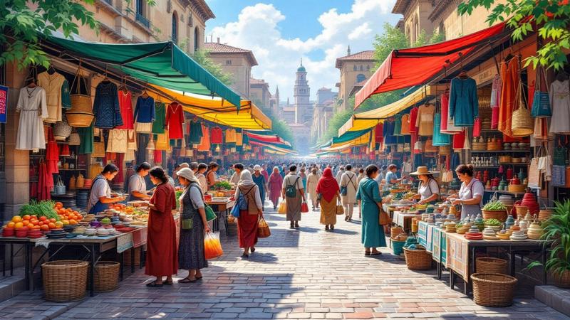
What it is: Overlap is a straightforward depth cue: when one object in an image covers part of another, our brain knows which is front and which is back. Using overlapping and layered subjects means deliberately having elements partially block others. This creates a sense of depth (one thing is closer, another farther) and also can lead the eye through layers 12 . For instance, in a busy street scene, you might have people in the foreground overlapping ones behind, and buildings behind them, etc., giving a rich layered effect. In composition, layering is about having a foreground, middle, background that interact – not just all isolated. Overlapping can also make an image feel more real because in real life, not everything stands side by side evenly; things often obscure others.
Prompt example: “A market scene with lively vendors in the foreground, shoppers behind them, and colorful stalls in the back – elements overlapping naturally for depth.” This is a complex scene description, but even broken down: we mention vendors in the foreground and shoppers behind them. That alone tells the AI that some people should be closer to the “camera” and others a bit further and partially behind the first. By also adding “stalls in the back” we establish a third layer. The phrase “overlapping naturally for depth” might or might not be explicitly understood by the AI, but including it signals that we expect a realistic depth arrangement (and Stable Diffusion might catch the word “depth”). The models will try to populate such a scene with those layers – you might see a vendor up close (maybe you only see them from the waist up because they are cut off by the frame’s edge, which is a form of overlap with the frame itself), then other people partially hidden behind them, etc. Hi-Dream, with its large capacity, handles multi-figure scenes well and usually keeps coherence, so overlapping people should be fine. Flux is more tuned for speed and might simplify the scene, but since we explicitly request layers, it should still include multiple depth planes.
Another example: “Ancient ruins in a jungle, with vines draping over crumbling walls and a tall statue visible behind the foliage”. Here we have vines in front of walls, and a statue behind foliage. This is overlap in a natural setting: vines overlap the walls (so vines are closer), and foliage overlaps parts of the statue (so plants are closer than the statue). This prompt encourages the AI to create layers of architecture and plants. All models will likely do this pretty well, because it’s logically consistent and quite visual. The overlapping vines and foliage give a peek of the statue and walls, which is more intriguing than seeing everything clearly. As a photography article might say, overlapping layers can create depth and a sense of discovery 12 .
Tips: Use words that denote position like in front of, behind, beyond, through. For example, “a bird flying in front of the moon”, “mountains behind the clouds”, or “looking through a crowd”. These practically force an overlap. If an AI tends to make things side by side instead of overlapping, be more explicit: “partially obscured”, “peeking out from behind”. You can also mention layers directly
(SDXL and others do understand simple directives like “layered” sometimes). E.g., “a layered
composition of three mountains, each overlapping the next”. Also, don’t worry if the initial result has some weird merges at overlaps (like two people fused) – usually adding a bit more detail separates them (like specifying different clothing or colors for the subjects can help distinguish overlapping people). Hi-Dream’s strength is keeping fidelity in complex scenes, so leverage that: you can ask for multiple subjects confidently. Overlap also pairs well with foreground interest: something as simple as “shooting past a hand railing in the foreground, focused on the subject beyond” creates a nice overlap effect. All these models were trained on real images where overlap is common, so they inherently know it’s normal – your prompt just needs to point out what overlaps what. The reward is an image that feels more three-dimensional and alive 12 .
Framing Through Reflections or Transparent Surfaces (Glass, Water, Mirrors)
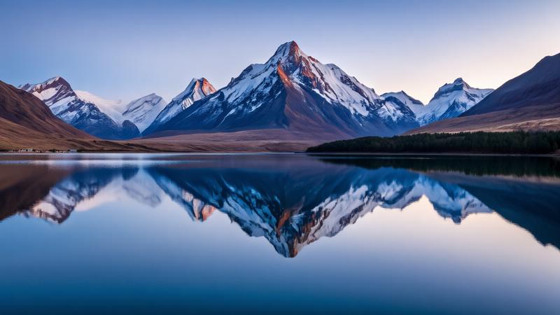
What it is: This is a creative twist on framing and layering – using reflections or see-through surfaces to add depth or duplicate subjects. Reflections (in water, mirrors, glass) can act like a frame or a secondary scene within the scene 13 . For example, a mountain reflected in a lake gives a symmetric composition where the reflection “frames” the mountain upside-down. Shooting through a window can show a subject inside plus a reflection of what’s outside overlaying them. Mirrors can show a subject’s front and back at once, or two sides of a room. These tricks can make images more intriguing and often quite beautiful. The idea is to either frame something with a reflection (like use the reflection as part of the border or context), or enhance depth by layering a reflection on a transparent surface.
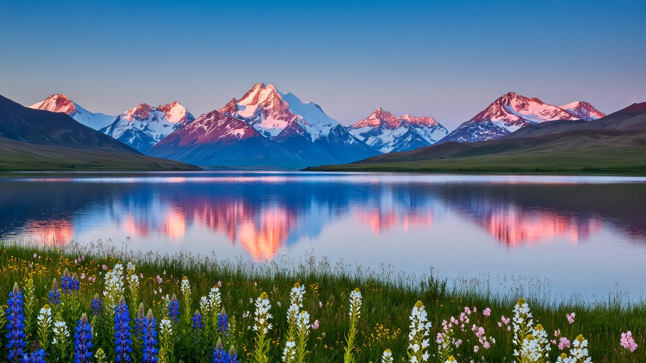
Prompt example: “A serene mountain reflected perfectly in a lake, the water acting like a mirror and framing the scene symmetrically”. In this prompt we clearly describe the classic reflection shot. Stable Diffusion and others will create a landscape where the mountain at the top is echoed upside-down in the lake at the bottom. By saying “framing the scene symmetrically,” we’re reinforcing that the reflection should create a symmetrical composition (many AIs know about symmetry and will try to produce a nice mirror image if you mention a perfect reflection). The reflection essentially doubles the subject, creating a natural frame (the bottom half of the image is the reflection). This is a known effect – in fact, reflection framing can add a sense of depth and a pleasing balance 13 . Hi-Dream is likely to produce a crisp reflection given its photorealistic leanings, and Flux, while maybe not as ultra-detailed, will still capture the symmetry because it’s a strong geometric cue.
Another scenario: “A portrait of a woman through a rain-covered window, her face visible behind the glass with city lights reflecting on the glass surface.” This is more complex, but very evocative. We are basically asking the AI to do a double-layer: the woman is behind the glass (so slightly obscured), and on the glass we see reflections of city lights. This kind of composition is advanced – you’re mixing a transparent surface (window) with reflections (city lights) and the actual subject (the woman). Stable Diffusion XL might handle this surprisingly well; it knows concepts like reflections on glass. Hi-Dream, with its large parameter count, can likely manage to blend these elements too. The output would feel like a moody photograph. The reflection of lights acts as a frame or overlay that gives context (the city outside) while we still see the subject’s face. It adds depth and storytelling (perhaps she is inside looking out). If the first attempt is messy (reflections can confuse models sometimes), simplifying the prompt might help: e.g. “a woman behind a window with soft reflections of lights on the glass” – focusing on fewer details.
Tips: Mirrors: If you want a mirror reflection, explicitly mention the mirror. For example, “a dancer stands in front of a mirror, her reflection visible beside her”. These models can do mirror reflections, though sometimes the reflection might not perfectly match (AI might give two similar dancers). Phrases like “reflection in the water”, “reflected on the glass,” “mirror image” cue the AI. For symmetric scenes like landscapes, words like “perfectly mirrored,” “symmetrical reflection,” “crystal clear reflection” will push for that beautiful doubling effect 13 . Transparent surfaces: Use “through” – e.g. “through a window,” “through a glass jar,” “through clear water”. This tells the AI there’s a see-through layer. You can also mention “blurred” or “wet glass” if you want that aesthetic of looking through something (like a steamy window or raindrops). One warning: reflections of text or faces might confuse older SD models (they mess up text and sometimes faces), but since you’re not using external tools, just avoid scenes where a reflection has to show clear text. For faces, if a mirror reflection looks off, consider using a profile pose or something less direct to reduce symmetry issues. All in all, reflections and transparent framing are a bit advanced, but the reward is a very professional-looking image. The models we’re targeting are up to the task for the most part – SDXL, for instance, has seen many mirror and window photos, so it will often pleasantly surprise you with the result.
Framing with Negative Shapes & Cutouts (Silhouette Framing & Cutout Effects)

What it is: This technique is about using empty space or silhouettes as a frame for your subject. “Negative space” refers to the empty or open parts of an image. Sometimes the shape of that empty space itself can frame the subject in a creative way. For example, imagine a subject seen through a keyholeshaped opening – the keyhole (dark shape) is the negative space that surrounds the subject. Or think of a bright subject seen against a dark silhouette outline of something; the silhouette becomes a frame. Cutout effects are similar – you compose the image as if part of it was cut away to reveal the subject. Silhouette framing is when your foreground is dark (like a black shape) and behind it the subject is bright and visible in the cut-out area of that silhouette 14 . This adds a lot of drama and often a sense of mystery, because the viewer is peeking through or seeing only a portion defined by that shape.
Prompt example: “View from inside a cave looking out: the cave interior is dark, creating a silhouette frame around the bright beach and ocean visible through the cave’s mouth.” This prompt describes a classic silhouette framing. The dark cave interior serves as a frame (likely a black border all around since we’re inside the cave), and the bright beach and ocean outside are the subject illuminated by daylight. By explaining it in detail, the AI will understand that the edges of the image should be dark (the cave walls) and the center should have the lit scene (beach and ocean). This uses a negative shape (the cave opening) as the frame. Stable Diffusion and Hi-Dream both do great with this kind of high-contrast scene – you’ll probably get a nicely exposed exterior with a black silhouette of the cave edges. Flux should also manage since it’s straightforward geometrically (big dark shape around, bright center). The result feels like you’re really inside looking out, which is immersive and visually striking. We essentially told the model to create a silhouette (cave interior) that forms a natural frame 14 .
Another example: “A portrait of a person lit from behind, their face in shadow (silhouette) forming a dark profile against a glowing sunset sky.” In this scenario, the person is the silhouette – a dark shape – and the sky is the bright background framing that shape. The prompt indicates the lighting (“lit from behind”) and that the face is in shadow, so the model will likely produce a silhouette of the person. The colorful sunset serves as the cutout shape where the person’s outline is visible. This is negative space framing too: the subject is defined by the space around them (the sky). All models can attempt this; sometimes older SD will try to add facial features even if we said silhouette, but adding “silhouette” explicitly usually gets the point across. The end image should have a strong outline of the person with little to no detail, set against a vibrant sky – a very dramatic look.
Tips: To use negative space or cutouts, think in shapes. You can literally mention shapes or objects that create a cutout: “heart-shaped hole,” “star-shaped window,” “keyhole silhouette,” “shadow of a person”. For instance, “a castle seen through the outline of a dragon’s silhouette in the foreground” – very fantasy, but it instructs the AI to make a dragon-shaped dark area that you see a castle through. It might take a couple of tries, but these models do grasp “seen through” or “in the shape of”. If subtle, try phrasing it different ways: “the silhouette of X frames the scene of Y”. Negative space itself can be prompted by saying “lots of empty space” or “vast blank sky around the subject” if you want simplicity (like a lone tree against a plain sky – the emptiness around it is the negative space giving it definition). Also, using words like silhouette, outline, shadow directly will cue the AI to produce strong shape-based compositions. One handy trick: describe the background vividly and the subject minimally except for its silhouette, e.g. “the subject is just a black silhouette”. This way the model focuses detail on the surrounding and leaves the subject as a shape. Hi-Dream, being very detailoriented, might try to add detail to a silhouette unless you clearly say not to. Stable Diffusion is usually quite willing to do pure silhouettes especially if you mention lighting (like “backlit”). Cutout effects might be a bit more hit-or-miss without external tools, but you can approximate them. For example, “a scene as if paper cut-out, the foreground a black cut-out city skyline and the sky a gradient of twilight” – SDXL might actually mimic a paper-cut look. In any case, negative space framing is about simplifying – often less is more. A photography tip on this is that using blank areas (sky, walls, etc.) can create elegance and clarity 15 . So don’t overcrowd your prompt. Sometimes just “silhouette of [subject] against [background]” gives a fantastic result. It’s a great way to get artsy compositions with minimal elements 14 .
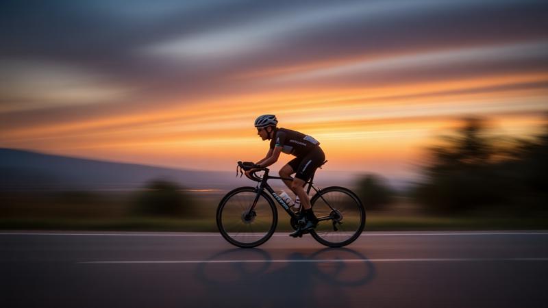
Final Encouragement: All these techniques can be mixed and matched once you get comfortable. For instance, you might try a prompt that uses implied motion and color harmony (“a cyclist speeding along a road at dusk, motion blur and a complementary orange-blue sky”) or foreground framing and reflections (“wildflowers in the foreground, reflecting in the lake that mirrors the mountains”). The Hi-Dream, Flux, and Stable Diffusion models are robust enough to handle multiple cues – just be clear in your wording and don’t go overboard in one prompt until you get the hang of it. Remember, advanced composition in AI images is all about describing the scene in a way that conveys these visual tricks. The more you practice writing prompts with these ideas, the more instinctive it will become. Soon you’ll be crafting prompts that yield images with depth, drama, and nuance that truly set them apart. Happy experimenting with your next-level compositions!
Master juxtaposition in photography for powerful composition https://thelenslounge.com/juxtaposition-in-photography-composition/
Complementary Colors: The Ultimate Guide in 2025 | IxDF
https://www.interaction-design.org/literature/article/complementary-colors-and-color-wheel? srsltid=AfmBOorltqCb-39AiTMGlI1ac0hI3mV8FkyXG6ctmlPja-kU70prjycU
7 Foreground, Middle Ground, Background: Giving Each Its Due | Photzy
https://photzy.com/foreground-middle-ground-background-giving-each-its-due/
8 9 10 Scale and Proportion in Photos
11 13 15 What Is Framing in Photography? A Powerful Technique to Transform Your Photos
https://www.colorexpertsbd.com/blog/framing-in-photography/
14 Framing in Mobile Photography: Adding Magic to Your Photos - Skyvik https://skyvik.in/blogs/news/framing-in-mobile-photography-adding-magic-to-your-photos?
srsltid=AfmBOopR3CocYM6nHDITErRPhJ41C9x0MlW-bmls0Ycm4MbPyyB34EVe


