This is part 7 of a series:
Simple Composition Tricks to Instantly Improve AI Images with Prompts
More Simple Composition Tricks to Instantly Improve AI Images Using Prompts
Intermediate Composition Tricks to Instantly Improve AI Images Using Prompts
Intermediate Emotional & Narrative Composition Techniques for AI Images Using Prompts
Simple Composition Tricks to Instantly Improve AI Images with Prompts: Camera Angles Edition
Simple Composition Tricks to Instantly Improve AI Images with Prompts: Perspective Edition
Simple Composition Tricks to Instantly Improve AI Images with Prompts: Color & Mood Edition
Simple Composition Tricks to Instantly Improve AI Images with Prompts – Light & Shadow Edition
Simple Composition Tricks to Instantly Improve AI Images with Prompts: Texture & Detail Edition

Modern AI image generators don’t just compose a scene based on your prompt – they also respond strongly to color and mood cues. By adding classic color techniques and atmospheric keywords to your text prompts, you can instantly set a visual tone or emotion for your AI-generated art. Just like a film director chooses lighting and color grading to tell a story, you can guide the AI with simple phrases to make your images feel warm and inviting, cool and mysterious, bright and dramatic, or anything in between. Best of all, these tricks are beginner-friendly, in plain language, and require no special tools or add-ons – just creative use of words. Let’s dive in!
1. Warm vs. Cool Palettes
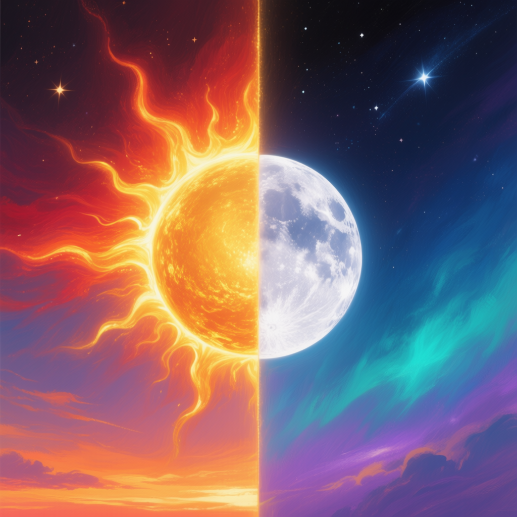
One of the most fundamental choices is between a warm or cool color palette. Warm colors include reds, oranges, and yellows, which we naturally associate with sunlight and heat[1]. Warm palettes tend to make an image feel cozy, energetic, or passionate. Think of a golden sunset or a roaring fireplace – those warm tones convey excitement, warmth, or even tension. In contrast, cool palettes use blues, greens, and purples – hues linked to shade and water. Cool colors generally create a calm, relaxed or mysterious mood[2][3]. A misty blue twilight or a scene bathed in moonlight feels serene or introspective. In practical storytelling: use a warm palette when you want an image to feel welcoming, happy, or full of energy (for example, a sunrise in a fantasy forest or a lively autumn scene). Use a cool palette for tranquil, somber, or secretive scenes (a quiet underwater shot, a night city with blue tones, or a foggy pine forest at dawn).
How to prompt it: To encourage a warm or cool palette, include those descriptors in your prompt. Phrases like “warm tones,” “golden light,” “red and orange glow” will push the AI toward sunny, heated colors. For a cool palette, use words such as “cool color palette,” “blue lighting,” “cold, desaturated tones” or name specific cool colors (e.g. “bathed in blue moonlight”). This signals the AI to bias the scene’s overall colors toward the warm or cool end of the spectrum.
Example Prompt (Warm vs. Cool Palettes):
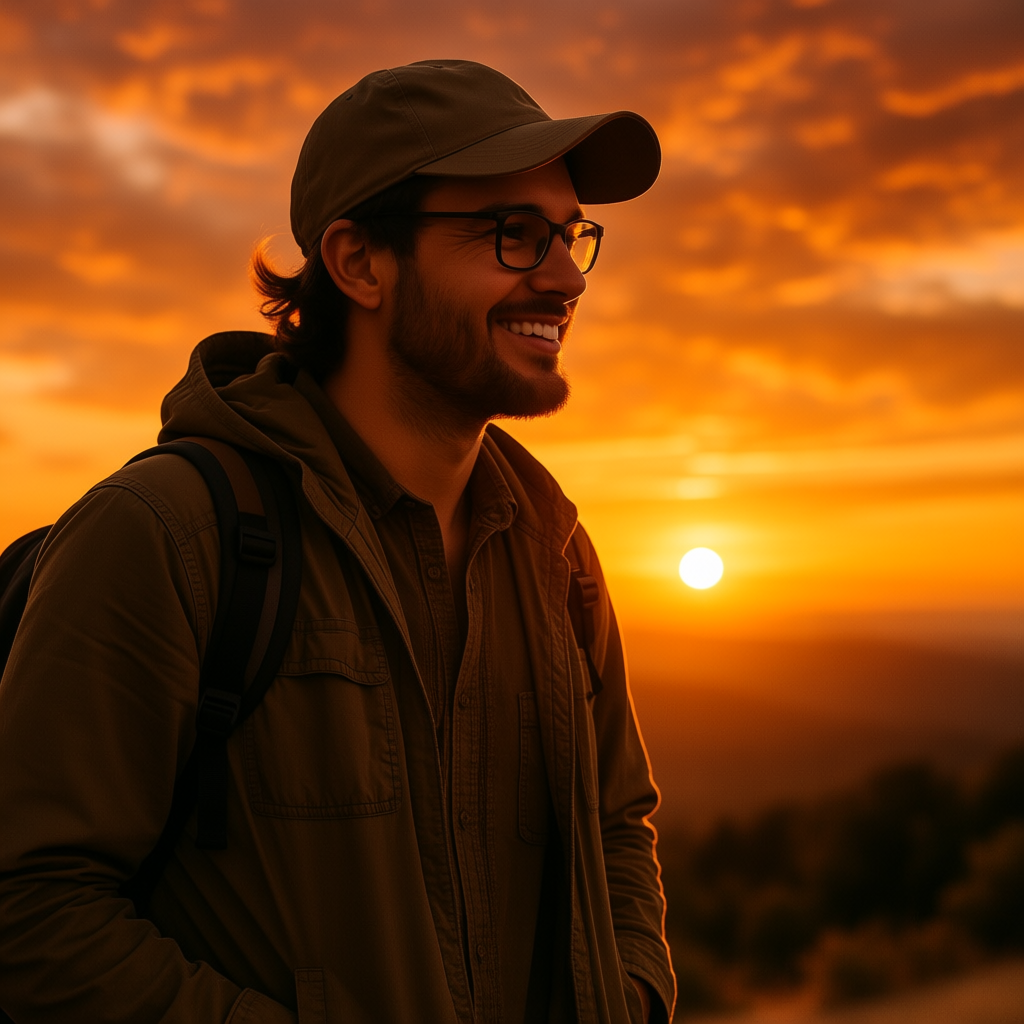
1. portrait of a traveler at sunset, warm golden light and fiery sky tones, cozy and inviting atmosphere
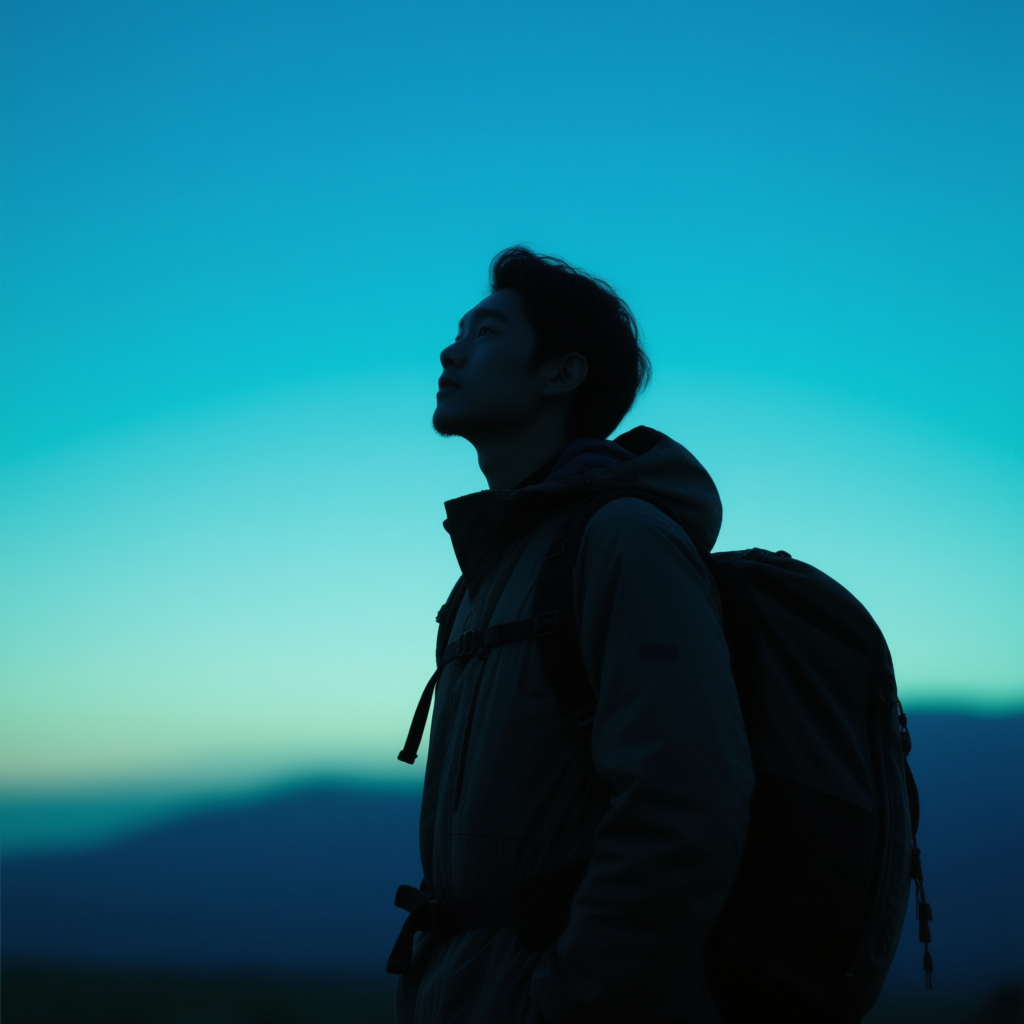
2. portrait of a traveler at dusk, cool blue lighting and muted blue-green background, calm and mysterious mood
In example 1, the prompt’s warm keywords (“warm golden light” and fiery sky tones) tell the AI to render the scene with red-orange hues. The result might be a photo where the subject is bathed in sunset glow, giving a feeling of comfort and energy. In example 2, the terms (“cool blue lighting” and blue-green background) shift the palette to blues and greens. This likely produces a more subdued, night-time image – perhaps the traveler under a twilight sky – which feels quiet, reflective, or even a bit magical. These two versions show how simply swapping color palette words can completely change the emotional tone of the generated image[2]. If your first attempt isn’t warm or cool enough, try adding more specific color words (e.g. “rich orange sunset hues” or “icy blue mist”) to reinforce it.
2. Contrast & Intensity
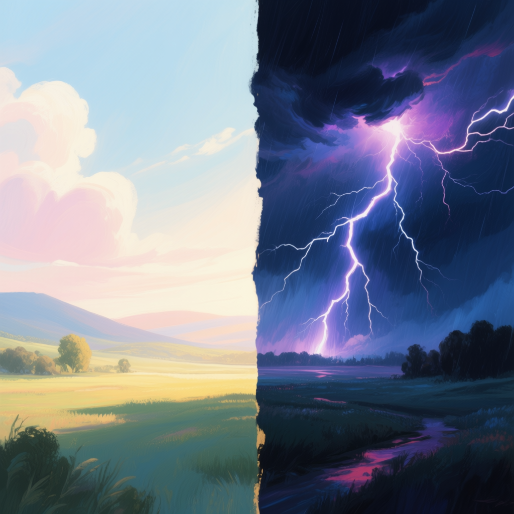
Beyond color choice, the contrast and intensity of lighting in your image dramatically affect its mood. High contrast versus low contrast, and vivid versus muted colors, each bring a different emotional flavor:
High Contrast: An image with high contrast has strong differences between light and dark areas. Bright highlights stand out sharply against deep shadows[4]. This look often feels bold and dramatic – think of a shaft of sunlight piercing a dark room, or a stage spotlight cutting through blackness. High contrast lighting creates tension and energy; it can make a scene feel intense, adventurous, or even mysterious[5]. Use high contrast for subjects or stories that are dramatic or high-energy (e.g. a heroic figure half in shadow, or a city street at night with neon lights and dark alleys).
Low Contrast: Low contrast images, on the other hand, have a narrower range between lights and darks – the tones blend more gently[6]. Shadows are softer, and highlights are dimmer. The result is a soft, subdued look that can feel peaceful, nostalgic, or dreamy[6][5]. Photographs on an overcast day or scenes in hazy fog are often low contrast. Low contrast smooths out harsh details and can create a calm, comfortable mood[7]. This is great for relaxed, intimate, or vintage-themed images (for example, an indoor portrait by window light for a gentle atmosphere, or a faded memory-like landscape with soft tones).
How to prompt it: To get high contrast, include phrases like “high contrast,” “hard lighting with deep shadows,” or even specific lighting styles like “low-key lighting” (which means dark, shadow-rich lighting). Words such as “dramatic shadows,” “sharp light,” or “strong highlights” also signal this effect. For low contrast, use terms like “soft lighting,” “low contrast,” “flat lighting,” “hazy” or “muted highlights.” Describing the weather can help too (e.g. “overcast day” or “misty lighting” yields fewer harsh shadows). If the AI still gives too much contrast, try explicitly adding “soft shadows” or reducing strong light descriptors.
Example Prompt (High & Low Contrast):
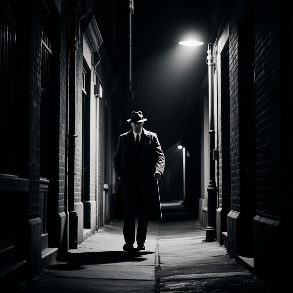
1. cinematic photograph of a detective in an alley, high contrast lighting, sharp shadows and a single streetlight illuminating the scene
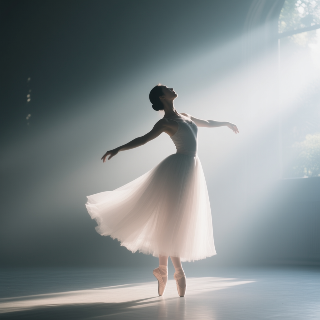
2. ethereal portrait of a dancer in morning light, low contrast, soft shadows and gentle highlights, diffuse glow
In the first prompt, keywords like “high contrast lighting” and sharp shadows tell the AI to produce an image with intense light-dark differences – perhaps the detective’s face lit by a harsh lamp while the background falls into darkness. Such an image would feel tense and dramatic. In the second prompt, terms like “low contrast, soft shadows, gentle highlights” suggest an image with very soft gradations of light. The likely result is an airy, delicate photo of the dancer with a serene, calm mood, almost like a dream. Notice how contrast changes story: the same alley can feel dangerous and bold in high contrast, or safe and quiet in low contrast[5]. If your high-contrast image loses too much detail in darkness, you can try adding a bit of fill light in your description, and if a low-contrast image looks too flat, mention a “soft glow” or a color to give it life.
Dramatic Lighting: Related to contrast is the idea of dramatic, directional lighting. This typically means a strong light source from one side (or behind a subject), creating pronounced shadows – a technique often seen in film noir or theatrical photos. Dramatic lighting (also called low-key lighting) adds a lot of mood: it can make a scene feel suspenseful, moody, or emotionally charged[8]. For example, a character half in shadow with only a streak of light across their eyes immediately feels more intense and mysterious. To prompt this, you can use phrases like “dramatic lighting,” “Rembrandt lighting” (a photography term for a particular triangular shadow on a face), or “chiaroscuro” (which literally means light-dark contrast in art). These cues tell the AI you want strong shadow-play for effect. Use dramatic lighting when you want tension or focus in the image – it’s like shining a spotlight on the most important part of your scene and letting the rest fall into darkness.
Muted Tones: Not every image needs bold, pure colors. Muted tones are colors that are desaturated (mixed with gray or a complementary color), making them less intense. A photo with muted colors might have lots of earthy browns, soft grays, faded blues – nothing too bright. Muted palettes often convey a quiet, serious, or nostalgic mood[9]. They can also feel more natural and realistic, since extreme vibrancy is toned down. Visually, muted colors let other elements like composition or texture shine without the color stealing the show[10]. Use a muted palette for scenes meant to feel old-fashioned (e.g. a 1970s film look), melancholic (a lonely rainy city with washed-out colors), or peaceful and contemplative (an interior with soft beige and gray tones). How to prompt it: Simply include “muted colors” or “desaturated colors” in your prompt. You can also specify “earth tones” for natural muted hues like olive green, brown, and clay, or mention a “faded” or “vintage color palette”. This will instruct the AI to dial back the saturation.
Pastel Palettes: Pastels are colors that are both light and low-saturation – imagine a baby pink, mint green, or powder blue. Pastel palettes are essentially tints of colors (mixed with white), resulting in very soft, gentle versions[11][9]. Using pastels in an image creates a whimsical, calming, or youthful mood[12][9]. They often evoke springtime, innocence, or nostalgia (like old hand-tinted photos or retro 80s pastel aesthetics). For example, an illustration in pastel tones might feel dreamy and playful, not aggressive at all. When you want an image to be light-hearted, romantic, or soothing, a pastel color scheme is a great trick. How to prompt it: Include phrases like “pastel colors,” “pastel palette,” or specify a pastel version of a color (e.g. “pastel pink sky,” “baby blue dress”). This nudges the AI to use softer shades rather than bold ones. Pastels work especially well with subjects like flowers, skies, cute characters, or any scene where you want a gentle, uplifting vibe[12].
Example Prompt (Muted & Pastel Colors):
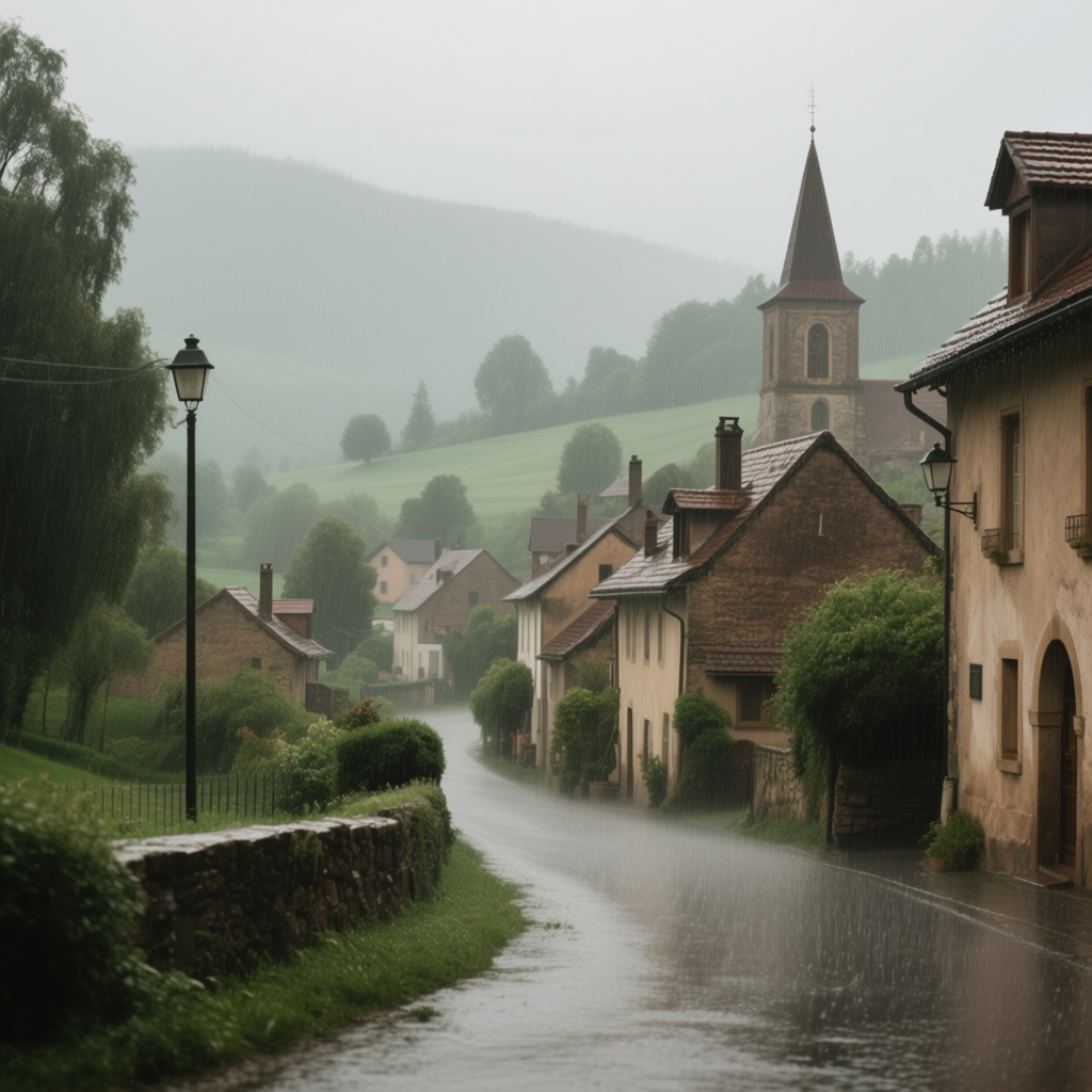
1. landscape of an old European village in rain, muted color palette, desaturated greens and browns, nostalgic atmosphere
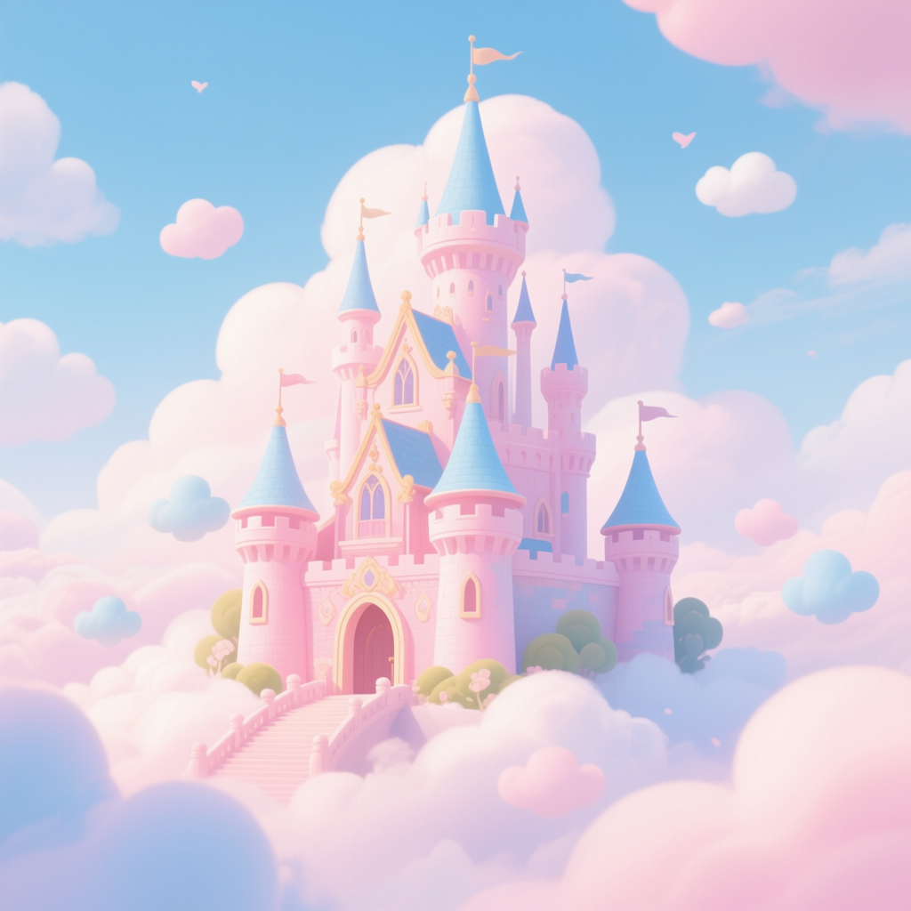
2. illustration of a fantasy castle in the clouds, pastel color palette, soft pinks and baby blues, whimsical and light
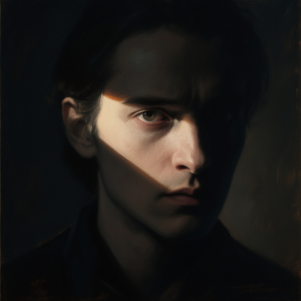
3. a cinematic portrait of a mysterious character, face half in deep shadow with a streak of light across their eyes, dramatic low-key lighting, chiaroscuro effect, strong directional light from one side, Rembrandt lighting triangle on the cheek, moody atmosphere, dark background, painterly texture, highly detailed, emotionally intense and suspenseful
In the first prompt, note the words “muted color palette” and desaturated greens and browns. The AI will likely produce an image with very understated colors – the village scene might come out in olive, taupe, and grayish tones, enhancing the nostalgic, calm mood (almost like an old faded photograph). In the second prompt, “pastel color palette” and the mention of soft pinks and baby blues guide the AI to use those delicate tints. The resulting fantasy castle image would probably be awash in pale pink skies and light blue clouds, giving it a dreamy, storybook feel. Both techniques reduce harshness but in different ways: muted colors make an image solemn and subdued, while pastels make it gentle and playful[9]. If your muted image looks too dull, you can balance by adding one hint of a stronger color as an accent. Conversely, if a pastel image isn’t coming out, try explicitly naming a couple of pastel shades (as we did) or use words like “soft glow” to reinforce the gentle vibe.
3. Monochrome & Limited Palettes
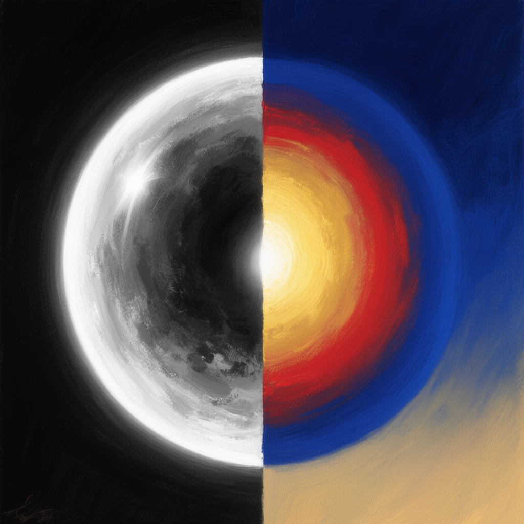
Sometimes less is more with color. A monochrome image uses variations of a single hue (or no hue at all, in the case of black-and-white) to create its look. Classic black-and-white photography is the best-known example – it replaces the entire color spectrum with shades of gray. But you can also have a monochromatic image in, say, all blues or all reds (like a photo under darkroom red light, for instance). The effect of monochrome is to immediately focus the viewer on shapes, contrast, and composition rather than on a mix of colors[13]. Emotionally, monochrome can feel timeless, elegant, or intense. Black-and-white often conveys drama or nostalgia (since it reminds us of old photos)[14]. A photo in pure sepia (brownish tones) feels antique and sentimental. A scene tinted entirely in deep blue might feel cold or melancholy, while one all in red can feel urgent or passionate[15]. By limiting color, you intensify the mood associated with that one color – it’s a very purposeful artistic choice.
When to use it: Monochrome or very limited palettes are great for storytelling when color itself is the story or when you want a stylistic, fine-art look. If you want to emphasize form and lighting (as many street or portrait photographers do), removing color distractions with black-and-white can heighten the emotional impact[13]. If you’re aiming for a vintage or historical vibe, a sepia or monochrome palette does that instantly. In AI art, you might use monochrome to mimic old film stills, to create a spooky one-color scene (imagine a horror scene all in moonlit blue), or even to ensure consistency in complex compositions (the AI might struggle with many colors, so limiting to one can actually produce cleaner results).
How to prompt it: Clearly include the type of limited palette you want. For black-and-white, you can say “black and white photo” or “grayscale”. For a one-color tint, specify “monochrome” and the color (e.g. “monochrome red image” or “in shades of blue”). Words like “sepia tone,” “duotone,” or “limited color palette” are also understood by many models. Duotone means the image is dominated by two colors (often one for shadows and one for highlights). You could prompt “duotone image, in red and black” for example, and the AI will try to use mostly those two. Triadic palette refers to using three colors that are spaced evenly on the color wheel (for example, red-yellow-blue or green-orange-purple). It’s a bit more advanced to prompt; you might list the three colors or simply say “triadic color scheme” and hope the AI picks it up. In general, for any limited palette, naming the specific colors you want to allow is helpful (e.g. “an illustration in only black, white, and gold”).
Example Prompt (Monochrome & Limited Palette):
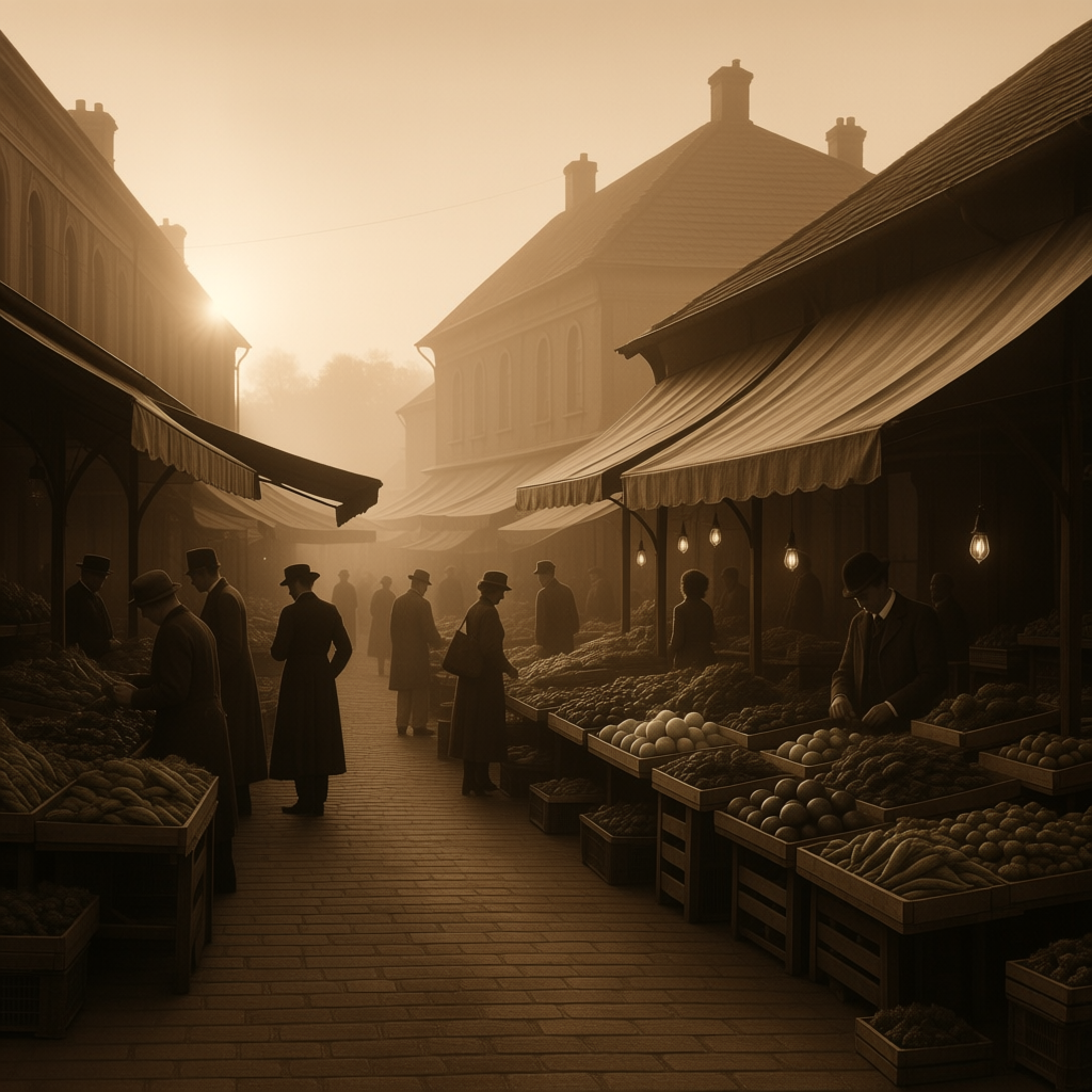
1. vintage sepia-toned photograph of an old marketplace at dawn, soft light and old-fashioned mood
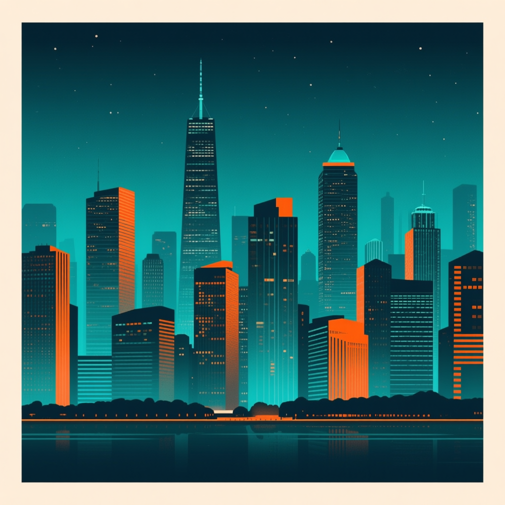
2. modern graphic poster of a city skyline at night, limited palette of teal and orange (two-tone style)
In the first example, the phrase “sepia-toned photograph” tells the AI to mimic that brownish monochrome look of early 20th-century photos. The generated image will likely have all its colors replaced with warm browns and creams, immediately giving it an antique, nostalgic feel (you can almost feel the old-time atmosphere). In the second prompt, we explicitly state a “limited palette of teal and orange.” This instructs the AI to use primarily those two colors. The result might be a stylized poster-like image where the buildings are shades of teal against a sky of orange, for instance. Teal-and-orange is actually a popular complementary color pair in modern cinematic grading[16] – using it in a prompt yields a very graphic, striking contrast. By limiting colors, you create a strong visual identity for the image. Notice how the sepia photo feels unified and sentimental, whereas the two-tone poster feels bold and artistic. You can experiment with other combinations: try “duotone image in black and red” for a Sin City-style graphic look, or “monochromatic blue scene” for something that feels cold and distant. If the AI sneaks in other colors, just re-emphasize by saying “limited to only [colors]” or try a different wording like “predominantly [color].”
4. Color Psychology & Symbolism
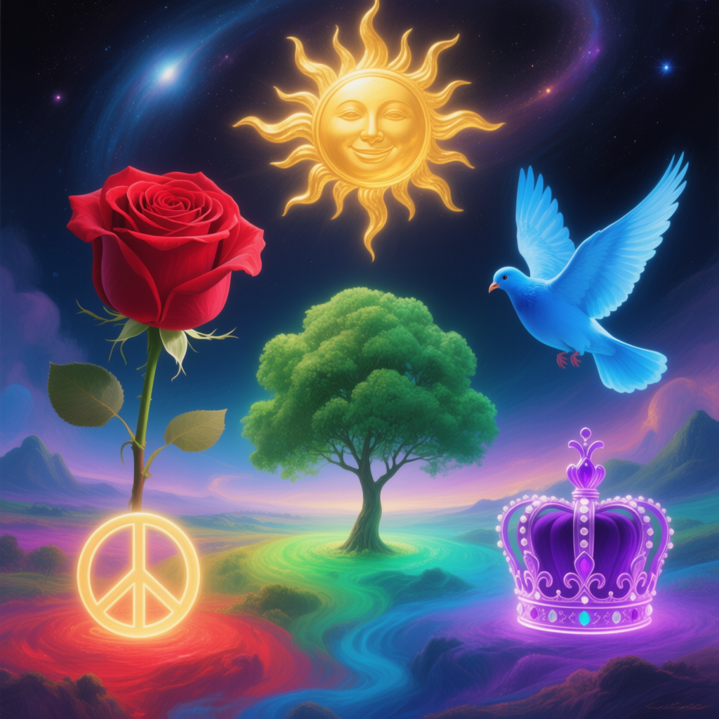
Colors come pre-loaded with cultural and emotional meaning. Using a specific color in your AI image prompt can subtly (or not so subtly!) influence the story it tells. This is color psychology – the idea that, for example, red can signify passion or danger, while blue can evoke calm or sadness[17]. By understanding some common color symbolism, you can choose descriptive color words in your prompt to reinforce the mood or theme you want.
Here are a few classic associations (though keep in mind, context matters and some meanings are culturally influenced):
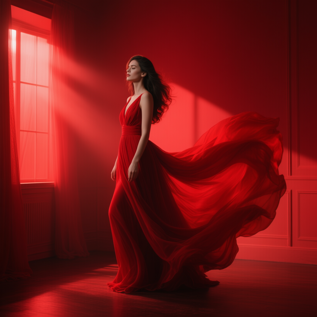
· Red – Often symbolizes passion, love, energy, or anger. It’s an intense color. A splash of red in an image will draw the eye and can signal importance or danger (think of red roses for love, or red stop signs and fire for warning)[18]. Prompt usage: “a woman in a flowing red dress” (red = dramatic passion), “red light spills into the room” (red lighting = danger or urgency).
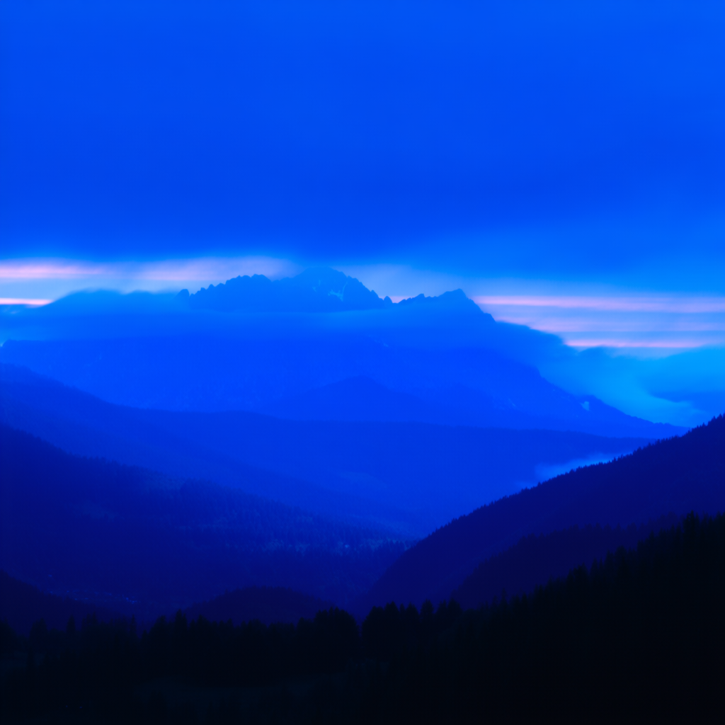
· Blue – Commonly represents calm, peace, and stability, but also melancholy or coldness[17][18]. Lighter blues feel friendly and tranquil (a clear sky, gentle sea), while deep navy or desaturated blues can feel sad or formal. Prompt usage: “a blue twilight over the mountains” (blue = serenity), “portrait bathed in blue light” (could feel cool, futuristic, or lonely depending on context).
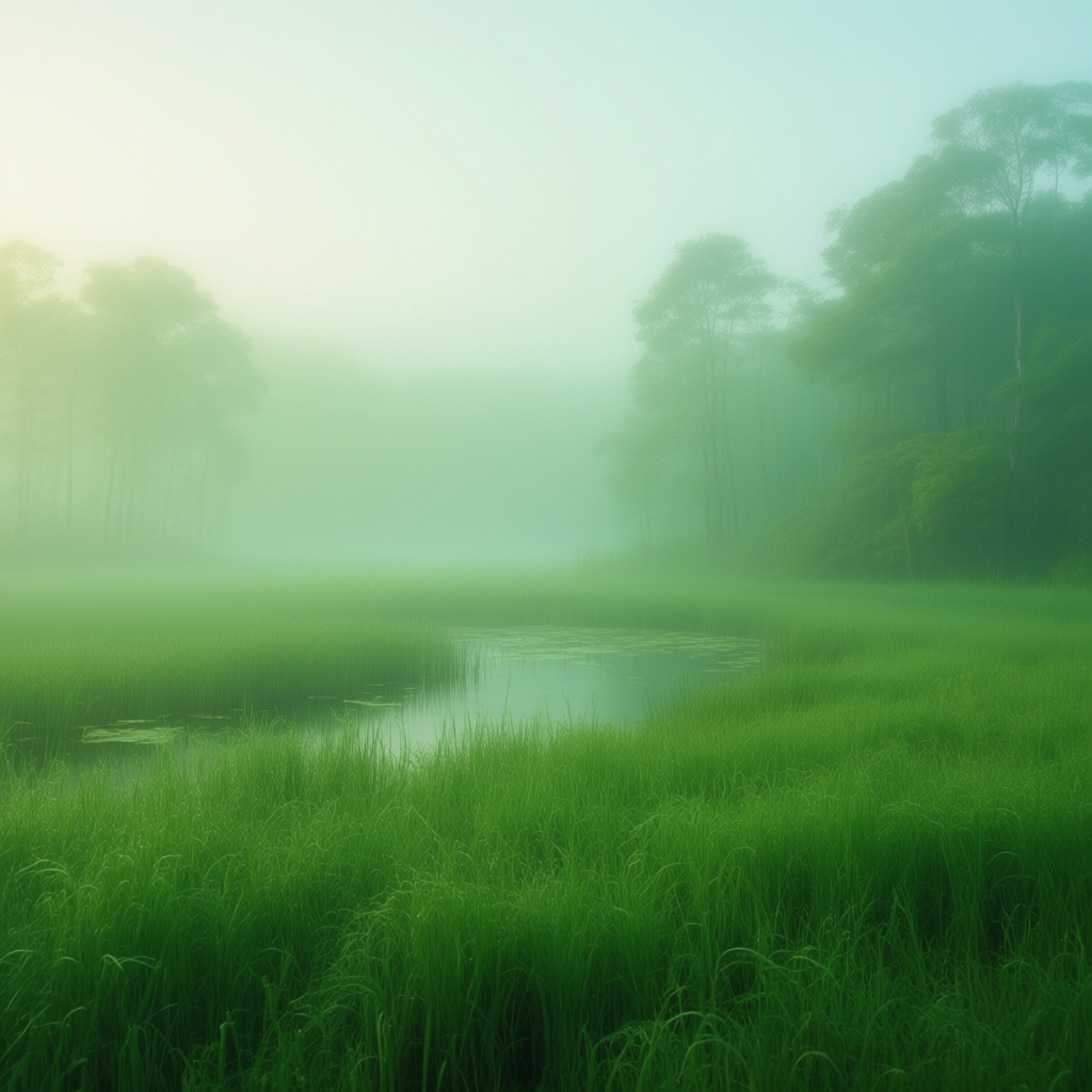
· Green – The color of nature, growth, and healing, but also envy or poison in some stories. Vibrant green feels fresh and life-affirming (lush forests, spring leaves)[19]. Murky green can feel eerie or sickly (swamps, toxic slime in sci-fi). Prompt usage: “an emerald green meadow under soft light” (green = life, renewal), or “a misty greenish glow in the swamp” (green glow = unnatural, mysterious).
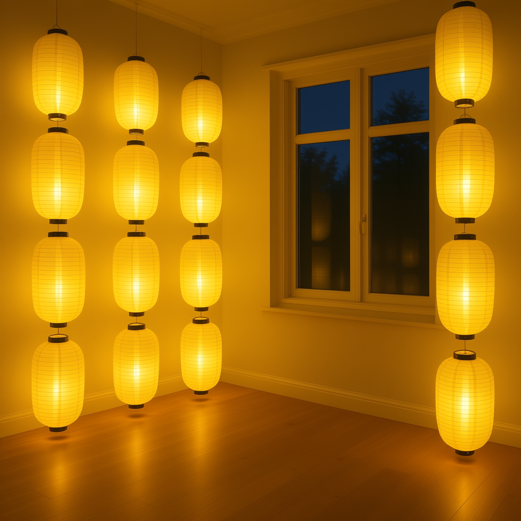
· Yellow – Bright yellow conveys joy, sunshine, warmth, and optimism[20]. It’s attention-grabbing (caution tape and taxis use yellow for visibility). Very strong yellow can also hint at hazard (like the black-and-yellow of warning signs). Prompt usage: “a room filled with golden yellow morning light” (happy, cozy), or “pale yellow lanterns glowing at night” (gentle, hopeful tone).
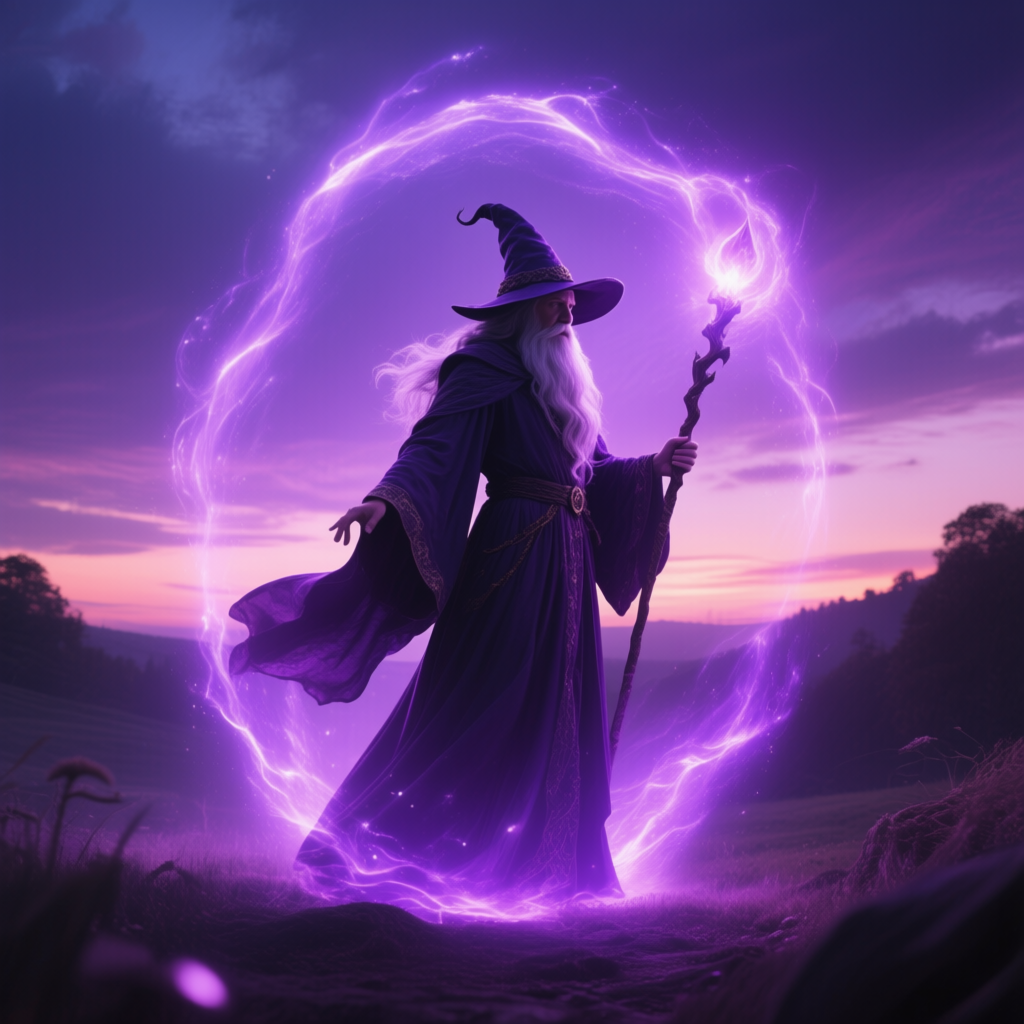
· Purple – Long associated with royalty and luxury (because purple dye was historically rare), and also magic or mystery[21]. Deep purples feel rich and imaginative; lavender feels sweet or nostalgic. Prompt usage: “a purple aura around the wizard” (purple = magical, noble), “dusk sky turning violet” (creative, otherworldly mood).
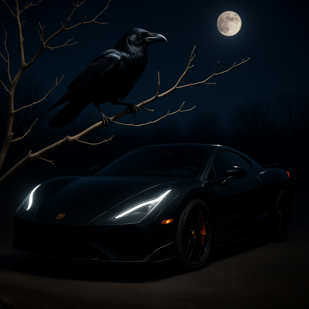
· Black – Often symbolizes power, elegance, or evil depending on context. A black suit is classy; a black void is ominous. In images, a lot of black or dark tones create a heavy, dramatic mood. Prompt usage: “a black crow on a barren branch” (black = death or mystery), “slick black sports car at night” (black = luxury, power).
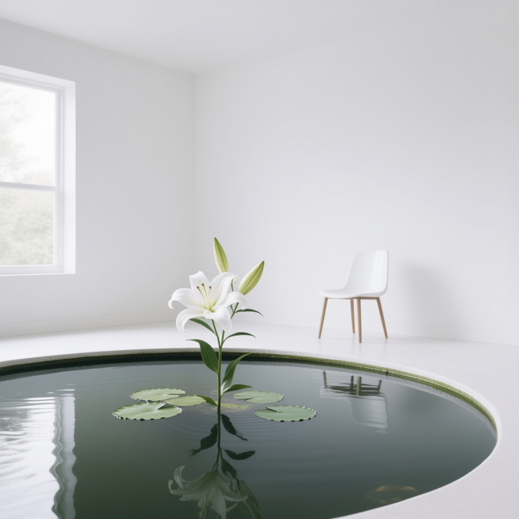
· White – Can mean purity, innocence, and peace (white wedding dress, doves)[22], but in some contexts it’s sterility or emptiness (a white hospital room, a blank canvas). Lots of white in an image can feel clean and minimalistic or stark and lonely. Prompt usage: “a white lily in a calm pond” (white = purity, tranquility), “an all-white room with a single chair” (white = emptiness, isolation, or modern simplicity).
These are just a few examples – many other colors (orange, pink, brown, etc.) have their typical connotations too. The key is: think about the emotion or idea you want to emphasize, and incorporate the corresponding color into your prompt. It could be in an object (e.g. “a red rose”), the environment (“a room lit by green neon signs”), or the overall color cast (“dramatic blue lighting”). Even if the viewer doesn’t consciously realize it, the color will help tell the story.
When to use it: Use color symbolism when you want to add a layer of meaning or mood without explicitly spelling it out in words. For instance, instead of saying “a scary scene,” you might describe “a dark alley under a blood-red sky” – the red sky already hints that something is ominous or violent. If you want to show a character is peaceful or hopeful, you might put them in a “soft white room bathed in morning light” to amplify that feeling of purity or hope. Combining color symbolism with composition and subject can make an AI-generated image much more impactful.
How to prompt it: Simply mention the colors that carry the mood. Often it’s as easy as adding an adjective: “a red door”, “wearing a blue cloak”, “under green lights”. For broader color casts, describe the lighting or atmosphere with that color: “an eerie green fog,” “neon purple glow,” “warm golden sunlight,” “cold blue shadows.” The AI will incorporate those color cues into the image. You don’t need to explain the meaning – just use the color and the model will likely apply it as a visual element. One prompt tip: if you want the color to dominate the scene, use words like “entire scene in red tones” or “a predominant blue atmosphere”. If you want just an accent, specify the object: “a black and white photo with a single red apple in the center” for a spot-color effect (many models understand this kind of prompt and will make the apple red in an otherwise monochrome image).
Example Prompt (Color Symbolism):
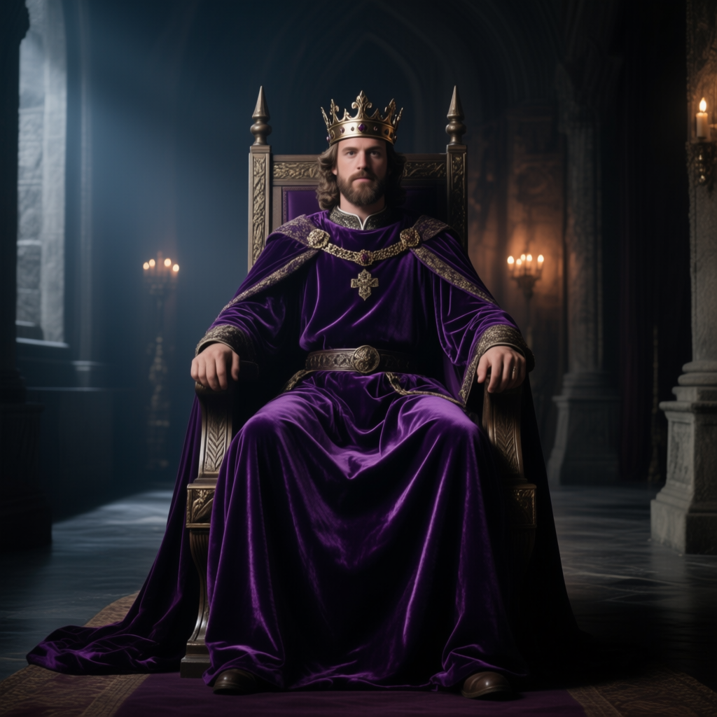
1. medieval king on his throne, wearing a deep purple velvet robe, dimly lit hall (regal, mysterious mood)
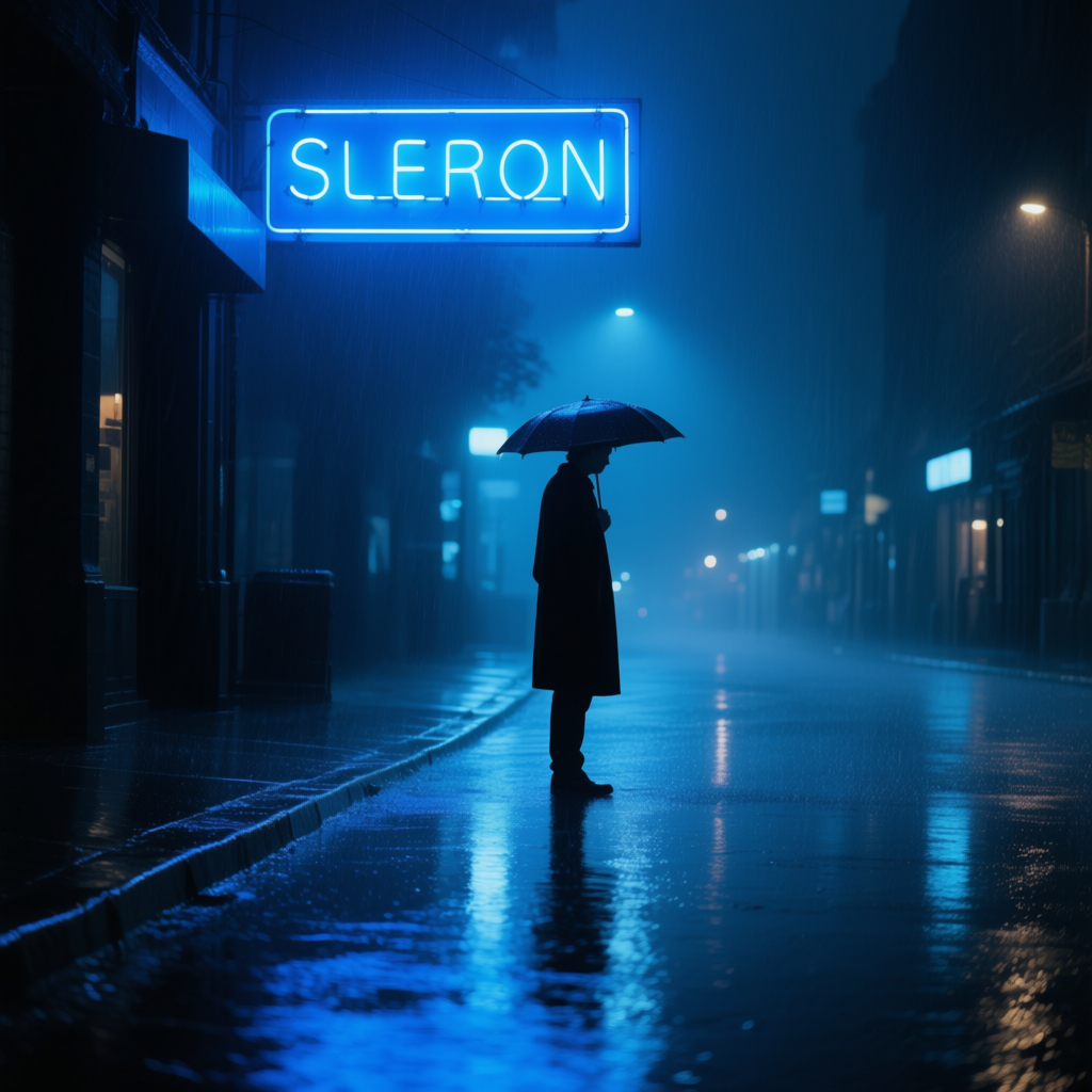
2. lone figure standing in the rain under a blue neon sign, wet street reflections (blue light for a melancholy, calm tone)
In the first example, we use purple in the prompt (“deep purple velvet robe”). Purple immediately suggests royalty, luxury, and intrigue[21]. We didn’t have to say the king is noble and powerful – the color does it for us. The AI will likely produce an image of a king draped in rich purple fabric, and that color will make the scene feel more majestic and mysterious. In the second prompt, the blue neon sign casts a blue glow on the scene. Blue lighting here sets a mood of sadness or loneliness on the rainy street, amplifying the emotional impact (you can imagine the quiet, contemplative atmosphere). These examples show how choosing the right color in your prompt can act like an emotional shorthand. If we swapped the key colors, the feelings would change – e.g. a king in red might feel more aggressive or warlike, and a street lit by red neon might feel dangerous or passionate instead of calm. So when crafting prompts, consider if a touch of color symbolism could reinforce the story you want the AI image to tell[18].
5. Atmosphere & Mood Lighting
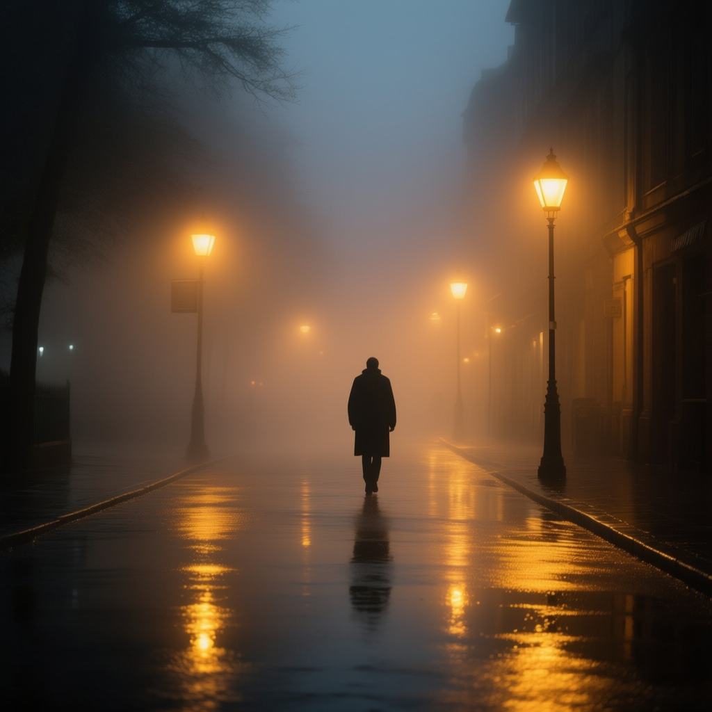
Beyond static color choices, how light appears in the scene – its source, time of day, and quality – will set a strong mood. Here are some atmospheric lighting techniques and how to use them in prompts:
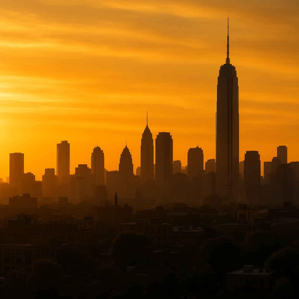
Golden Hour: The golden hour is the period just after sunrise or before sunset when the sun is low and the light is soft, golden, and directional. Photographers love it because it makes everything look warm and magical[23][24]. Golden hour light adds long shadows and a golden-orange glow to scenes, evoking feelings of warmth, nostalgia, and beauty[24]. Using “golden hour” in a prompt is a fantastic way to get the AI to produce a scene with that rich, honeyed lighting. It works for almost any subject – “a portrait in golden hour light,” “a mountain valley during golden hour,” “city skyline at golden hour”. The result will likely have a sky tinted orange-pink and a very cozy, idyllic mood. When to use: whenever you want a scene to feel romantic, hopeful, or peacefully happy. It’s great for nature landscapes, portraits with lens flare, or cinematic cityscapes that look straight out of a postcard.
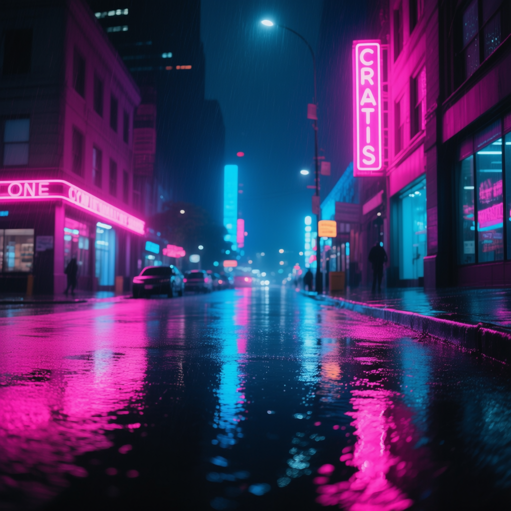
Neon Glow: At the opposite end of nature’s golden hour, we have the artificial allure of neon lighting. Neon lights – those vibrant glowing signs in colors like electric blue, hot pink, or red – immediately suggest a modern, urban, possibly retro setting. They cast colored light into their surroundings, creating pockets of bright, saturated color in the dark. A neon glow can give an image a moody, futuristic, or “cyberpunk” vibe[25]. It can also feel a bit nostalgic (80s downtown scenes) or edgy. Use “neon lights” or “neon glow” in your prompt for scenes set at night: e.g. “rainy city street at night, neon glow reflecting on wet pavement” or “portrait lit by pink and blue neon signs”. The AI will incorporate those intense colors and likely produce dynamic lighting that can transform a mundane scene into something visually dazzling[25]. Neon lighting is perfect for when you want an image to stand out or feel stylishly modern – think sci-fi cityscapes, nightlife photography, or creative portraits with colored lighting.
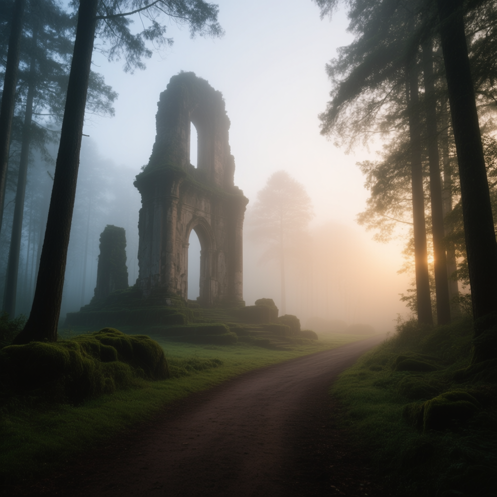
Foggy Haze: Fog, mist, or haze in an image adds atmosphere and depth in a unique way. Fog is basically cloud on the ground – it diffuses light, softens contrast, and often partially obscures the background. The result is a sense of mystery and mood; things disappear into the fog, which engages the viewer’s imagination[26][27]. A foggy scene can feel serene and dreamy (like a gentle mist over a lake at dawn) or eerie and suspenseful (like a dense fog in a dark forest). To prompt fog or haze, use words like “foggy,” “misty,” “hazy,” or even “cinematic fog”. For example: “a foggy forest path at dawn” or “ancient ruins shrouded in mist”. The AI will likely reduce contrast and detail in the distance, creating that layered depth where objects fade as they go back – exactly what fog does[28]. When to use: whenever you want to boost the mood and make a scene more poetic or mysterious. Fog works great in landscapes, cityscapes (London-esque foggy streets), and horror scenes alike. It’s also a useful way to hide messy background details in AI images – fog covers a multitude of sins while making the image more atmospheric!
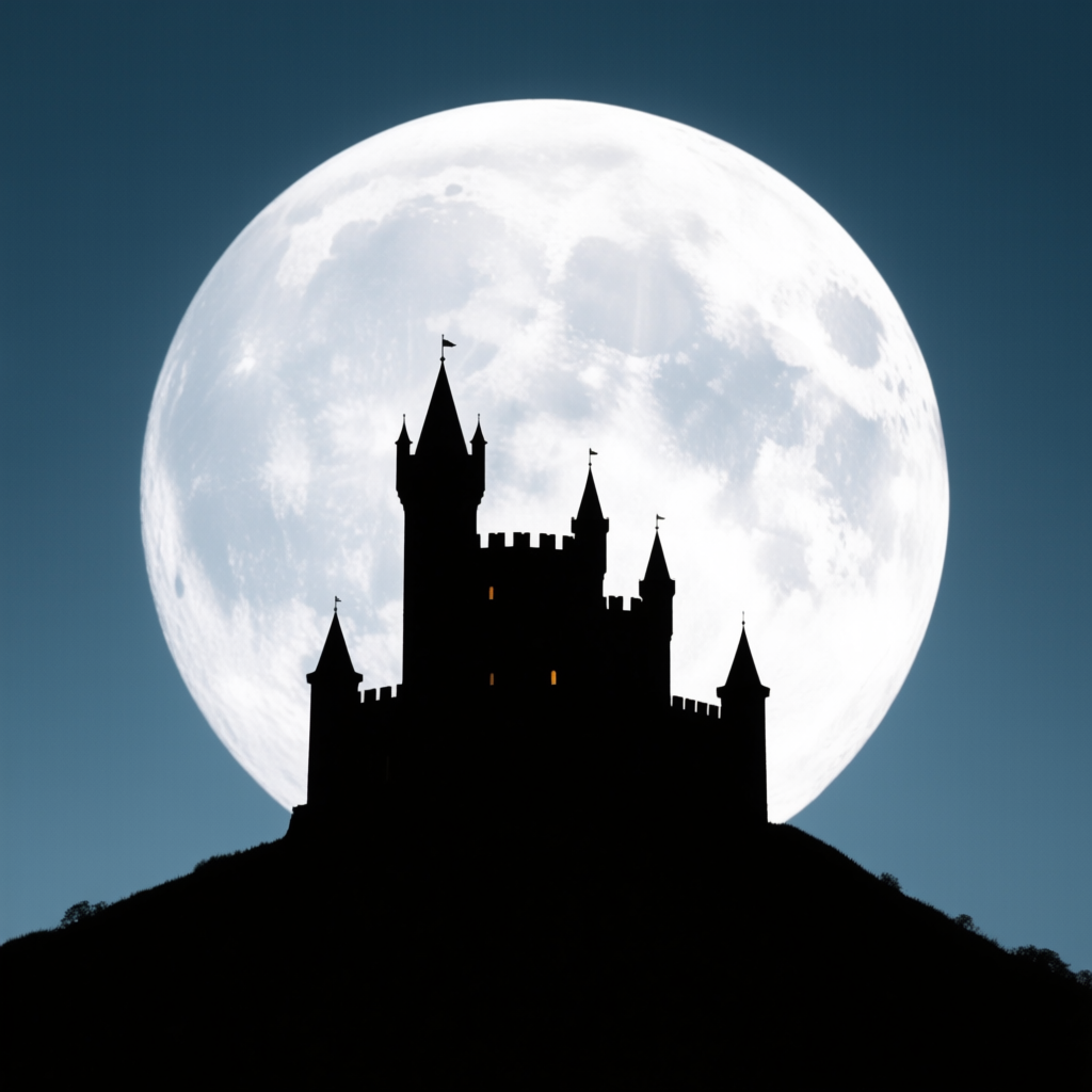
Silhouettes: A silhouette is created when your subject is dark against a brighter background – essentially backlighting taken to an extreme. Instead of seeing details of the subject, you see a bold shape (completely or mostly black). Silhouettes naturally add drama and mystery to an image[29]. They simplify the story to outline and form, which can often convey emotion even more strongly than a detailed face would[30]. For example, a silhouette of a couple kissing at sunset can feel more romantic and universally symbolic than a regular photo of them. To prompt a silhouette, you definitely want to mention “silhouette” of whatever subject: “silhouette of a tree against the sunset sky,” “a dancer in silhouette, spotlight behind her.” Also include the bright background source – usually “against a sunset,” “against the bright full moon,” or “in front of a bright window”. The AI will interpret that as you want the subject dark and the background light. Silhouettes are best used when you want to emphasize the shape of your subject or create a sense of anonymity. They feel dramatic, emotional, sometimes introspective[31]. In prompts, silhouettes pair well with golden hour (lots of people do “sunset silhouette of a person on a hill” for a reason – it’s beautiful and emotional[32]). Also try silhouettes for striking compositions: “silhouette of a castle on a hill, huge moon behind it” for a fantasy vibe, or “silhouette of a lone tree in fog” for a moody minimalist photo.
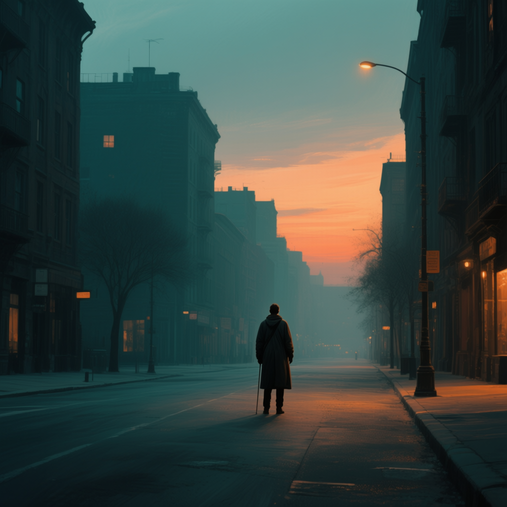
Cinematic Color Grading: This is a broader term, but essentially it means applying a film-like color palette or tint to your image to set a mood. In movies and TV, color grading is used to give each scene a certain tone – for instance, a horror film might be graded in sickly green-blue tones, while a summer adventure might have warm golden tones. Some well-known cinematic looks include the “teal and orange” grade (teal shadows, orange highlights) common in action movies[16], or the “bleach bypass” look (very desaturated, crushed blacks – used to create a bleak war atmosphere[33]). When prompting, you can actually invoke these by saying “cinematic lighting” or “cinematic color grading”. If you have a specific look in mind, describe it: “graded in teal and orange”, “cinematic blue-gray tones”, “muted cinematic grade, like a film scene”. Many AI models have been trained on film stills and will respond to these cues by adding a cohesive color tone to the image. When to use it: if you want your AI image to look like a frame from a movie or to carry a very specific tonal mood. For example, “cinematic color grading, cool blue shadows and warm highlights” will likely give you that dramatic Hollywood contrast between orange-ish light and blue-ish dark areas[16]. Or “90s film photo style, slightly faded colors” could mimic an old movie look. It’s a powerful way to tie the whole image together under a mood.
You can combine cinematic grading with other descriptors: “a portrait in golden hour, cinematic grading” might yield an image that not only has sunset light but also the polished tones of a movie still (perhaps with teal shadows creeping in). Conversely, “cinematic black and white” will ensure a strong contrast monochrome like classic film noir. Don’t be afraid to use film or genre references: “cyberpunk cinematic lighting” or “film noir lighting” can be shorthand for neon + contrast or low-key black-and-white, respectively. The AI often understands these genre cues.
Example Prompt (Atmospheric Lighting):
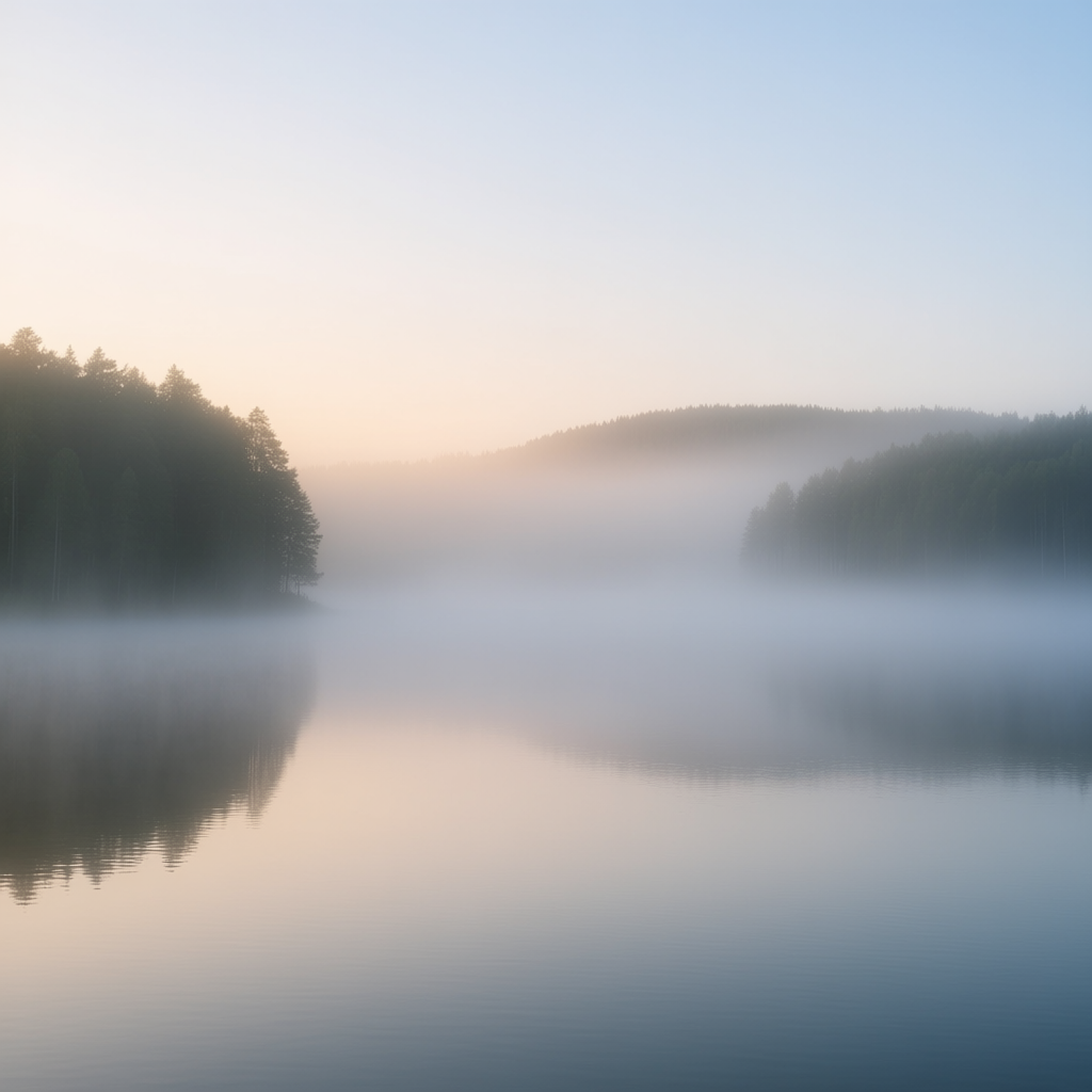
1. serene lake at dawn, morning mist rising from the water, soft diffused light (foggy, peaceful atmosphere)
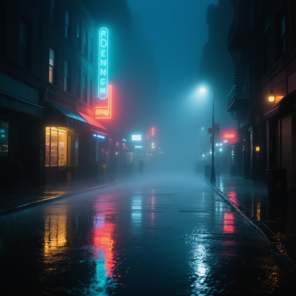
2. rainy city street at night, neon-lit with reflections on wet pavement, foggy haze, cinematic mood
In the first prompt, we explicitly mention “morning mist” which tells the AI we want that foggy atmosphere. The result would likely be a low-contrast, pastel-colored scene of a lake with a gentle haze – conveying tranquility and a touch of mystery as the distant shore fades away[26]. In the second prompt, phrases like “neon-lit,” “wet pavement reflections,” and “foggy haze” all combine to paint a vivid scene. The AI would probably produce a city street glowing with neon signs (maybe blues, pinks) reflecting on the ground, with some mist in the air blurring the distance – essentially a cinematic, Blade Runner-esque mood[25]. Notice we didn’t say “cyberpunk” or anything explicitly, but the combination of neon, rain, and fog evokes that style strongly. These examples illustrate how atmospheric elements like fog and neon can transform a scene’s mood entirely. A dry, clear city at noon would feel very different from the rainy neon night! When prompting, think of the weather and time of day as much as the subject: a sunny day, a stormy night, a foggy morning, twilight, etc., all have distinct color and contrast qualities you can describe. This way, you set the emotional stage for the AI image to come.
Combining Color & Mood Approaches
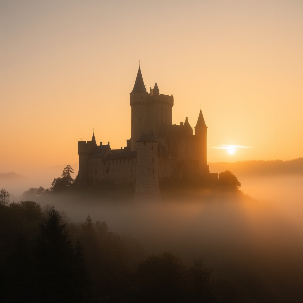
Just like a master painter or film director might use multiple techniques together, you can mix and match these color and mood prompt tricks to get a truly rich image. In fact, many of the best AI-generated images combine several of these elements naturally. For example, you might use a warm palette with high contrast to create an image that feels both inviting and dramatic – perhaps a scene at sunset (warm colors) with bold shadows (high contrast) for extra depth. Or you could combine color symbolism with atmosphere: imagine a foggy scene illuminated by eerie green light – you get the mystery of fog plus the unearthly vibe of the color green.
When combining, be clear in your prompt about each aspect. You can string descriptors one after another; the AI will try to satisfy all of them. It helps to paint a mental picture first of what you want, then describe the key colors, lighting, and mood elements that achieve it. The order of words is not extremely important, but grouping related terms can make it easier for the AI to parse (for instance: “a castle at sunset, warm golden light, low contrast, misty atmosphere, cinematic color grading” – here we have time of day and light quality together, then an atmosphere, then a grading style).
Example Prompt (Combining Techniques):
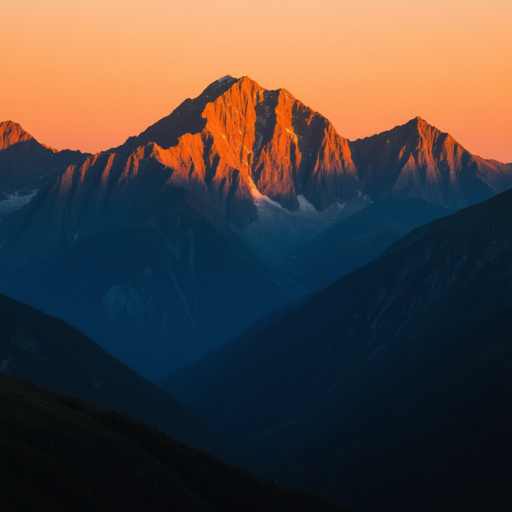
1. mountain landscape at sunset, warm orange sunlight on peaks but cool blue shadows in valleys, high contrast, epic and dramatic
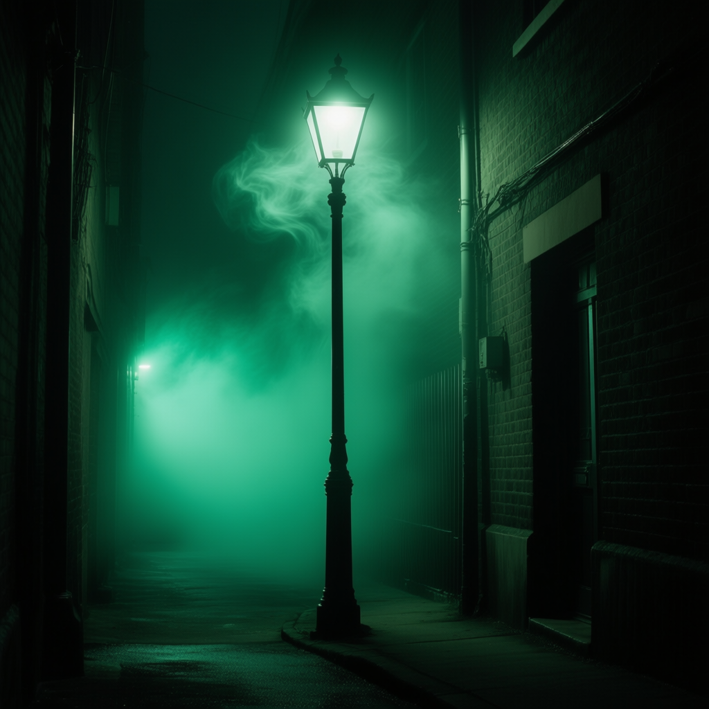
2. lone streetlamp in a dark alley, green fog swirling around, muted colors, cinematic horror mood
In the first combined example, we deliberately mix warm vs cool palette elements (“warm orange sunlight” and “cool blue shadows”) in one scene, along with high contrast (sunset light usually gives strong contrast). The AI would likely produce a stunning alpine scene where the mountaintops glow orange while the depths are tinted blue – a beautiful natural phenomenon often seen at twilight. This simultaneous warm and cool contrast[24] adds visual tension and is very storytelling: it might feel hopeful yet ominous, or highlight the last warmth of day against encroaching night. In the second example, we combined a symbolic color with atmosphere: green fog. Green here implies something unnatural or dangerous, and the fog adds mystery. We also said muted colors and “cinematic horror mood” to tie it together. The AI could output an image of an alley with a sickly green mist under a streetlamp, everything else subdued – instantly giving horror vibes without needing a monster in frame. The takeaway is that mixing approaches lets you fine-tune the story: you control palette (warm/cool), contrast (high/low), color meaning (specific hues), and atmosphere (fog, time of day, etc.) all at once to craft the exact feel you want.
Feel free to experiment with combinations in your prompts. Want a romantic yet mysterious scene? Try a cool palette with low contrast (e.g. a pale blue foggy morning in a forest) or warm colors with heavy fog (a golden glowing fog at night). Want something that feels epic and cinematic? Use complementary colors (like teal and orange) plus dramatic lighting. The possibilities are endless, and the more you practice combining them, the more intuitive it will become.
Color & Mood vs. Composition – What’s the Difference?
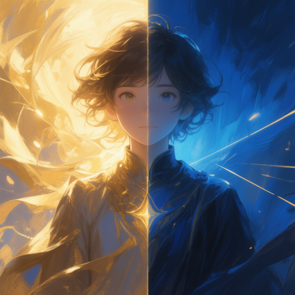
You might be wondering how these color and mood tricks relate to composition (framing, leading lines, etc., as covered in the first part of this series). Think of it this way: composition is how the elements of your scene are arranged – it’s like setting the stage in a play. You decide where the subject stands, what’s in the background, what angle we’re looking from. Color and mood, on the other hand, are like the lighting and music for that scene – they don’t change what is in the shot, but they hugely change how it feels.
An everyday analogy: Imagine two photos of the same person in the same pose (same composition). In one, it’s taken at midday in a colorful park; in the other, it’s at dusk under streetlights in the rain. The first is bright and cheerful, the second is moody and dramatic – even though the subject and framing are identical. That’s the power of color and mood. Composition builds the structure of your image (it’s the geometry and layout), while color and mood build the emotion and tone (it’s the visual soundtrack). Both work together to tell a full story. In prompts, you might use composition terms (like “wide-angle, rule of thirds”) to set up the scene’s layout, and then layer color/mood terms (like “golden hour, warm tones, high contrast”) to dress that scene in the desired emotional tone.
For the best AI art results, pay attention to both: first arrange your “actors” and scenery (composition), then decide on the “lighting and color grading” (mood). For example, “a portrait of a dancer, centered symmetry composition, soft pastel colors, diffused lighting” uses composition (centered symmetry) and palette (pastels with diffused light) together. The AI will place her in the middle and also render her with gentle colors – giving a harmonious final image. By clearly separating these ideas in your mind, you can more systematically craft prompts: one part for what’s in the scene and how it’s framed, another part for the look/feel of it.
In summary, composition is where things are and what they are doing, color & mood is what kind of emotional filter or light is cast over them. Both are crucial. A well-composed image with poor lighting can feel flat, and a vividly lit scene with no composition can feel aimless. So use composition tricks to get a solid image, then enhance it with the color and mood tricks from this guide to make it truly compelling.
Quick-Reference Summary of Color & Mood Terms
To wrap up, here’s a handy list of color and mood keywords you can mix into your prompts. These terms can help instantly change the look and feel of your AI-generated images. Feel free to copy-paste or tweak them as needed:
· Warm palette (reds, oranges, yellows, golden light) – for energy, warmth, passion
· Cool palette (blues, greens, purples, moonlight) – for calm, cold, mystery
· High contrast – strong lights & darks, dramatic and intense
· Low contrast – soft tones, gentle, calm or dreamy ambiance
· Dramatic lighting / Low-key lighting – deep shadows, one light source, adds tension
· Soft lighting / High-key lighting – even, low shadow, upbeat or airy mood
· Muted colors – desaturated, low intensity hues (vintage, serious, subdued feel)
· Pastel colors – light, tinted hues (soft, whimsical, gentle feel)
· Monochrome (or Grayscale, Black and white) – one color or no color, timeless or focused mood
· Sepia tone – brownish monochrome (vintage, nostalgic effect)
· Duotone – two-color scheme (e.g. red and black, blue and orange)
· Limited palette – restrict colors (e.g. “only gold and white tones”) for stylization
· Triadic color scheme – three balanced colors (e.g. red, blue, yellow together)
· Golden hour lighting – warm, soft light just after sunrise or before sunset (romantic, nostalgic)
· Blue hour – cool bluish light just after sunset (quiet, melancholic)
· Neon lighting / Neon glow – vivid colored lights (futuristic, urban, edgy mood)
· Foggy / Misty / Hazy – add fog or mist (mystery, depth, softness)
· Silhouette – dark subject against bright background (dramatic, emphasizes shape)
· Cinematic color grading – movie-like tones (use with specific looks like “teal and orange”, “bleach bypass”, “film noir”, etc.)
· Cinematic lighting – generally implies artful, movie-style lighting (often dramatic or well-crafted light)
· [Color] glow / ambiance – e.g. “red glow,” “blue ambient light,” “green tint” (to bathe scene in a color)
Mix and match these terms with your subject and composition descriptions. For example: “a portrait of a woman, soft pastel colors, golden hour sunlight, bokeh background” or “futuristic skyline at night, neon glow, high contrast, cinematic”. By choosing the right color and mood words, you’ll guide the AI to create images that not only look good, but also feel right for your story. Happy prompting, and enjoy coloring your worlds with mood![2][25]
[1] The Role of Color in Photography: Creating Mood and Emotion
https://kellytareskiphotography.com/the-role-of-color-in-photography-creating-mood-and-emotion/
[2] [19] [20] [21] [22] Color Psychology In Photography: Key Tips For Use I Skylum Blog
https://skylum.com/blog/color-psychology-for-photographers
[3] Emotional Impact of Color in Landscape Photography
[4] [6] Light, Shadows, and Contrast: A Beginner’s Guide to Photography – ZHIYUN Store
[5] High Contrast vs Low Contrast Photography: A Complete Guide
https://fotober.com/high-contrast-vs-low-contrast-photography
[7] Low Contrast vs High Contrast for Real Estate Photography
https://www.photoup.net/learn/low-contrast-vs-high-contrast-for-real-estate-photography
[8] High-Key Lighting vs. Low-Key Lighting In Film | Backstage
https://www.backstage.com/magazine/article/high-key-lighting-vs-low-key-lighting-in-film-75630/
[9] [10] [11] [12] Pastel vs. Muted Colors: Pros and Cons
[13] [14] Black & White Prints | LIK Fine Art
[15] How to use Monochromatic Color to Convey more Emotion in your Photography
https://digital-photography-school.com/monochromatic-color-in-photography/
[16] [33] Understanding the Basics of Cinematic Color Grading
https://www.filmsupply.com/articles/cinematic-color-grading/
[17] [18] Color Psychology: Does It Affect How You Feel?
https://www.verywellmind.com/color-psychology-2795824
[23] The Golden Hour: Why it is the Best Time of Day for Photographs
https://jamesthomaslong.com/why-the-golden-hour-is-the-best-time-of-day-for-photographs/
[24] A Complete Golden Hour Photography Guide – MIOPS
[25] Glow In The Dark Photoshoot With Neon: Ideas & Tips | Skylum Blog
https://skylum.com/blog/glowing-in-the-dark-the-neon-photoshoot-ideas
[26] [27] [28] Fog turns into stunning photos
https://www.clippingpathassociate.com/blog/fog-turns-into-stunning-photos
[29] [32] Silhouettes Speak - NYIP Photo Articles
https://www.nyip.edu/photo-articles/photography-tutorials/silhouettes-speak
[30] Powerful Silhouette Photography in 5 Simple Steps
https://photography-playground.com/silhouette-photography/
[31] Using shadows and silhouettes in your photography: A guide


