This is part nine in a series:
Simple Composition Tricks to Instantly Improve AI Images with Prompts
More Simple Composition Tricks to Instantly Improve AI Images Using Prompts
Intermediate Composition Tricks to Instantly Improve AI Images Using Prompts
Intermediate Emotional & Narrative Composition Techniques for AI Images Using Prompts
Simple Composition Tricks to Instantly Improve AI Images with Prompts: Camera Angles Edition
Simple Composition Tricks to Instantly Improve AI Images with Prompts: Perspective Edition
Simple Composition Tricks to Instantly Improve AI Images with Prompts: Color & Mood Edition
Simple Composition Tricks to Instantly Improve AI Images with Prompts – Light & Shadow Edition
Simple Composition Tricks to Instantly Improve AI Images with Prompts: Texture & Detail Edition
Modern AI image generators don’t just arrange shapes and colors – they also respond strongly to texture and detail cues. By adding classic texture techniques and tactile keywords to your text prompts, you can make your AI-generated art feel tangible and rich with story. Think of how a painter like Van Gogh used thick brushstrokes for emotion, or how a photographer captures the roughness of old wood or the softness of fur to set a mood. In film, directors pay attention to costumes and set textures to convey time period and atmosphere. In the same way, you can guide the AI with simple descriptive words to give your images a feel – whether it’s coarse and gritty, silky and soft, or polished and shiny. Best of all, these tricks are beginner-friendly, in plain language, and require no special tools or add-ons – just creative use of words. Let’s dive in!
1. Surface Contrast (Rough vs. Smooth, Cracked vs. Polished, Weathered vs. Pristine)
One powerful way to add interest to an image is by contrasting different surface textures. Choosing rough vs. smooth or old vs. new surfaces can instantly set a mood. For example:
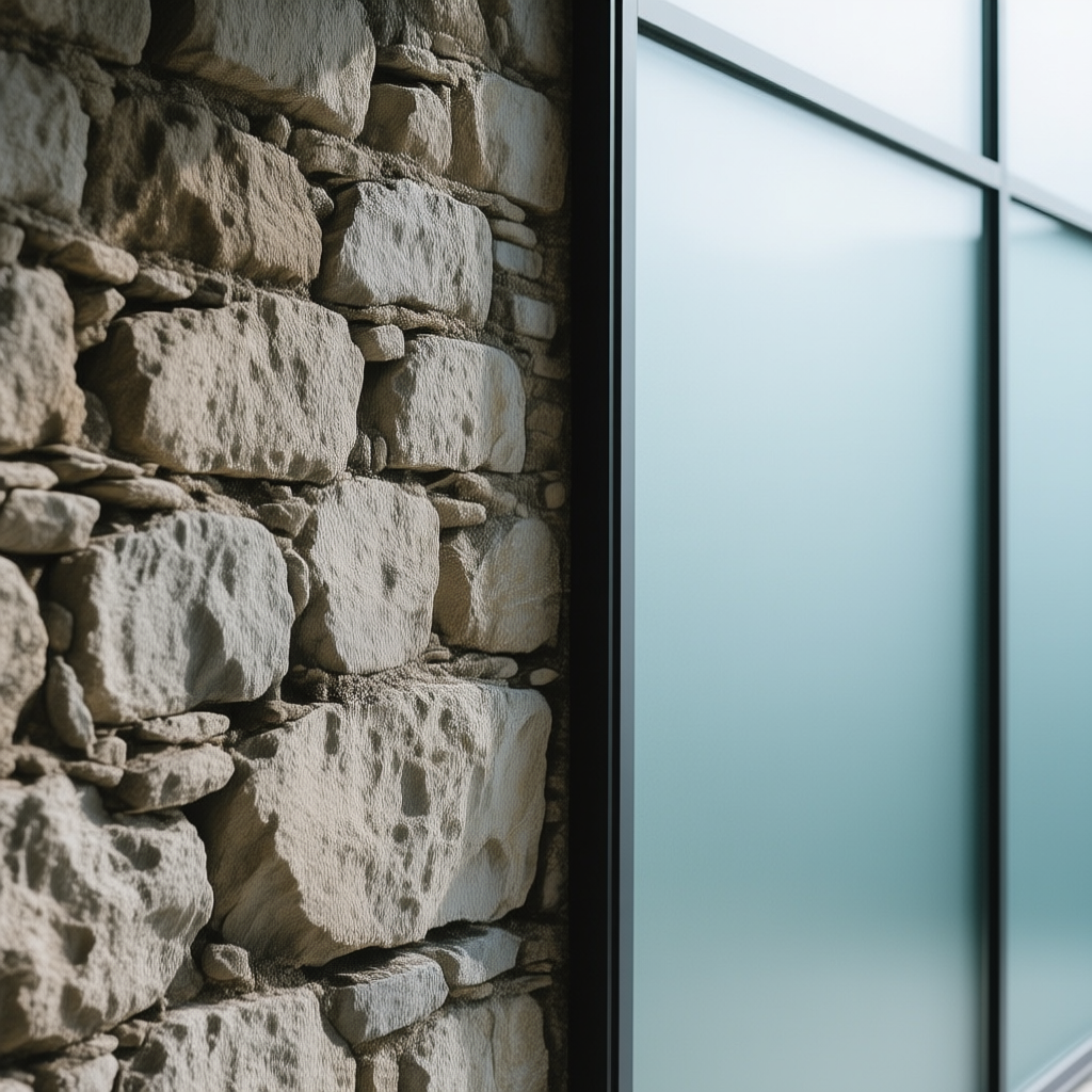
Rough vs. Smooth: A rough surface is uneven and gritty to the eye, like coarse stone or sandpaper. It tends to create a sense of ruggedness or tension, demanding attention with its visual “noise.” In contrast, a smooth surface is even and sleek (like glass or calm water), which feels calm, clean, or gentle. Rough textures can make a scene feel aged or harsh, while smooth textures feel modern or peaceful. Photographers note that smooth, soft textures convey gentleness and calm, whereas rough, hard textures create tension or edginess[1]. Use rough surfaces when you want grit, toughness, or realism; use smooth surfaces for a soothing, refined vibe. Example Prompt: an old stone wall with a rough, craggy face stands beside a smooth, glassy modern window.

Cracked vs. Polished: Cracked surfaces (like cracked paint, glass, or dried mud) have visible breaks and imperfections that imply age, fragility, or neglect. A cracked texture tells a story of time passing or something being broken. Meanwhile, a polished surface (like polished marble or metal) is perfectly smooth and often shiny, suggesting newness, care, or luxury. Cracks evoke an emotional effect of decay or vulnerability, whereas polish gives a sense of elegance or order. Use cracked textures in prompts for ruins, old objects, or weathered characters; use polished textures for pristine, upscale settings or to highlight a subject as important. Example Prompt: a treasure chest made of cracked, weather-beaten wood next to a polished gold lock gleaming in the light.
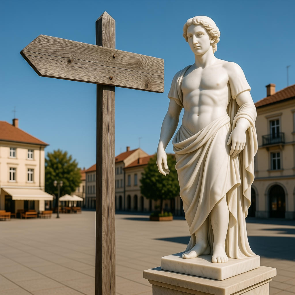
Weathered vs. Pristine: Weathered surfaces are those worn down by time and the elements – think of sun-faded fabric, rusted iron, or an old barn’s peeling paint. They bring a sense of history, resilience, and nostalgia (or sometimes decay). Pristine surfaces, on the other hand, are brand-new or immaculately maintained – spotless glass, freshly painted walls, untrodden snow. A weathered texture creates a mood of age, wisdom, or enduring hardship, while a pristine texture feels pure, untouched, or sterile. You might use weathered textures to tell stories of enduring journeys or bygone eras, and pristine ones for scenes of new beginnings or clinical, futuristic settings. Example Prompt: an old weathered wooden signpost beside a pristine white marble statue in the town square, contrasting history and modernity.
2. Material Qualities (Glossy vs. Matte, Reflective vs. Dull Finishes)
Different materials have distinct surface qualities. Some surfaces shine and reflect light, while others are flat and diffuse. Understanding these qualities lets you control the shine and vibe of your image:
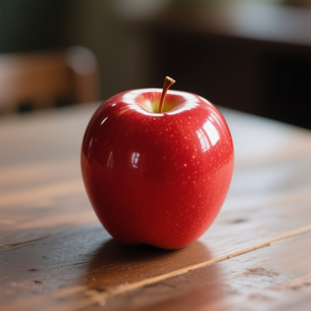
Glossy (Shiny) vs. Matte (Flat): A glossy surface is smooth and highly reflective – it produces bright highlights or even mirror-like reflections (like a polished car or a still lake). Glossy surfaces appear vibrant and eye-catching, often associated with luxury or newness (imagine a glossy magazine photo or slick wet paint). A matte surface is the opposite: it has no shine, often due to a microscopically uneven texture that scatters light instead of reflecting it[2]. Matte (also called dull or flat) surfaces feel softer and more subdued, giving an understated, anti-glare look[3]. In prompts, glossy keywords (e.g. “shiny,” “gleaming,” “polished”) will make the AI render objects with bright highlights and clarity, whereas matte terms (like “dull finish,” “matte surface,” “flat color”) result in a softer, more diffuse look. When to use: Go glossy when you want energy, contrast, or a modern sleek aesthetic; go matte for a gentle, vintage, or cozy feel. Example Prompt: a glossy red apple with light glinting on its skin, sitting on a matte wooden table that absorbs the light. (The apple will look shiny and attention-grabbing, the table will look rustic and non-reflective.)
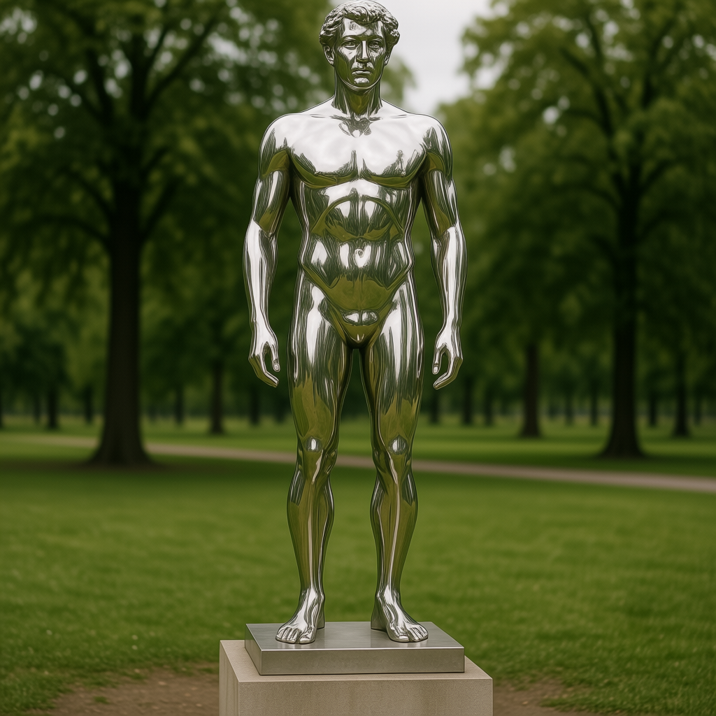
Reflective vs. Dull: This is a similar idea in a slightly different context. Reflective surfaces (like mirrors, chrome, or calm water) literally reflect their surroundings. They create dynamic visuals – for instance, a cityscape reflected in a skyscraper’s windows, or a person’s face reflected in a mirror. Reflections can add depth or a sense of realism and complexity to an image. Dull surfaces (not in the boring sense, but non-reflective) such as unpolished stone, weathered metal, or chalky paint do not show clear reflections; they soak up light and have a stable, solid appearance. Use reflective materials in your prompts to emphasize light and environment (e.g. “mirror-like floor,” “reflective water”), which can evoke feelings of openness, brightness, or even introspection (seeing oneself). Use dull materials when the focus should be on the object’s form or color itself rather than shine, or to create a muted, earthy atmosphere. Example Prompt: a reflective chrome statue in a park, showing distorted reflections of the trees, standing on a dull concrete pedestal.
(Tip: Glossy/reflective surfaces can make an image feel lively and bold, but too many can be overwhelming. Matte/dull surfaces bring balance and let the viewer focus on other details without glare. Mix them as needed for contrast.)
3. Softness & Sharpness in Textures (Silky, Mossy vs. Jagged, Spiky)
Textures can also be described by how soft or hard/sharp they feel. This isn’t about light or color, but the physical impression a surface gives. Including such descriptors in your prompt can set a comforting or intense tone:
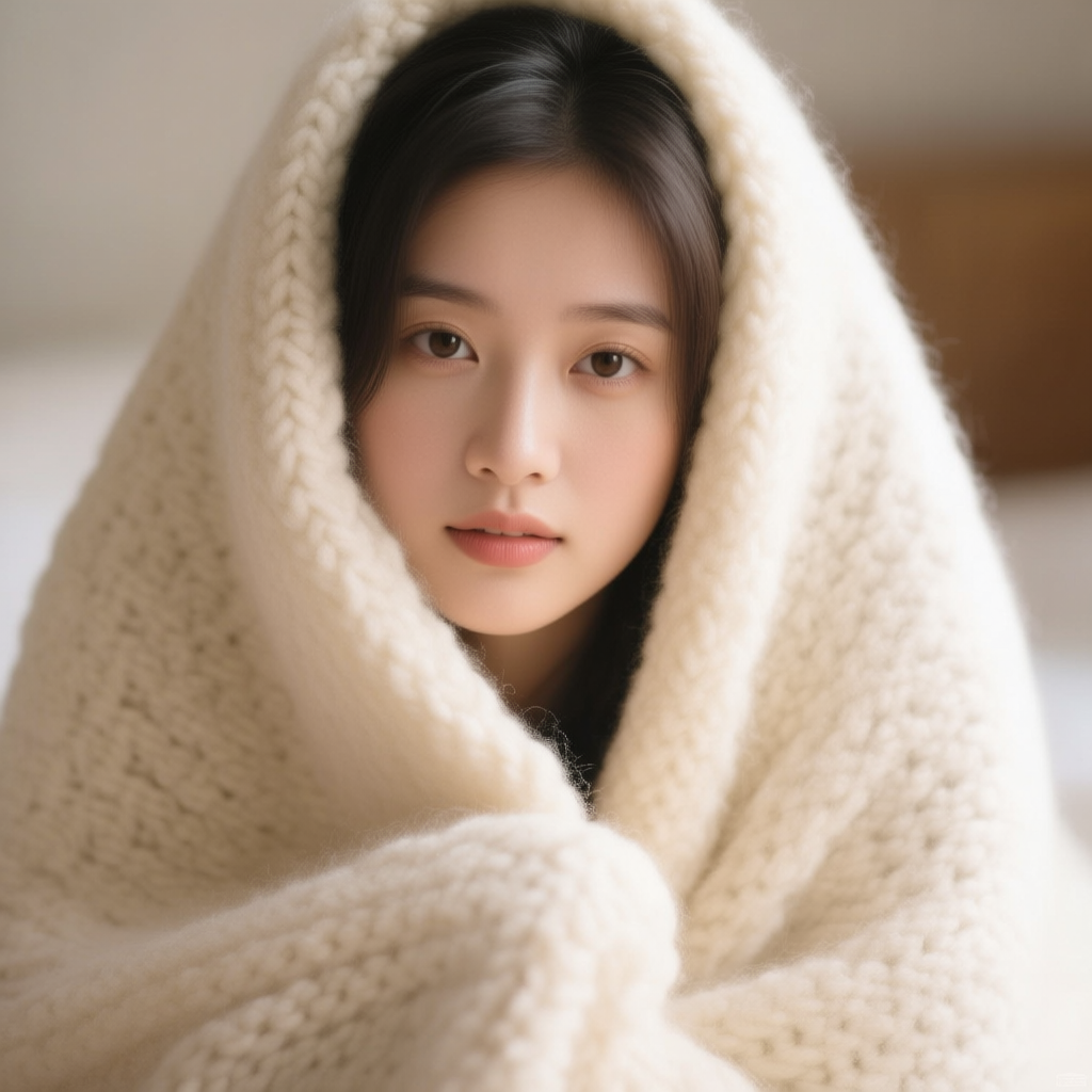
Soft Textures: These are surfaces that look like they’d be pleasant or gentle to touch. Examples: silky fabric, plush fur, mossy surfaces, or velvety petals. Soft textures often convey warmth, comfort, or delicacy. They tend to smooth out an image’s mood. For instance, silk or satin fabric draped in a scene adds a sense of luxury, grace, or tenderness. Moss covering a stone gives a tranquil, fairy-tale forest feel. Use soft textures to make a setting feel inviting, cozy, or peaceful. They can also humanize a scene (a soft blanket in a room makes it feel lived-in). Emotional effect: Softness usually calms the viewer and can evoke intimacy or nostalgia. Example Prompt: a portrait of a young woman under a soft knitted wool blanket, the fabric’s fluffy, soft texture filling the frame with warmth. (This would make the image feel cozy and gentle.)
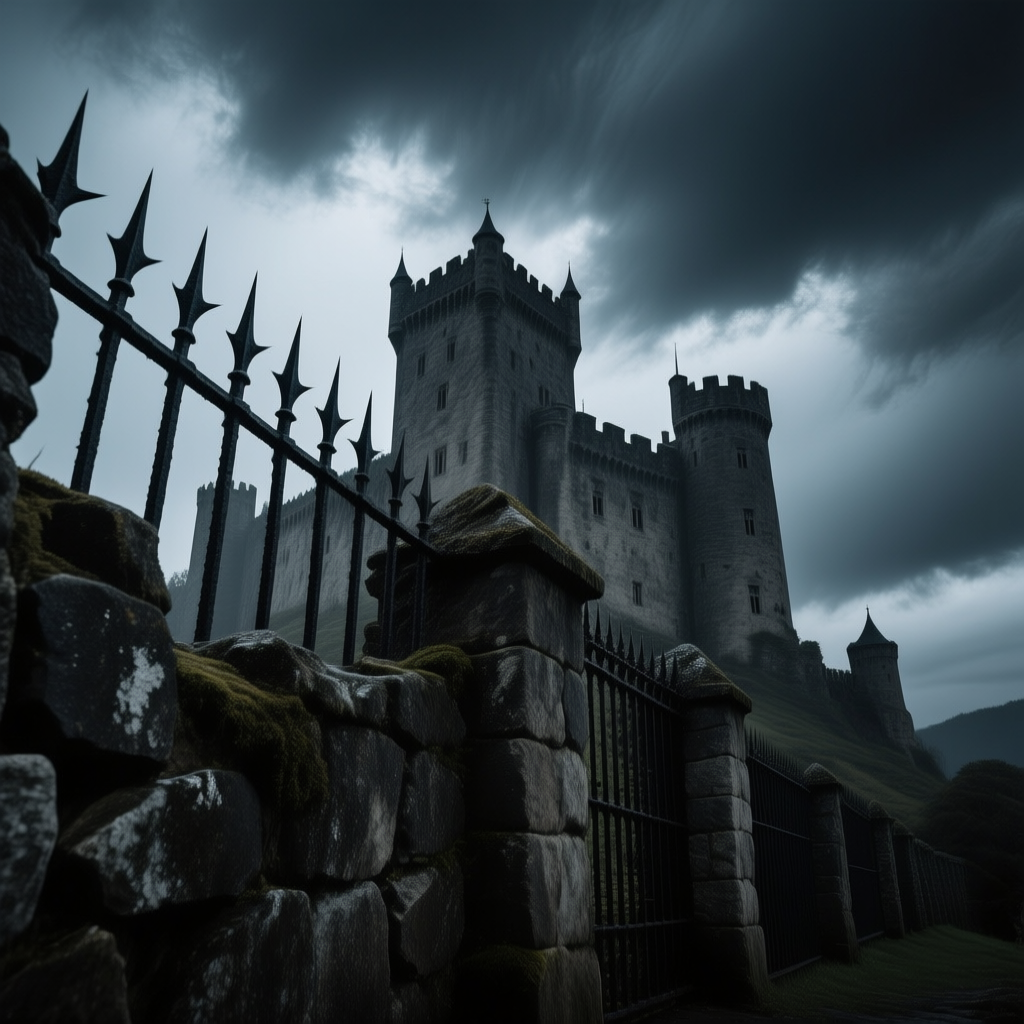
Sharp or Hard Textures: In contrast, sharp or jagged textures look like they could poke or cut. Think jagged rocks, thorny thistles, spiky metal blades, or even the coarse, rugged bark of an old tree. These textures add visual tension and energy. A scene filled with jagged, hard surfaces can feel dangerous, wild, or stark. For example, jagged rocks on a mountainside convey a harsh, adventurous environment, and sharp blades or spines (like on a cactus or a weapon) immediately create suspense or drama. Use sharp textures to introduce a sense of risk, strength, or severity in your image. Emotional effect: Sharp details create edginess and can put a viewer on alert (in a good way for dramatic scenes). Example Prompt: an imposing castle guarded by jagged stone walls and spiky iron fences, under a stormy sky. (The abundance of hard, sharp textures will give an ominous, intense mood.)
Remember you can mix soft and sharp elements for contrast. For instance, “soft moss growing on jagged rocks” combines comfort with harshness – visually interesting and symbolically rich (nature softening something hard). Don’t hesitate to experiment by adding a soft element to a sharp scene or vice versa to balance the feel.
4. Natural Textures (Bark, Moss, Fur, Feathers, Stone, Sand, Snow, Water)
Nature is full of wonderful textures that immediately set the scene and mood. Describing natural materials in your prompt helps the AI imagine the environment vividly. Here are some common natural textures and how they affect an image:
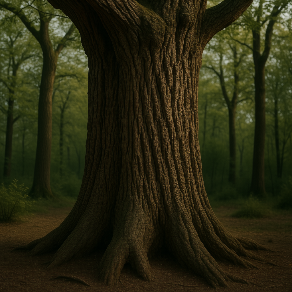
Bark: The surface of tree bark is typically rough, with grooves and ridges. Including gnarled or rough bark in a prompt gives a rustic, organic feel. It can symbolize age and strength (an old tree’s wisdom) or even toughness. Bark textures work well in forest scenes or close-ups of trees, making the viewer practically feel the tree’s presence. When to use: to add a rugged, natural backdrop or highlight age (old oak with cracked bark). Example Prompt: an ancient oak tree trunk, its rough bark covered in deep grooves, standing strong in the forest.
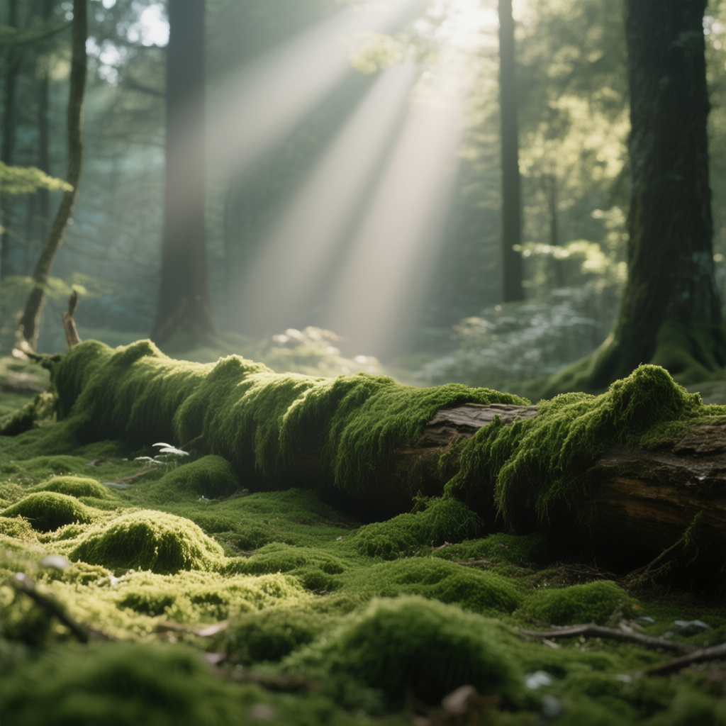
Moss: Mossy surfaces are soft, green, and plush. Moss often grows on rocks, trees, or old buildings. A mossy forest floor or moss-covered stone gives a scene a tranquil, enchanted mood – as if the place is undisturbed and peacefully reclaimed by nature. Moss texture implies moisture, quiet, and time (since it takes time to grow). When to use: to make a scene feel ancient, calm, or untouched by humans. Example Prompt: sunbeams filtering onto a moss-covered log in a quiet forest, the ground soft and green with moss.
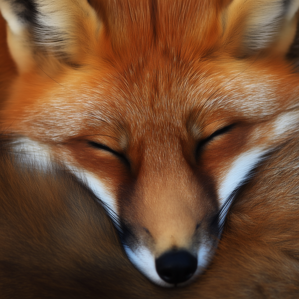
Fur: Animal fur is usually depicted as fluffy, soft strands. Mentioning fur in a prompt (e.g. soft fur, thick mane of fur) adds warmth and often a cozy or lively element (if on a pet, it’s comforting; if on a wild animal, it’s the realism of the creature). Fur texture can convey comfort (a fur rug by the fire) or the wildness of an animal (the shaggy fur of a bear). When to use: whenever an animal is in frame, or to add a tactile sense of warmth. Example Prompt: a close-up of a sleeping fox curled up, its fluffy red fur catching the dappled light. (Viewers can almost imagine the softness.)

Feathers: Feathers have a delicate, layered texture. They suggest lightness and gentleness. A bird’s plumage can also bring vibrant patterns or colors. Including feather texture might mean showing a single feather (symbolizing fragility or freedom) or a bird with detailed plumage (like the iridescent feathers of a peacock for a dramatic effect). Feathers evoke a sense of flight, freedom, or softness. When to use: to add a touch of grace or whimsy (falling feathers, an angelic motif) or natural beauty (close-up of a bird). Example Prompt: a white feather drifting to the ground, every fine strand visible against a soft sky. (This emphasizes the feather’s delicate texture and gentle mood.)
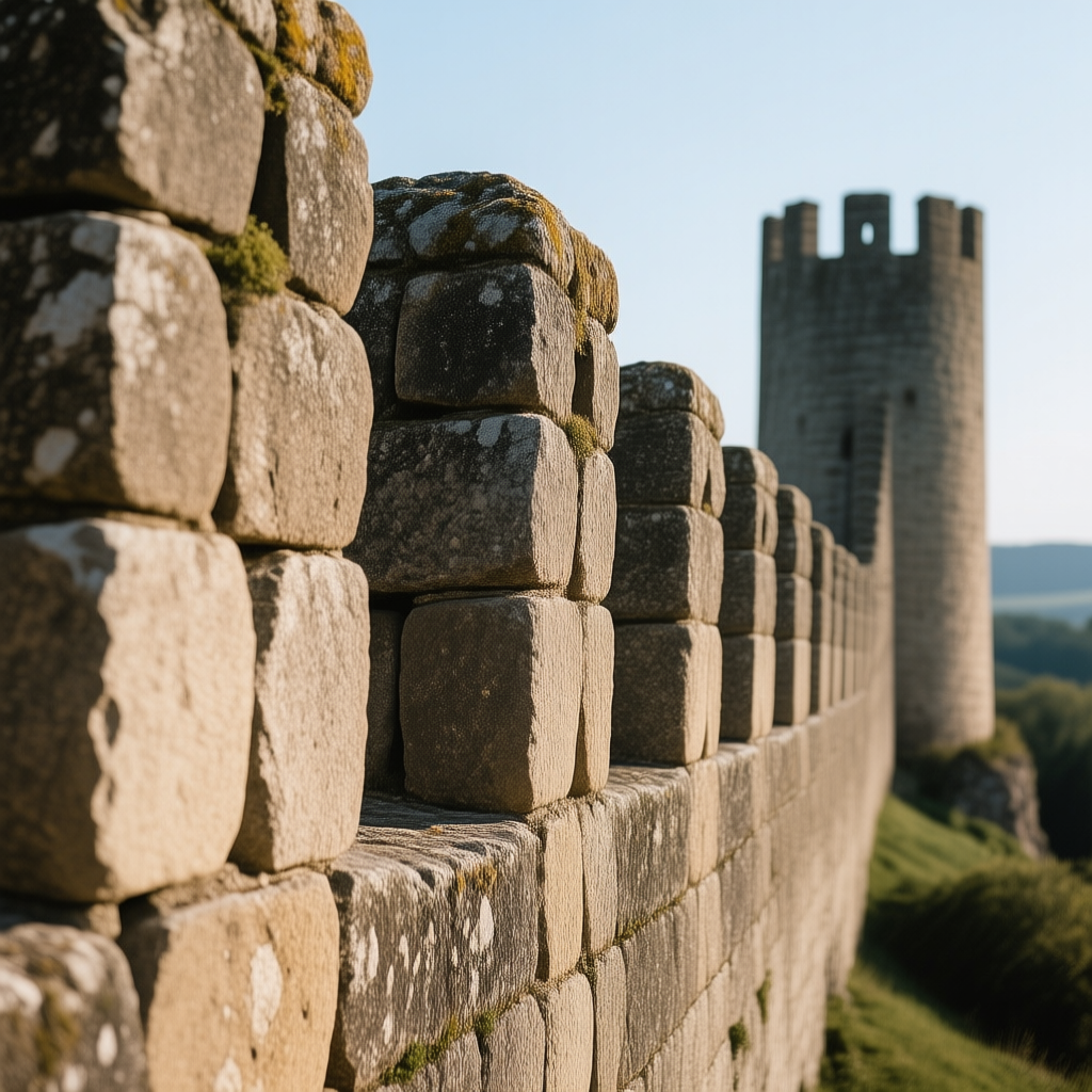
Stone: Stone can have various textures – from rough, craggy rocks to smooth pebbles. Generally, stone surfaces add a sense of solidity, permanence, and earthiness. Weathered stone (rough, with chips and moss) implies age and endurance (old ruins, mountains), whereas polished stone (like river stones or marble) gives a refined, calm feel. Use stone textures for anything from majestic natural scenes (rocky mountains, stone cliffs) to ancient human-made structures (temples, cobblestone streets). Emotional effect: rough stone = rugged and adventurous; smooth stone = tranquil and stable. Example Prompt: a medieval city wall built from rough stone blocks, each stone worn and textured by time.
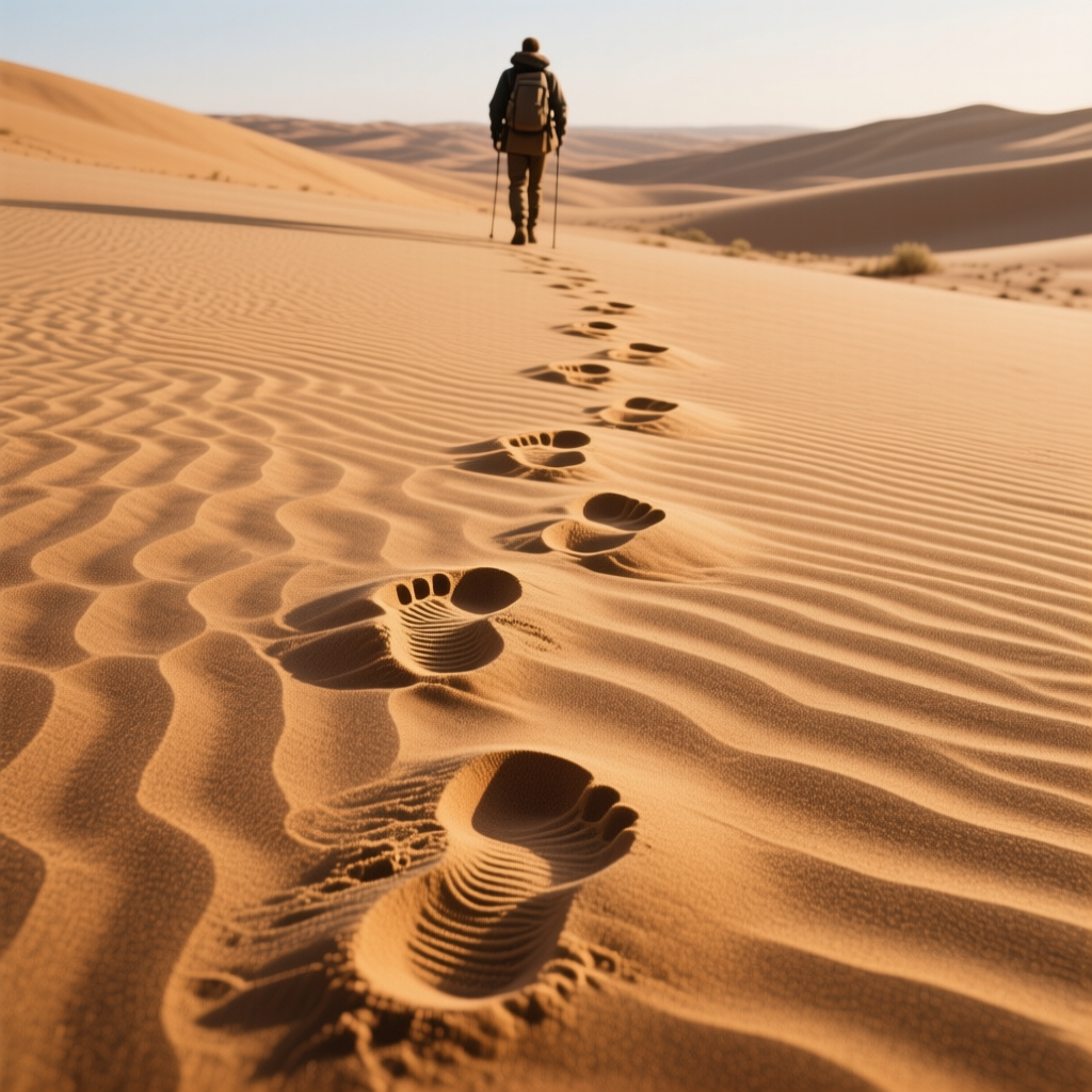
Sand: Sand has a granular texture. Dry sand is loose and grainy; you can describe fine sand, gritty sand, or even wind-swept sand dunes. This texture often gives a sense of warmth and relaxation if it’s a beach (soft golden sand) or desolation and heat if it’s a desert (endless dunes). Wet sand becomes smoother and reflective. Including sand in a prompt immediately suggests a shore or desert setting. When to use: beach scenes (for a peaceful, sunny vibe) or desert scenes (for a harsh, vast mood). Example Prompt: footprints trailing behind a traveler in the rippling desert sand, each step forming a textured impression under the sun.
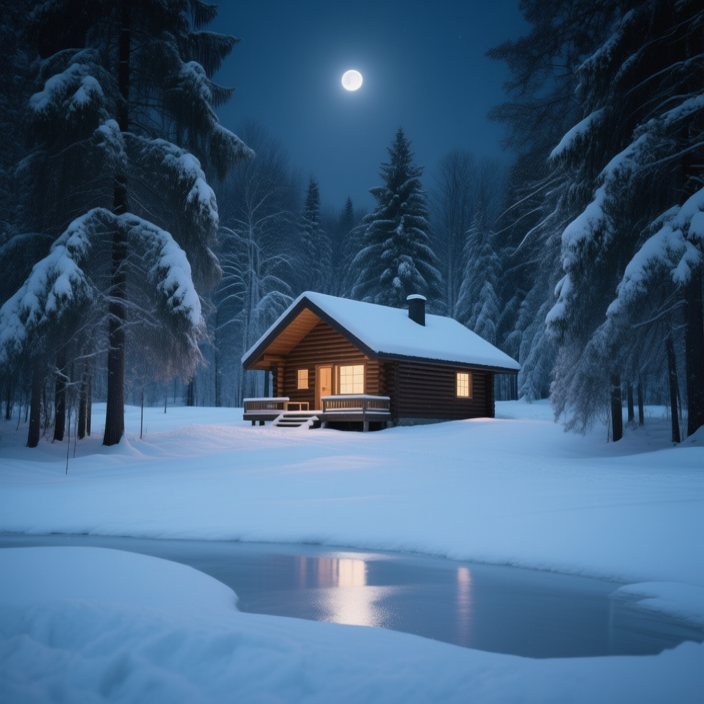
Snow: Snow is soft, powdery when fresh, and can become crunchy or icy when older. Fresh snow blanket makes a scene feel quiet, pure, and cold. It covers and smooths out surfaces (softening the world’s details), which often creates a calm or austere atmosphere. Describing powdery snow, crunchy snow, or snowflakes can add either a gentle magical vibe (soft falling snow) or a stark, isolated mood (a snow-covered barren field). When to use: winter scenes, to add silence, serenity, or even melancholy. Example Prompt: a cabin in the woods surrounded by fresh snow, the ground a soft white carpet reflecting moonlight. (The snow texture gives a peaceful, cold night feeling.)
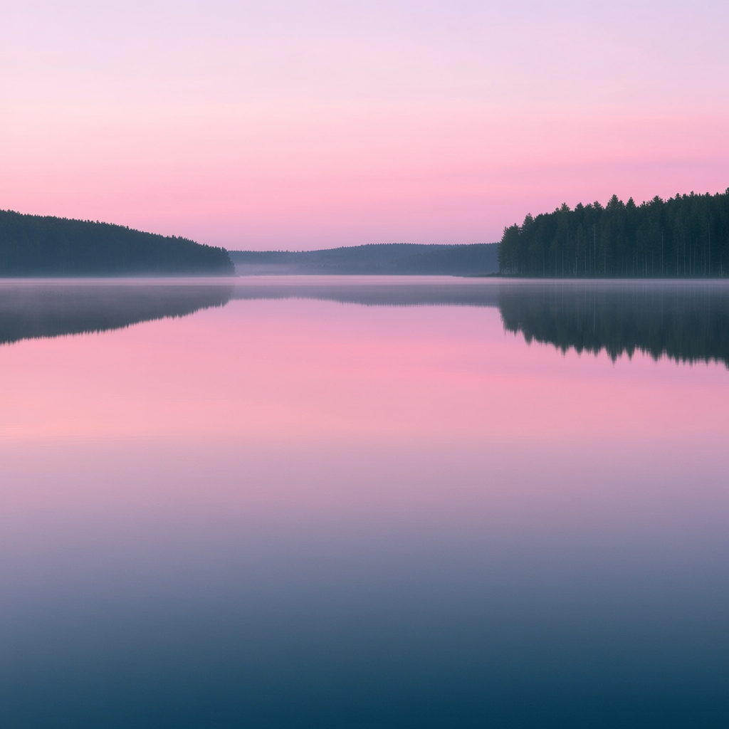
Water: Water is unique because it can appear in different textures depending on its state. Calm water has a smooth, mirror-like texture (great for reflections and a peaceful mood). Rippling or wavy water adds dynamic patterns and energy. Splashing water looks chaotic and detailed with droplets (action, freshness). Including descriptors like glassy lake, choppy ocean waves, or glistening raindrops tells the AI how the water should feel. Emotional effect: smooth water = tranquility; waves = movement and excitement; raindrops = freshness or gloom depending on context. Example Prompt: a glassy lake at dawn, the water perfectly still and reflecting the pink sky. (This yields a very calm, reflective scene, literally and mood-wise.)
5. Artificial Textures (Metal, Glass, Leather, Plastic, Textiles, Paper, Concrete)
Human-made or processed materials also bring their own textures which can set a scene’s era, location, or mood. Using these in prompts can hint at an industrial setting, a cozy home, a futuristic city, etc.:

Metal: Metal surfaces can range from gleaming and smooth (polished steel, chrome, gold) to rusty and pitted (old iron, corroded steel). Shiny metal gives a modern, clean, or high-tech feel (think of a sci-fi chrome robot or a shiny new car). Rusted metal gives an aged, gritty, industrial vibe (old factories, steampunk aesthetics). Including metal texture words like shiny, polished, reflective, metallic, rusty, corroded will drastically change the image. Emotional effect: polished metal feels strong and new; rusted metal clearly symbolizes decay and time (indeed, rust is often seen as a symbol of decay and poor quality over time[4]). Example Prompt: sunlight reflecting off the polished steel hull of a spaceship, while rusted metal debris lies on the landing pad. (We see both new and old metal textures for contrast.)
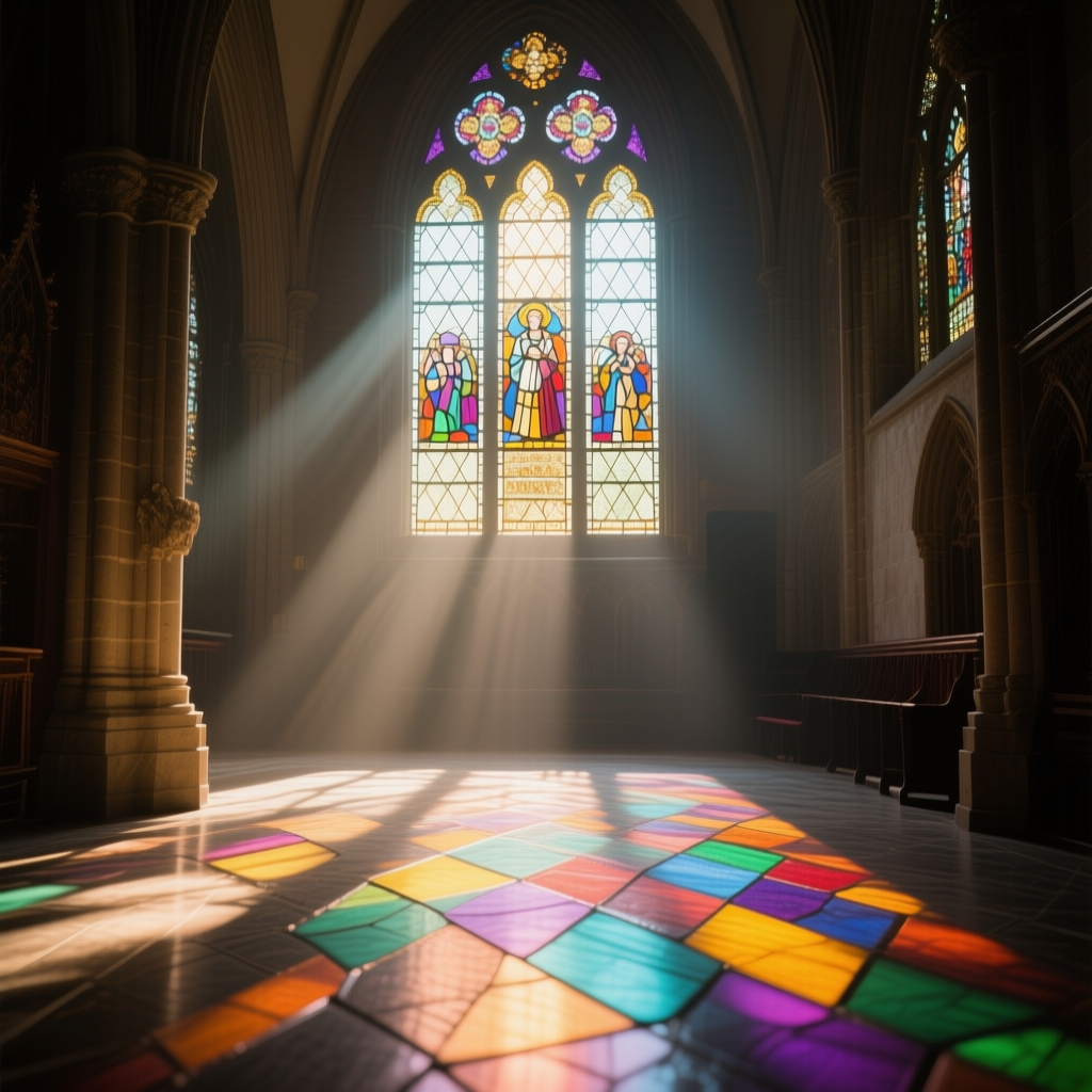
Glass: Glass is characterized by its smooth transparency and reflections. A glass texture can be clear, frosted, or shattered. Clear glass (like windows or glasses) adds a sense of openness, light, and sometimes fragility (you can see through it, but it’s breakable). Frosted or textured glass distorts light and offers a softer look (privacy, mystery). Broken glass introduces jagged edges and implies something dramatic happened; it’s a strong visual symbol of fragility or chaos. Culturally, glass often symbolizes fragility and elegance – for example, an empty glass or glass figurine can represent delicate beauty (in art, glass traditionally symbolizes fragility[5]). Use glass in prompts for modern architecture (glass skyscrapers), reflective scenes (mirrors, windows with reflections), or symbolic moments (a glass vase about to shatter). Example Prompt: a stained-glass window in a cathedral, the morning light painting colored patterns on the floor. (The glass texture here creates a beautiful, peaceful mood with its colorful transparency.)
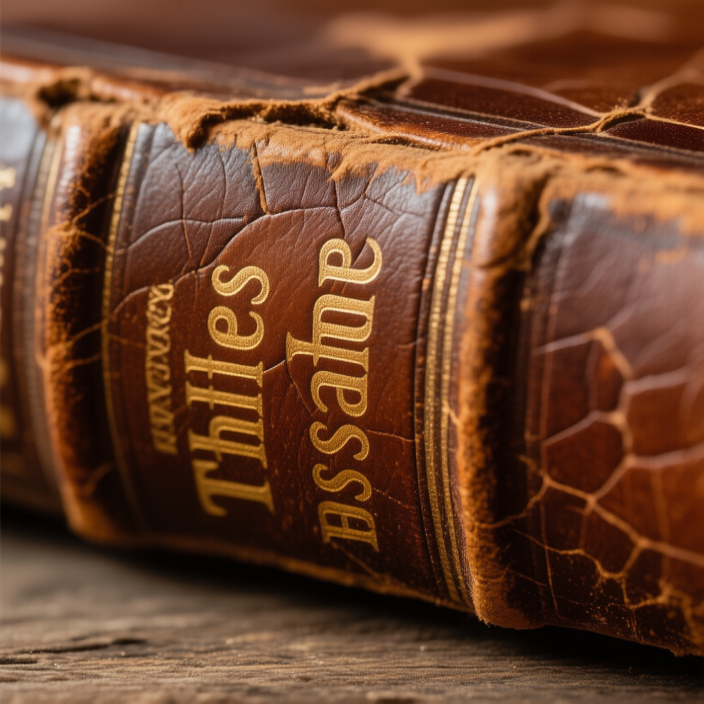
Leather: Leather has a textured grain that can be smooth and supple when new or cracked and worn when aged. Leather immediately evokes a tactile sense – think of a leather jacket, an old leather-bound book, or a vintage leather armchair. New leather is sleek, slightly reflective, and signals quality or luxury (and maybe a bit of toughness/cool factor, like a biker jacket). Aged leather has cracks, patina, and softened areas, which add character and a sense of history (like an old saddle or antique book cover). Use leather textures to give a scene warmth and realism (e.g., a character sitting in a leather chair by a fireplace feels cozy but classy) or to suggest longevity and use. Example Prompt: a close-up of an old leather book cover, its brown leather cracked and worn, with gold embossed letters faded by time. (This delivers a sense of age, nostalgia, and tangible history through texture.)
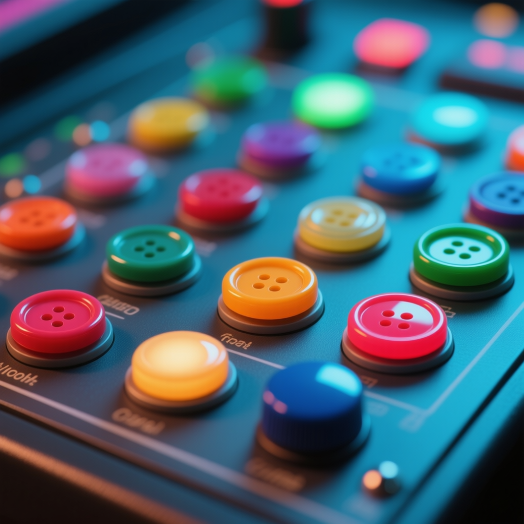
Plastic: Plastic is common and can have various finishes, but generally smooth (often with a subtle shine) or matte cheapness. Describing shiny plastic can imply modern toys, gadgets, or slick surfaces, while faded or scratched plastic suggests something old or of low quality. Plastic textures often carry a modern, artificial feeling (unlike organic wood or stone). For example, a glossy plastic surface might be found on a colorful toy, giving a playful vibe, whereas a scuffed plastic appliance might indicate wear and tear in a mundane setting. Use plastic in prompts when describing everyday objects (a plastic bottle, a vinyl record – vinyl is a type of plastic, etc.) or futuristic synthetic environments. Example Prompt: an assortment of colorful plastic buttons on a control panel, each one smooth and slightly reflective under the lights. (This would give a sense of a modern or retro-tech control interface.)
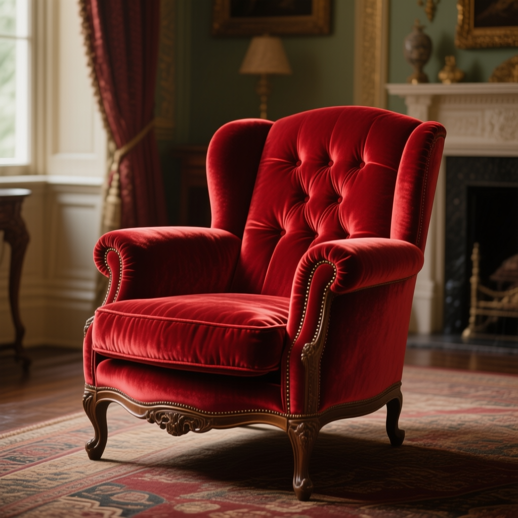
Textiles (Fabric): Fabrics come in countless textures: coarse burlap, soft cotton, luxurious silk, thick wool, lace, denim, velvet and so on. Mentioning a specific fabric type or a descriptor like frayed, silky, knitted, velvety, sheer immediately adds detail to clothing, furniture, or backgrounds. Coarse fabrics (burlap sack, rough canvas) add a rustic, rough feel. Fine fabrics (silk, satin) add elegance and smoothness. Wool or knit adds coziness and warmth (a knitted scarf, a wool blanket). Lace adds delicate, intricate detail for a vintage or feminine touch. Use textile textures to define the mood of interior scenes (plush velvet drapes for luxury, rough canvas tent for adventure) or the personality of characters (a character in a frayed denim jacket vs. one in a crisp silk gown). Example Prompt: a velvet armchair in a Victorian parlor, its red velvet fabric catching the light to show a soft sheen and plush texture. (The velvet suggests luxury and comfort in a classic setting.)

Paper: Paper can be glossy and smooth (a magazine page, photograph) or rough and fibrous (handmade paper, old parchment). It’s an often overlooked texture but can be very atmospheric: aged paper with rough, torn edges and a parchment feel can make a scene feel historical or scholarly, whereas shiny photo paper might be part of a modern scene. Use paper texture in prompts when relevant: for example, describing “a letter written on crinkled, yellowed paper” gives a very different feel than “a note on glossy white paper.” The former feels old and sentimental, the latter clean and contemporary. Example Prompt: an ancient map drawn on weathered parchment, the paper’s surface uneven and grainy with age, spread out on a wooden table. (This conjures a tactile image of the map’s texture, adding to the adventurous mood.)
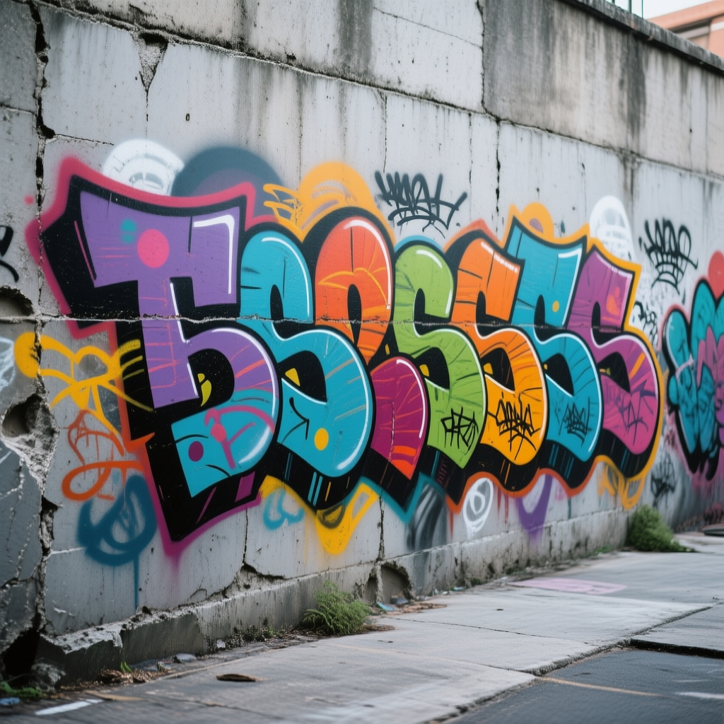
Concrete: Concrete is a mix of stone, cement, etc., and typically appears grainy, rough, and gray, though it can be polished. Concrete textures give an urban, industrial feel. An old concrete wall with cracks and stains feels gritty and real (think graffiti on concrete, or an underpass). Smooth polished concrete floors can appear modern, minimalistic (trendy loft apartment or art gallery look). Including concrete can instantly place your scene in a city, bunker, or modern architecture. It often symbolizes sturdiness and utilitarian environments. Example Prompt: a graffiti mural painted on a rough concrete wall, the gray concrete texture visible between the colorful spray paint. (The roughness of the concrete adds to the urban, edgy atmosphere of the scene.)
6. Micro-Detail vs. Macro-Detail (Fine Details vs. Bold Textures)
Sometimes it’s not just what the texture is, but how large or small it is. Detail scale can greatly affect the image’s feel:
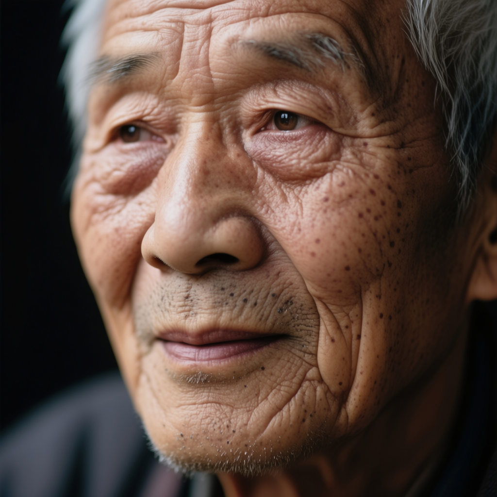
Micro-Detail (Fine Texture): This refers to very fine, small-scale details on a surface. For example, fine cracks in old porcelain, the grain of wood or film, the pores on a leaf or skin, delicate engraving on metal, or the subtle weave of a fine fabric. Including micro-detail in your prompt can make an image feel ultra-realistic or intricate. It draws the viewer in to notice small things, adding a sense of realism, age, or complexity. Use words like finely detailed, intricate, delicate pattern, microscopic detail, finely textured to signal this. When to use: whenever you want to emphasize that something should look very realistic or aged up-close (e.g. a close-up shot of an object where texture matters). Be careful: too much micro-detail can sometimes confuse AI models or make an image busy, but moderate use yields richness. Example Prompt: a close-up portrait of an elderly man, every fine wrinkle and pore on his skin visible, telling a story of age and experience. (This prompt emphasizes micro-details on skin, making the image emotionally powerful and realistic.)
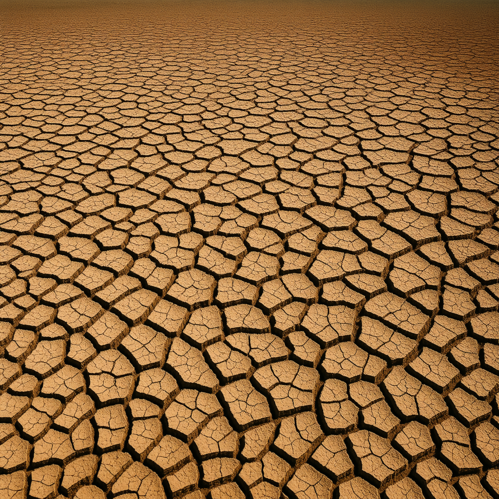
Macro-Detail (Bold Texture): This is large, noticeable texture or pattern that stands out at a glance. Instead of tiny details, think big, bold surface features. For example, the large scales on a dragon’s hide, the broad swirls of wood grain on a tabletop, the big geometric panels on a modern building, or thick brushstrokes in a painting. Macro-details are great for stylistic impact and can define the look of an object from afar. They create visual interest even when you’re not zoomed in. Use phrases like bold texture, large-pattern, chunky detail in prompts to encourage this. When to use: when the texture itself is a statement piece of the image (e.g., a close view of elephant skin with deep folds, or a wide shot of cracked earth with big fissures that form a pattern). Example Prompt: an aerial view of a drought-stricken land, large cracked earth patterns spreading across the ground. (The macro texture of the cracked earth is the focus, creating a dramatic, graphic visual.)
In practice, you can combine micro and macro detail in one image: imagine a close-up of a butterfly wing – the macro pattern of its wing spots is striking, and the micro texture of tiny scales on the wing adds realism. When prompting, decide if you want the AI to emphasize tiny details or bold texture shapes, and use appropriate words. For AI art, terms like “highly detailed” or “intricate” push micro-detail, while terms like “bold patterns” or focusing on the overall texture (e.g. “zebra stripes” – a macro pattern) emphasize macro detail.
7. Patterned Surfaces (Weaves, Tiles, Scales, Fractals, Repeating Designs)
Patterns are textures that repeat in some ordered way. They can be man-made (like tiles or fabrics) or natural (like honeycomb or scales). Adding pattern descriptors helps create visual rhythm and can make an image more engaging or realistic:
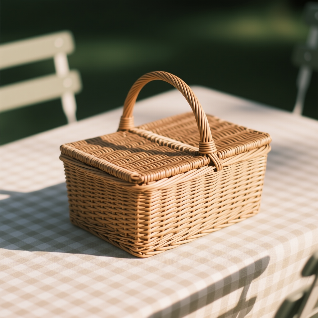
Woven Patterns (Weaves): When individual strands or strips are interlaced, you get a woven texture. Common examples are a wicker basket, a straw hat, fabric weaves or a bamboo mat. A weave pattern gives a sense of craftsmanship and warmth (think cozy wicker furniture or homespun cloth). Use terms like woven, basket weave, interlaced fibers to prompt this. Emotional effect: Weaves often feel homey, traditional, or rustic. Example Prompt: a picnic basket sitting on a table, its woven wicker texture casting a subtle shadow pattern. (The weave texture adds detail and a comfortable, handmade vibe.)
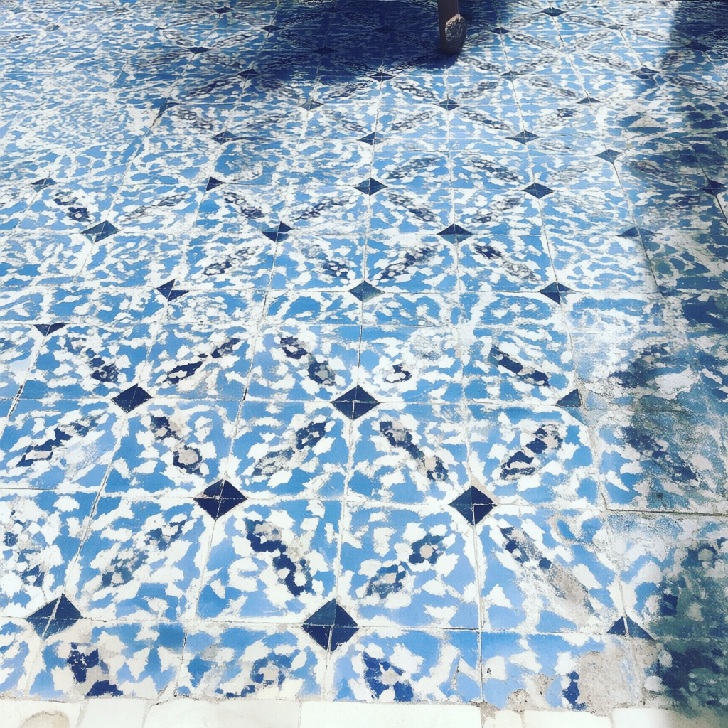
Tiled Patterns: Tiles are repeated shapes (often square, but also mosaic pieces) laid in a grid or design. Tiled floors or mosaic walls instantly introduce a sense of order and sometimes cultural flavor (e.g., Moroccan tiles with geometric patterns, or a classic black-and-white checkerboard floor). Mentioning “tiled” or “checkerboard pattern” or “intricate mosaic” in prompts will result in repeating designs. Patterns like these can lead the eye or create symmetry. When to use: to depict architectural detail (floors, walls, ceilings) or to add a rhythmic, symmetric element in an image. Example Prompt: a sunlit courtyard with intricate blue-and-white mosaic tiles covering the floor. (This suggests a beautiful repeating pattern that adds visual interest and possibly a Mediterranean mood.)

Scales: Scales refer to the overlapping plates on fish, reptiles, dragons, etc. This is a natural repeating pattern that often conveys protection, armor, and a bit of fantasy if used creatively. Scales can be small and fine (a snake’s scales) or large and plate-like (dragon or pangolin scales). Including “scaly” or “scale pattern” prompts the AI to give a surface that shingled look. Emotional effect: Depending on context, scales can be mesmerizing and beautiful (iridescent fish scales) or intimidating (armor-like dragon scales). Example Prompt: a close-up of a koi fish swimming, its iridescent scales catching the light in a repeating mosaic. (This highlights the pattern and beauty of scales.)
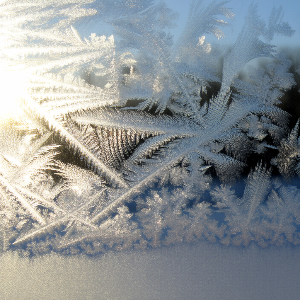
Fractals & Natural Patterns: Fractals are patterns that repeat in self-similar ways at different scales (like spiral shells, fern leaves, snowflakes, or certain geometric art designs). While “fractal” is a mathematical term, in visual prompting it can be used to ask for very complex, swirling or branching patterns that feel infinite. Even if you don’t use the word “fractal,” you can describe things like branching patterns (veins of a leaf, tree branches), spirals (shells, galaxies), or crystals (snowflake patterns) – all of which have fractal-like detail. These patterns often evoke a sense of wonder or complexity in nature. Example Prompt: frost on a windowpane forming delicate fractal patterns in the morning sun. (This yields the intricate repeating patterns of ice crystals – a fractal natural design – which creates a beautiful, delicate texture across the glass.)
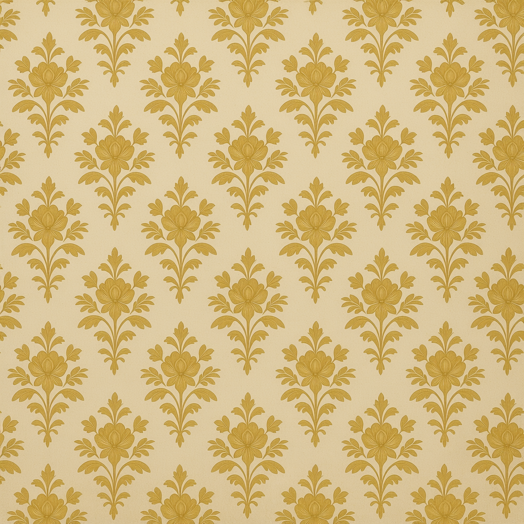
Repeating Designs: This is a broader catch-all for any decorative pattern that repeats – it could be floral wallpaper, polka dots, stripes, celtic knot designs, etc. If you want a pattern, name it or describe it! Repeating designs can set style (polka dots for a playful retro look, baroque patterns for an ornate classic look). Example Prompt: a vintage wallpaper with a repeating floral pattern in gold and cream, slightly faded by time. (The repeated pattern gives a sense of era and setting immediately.)
Using patterned textures in your prompts can not only make the output more visually rich but also help establish setting and mood quickly. A word of advice: if you specify a very complex pattern (like a detailed fractal), the AI might approximate it. It can be useful to focus on the idea of the pattern rather than expecting perfect mathematical repetition. For instance, “intricate fractal-like patterns” will get you complexity, even if not a true fractal.
8. Light & Texture Interaction (Highlights, Reflections, and Glistening Effects)
It’s hard to talk about texture without mentioning light, because light reveals texture. The same surface can look very different under different lighting. Here’s how you can use prompts to describe light interacting with texture:
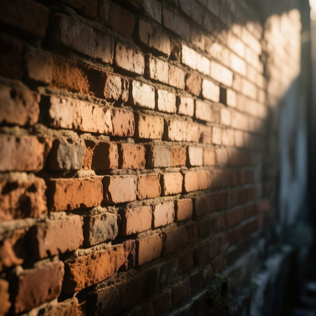
Emphasizing Texture with Light: To really show off a texture, artists often use angled lighting. Light coming from the side (raking light) will cast small shadows in the bumps and recesses, making texture pop out. In photography, side-lighting is known to reveal texture clearly[6]. In your prompts, you might include phrases like “harsh side lighting on the wall to show its texture” or “low-angle light accentuating the cracks”. This tells the AI to imagine the lighting in a way that the texture is obvious. Example Prompt: a beam of late afternoon sun hits the old brick wall at a low angle, highlighting every rough bump and shadow in the brickwork. (This prompt makes it clear that the lighting should make the wall’s rough texture very visible.)
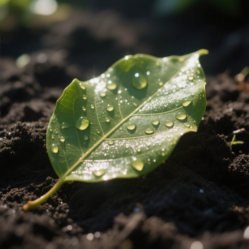
Glossy vs. Matte under Light: We touched on this in material qualities, but to reiterate with lighting: glossy surfaces will have bright specular highlights – little points or areas of white shine where the light reflects – and may show reflections of other things. Matte surfaces will have a gentle, even illumination with no bright spots. If you want to describe this in a prompt, use words like “gleaming” or “glistening” for something catching highlights, and words like “softly lit” or “diffuse glow” for matte things. For instance, “rain-soaked pavement glistening” vs. “dry pavement with a muted finish”. Example Prompt: a wet leaf glistening with tiny highlights in the sun, while the matte soil below it stays dark and non-reflective. (The leaf appears shiny and reflective, the soil dull – showing both effects.)
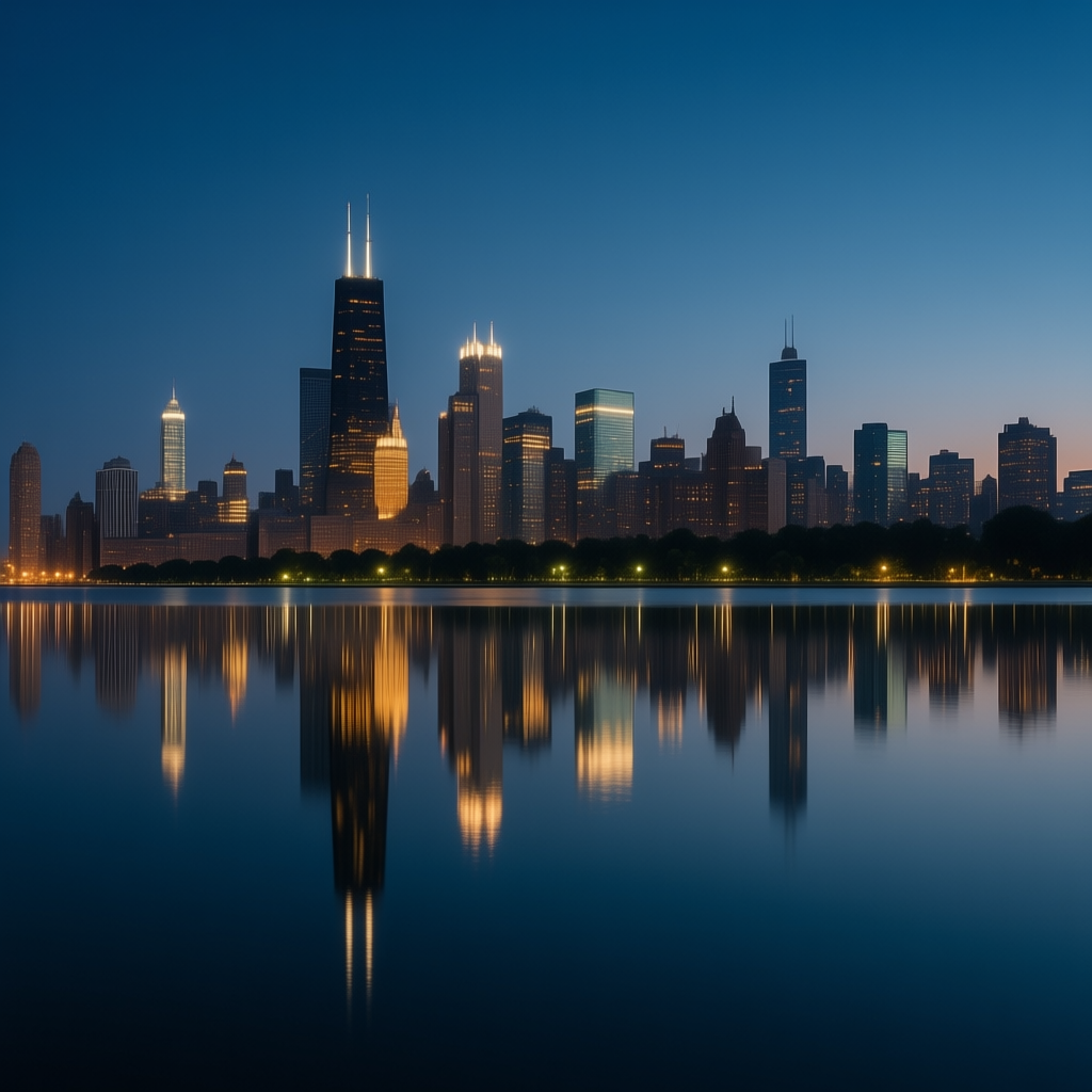
Reflections on Transparent or Polished Surfaces: If your scene has glass, water, or polished metal, mentioning reflections can add realism. For example, “reflection of the city lights on the water” or “a man’s face visible in the mirror’s reflection”. This tells the AI that the surface is so smooth it’s like a mirror. Example Prompt: a city skyline at night mirrored in the calm lake water, the reflections of skyscraper lights shimmering gently. (The water texture becomes part of the story because of what it reflects.)
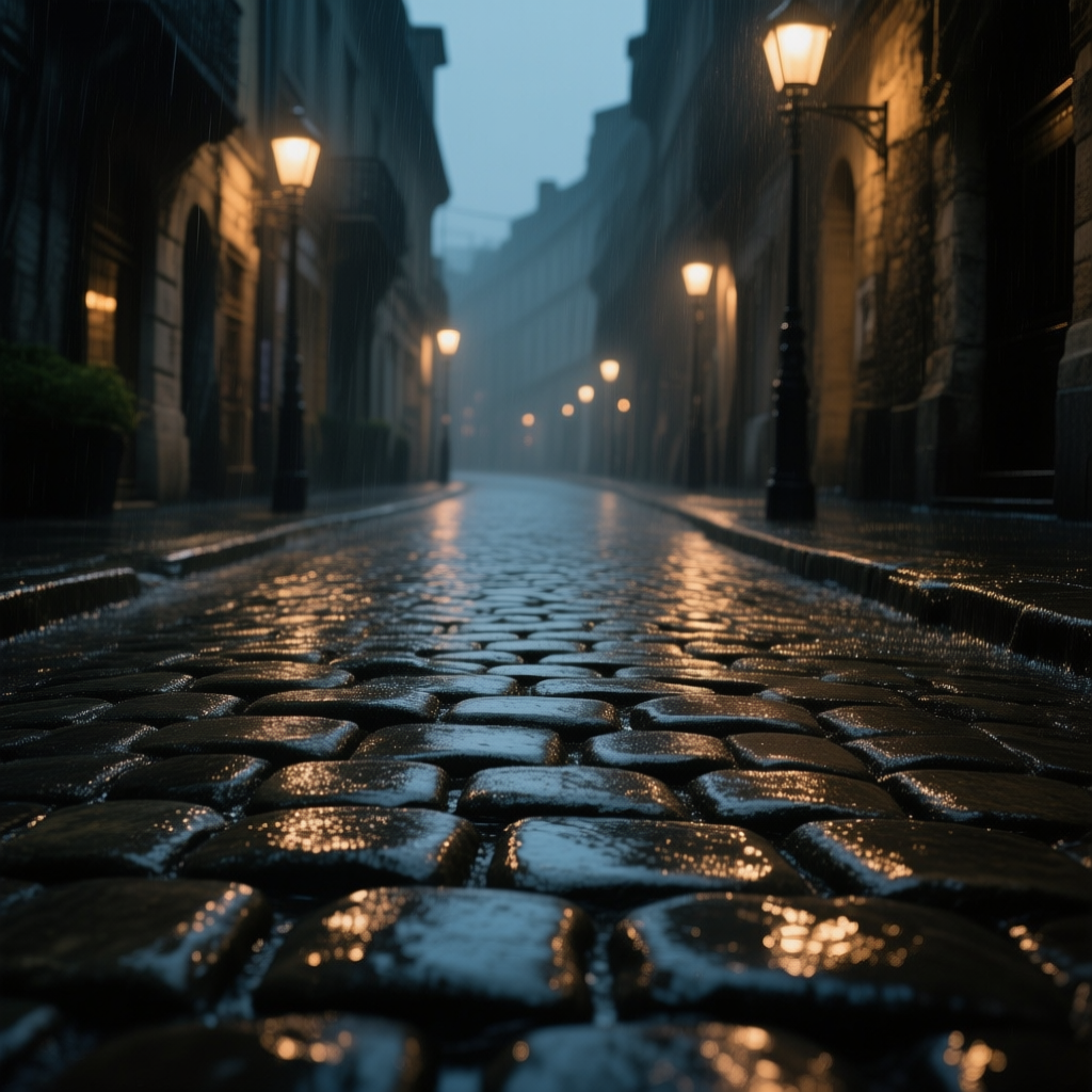
Glistening and Wet Textures: Adding the word “wet” in your prompt can dramatically change the texture portrayal. A wet surface (be it wet metal, wet wood, or wet leaves) will appear darker but with bright glints of light. Water adds tiny reflective facets and intensifies color saturation. Describing something as “rain-soaked,” “dewy,” “glistening with rain” will result in an image where surfaces have that shiny wet look, often very appealing and dramatic. When to use: to create freshness (morning dew on grass), drama (a character standing in rain, water drops on their skin), or amplify texture (wetness can make rough surfaces even more contrasted). Example Prompt: an old cobblestone street, wet from rain, each stone glistening under the streetlights. (This conveys a richly textured street scene with high contrast and a moody atmosphere thanks to the wet shine.)
In summary, texture & detail and light & shadow are partners in crime. Texture is like the “skin” of the world, and light is what makes that skin visible. When prompting, consider not just the texture itself but how it’s lit. Do you want to hide the texture (then maybe soft, even lighting or a more matte description) or show it off (then directional light or words like “glistening,” “highlighting,” etc.)? A smooth marble statue can look flat under flat lighting, but come alive with dramatic light. A rough surface can look subtle in soft light, but every crack shows in hard light. Use this interplay to your advantage. (For more on light & shadow, see the Light & Shadow Edition of this series – but the key difference is: texture/detail describes the physical feel of surfaces, while light/shadow is about visibility and contrast on those surfaces. One doesn’t replace the other; they work together.)
9. Tactile Symbolism (Telling Story Through Texture: Marble, Rust, Glass, etc.)
Textures aren’t just eye-candy – they often carry symbolic meaning or emotional subtext in visual art and storytelling. By choosing certain textures, you can hint at themes or character traits without spelling them out. Here are a few classic examples of tactile symbolism and how to prompt them:
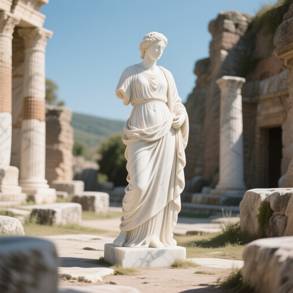
Marble = Timelessness & Elegance: Marble is a smooth, hard stone often used in classical sculptures and grand architecture. It’s associated with Ancient Greece/Rome, and fancy buildings. Because so many long-standing structures and statues are marble, it symbolizes permanence and timeless beauty. It also connotes luxury and purity (white marble especially). Including marble in a scene (e.g. a marble floor, marble columns, a marble statue) can elevate the mood to feel historic, formal, or aspirational. Emotional effect: marble feels cold but esteemed – think of a museum or palace. (Historically, marble was a symbol of luxury and elegance[7].) When to use it: to lend a scene a classical, immortal quality or to signify wealth/culture. Example Prompt: a lone marble statue in an ancient ruin, its white surface glowing in the sun, unchanged by time. (This uses marble texture to imply the scene’s timeless, noble atmosphere.)
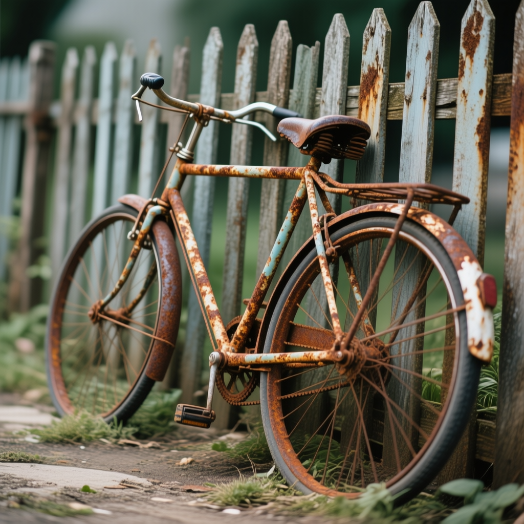
Rust = Decay & Passage of Time: Rust is what happens when metal decays, covering it with a reddish-brown, flaky texture. Rust immediately sends a message of age, neglect, and decay. Visually, it’s a powerful texture – chaotic, rough, and colorful. If you want to show that something is old or abandoned, describing it as rusted or rusty does the trick (rusty car, rusted iron gate, etc.). It evokes a sense of history, and sometimes melancholy or beauty in decay (there’s an entire aesthetic around urban decay photography, loving the textures of rust and peeling paint). Emotional effect: rust gives scenes a gritty, authentic mood; it can also symbolize mortality or the idea that all man-made things eventually return to nature. (We usually perceive rust as a symbol of decay and poor quality with time[4] – but it can be beautiful in art.) When to use it: post-apocalyptic scenes, abandoned buildings, anything meant to feel old or weather-beaten. Example Prompt: a bicycle leaning against an old fence, its frame covered in rust, telling the silent story of years gone by. (You can almost feel how long it’s been there through the rust texture.)

Glass = Fragility (or Clarity): Glass, as discussed, is smooth and transparent. Symbolically, clear glass can mean transparency or truth, while cracked/broken glass often means fragility, brokenness, or danger. If you include shattered glass in a scene, it immediately adds a sense of something gone wrong (violence, turmoil) or the idea that something delicate has broken (a broken mirror could symbolize a fractured identity, for example). Intact glass can also show fragility if it’s thin or in a precarious situation (like a glass figurine teetering on an edge). Emotional effect: glass can make a scene feel tense if it’s about to break, or heartbreaking if shown broken after an event. It can also make things feel modern and open (a glass wall). (Traditionally, glass symbolizes fragility and also transparency[5] – think of phrases like “glass cannon” for something powerful but easily broken, or “people in glass houses…”) When to use it: whenever you want a visual metaphor for delicate situations or to enhance drama. Example Prompt: a single cracked glass orb lying on a dark floor, light passing through its fractured surface. (This image would feel fragile, beautiful, and a bit tragic, all conveyed through the texture of cracked glass.)
Of course, these are just a few examples. Many textures carry meanings: velvet might imply luxury or sensuality (and maybe secrecy, with the phrase “behind the velvet curtain”), silk can signify softness and elegance, burnt/charred wood can hint at destruction or past fire, thorns (sharp texture) clearly symbolize danger or pain, smooth pebbles could symbolize tranquility and meditation (like Zen stone gardens). When writing prompts, think about the story or feeling you want, and consider if a texture can reinforce that. It’s a subtle but powerful tool.
For instance, instead of saying “an old throne in an abandoned castle,” you could say “an old throne upholstered in faded, tattered velvet, its metal frame specked with rust.” Suddenly, you haven’t just told us it’s old – you’ve shown it through texture, and those textures (tattered velvet and rust) bring extra feelings of decay, former glory, and passage of time. This way, texture and detail become storytellers in your image.
10. Combining Texture & Detail for Rich Storytelling
Just as contrasting colors or lighting can enhance an image, combining contrasting textures in one scene can create compelling stories and visual interest. Don’t limit yourself to using just one texture at a time – consider how different surfaces interact in your scene:
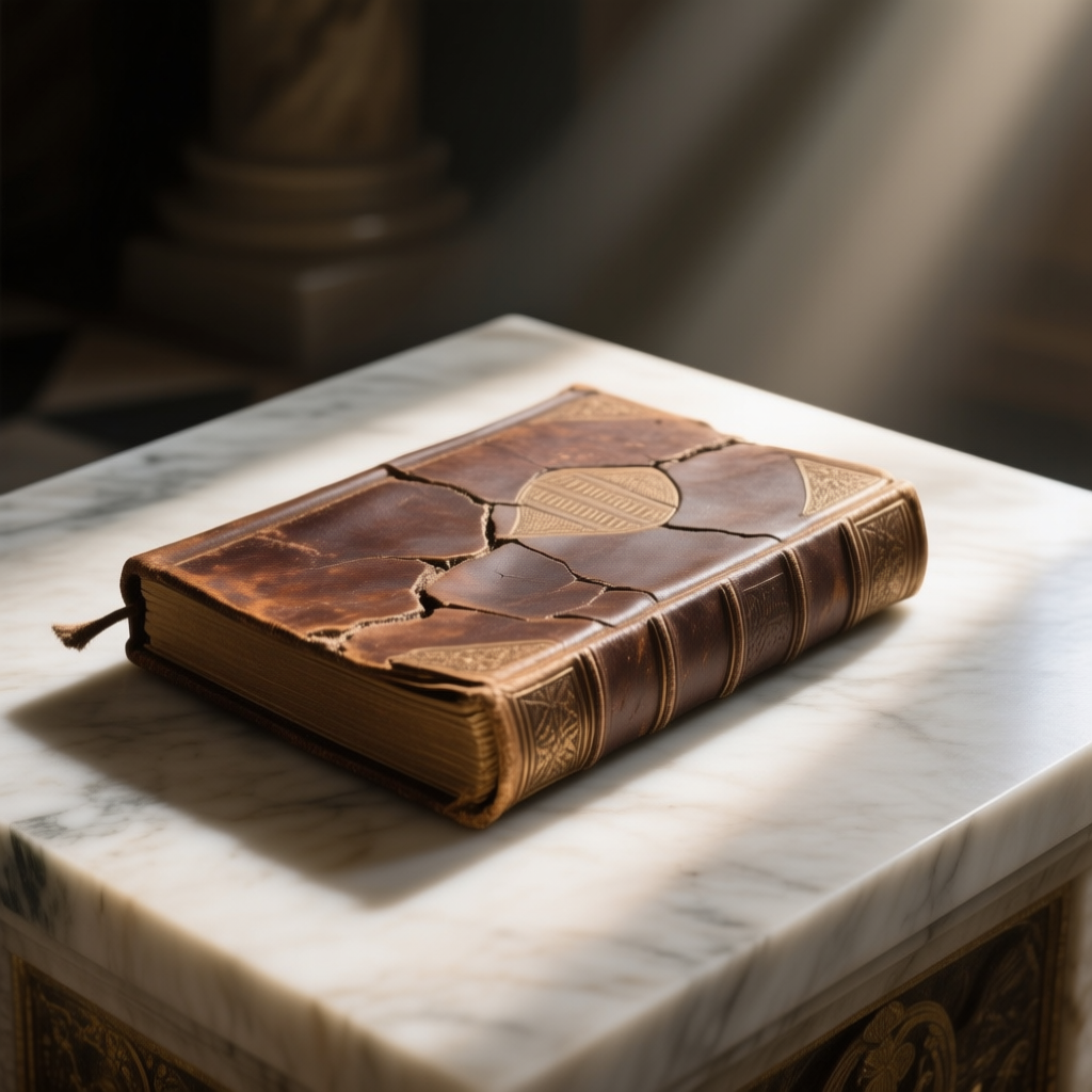
Contrast for Emphasis: Placing very different textures together makes each stand out more. For example, imagine cracked, weathered leather against smooth marble. The roughness of the leather will feel even more rugged next to the pristine stone, and the marble will seem even more polished and cold by comparison. This can be symbolic too – perhaps a narrative of old vs new, or nature vs civilization. Example Prompt: an ancient leather-bound book, cracked and scuffed, lying atop a smooth marble altar in a ray of light. (Here the textures themselves tell a story: the book is organic, aged knowledge; the marble altar is enduring and pure – together hinting at a contrast between human history and timeless stone.)
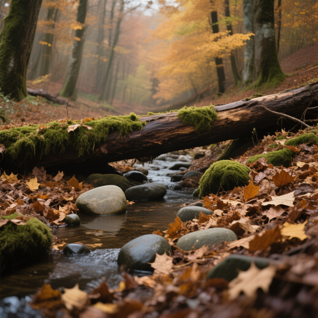
Blending for Realism: In real life, rarely is everything one texture. A forest scene isn’t just “green” – it’s rough bark, soft moss, slick leaves, maybe a babbling brook with water. Describing multiple textures makes the scene more immersive. Example Prompt: an autumn forest floor with crunchy dry leaves, smooth stones in a creek, and patches of soft moss on fallen logs. (This prompt layers several textures, painting a rich, touchable picture of the forest.)
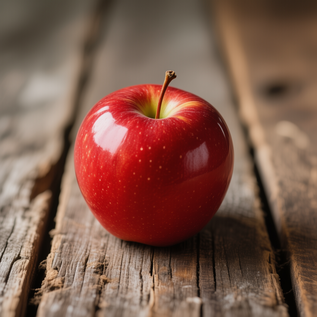
Enhancing a Focal Point: You can use texture contrast to draw attention. A portrait might mention the contrast of a subject’s rough denim jacket against their smooth skin, emphasizing the person’s face. Or a single red apple on a rustic table: “a shiny red apple on a rough wooden table” – the shiny smooth apple becomes the focal point against the matte, coarse wood. This is a classic technique in photography and painting to make subjects pop.
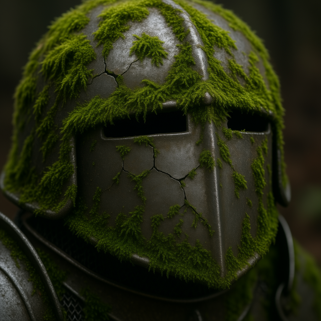
Storytelling through Texture Mix: Sometimes mixing textures can suggest narrative elements. “Soft moss overgrowing the cracks of an old armor” tells of nature reclaiming man-made relics. “Delicate lace curtains fluttering against a gritty urban brick wall” could symbolize gentleness surviving in a harsh environment. Think about the story and see if mixing an unlikely texture in can add depth. AI art often responds well to such poetic combinations, producing images that are intriguing and layered.
When combining, it helps to be specific but not overly long. Two to three distinct texture descriptors in a prompt can usually be handled. If you rattle off every texture in the scene, the model might confuse or prioritize oddly. So choose the key ones that matter most. And as always, you can do multiple prompt attempts, dialing up or down certain texture words to get the right balance.
Texture & Detail vs. Light & Shadow – What’s the Difference?

You might be wondering how these texture/detail tricks relate to the light & shadow techniques (if you’ve read the Light & Shadow Edition of this series). They are indeed closely linked, but focus on different aspects of your image.
Think of it this way: texture and detail define what the surfaces of things are like – it’s like the “skin” of objects in your scene (rough, smooth, patterned, etc.), essentially how things would feel if you could touch them. Light and shadow, on the other hand, define how those surfaces are illuminated or hidden – it’s like shining a flashlight on that skin or putting it in partial darkness, essentially how things are revealed to the eye. Texture/detail is the property of the object; light/shadow is the condition of the environment affecting the object.
An analogy: imagine you’re staging a play. The composition (from our first guide) is where you place the actors and props. The texture and detail are the costumes and set materials – is the backdrop a smooth painted wall or rough stone? Are the costumes silk and velvet or burlap and armor? They set the physical character. Now, light & shadow is the stage lighting – are we illuminating those costumes with a gentle glow or a stark spotlight? It sets the mood and emphasis.
To see the difference, picture two scenarios of the same subject: say, an old diary on a table. If I describe the diary’s texture, I might say it has cracked leather covers, yellowed paper pages with rough edges, and a rusty lock. That gives you a vivid sense of the object’s physical qualities and suggests it’s antique. Now, separately, consider lighting: I could say it’s lit by dim candlelight with flickering shadows versus bright noon sunlight streaming in. The first lighting makes the scene mysterious and intimate; the second makes it clear and warm. But the diary’s textures (cracked leather, rough pages) haven’t changed – only how we see them.
Both aspects work together for a full effect. If that cracked leather diary is in flickering candlelight, the shadows in the cracks might dance and the mood is very old-timey and secretive. In bright sunlight, every detail is clear and it feels nostalgic but less ominous. Neither approach is “right” or “wrong” – they’re different feelings with the same detailed subject.
So when prompting, try separating these ideas in your mind (and even in how you phrase the prompt): one part of your prompt can describe the textures/details you want (as we’ve practiced in this guide) – this ensures the AI knows what everything feels like. Another part of your prompt can describe the lighting and atmosphere (as covered in the Light & Shadow guide – e.g. “soft diffused light” or “high contrast shadows”). For example: “a portrait of a traveler, weathered leather jacket and scruffy beard (texture detail), golden hour sunlight and soft shadows (lighting)”. The result should be an image where the subject has the tactile realism (you can imagine the rough jacket and bristly beard) and the intended mood from lighting (warm and gentle because of golden hour light).
In short: Texture & detail make your image feel real and story-rich, while light & shadow make your image feel mood-rich and dramatic. A truly compelling image often needs both: interesting stuff in it (textures/details) and interesting light on it. Now that you know how to control each, you can mix and match to get the exact vibe you want.
Quick-Reference Summary of Texture & Detail Terms
To wrap up, here’s a handy list of texture and detail keywords you can mix into your prompts. These terms can help instantly change the tactile feel of your AI-generated images. Feel free to copy-paste or tweak them as needed:
· Rough – coarse, uneven surface (creates rugged, gritty feel)[1]
· Smooth – even, sleek surface (creates calm, clean feel)[1]
· Cracked – having cracks/breaks (implies age, damage or dryness)
· Polished – highly smooth and shiny (implies newness, cleanliness)
· Weathered – worn by weather/time (aged, rustic character)
· Pristine – in perfect, untouched condition (new, pure atmosphere)
· Glossy / Shiny – reflective, high sheen surface (adds bright highlights, modern or wet look)
· Matte / Dull – non-reflective, flat surface (no glare, muted feel)[2]
· Soft (e.g. fluffy, plush, velvety) – yielding, gentle texture (comforting, warm mood)
· Sharp (e.g. jagged, spiky, coarse) – hard or pointy texture (tense, harsh mood)
· Gritty – fine roughness (like sand or grain, can add realism or dirtiness)
· Silky / Satiny – very smooth, soft (luxurious, gentle feel)
· Burlap / Coarse – very rough fabric texture (rustic, homey feel)
· Mossy – covered in moss (soft, green, ancient vibe)
· Rusty – covered in rust (decay, old industrial vibe)[4]
· Scaly – covered in scales (reptilian, armored look)
· Woven – interlaced strands (basket weave, fabric weave; handmade warmth)
· Tiled / Mosaic – repeated tile pattern (ordered, geometric interest)
· Grainy – visible grain (wood grain, film grain; natural or vintage effect)
· Porous – small holes (like sponge, lava rock, or rough stone; organic feel)
· Intricate / Fine detail – lots of tiny detail (enhances realism, complexity)
· Bold texture / Large-pattern – big, noticeable texture pieces (graphic impact)
· Glistening – shining with reflected light (often wet or oily surfaces)
· Frosted – semi-opaque, matte (like frosted glass; diffuse and soft)
· Peeling – bits coming off (peeling paint; implies neglect, age)
· Embossed / Engraved – raised or carved details (ornate, tactile detail)
· Patina – a surface film from age/use (like tarnish on copper, adds character)
· Fibrous – visible fibers (paper, fabric, plants; organic texture)
· Lacy – delicate, lace-like pattern (intricate, feminine touch)
· Smooth as glass – extremely smooth (can imply fragility or sleekness)
· Mirror-like – highly reflective (creates mirror images, shiny look)
· Sandpapery – very rough fine grain (abrasive texture, gritty)
· Spongy – soft and porous (e.g., moss, foam; cushioned feel)
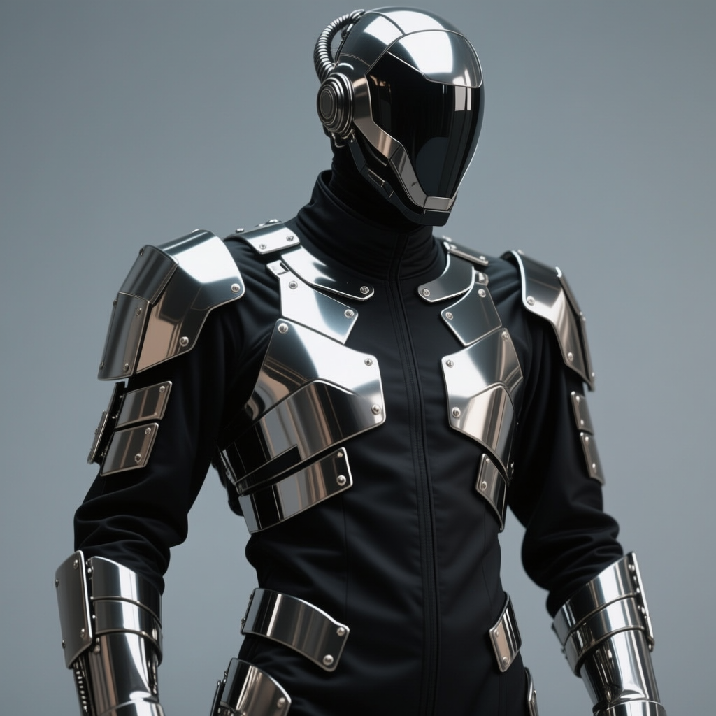
Mix and match these texture terms with your subject and setting. For example: “a medieval door, weathered wood, with rusty iron hinges” or “a futuristic suit made of glossy metal plates and matte black fabric”. By choosing the right texture words, you’ll guide the AI to create images that not only look good but also feel rich and evocative. Happy prompting, and enjoy adding texture and detail to your visual stories!
Sources:
1. Jamie Konarski Davidson – “Texture – How It Feels” (New Life Photos blog)[1][6]
2. Reddit ELI5 discussion – Explanation of matte vs. glossy surface reflection[2][3]
3. Ruben Sorhegui Tile – The Timeless Beauty of Marble Flooring (marble as symbol of luxury)[7]
4. Davor Katusic, Full Frame (Medium) – Looking for the Rust and My Reasons Behind It (rust as symbol of decay)[4]
5. Evgeniy Rogatnev (Art site) – Vanitas painting symbols (glass symbolizes fragility)[5]
[1] [6] Texture – How It Feels – New Life Photos | Jamie Konarski Davidson
https://www.newlifephotos.com/blog/texture-how-it-feels/
[2] [3] ELI5: the difference between matte and glossy finishes - how do they work? : r/explainlikeimfive
[4] Looking for the Rust and My Reasons Behind It | by Davor Katusic | Full Frame | Medium
https://medium.com/full-frame/looking-for-the-rust-and-my-reasons-behind-it-66ac2e4741f4
[5] Painter Evgeniy Rogatnev – Art copy of the original painting «Vanitas», 30х40 sm.
https://rogatnev.art/en/gallery/vanitas/
[7] The Timeless Beauty of Marble Flooring | Sorhegui Tile
https://sorheguitile.com/the-timeless-beauty-of-marble-flooring/


